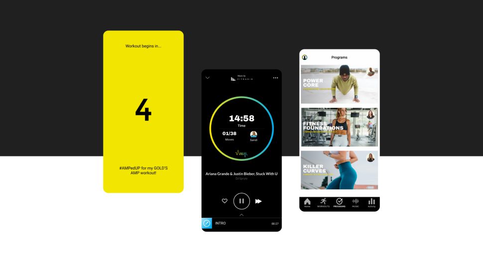
10 Mobile App Personalization Strategies
Quick Summary
The article emphasizes the importance of balancing relevance and user control in mobile app personalization. It suggests that effective personalization requires using just enough data, explaining its use clearly, and providing users with easy options to modify or disable it. Key strategies include starting with clean user data linked to a specific use case, focusing onboarding on user intent rather than lengthy forms, grouping users based on behavior and context, and adjusting the app's home screen without altering core navigation. These approaches aim to enhance user experience while respecting user preferences and privacy.
Users expect relevance, but they also want control. This guide comes down to one simple idea: if I want mobile app personalization to work, I need to use just enough data, explain it in plain language, and give users easy ways to change or turn it off.
Here’s the short version:
- I start with clean user data tied to a clear use case
- I shape onboarding around user intent, not long forms
- I group people by behavior and context
- I adjust the home screen without moving core navigation
- I use recommendations where user intent is already high
- I send push notifications based on timing and stated preferences
- I trigger in-app messages from user actions
- I let people set preferences and privacy controls
- I use location only when the value is obvious
- I test and refine with retention, CTR, conversions, reviews, and support feedback
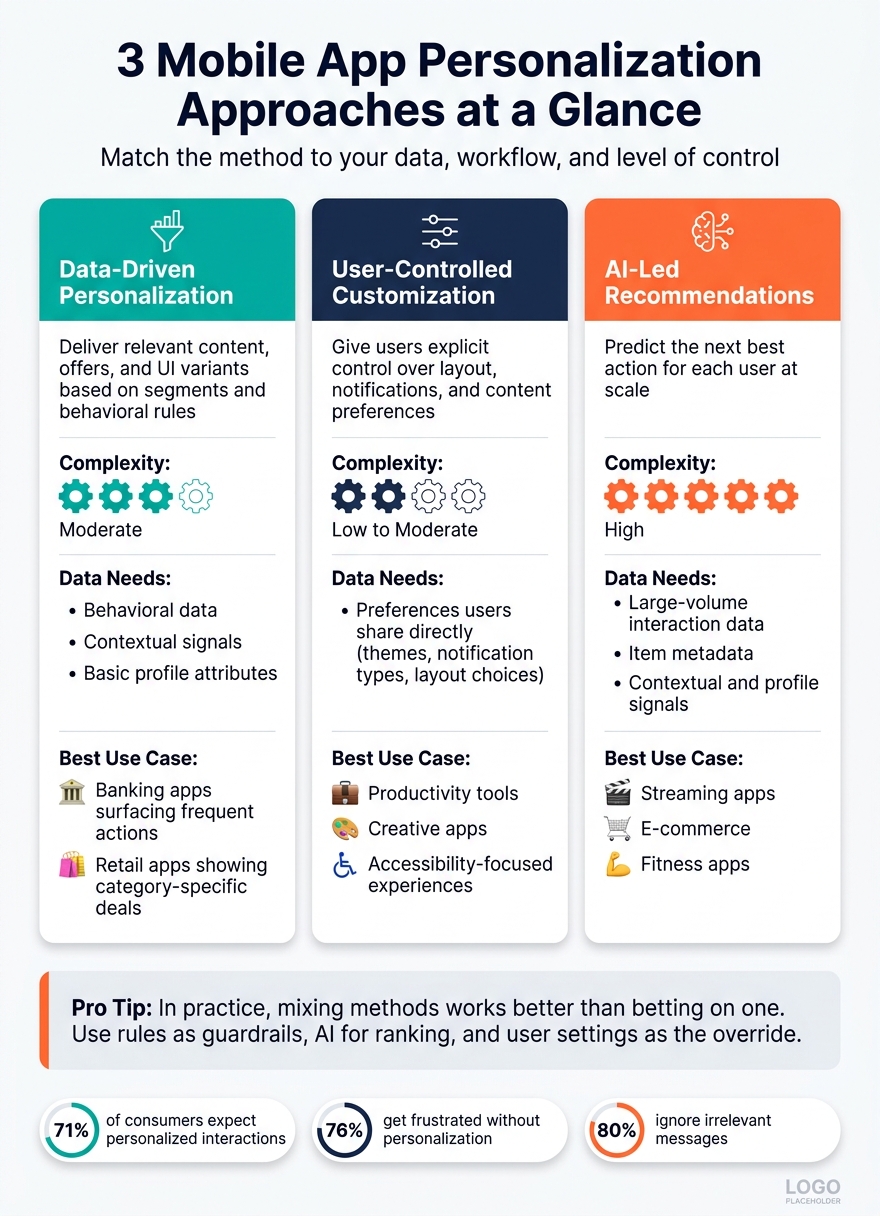
A few stats make the case. 71% of consumers expect personalized interactions, 76% get frustrated without them, and 80% ignore irrelevant messages. So this isn’t about adding more prompts or more data. It’s about showing the right thing at the right time, in a way that feels clear and user-led.
Quick Comparison
| Strategy | What I use it for | Main rule |
|---|---|---|
| User data | Power all personalization | Collect only what helps |
| Onboarding | Learn intent early | Ask a few questions, not many |
| Behavioral segmentation | Group users by actions | Use more than one signal |
| Home screen personalization | Surface top actions faster | Change content, not structure |
| AI recommendations | Suggest next best items | Start simple and label why |
| Push notifications | Bring users back | Time and frequency matter |
| In-app messaging | Help in the moment | Trigger from behavior |
| User preferences | Give people control | Keep settings visible |
| Location-based personalization | Add local context | Ask only when needed |
| Testing | Improve over time | Measure trust and results |
A simple rule helps here: label behavior-based content clearly. If a section says something like “Recommended because you watched…”, users can see why it showed up instead of feeling like the app is making random guesses.
Consent and Transparent Data Use
People are much more likely to share data when the value exchange is clear. Broad lines like “to improve your experience” don’t say much. Plain, specific wording works better.
For example:
“We use your workout history to suggest training plans that match your fitness level”
That kind of explanation tells users what data is used and what they get back.
Good consent design also means granular opt-ins. A user should be able to turn on content personalization without also agreeing to location-based features or marketing messages. And those choices shouldn’t be buried after onboarding. People need a simple way to update them later.
That matters even more in the U.S., where nearly 60% of consumers say they prioritize data privacy over personalization benefits, and almost 40% always disagree with third-party data sharing.
Accessibility and User Control
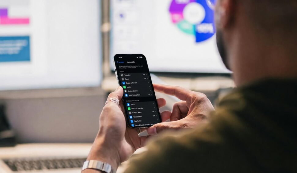
Dynamic interfaces can cause problems fast if accessibility isn’t part of the build. Screen readers like VoiceOver on iOS and TalkBack on Android depend on steady structure and clear labels. If a recommendations carousel appears without a label, or if it throws off focus order, it stops being helpful and starts getting in the way.
So the fix isn’t to avoid dynamic content. It’s to build it with care.
Keep core navigation stable even if home screen modules change. Add clear labels to personalized elements. Follow WCAG 2.1. Let users resize text without breaking the layout. And give people a way to reduce or turn off personalization without blocking access to the app’s main features.
Examples from Common U.S. App Categories
Personalization looks a little different from one app type to another, but the logic stays the same.
- Retail apps show “Recommended for you” sections based on browsing and purchase history. Saved shopping lists and preferred delivery addresses are customization.
- Fitness apps adjust workout suggestions based on logged sessions and performance. Users choose goals like strength or cardio, along with workout length.
- Finance apps automatically surface alerts for unusual spending or frequently used accounts. Users set budget categories and their own notification limits.
- Media and streaming apps shape home screens around viewing history. Users manage watchlists and follow topics or channels they care about.
- Food delivery apps suggest restaurants based on past orders and time-of-day patterns. Users set dietary filters and pin favorite spots.
Across all of these, the pattern is pretty simple: personalization decides what gets highlighted, while customization decides how the user sets things up.
With those basics set, the next step is building the data layer behind personalization.
1. Build a User Data Foundation
Once consent and user controls are set, the next step is simple: collect only the signals that make personalization better. Every personalization feature sits on top of data, and messy data leads to messy results. So tie each data point to a clear goal.
Four data types matter most here. Behavioral data shows what users do in the app, like screens visited, features used, purchases, and session frequency. Demographic data covers things like age range, location, and language, which can help with broad segments. Contextual data looks at the user’s current situation, such as device type, time of day, or network conditions. And explicit preference data comes straight from the user, including interests, notification preferences, and accessibility settings.
If you’re deciding where to start, begin with behavioral data and preference data. Those usually give you the clearest signal. Add demographic and contextual inputs later, and only if they make the experience more relevant.
Timing matters just as much as the data itself. During onboarding, keep it light. Ask just 2–3 questions, such as:
- Language
- Broad interests
- Notification preferences
Then wait until the user completes a first meaningful action before asking for anything else. After that, passive behavioral logging can do much of the work. Small in-app prompts, like an “Update your interests” card, also help keep profiles current as user needs change over time.
On the technical side, each user should have a unified profile. That means one ID connects preference attributes, consent flags, and behavioral events across devices. Event data should live in a single schema with fields like type, timestamp, device, and context, so recommendation and segmentation rules can query it without friction. Shared tags such as high-engagement or coupon-sensitive also help, because different features can reuse the same rules instead of rebuilding them from scratch.
Consent flags and withdrawal controls should live inside the profile layer too. Users need a clear way to review or revoke permissions in-app. That profile layer is what powers segmentation and recommendations later on.

2. Personalize Onboarding Flows
Onboarding is your first shot at making the app feel relevant. Start by learning why someone is there, then use that answer to shape what they see next.
One intent question is often enough to send users down the right path. A fitness app, for example, might ask if the user wants to lose weight, build strength, or train for a race. From there, it can show a first workout that fits that goal. The welcome screen, goal selection, setup, and first content screen should all reflect that choice. Use U.S. defaults like MM/DD/YYYY for dates and $ for dollar amounts, and make sure users can edit those settings without friction.
What users do during onboarding matters just as much as what they say. If someone skips a detailed tutorial but spends time with an interactive demo, the app can pull back on later explainer screens and move them into a more hands-on flow. That kind of behavior-based routing works best when each onboarding step tracks actions and uses simple rules to decide which screen comes next.
Permissions need good timing too. If you ask for location or notifications before users see the app’s point, opt-in rates tend to drop. A short screen before the system prompt that explains the reason for the request can lift iOS notification opt-ins from about 35–40% to 50–60%. Keep the copy plain and direct. Tell users what the permission does, why it helps, and that they can change it later in Settings. That first permission prompt should feel like part of onboarding, not some random interruption.
A few small choices help here:
- Mark optional questions clearly
- Offer a Skip for now option when an answer isn’t needed
- Leave optional profile fields for later
Those early signals can later support segmentation and recommendations.
3. Segment Users by Behavior and Context
After onboarding, start turning user signals into clear segments based on what people are doing right now and the situation they’re in. Behavioral segmentation groups users by things like screen views, feature usage, purchase frequency, session length, and drop-off points. Why does that matter? Because behavior is one of the clearest signs of intent. And those segments can shape what the app shows next.
The strongest segments don’t rely on just one signal. A single data point rarely gives you enough to act on with confidence. When you group several actions together – like recency, frequency, and feature affinity – you get segments that are steady enough to use for tailored content, reminders, or offers.
Context makes those segments even sharper. Time of day, device type, entry channel, and journey stage can all make the experience feel more relevant without leaning on sensitive data. A fitness app showing recovery tips in the evening is a simple example. A travel app surfacing a boarding pass when a user is at the airport and has opted in to location access is another. That’s the difference between a timely experience and a generic one.
Segmentation can lift engagement by up to 74%. In the U.S., follow CCPA/CPRA notice and opt-out rules for sensitive segments. Stick to signals users would expect you to use, and make opting out easy. Roughly two-thirds of consumers have recently run into personalization that felt inaccurate or invasive, and that can lead to unsubscribes or disengagement. Use these segments to guide the next screen, message, or offer.

4. Tailor the Home Screen and Navigation
Use behavioral segments to put the right actions first on the home screen. In a banking app, that may mean showing Transfer or Pay Bill up top. In a fitness app, the focus might shift from Workouts in the morning to Sleep or Recovery at night. These small tweaks cut down on taps and help people finish tasks faster.
Personalize home-screen modules, shortcuts, and action strips, but keep the core navigation fixed. Change the content, not the structure.
Inside that steady layout, let repeat behavior guide what moves up. If users check balances all the time or start the same workout over and over, bring those actions closer to the top. Time of day can sharpen that logic even more, and you can do it without leaning on sensitive data.
A personalized home screen can lower tap count, trim task time, and help keep users active in the app. Track metrics like:
- Task completion rate
- Tap-through rate on personalized modules
- Average taps from home to a key feature
To see whether it’s working, run an A/B test against a static layout.
Privacy matters here. Use a plain-language toggle such as “Use my activity to highlight the tools I use most.” Keep anything that might feel too personal off shared screens. Health apps, in particular, need to tread lightly. It also helps to keep a clear fallback path for standard content and make controls easy to find so users can reset personalization fast.
5. Use AI-Driven Recommendations
Once you have clean event data and clear segments, AI can turn those signals into useful next-step suggestions. Recommendation systems look at behavior, metadata, preferences, and context to rank the next best option. The best setups usually begin with dependable event data and well-structured content metadata. Then, as data quality and governance improve, they add richer profile and context signals.
After the system knows what to recommend, the next step is deciding where to show it. Put recommendations in places where intent is already high. On product or content detail pages, modules like related items, frequently bought together, or recommendations based on what you watched can bring up relevant options without making users search all over again. At the end of a session, suggest the next best action. Keep placements tight, though. If you stack carousel after carousel on the same screen, people tune out fast.
Spotify is a good example of why timing matters. A randomized field experiment found that adding personalized podcast recommendations increased podcast streams by 28.90%. That kind of lift can happen, but only when suggestions feel relevant, well-timed, and varied enough that they don’t start looking like the same thing over and over.
Cold start is still the biggest problem for new users and new items. When there’s little or no history to work with, lean on onboarding selections, popularity-based lists, and contextual defaults so the first few recommendations still feel useful. As more behavior comes in, the model can move toward learned patterns. Clear labels and explainability cues, such as a Why am I seeing this? prompt, also help people understand why a suggestion showed up, especially early on when the system is still figuring things out.
Keep recommendation controls visible, easy to understand, and simple to switch off. Those same relevance rules should guide push notifications too.
6. Personalize Push Notifications
Use the same behavior signals behind your recommendations to send timely notifications between sessions. This can make a big difference: personalized push notifications lift open rates from 1.5% to 5.9% and help early retention, with open rates that are about 4x higher than generic messages.
Push notifications work a little differently from other personalization surfaces because there’s an opt-in step first. That means you should lean on what users have clearly told you they want. Focus on stated preferences like topics, message frequency, and quiet hours, along with profile details such as ZIP code, time zone, and preferred language. That’s what helps a message land at the right moment instead of feeling random.
Timing matters just as much as the message itself. Send pushes after key actions, like within 30 to 60 minutes of cart abandonment or the next morning after a late-night session with a continue-watching reminder. For promos, cap sends at 1–2 per day. Transactional alerts like order updates or balance alerts can have higher limits. If opt-outs start climbing, don’t just send more. Fix the timing or the copy first.
For consent, use explicit opt-in and explain in plain language how notifications will be used. Include a link to your privacy policy. Inside your app, keep a Notification Settings screen where people can control topics, frequency, quiet hours, and personalization. And keep those settings easy to find after onboarding, so users can make changes without digging through system menus.

7. Customize In-App Messaging
Inside the app, messages should help users finish what they already started. That’s when in-app messaging works best. It should react to user behavior, not run on a fixed timer. On average, behavior-triggered messages reach 28% engagement, and that climbs to 56% when triggered by user actions.
Use the same event data and segments across the app to figure out where someone is in the lifecycle: new, active, at risk, or reactivated. Then match the message format and CTA to that stage.
- Active users tend to respond well to feature discovery prompts and personalized summaries.
- At-risk users – people whose activity has dropped below a set threshold – need value-led nudges when they come back.
- Reactivated users need a short recap and one clear next step.
These triggers should come from the same behavioral signals used throughout the product. Show messages right after key actions, at likely drop-off points, or after 30–60 seconds of inactivity. BetterMe saw a 22% retention increase and stronger results in challenges and purchases after moving to personalized, behavior-triggered messaging. Fishbrain used the same approach and drove a 7.4% uptick in paid-feature adoption plus a 3% increase in win-back subscriptions.
Each message should fit one moment, one need, and one action. Keep it tight: one goal, one CTA. For example, a retail app might tell a user to add $15 more to unlock free shipping while they’re on the cart screen. A finance app might show that the user saved $320 this month at the 30-day mark.
Privacy matters here. Use only the data you need. Don’t surface sensitive details – like exact account balances or health diagnoses – in visible messages. And make sure users can dismiss, adjust, mute, or turn off personalized messaging without digging through settings.
8. Offer User-Controlled Preferences
Once automated personalization kicks in, user controls give people a way to fine-tune what the app learns. They work best as an added layer on top of behavior-based personalization, not as a swap for it.
The best controls focus on what users care about most: content categories, notification frequency and timing, channels, and data-sharing choices. A fitness app that lets someone pick a preferred workout type and reminder time feels more useful than one that just guesses. That kind of control cuts down on friction and helps avoid irrelevant content.
Timing matters too. Use the same behavioral signals behind your recommendations to ask for preferences at the moment they make sense. That usually means after a meaningful action or right before the user would get something from the setting. A short “choose what you want to see” screen can work well here, especially after the person has already used the app enough to know what they want.
Spotify’s Taste Profile shows how user feedback can shape recommendations directly.
Keep these controls clear and easy to use. Use plain language, group related settings together, and make it simple to update, limit, or reset preferences at any time from a visible settings screen.
Saved preferences should also shape location- and context-based experiences.
9. Use Location-Based Personalization
After user preferences, location adds context in the moment. It helps your app react to where someone is, not just who they are. The key is simple: use location only when it makes the experience more useful right then and there. A food delivery app can show nearby restaurants around lunch, a retail app can trigger an in-store offer, and a weather app can display local forecasts in °F.
Not all location data needs the same level of detail. Use the least precise option that still gets the job done. GPS makes sense for geofencing. City or ZIP code often works fine for regional content. In most cases, you do not need exact coordinates.
Ask for location when the user can see why it matters. For example, when they tap Find stores near me or Show local deals. That timing matters a lot. Research shows that when an app clearly explains the benefit of sharing location, willingness to enable nearby offers rises from about 55% to nearly 69%. The same just-in-time approach should shape the settings you show after opt-in.
Under California’s CCPA/CPRA, precise geolocation counts as sensitive personal information, so users should be able to choose how much precision the app uses. Use direct prompts like Show nearby stores and same-day pickup options. Then give people a simple choice in settings:
- Approximate
- Precise
- Off
If someone says no, don’t leave them stuck. Offer a ZIP or city fallback so the app still works. A ZIP or city fallback keeps the app useful when users decline location access.
With location in place, the next move is to test whether the experience still holds up when personalization shifts.


10. Test and Refine Continuously
Personalization needs steady testing because user behavior shifts, and models can drift over time. Think of it as an ongoing experiment, not a one-time setup. The aim is simple: keep recommendations relevant without chipping away at trust.
Track metrics like 7-day and 30-day retention, session length, click-through rates, and conversions such as AOV and subscription upgrades. Then pair those numbers with qualitative signals like in-app surveys, app store reviews, and support tickets. That’s how you spot friction that raw data can miss.
Research backs this up. Recommendation accuracy and real-time adaptation both show strong positive effects on customer engagement (β = 0.348, p < 0.001; β = 0.312, p < 0.001). In plain English: small, steady gains in your personalization logic can add up over time.
Once you know what to measure, test one variable at a time. Give each test at least one full usage cycle, which is usually a week or more. Focus on high-impact touchpoints, such as:
- Onboarding
- The home screen
- Push notifications
- Re-engagement messages
Then use what you learn to tune the system. Winning variants should become the new baseline. Losing variants still help – they show you what not to repeat. At the same time, keep privacy controls easy to find. Under CCPA and related frameworks, users should know what data shapes their experience and should be able to opt out.
Collect only the data you need, anonymize it when you can, and make preference controls easy to reach. Aggressive tracking might lift click rates in the short term, but it can weaken the trust that long-term retention depends on.
Personalization Approach Comparison Table
10 Mobile App Personalization Strategies: Approaches, Data Needs & Best Use Cases
After the tactics above, use this comparison to pick the simplest personalization model that fits the job. The three main approaches – data-driven personalization, user-controlled customization, and AI-led recommendations – do different things well. Use the table below to match the method to your data, workflow, and level of control.
| Approach | Purpose | Implementation Complexity | Data Needs | Best Use Case |
|---|---|---|---|---|
| Data-Driven Personalization | Deliver relevant content, offers, and UI variants based on segments and behavioral rules | Moderate - analytics, segmentation, rules engine | Behavioral data, contextual signals, basic profile attributes | Banking apps surfacing frequent actions, retail apps showing category-specific deals |
| User-Controlled Customization | Give users explicit control over layout, notifications, and content preferences | Low to moderate - settings and UX structure | Preferences users share directly (themes, notification types, layout choices) | Productivity tools, creative apps, accessibility-focused experiences |
| AI-Led Recommendations | Predict the next best action for each user at scale | High - ML models, live system support, monitoring | Large-volume interaction data, item metadata, contextual and profile signals | Streaming apps, e-commerce, fitness apps |
Each approach has a clear fit. Rules work well for transactional apps. User controls work well when people have different ways of working. AI works best for high-volume content or large product catalogs.
In practice, mixing methods often works better than betting on only one. A simple hybrid can use rules as guardrails, AI for ranking, and user settings as the override.
Start with one high-impact use case. Then add AI after the base experience has already shown that people find it useful.
Once you choose the model, keep the interface clear as personalized content changes.
Design and UX Considerations for Personalization
Once the personalization logic is set up, the interface still has a big job to do. It needs to keep the experience steady, easy to read, and easy to control. Think of these design choices as guardrails. They help personalization feel helpful instead of messy.
Keep Navigation Clear as Content Changes
Start with orientation. As personalized content shifts, the tab bar and primary destinations should stay fixed. That way, users don’t feel like the app keeps changing the floor plan on them.
For example, a retail app might show different featured categories to different shoppers while keeping the cart, search, and account tabs in the same place. The content can change. The core path through the app shouldn’t.
Make Preference Controls Easy to Find
Put a clearly labeled “Personalization & Privacy” section in Profile or Settings. When controls are visible, personalization feels less opaque and much easier to undo.
Use plain language, such as “Show personalized recommendations”, “Use my location”, “Turn off personalized notifications.” After someone makes a change, confirm it with a short in-app message. It also helps to include a “Reset recommendations” option for users who feel the app has drifted away from what they want.
Once people can manage the basics, you can introduce deeper controls over time.
Use Progressive Disclosure
Show advanced personalization controls only after users have enough context to make sense of them. Timing matters here. Behavioral triggers can help: after a purchase or repeated visits, a contextual tooltip can point out a feature the user hasn’t tried yet.
Just make sure users can skip, snooze, or revisit that guidance. No one likes being forced through a tutorial when they already know the ropes.
Maintain Accessibility and Brand Consistency
Dynamic modules – carousels, recommendation cards, and personalized banners – need high contrast ratios, tap targets of at least 44–48 px, clear focus states, and a reading order that still works when content updates. They should also work with screen readers and keyboard input. Labels shouldn’t disappear, and core controls shouldn’t jump around without warning.
At the same time, personalized screens should still feel like the same app. Typography, color palette, spacing, and component styles should stay uniform across each personalized state. A design system with defined tokens and reusable components helps teams do this at scale. Visual Soldiers, an Atlanta-based creative agency, offers brand strategy, UX/UI design, and custom app development services for teams building at this layer.
Build a Smarter Mobile Experience
Turn user insights into intuitive, personalized app experiences with Visual Soldiers.
Book a Discovery CallConclusion
These strategies work best as one connected system. Strong personalization doesn’t come from one tactic on its own. It comes from clean data, clear segments, timely messaging, practical AI, and steady testing working together.
Here’s how that plays out: data shapes segmentation, segmentation points messaging in the right direction, and testing helps improve each layer over time. The upside can be meaningful, but only when personalization stays useful and easy to trust.
That depends on transparency. Relevance works best when users understand what data is being used and have control over it. Trust isn’t separate from personalization. It’s part of it. Treat personalization as a loop: test, measure, and refine as behavior shifts. That’s what helps keep it relevant over time.
FAQs
Collect only the data tied to the features you offer. Start with what your app actually needs, then cut anything that doesn’t serve a clear purpose.
For example, browsing history might help power personalized recommendations. Location data, on the other hand, might have nothing to do with that feature.
Put more weight on zero-party data that users choose to share because they get a clear benefit in return. When possible, lean on contextual signals instead of tracking people across unrelated platforms. And when you ask for permission, use consent dialogs that are clear, specific, and easy to understand.
Start by mapping user journeys to spot friction points, like onboarding drop-offs, slow search, or the same support questions showing up again and again. Then look at the problem in plain terms: will personalization, prediction, or automation solve it best?
A good first move is to launch one simple AI-driven feature. That could be contextual help, a smart chatbot, personalized recommendations, or better search. Visual Soldiers can help with strategy and implementation.
Collect only the data you need, and give people clear consent options.
Personalizing your mobile app without hurting user trust starts with clear communication and careful data use. Tell people why they’re seeing certain recommendations, and say how their data is used in plain, specific terms.
Put consent first. Give users simple opt-in and opt-out choices that are easy to find and use. It also helps to lean on zero-party data that users choose to share on purpose, especially when the benefit is clear right away. That way, the value exchange stays obvious.

Visual Soldiers
Visual Soldiers is an Atlanta-based creative studio specializing in branding, design & digital experiences.