RxHarmony Case Study
Simplifying the Complex
RxHarmony operates as a behind-the-scenes growth partner for healthcare providers looking to scale with clarity and confidence. They came to us needing a refreshed identity that better reflected who they are today: intelligent, reliable, and deeply invested in the success of their clients.
Our process began with a comprehensive audit of the existing brand alongside interviews with key stakeholders at RxHarmony. The goal was simple: understand where the brand stood, where it wanted to go, and where disconnects between perception and reality existed.
After synthesizing our findings, we conducted a full competitor analysis to better understand the landscape surrounding RxHarmony and identify opportunities for differentiation. That strategic foundation became the framework for every creative decision moving forward.
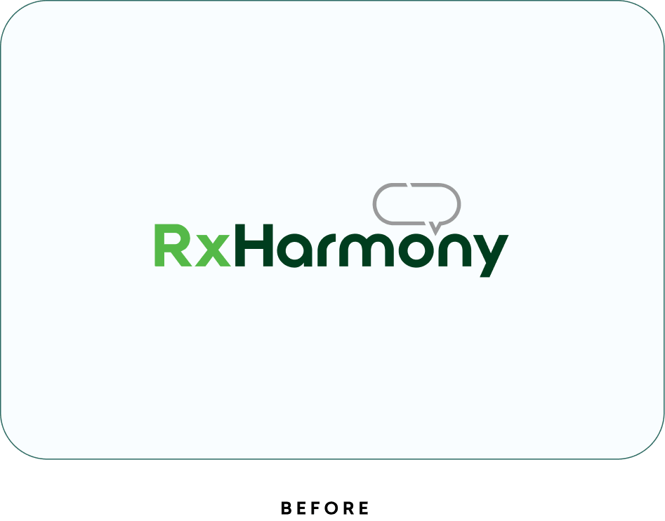
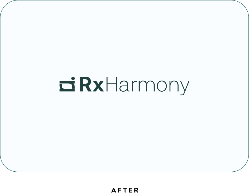
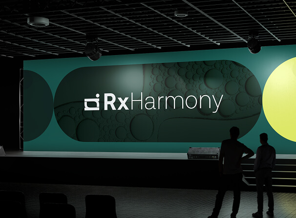
The identity evolution started with the mark itself. The existing logo carried recognizable equity, so rather than replace it entirely, we refined and elevated it. The updated logotype maintains familiarity while introducing subtle contrast through varied weights between “Rx” and “Harmony,” creating a more confident and contemporary feel.
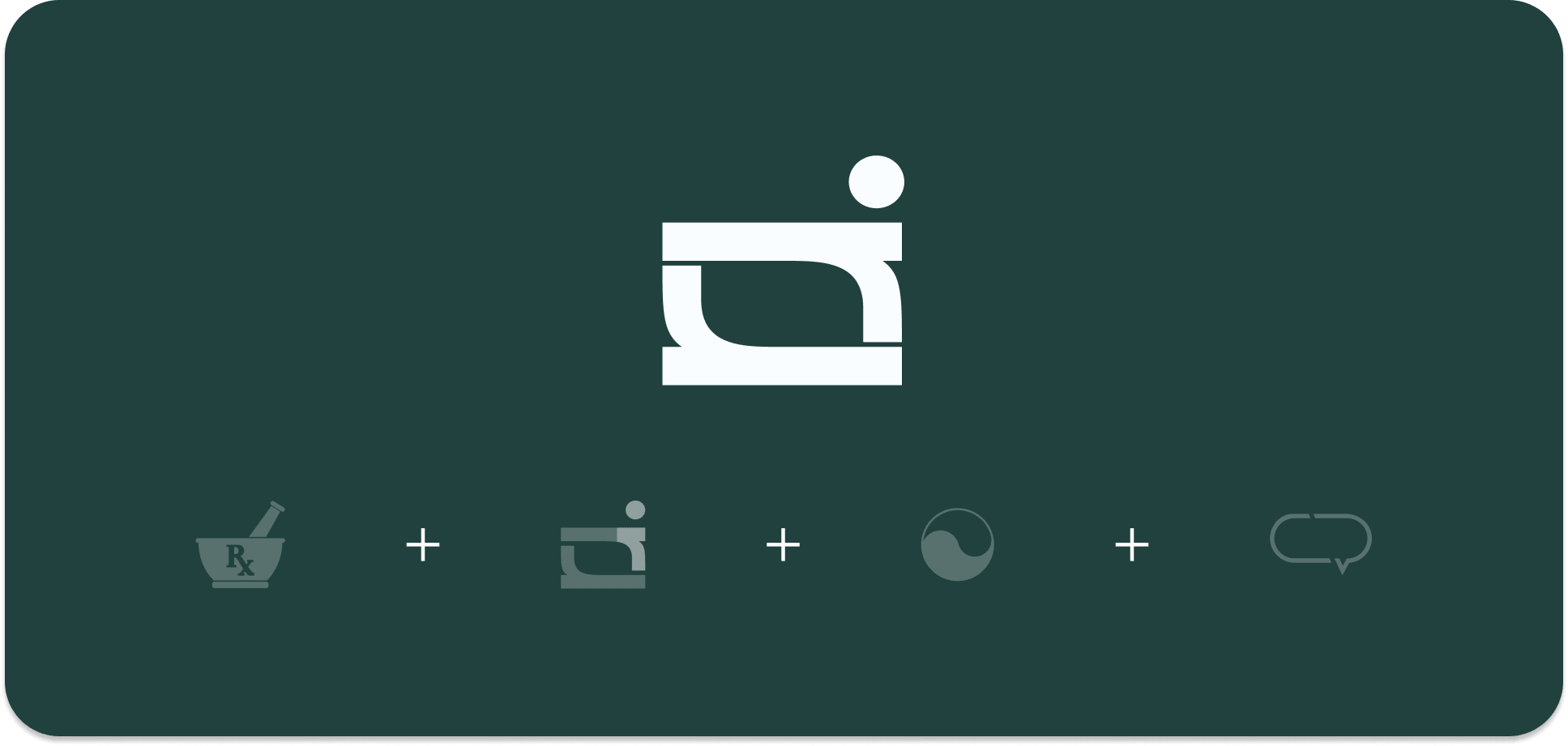
The new brand mark draws inspiration from a mortar and pestle, grounding the identity within the medical space while introducing a more symbolic layer. There’s also an abstract yin-yang relationship within the form, representing balance, clarity, and harmony, the very things RxHarmony helps provide to its clients. Even the negative space subtly references the chat bubble from the previous identity, giving the new mark continuity without feeling tethered to the past.
The result is a system that feels timeless, energized, and distinctly positioned for the future without chasing trends.
Simplifying the Complex
Simplifying the Complex
Simplifying the Complex
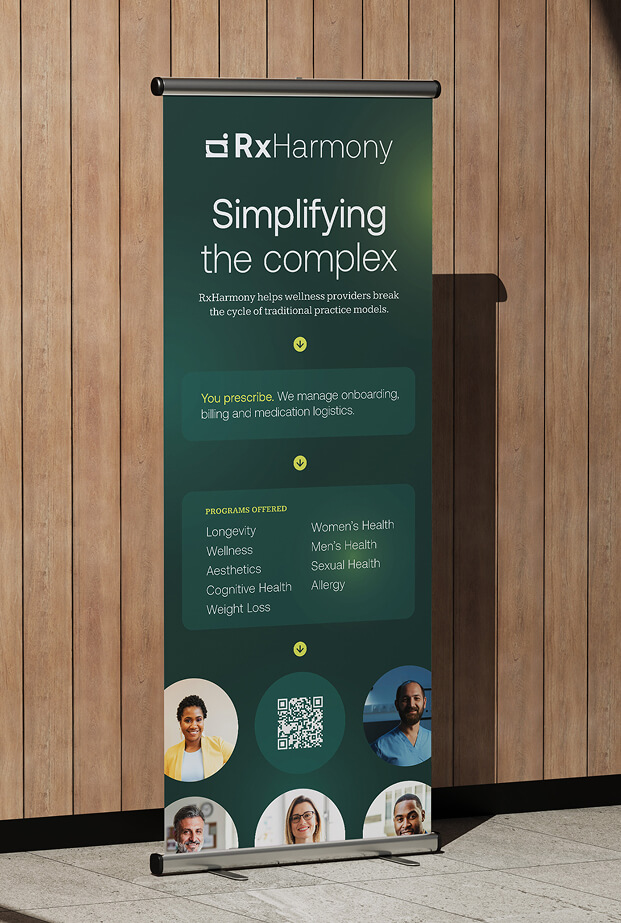
BRAND ELEMENTS
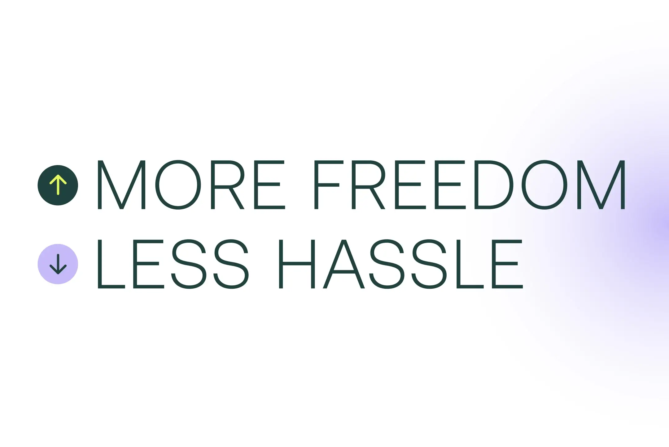
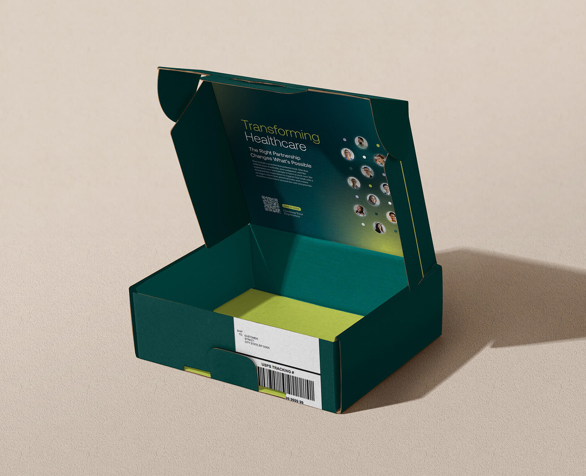
Supporting the identity is a visual language centered around movement, illumination, and momentum. Gradients represent clarity emerging from complexity, while directional arrow elements reinforce guidance and forward progress throughout the brand system.
The refreshed color palette retains the deep forest green from the previous identity to preserve familiarity and trust while introducing a vibrant electric green, internally called Pulse, to add energy and stronger digital visibility. Softer supporting tones in off-white and lavender help balance the system across digital and print applications.
Typography further reinforces this balance. Aeonik brings a modern and confident voice to headlines and large-scale messaging, while Kameron introduces warmth, trust, and readability throughout longer-form content. Together, the pairing helps the brand feel both forward-thinking and dependable.
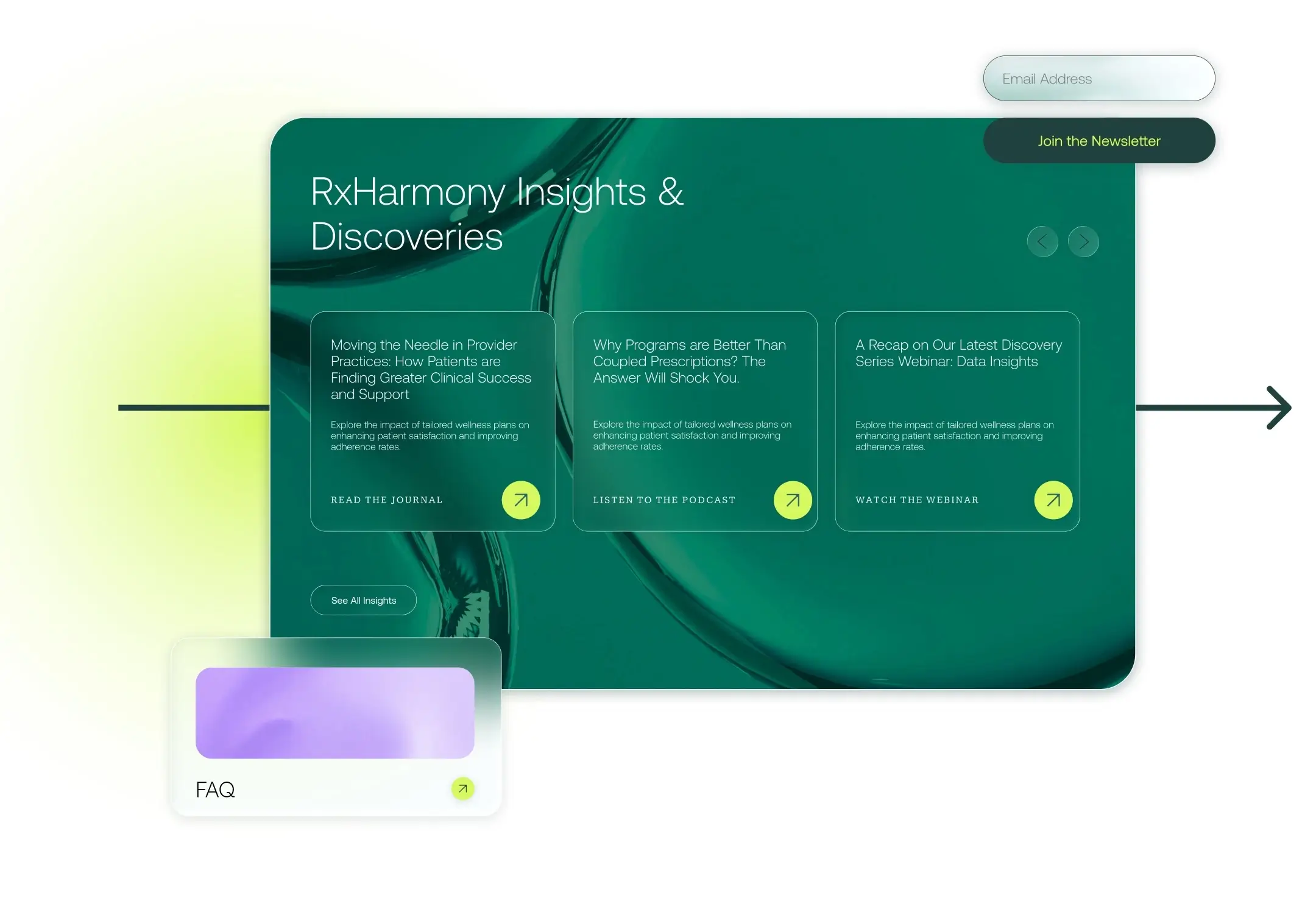
USER EXPERIENCE & WEB DESIGN
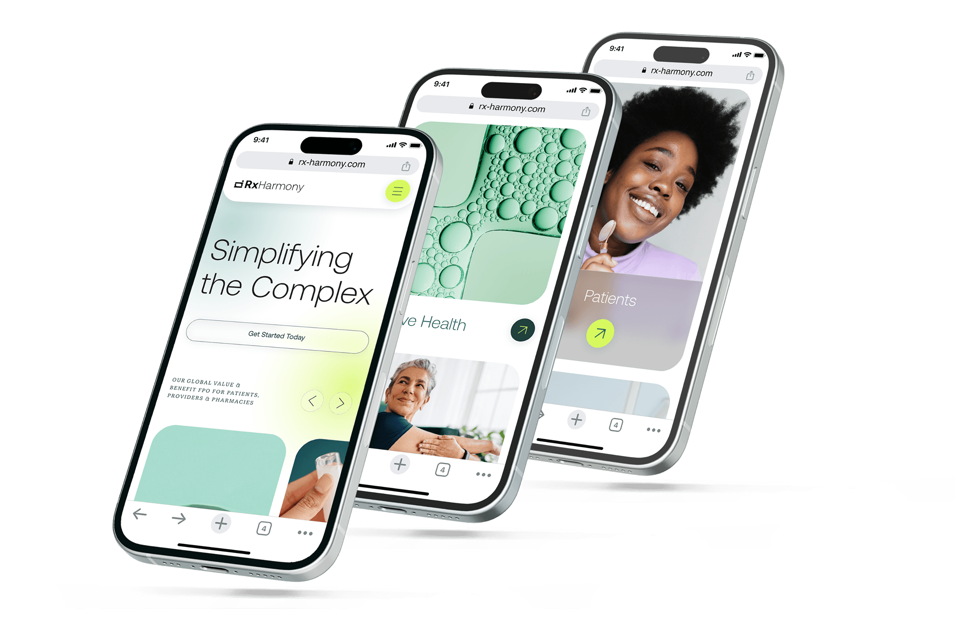
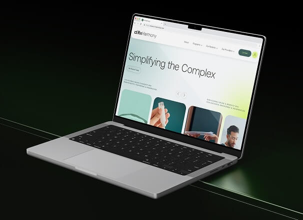
The RxHarmony website was designed to feel intuitive, structured, and highly approachable while still reflecting the brand’s confident and intelligent personality.
Built on a modular system, the site gives the RxHarmony team the flexibility to easily create, edit, and expand content as the business evolves. The goal wasn’t simply to create a visually compelling website, but to build a scalable digital foundation designed for long-term adaptability and growth.
The experience itself is intentionally streamlined and elegant in flow, responsive across all devices, and carefully structured to remove friction wherever possible.
Accessibility informed both the design and development process from the start. Typography, color contrast, semantic structure, and responsive behavior were all carefully considered to create a more inclusive and intuitive digital experience across every device.
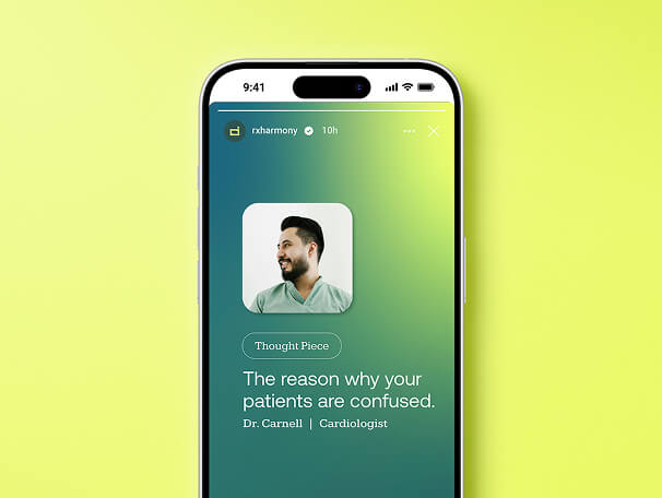
We also developed a robust blog platform capable of supporting multiple content types, improving SEO performance while positioning RxHarmony as a trusted educational resource within the healthcare space.
Audience segmentation was further reinforced through strategic color application, helping providers and patients intuitively navigate to the content most relevant to them.
The final result balances beauty with utility, a platform designed to perform as well as it presents.
RXHARMONY REIMAGINED
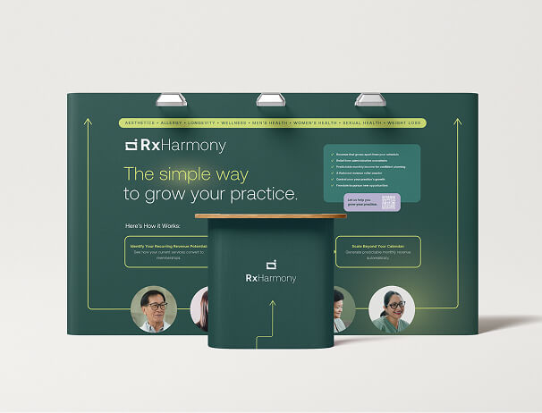
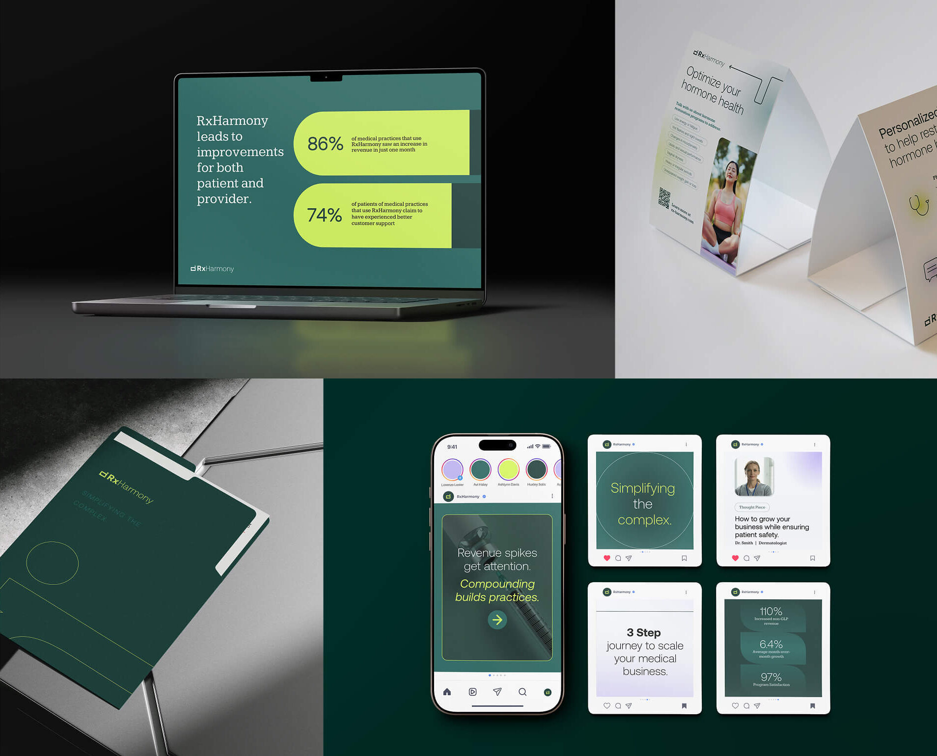
The refreshed brand gives RxHarmony a stronger sense of confidence, clarity, and personality while still feeling timeless. It positions the company less like a traditional service provider and more like a strategic partner helping healthcare practices navigate growth with structure and ease. That shift is reflected across every touchpoint, especially within the website experience itself, where the brand’s positioning and purpose are fully realized through thoughtful messaging, usability, and design.
At its core, the new RxHarmony experience is built around a simple promise: helping providers operate with greater freedom while creating better experiences for the patients they serve.


And after the brand is built?
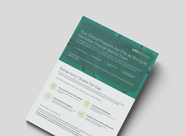
We support our client’s design & development efforts long after the brand project is rolled out. RxHarmony utilizes an Enterprise Design Plan to support their in-house team, explore applications of their new brand identity, and upscale their marketing systems.
Presentation Design