TerraClear


AI augmented farming solutions
Brand Discovery · Application Re-Design
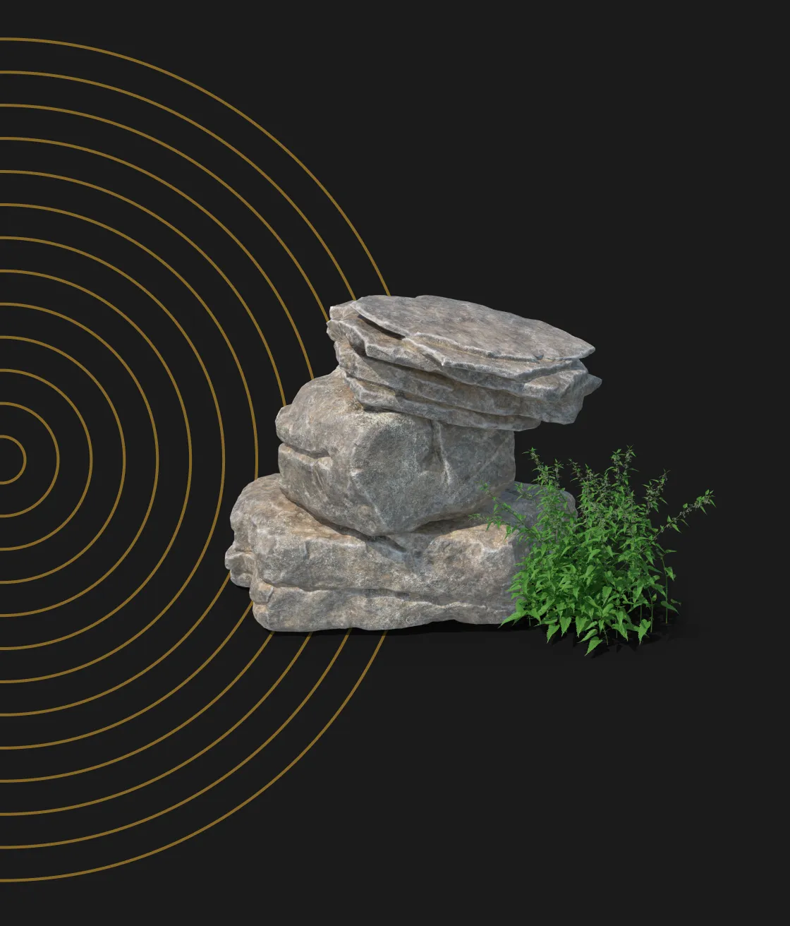
From Rocks to Crops
TerraClear is putting AI to work in the field. The agtech company uses robotics and machine vision to map farms in ultra high resolution, spotting everything from buried rocks to quarter inch weeds, then turns that imagery into prescriptions growers can act on almost immediately.
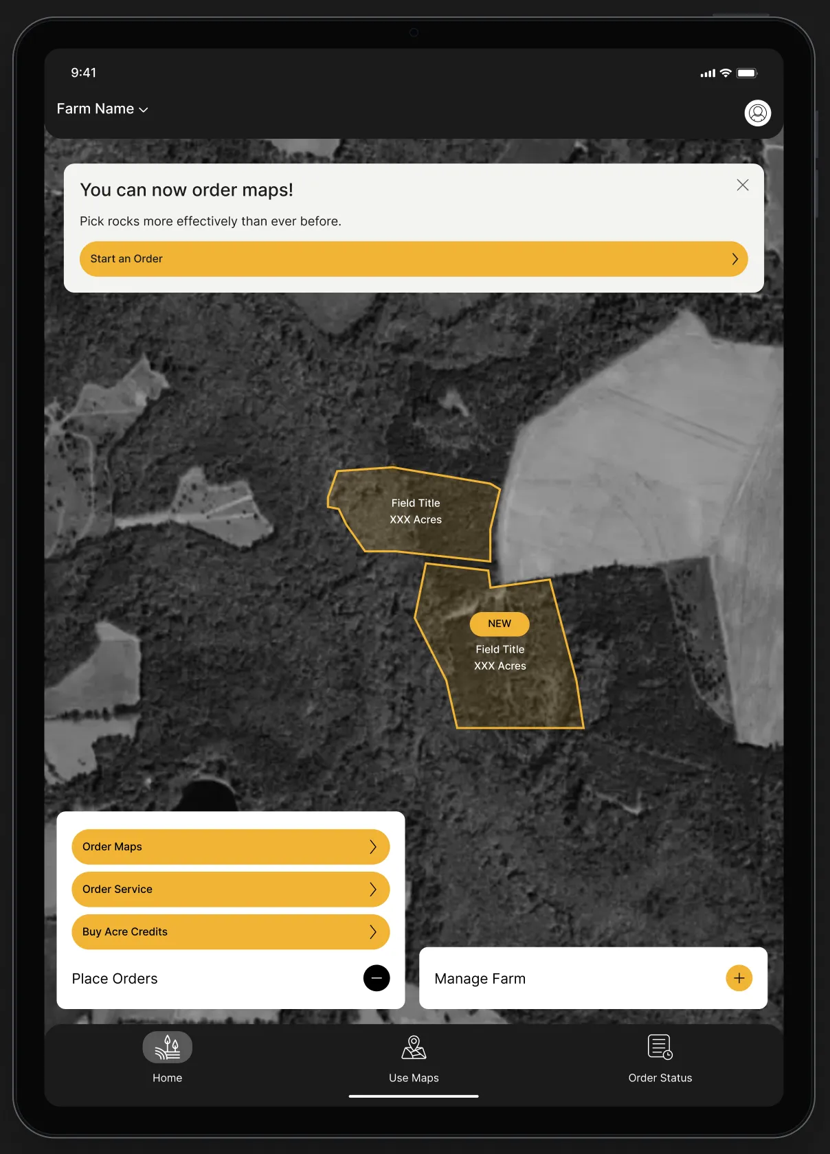
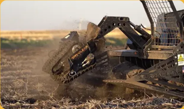
Fewer rocks. Faster picks.
AI powered rock maps show the size, density, and location of every rock, plus the fastest path to pull them.

Spot weeds early. Spray smarter.
Machine vision detects weeds as small as a quarter inch, identifies the species, and guides precise application.
Built Fully Responsive
TerraClear’s technology is powerful, and their app needed to keep pace. We started with UX research to understand how growers, operators, and the TerraClear team actually move through the platform, then wireframed every flow from farm setup to map ordering. Along the way, we cut extra steps, simplified decision points, and put the actions growers use most front and center, turning a complex toolset into a clear path from field data to action.
Each screen was built on a scalable component library, so the same system adapts cleanly across desktop, tablet, and mobile. Buttons, cards, maps, and navigation all follow one set of rules, which keeps the experience consistent for users and makes new features faster for TerraClear’s team to design and ship. The interface was designed to work as well in the office as it does in the cab of a truck.

Designed from the Field Up
A Meticulous Audit
We started by auditing TerraClear’s existing app flow by flow, flagging every point where a grower might stall: boundary drawing with no guidance, long forms before a farm was even created, and key actions hidden behind menus. With most users managing a single farm and just a couple of fields, the path forward was clear. We consolidated onboarding into a few focused screens, saved account details for checkout, and turned the home screen into a true landing experience with prompts and suggested next steps.
Strategic User Journeys
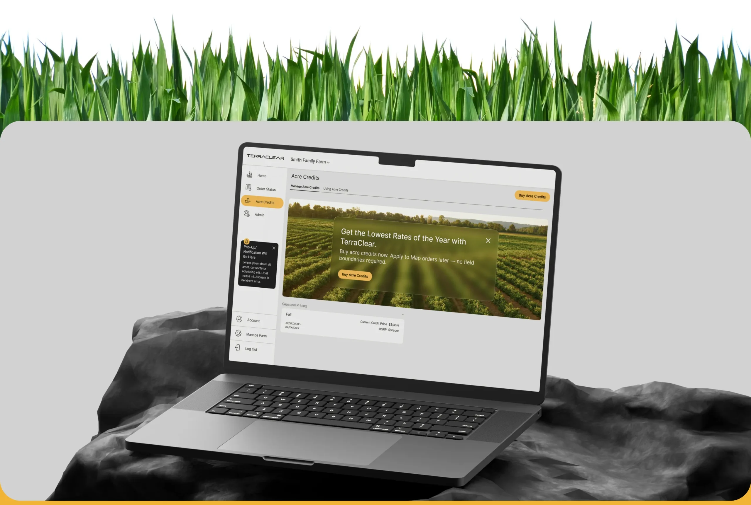
From there, we rebuilt the core journeys around how farms actually run. Guided steps for drawing boundaries, entry and exit points, and dump locations make sure nothing critical gets skipped. Ordering now feels as familiar as online shopping, with acre credits, seasonal pricing, and a simple checkout. Every flow was wireframed, reviewed with the TerraClear team, and carried across mobile, tablet, and desktop.
One System, 3 Screen Sizes
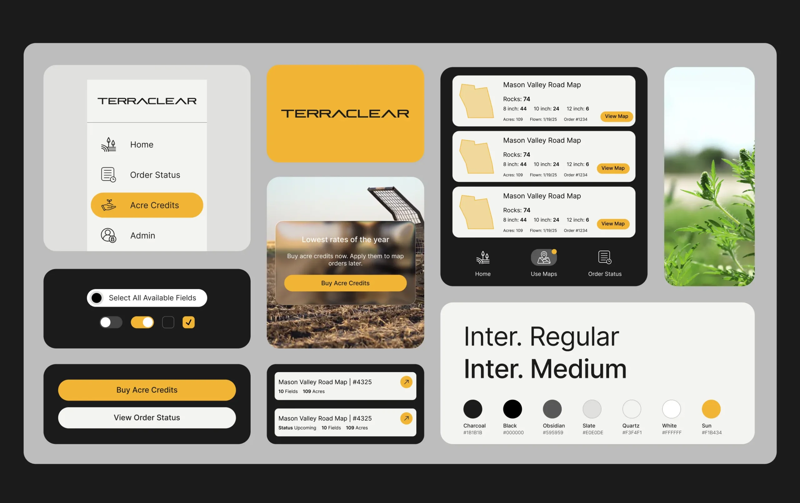
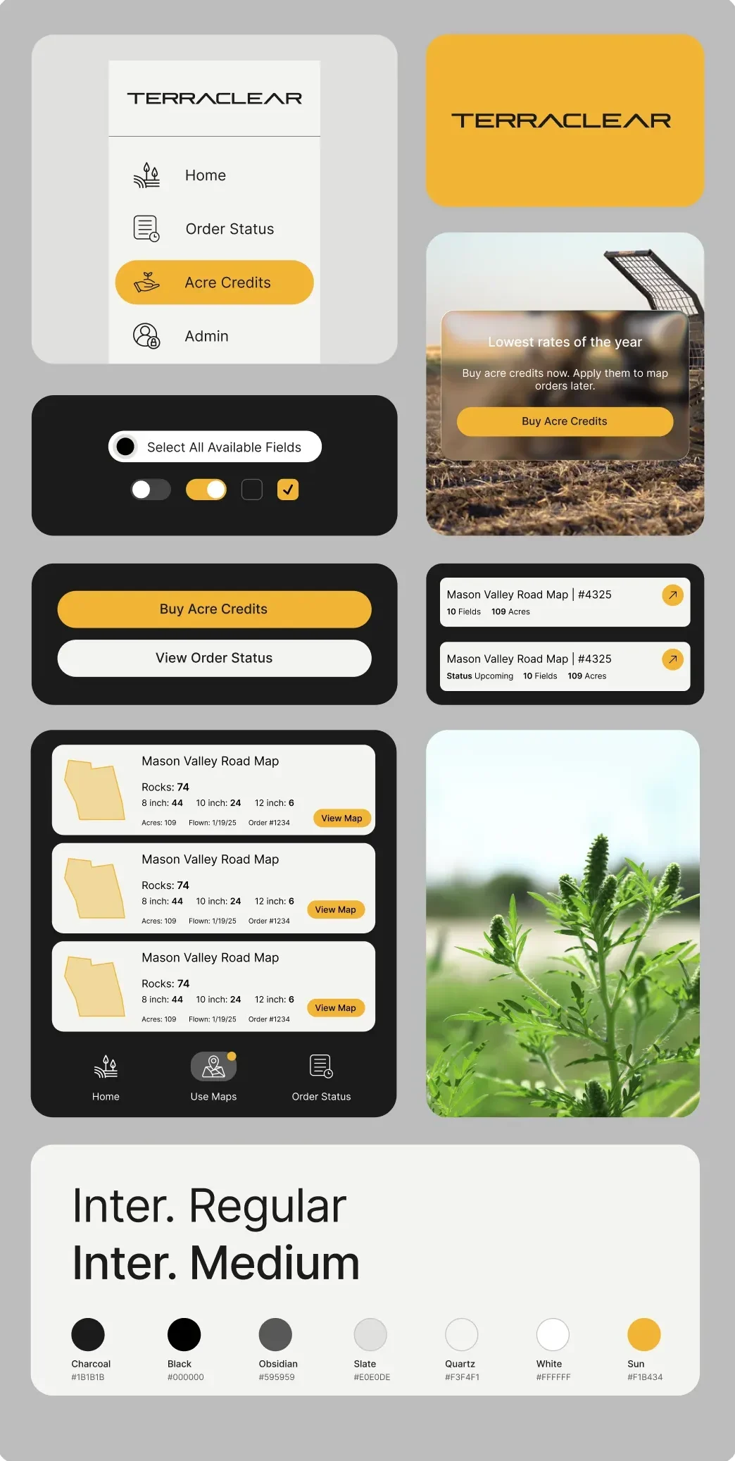
Design began with a component library built for scale. We designed 34 core component sets, from navigation, buttons, and form fields to order status cards, seasonal pricing drop-downs, field detail cards, and acre credit checkout selections. Each one is backed by a shared foundation of 25 text styles and a focused color palette, with documentation for both mobile and desktop so TerraClear’s team knows exactly how every piece behaves and where it belongs.
From there, the same building blocks scale across three screen sizes. On mobile, a bottom tab bar keeps all navigation within thumb’s reach for growers in the field. On tablet, layouts open up for map review and ordering. On desktop, a persistent side navigation and wider canvas give farm managers room to handle fields, orders, access, and billing at a glance. The components stay consistent while the layouts adapt, so users always recognize where they are and TerraClear’s team can design and ship new features faster on every device.


Ready for What’s Next
With streamlined flows, a scalable component library, and a consistent experience across mobile, tablet, and desktop, growers can go from field data to action faster than ever. And as TerraClear expands into new tools, the system we built is ready to grow right alongside them.

We recently partnered with the Visual Soldiers team on a complete web and mobile app redesign for our agri-tech platform, with the main goal of making it far more intuitive and usable for farmers. From start to finish, working with their team was an absolute pleasure—clear communication, genuine collaboration, and a process that kept everything on track without ever feeling rushed. They listened to our users’ needs and translated that insight into a clean, modern design that has made a huge difference. Highly recommend the Visual Soldiers team!
Technical Product Manager at TerraClear Inc
View Similar Case Studies
Results update automatically as you select filters.