Aerwell Brand & Website Design Experience
Aerwell Brand & Website Experience
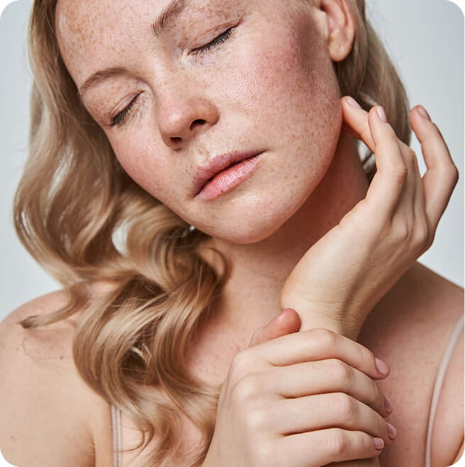
Aerwell is a longevity healthcare company
built for the modern pursuit of a longer, better life.
A Name That Breathes
The name Aerwell was developed as a core part of the brand strategy, designed to carry meaning from the outset. Drawing from “aer,” the classical root for air, breath, and atmosphere, and “well,” denoting both wellness and a deep reservoir, the name speaks to the essential nature of what Aerwell provides: the vital foundation beneath every element of a life well lived.
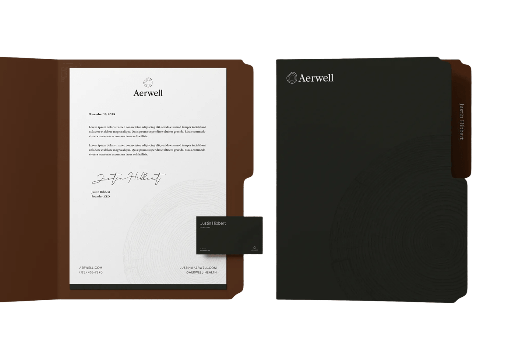
Three-fold Logo Symbolism
Tree Rings
A nod to longevity and the passage of time, the rings are a symbol of resilience, growth, and the added years of vitality that Aerwell helps unlock.
Human Cells
The concentric forms echo the shape of human cells, grounding the brand in science and healthcare. They reflect Aerwell’s focus on supporting the body from the inside out.
Water Ripples
The organic forms radiating outward speak to the natural harmony of the body, and the compounding impact of small, intentional changes.
Building a Strategic Foundation
We partnered with Aerwell to define a foundational brand strategy that could support both clinical credibility and elevated lifestyle positioning. Through a structured discovery process, we articulated a clear mission, vision, and set of values that define Aerwell and set it apart from traditional healthcare and wellness brands. This strategic framework extended into a refined brand voice: intelligent, composed, and deeply human. This essential work informed every visual and messaging decision, ensuring the brand shows up with clarity, consistency, and authority.
live well, longer
live well, longer
live well, longer
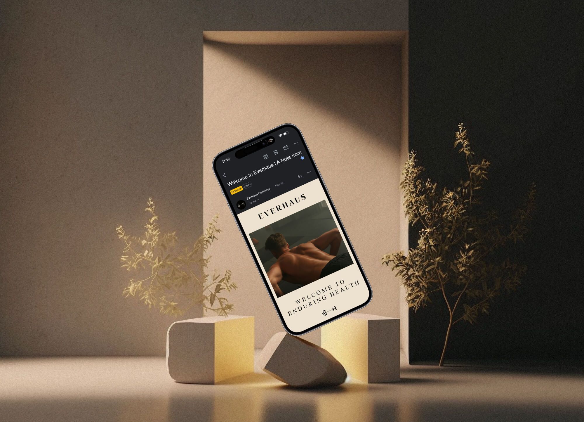
A Digital Presence as Considered as the Care It Represents
The Aerwell website was designed to do exactly what the brand promises: make complexity feel clear. We engineered a digital experience that translates the rigor of comprehensive health diagnostics into an approachable, confident, and visually elevated interface. Every layout decision, typographic choice, and interaction was made to position Aerwell as the definitive authority in personalized healthcare strategy, while welcoming, not intimidating, the people it serves.
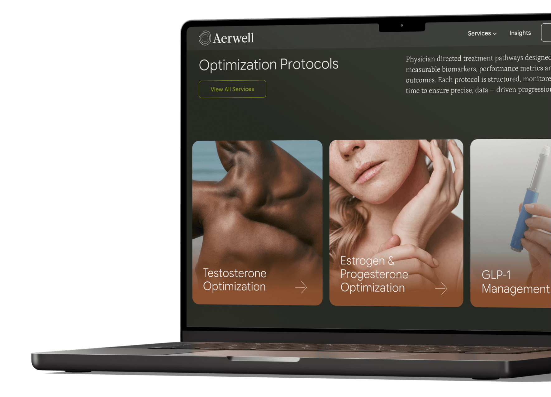
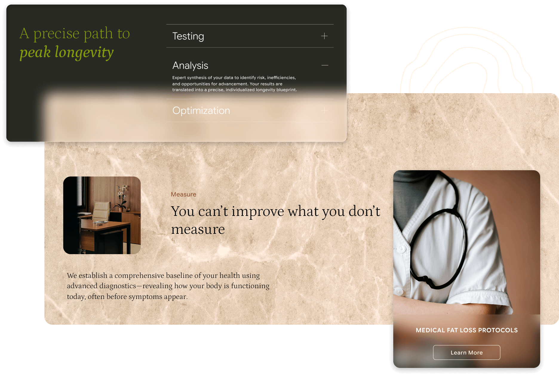
A modular wordpress system
Behind the scenes, we built a modular WordPress system designed for flexibility and speed. Using a library of reusable components, Aerwell’s team can create new pages, update content, and expand the site without starting from scratch each time. The structure keeps everything consistent while giving them the freedom to move quickly as the brand evolves.
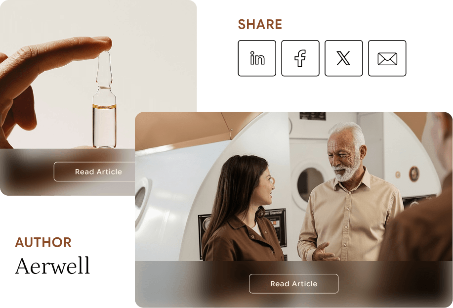
A Foundation for Thought Leadership
We designed the blog as a foundation for ongoing growth, giving Aerwell a space to consistently share insights and build authority. Articles are organized through filterable categories, making it easy to navigate a growing library of content. It supports both discovery and depth, helping Aerwell show up in search while reinforcing its position as a leader in precision healthcare.