
How to Create Accessible Color Palettes
Creating an accessible color palette ensures your designs are usable for everyone, including people with visual impairments or color blindness. Around 8% of men and 0.5% of women experience color vision deficiencies, and 70% of websites fail basic color contrast checks. By following WCAG 2.0/2.1 Level AA standards, you can improve readability, comply with laws like the ADA and Section 508, and avoid legal risks.
Here’s what you need to know:
- Contrast Ratios: Text and background colors must meet specific contrast ratios (4.5:1 for normal text, 3:1 for large text).
- Non-Color Cues: Don’t rely solely on color to convey information – use icons, patterns, or labels as backups.
- Testing: Simulate color blindness, test in grayscale, and validate designs in different lighting and devices.
- Tools: Use contrast checkers (e.g., Adobe Color, ColorCheck) and palette generators to create and test compliant color schemes.
Accessible designs benefit everyone by improving usability in various conditions, like bright light or low vision scenarios. Start by defining brand and functional colors, testing combinations, and documenting approved pairings for developers.
Key takeaway: Accessibility isn’t just about compliance – it’s about making your designs work for all users.
Keep reading for step-by-step guidance, practical tips, and tools to help you build color palettes that meet accessibility standards.
How to Quickly Design Beautiful, Accessible, Digital Color Palettes
Accessibility Standards for Color Design
Accessible color design goes beyond aesthetics – it’s about adhering to specific, measurable rules that ensure inclusivity. By understanding visual impairments, contrast benchmarks, and non-color cues, you can create designs that work for everyone.
Visual Impairments and How They Affect Color Perception
Around 8% of men and 0.5% of women have some form of color vision deficiency (CVD). Globally, that’s roughly 350 million people. The most common types, protanopia and deuteranopia, account for over 99% of cases and make red and green appear as muted, similar tones. This is why relying solely on color for status indicators often leads to accessibility issues in user interfaces.
But CVD isn’t the only challenge. The World Health Organization estimates that 2.2 billion people worldwide live with some form of vision impairment. For many, luminance – the contrast between light and dark – matters more than color. Even colors that look distinct to those with full vision can appear identical to someone with achromatopsia (complete color blindness) if they share the same lightness value.
To ensure accessibility, test your designs in grayscale. If critical elements like status indicators or chart segments lose meaning without color, your palette needs adjustment.
This understanding of visual impairments lays the groundwork for meeting the technical contrast standards outlined by WCAG.
WCAG Contrast Ratio Requirements
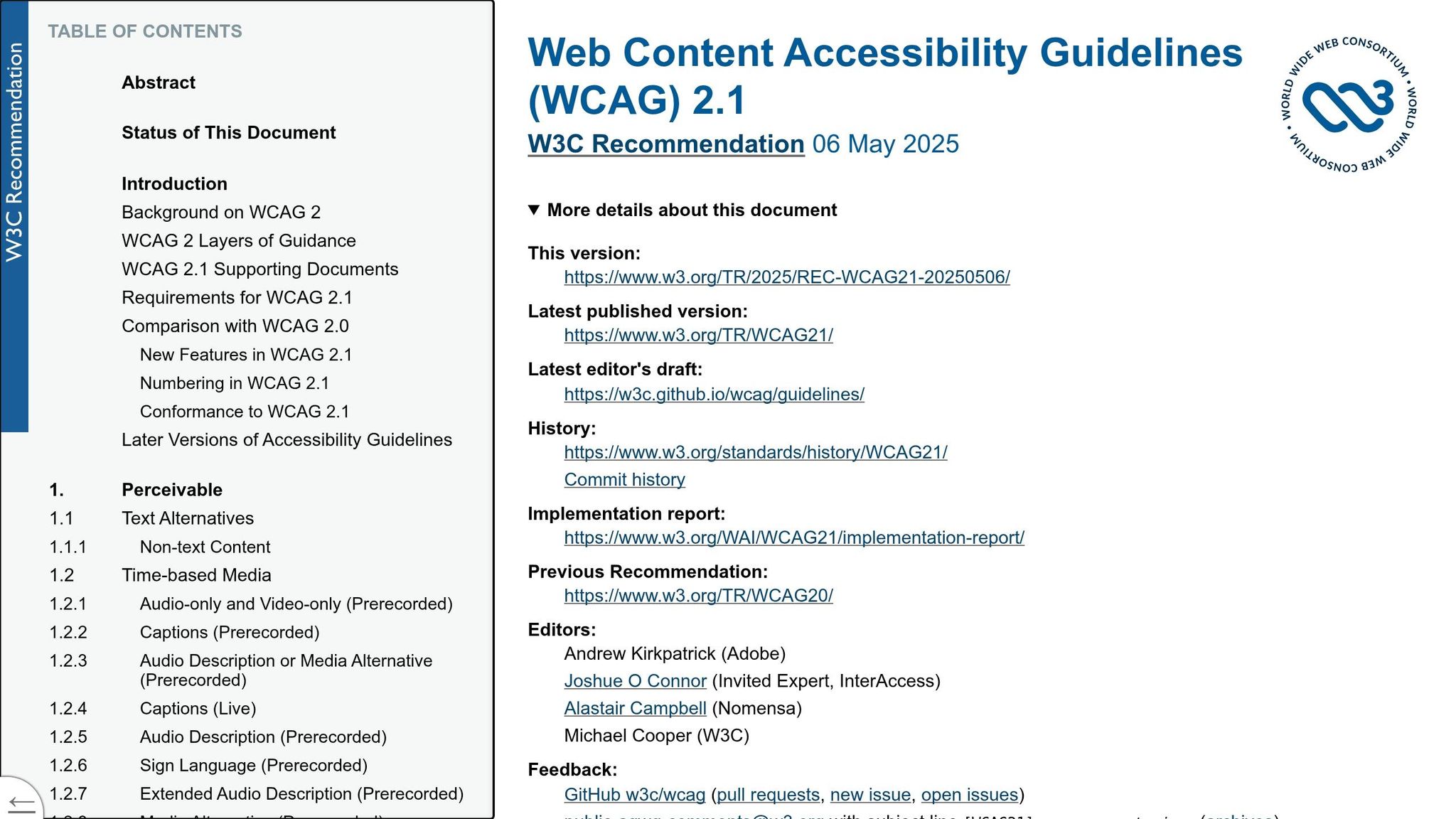
The Web Content Accessibility Guidelines (WCAG) set specific contrast ratio standards to ensure clarity for users in varied viewing conditions. Contrast ratios range from 1:1 (e.g., white on white) to 21:1 (e.g., black on white).
Here’s how WCAG breaks down the requirements:
| Content Type | Level AA (Minimum) | Level AAA (Enhanced) |
|---|---|---|
| Normal Text (<18pt or <14pt bold) | 4.5:1 | 7:1 |
| Large Text (≥18pt or ≥14pt bold) | 3:1 | 4.5:1 |
| UI Components & Graphics | 3:1 | Not defined |
| Incidental / Logos | No requirement | No requirement |
WCAG defines “large text” as at least 18pt (around 24px) for regular weight or 14pt bold (around 18.7px). Larger text is easier to read, so it has slightly lower contrast requirements.
A critical detail to remember: don’t round up contrast ratios. For example, a ratio of 4.49:1 does not meet the 4.5:1 requirement for Level AA. Additionally, contrast must be maintained across all interaction states – hover, focus, and active – not just the default appearance.
“Contrast is a measure of the difference in perceived ‘luminance’ or brightness between two colors.” – WebAIM
In the U.S., Level AA compliance is legally required for most organizations under the ADA and Section 508. Level AAA, while optional, is often pursued for products prioritizing accessibility or for long-form reading experiences.
Using Visual Cues Beyond Color
Meeting contrast ratios is just one part of accessible design. To ensure your message gets across even when color perception is compromised, WCAG Success Criterion 1.4.1 emphasizes:
“Color is not used as the only visual means of conveying information, indicating an action, prompting a response, or distinguishing a visual element.” – W3C
This means every color-coded element should have a non-color backup. For example:
- Pair color signals with icons or labels.
- Underline links instead of relying solely on color.
- Use patterns like stripes or dots in data visualizations to differentiate chart segments alongside color.
“Redundant signals aren’t clutter; they’re clarity.” – EnChroma
For hyperlinks, if color is the only differentiator, it must meet a 3:1 contrast ratio against surrounding text in addition to the background contrast requirements. However, the simplest solution is to underline links in body text, ensuring they’re always identifiable.

Step-by-Step: How to Build an Accessible Color Palette
Understanding accessibility standards is one thing – creating a color palette that actually works in practice is another. The difference between success and failure often lies in the structure. As Dennis Traina, Founder of 137Foundry, explains:
“Color systems age better than color palettes. If you find yourself adding new hex values to fix a contrast problem rather than adjusting a token, that is a signal the system architecture needs attention, not the color.”
Let’s break down the process into clear steps to ensure your palette meets accessibility requirements.
Defining Brand Colors and Functional Colors
Start by separating your colors based on their purpose. Brand colors – like primary, secondary, and accent hues – express your identity. Functional colors, on the other hand, serve specific roles: they indicate success, warnings, errors, or ensure text readability. The biggest accessibility issues often arise when these categories are mixed without clear guidelines.
Define the roles of functional colors before picking hues. A semantic naming system can help. For instance, instead of labeling a color --blue-500, use a name like --color-action-primary or --color-feedback-error. This way, even if a brand color changes, your system remains intact. Here’s a simple breakdown of functional categories:
| Semantic Token | Role | Example Usage |
|---|---|---|
color-action-primary |
Main interactive elements | Primary buttons, active links |
color-feedback-success |
Positive confirmation | "Message sent" notifications |
color-feedback-warning |
Cautions or alerts | "Session about to expire" banners |
color-feedback-error |
Critical failures | Invalid form fields, failed actions |
Additionally, create a neutral scale with 10–12 shades ranging from near-white to near-black. This neutral palette will become the foundation for text, backgrounds, borders, and both light and dark themes.
Testing and Adjusting Contrast Ratios
Every brand color should be tested against pure black (#000000) and pure white (#FFFFFF). If a color fails to provide adequate contrast with both, it should be classified as decorative and replaced with an accessible alternative for essential UI elements. Be precise – contrast ratios like 4.47:1 do not meet the 4.5:1 AA standard.
When adjustments are needed, modify the lightness in the OKLCH color space instead of using HSL. OKLCH is more perceptually uniform, which helps maintain the color’s vibrancy and hue. A small tweak – around 10–15% in lightness or saturation – is often enough to meet the AA threshold without compromising the brand identity.
“The cheapest time to fix a contrast problem is before you ship the design.” – ColorPaletteGenerator.ai
Once the colors meet the required contrast levels, map out all possible combinations in a structured matrix.
Building a Color Combination Matrix
After fine-tuning each color, organize the approved pairings into a contrast matrix. This grid lists text colors as rows and background colors as columns, with each cell showing the contrast ratio and whether it passes or fails. It’s a practical tool your team can rely on instead of abstract WCAG numbers.
Label each cell as Pass AAA, Pass AA, AA Large (for text at 18pt/24px or larger, or 14pt bold), or Fail. Test these combinations on real surfaces like card backgrounds, overlays, and alert banners – not just white and black. Here’s an example of what the matrix might look like:
| Background | Dark Gray #333333 |
Brand Blue #000055 |
White #FFFFFF |
|---|---|---|---|
White #FFFFFF |
12.6:1 - Pass AAA | 8.4:1 - Pass AAA | 1:1 - Fail |
Light Gray #F5F5F5 |
10.2:1 - Pass AAA | 7.1:1 - Pass AAA | 1.2:1 - Fail |
Brand Blue #000055 |
1.6:1 - Fail | 1:1 - Fail | 8.4:1 - Pass AAA |
Alert Red #DD0000 |
3.8:1 - AA Large | 2.1:1 - Fail | 4.2:1 - AA Large |
Document the approved pairings clearly so developers know exactly which combinations are safe to use.
“A design system with accessible color tokens is only useful if designers and developers know which pairings are safe.” – Derek Giordano, Designer & Developer
Next, let’s look at tools that can help you build and test these palettes effectively.

Tools for Building and Testing Accessible Color Palettes
To ensure your designs are visually inclusive, it’s essential to use reliable tools that help build and test accessible color palettes. Here’s a breakdown of tools and methods to refine your process.
Contrast Checkers and Accessibility Validators
Adobe Color is a go-to for checking contrast and simulating color blindness, making it easier to spot visibility issues early on. Its “Conflict Guides” feature visually flags color combinations that might appear indistinguishable to users with color vision deficiencies.
“Understanding how users may perceive your color choices early will save you from having to go back to the coloring board to find new shades when you discover your designs aren’t working for everyone.” – Adobe Color
ColorCheck takes accessibility a step further by simulating eight types of color blindness and using AI to suggest fixes that align with your brand’s identity. Interestingly, research shows that only 60% of designers can reliably judge WCAG AA contrast levels, underscoring the value of automated tools.
These contrast checkers provide a solid framework for evaluating your palette before moving into the design phase.
Palette Generators and Builders
Palette Checker is a versatile tool that pulls colors from images, creates harmonious schemes, and tests combinations against WCAG 2.1 AA and AAA standards. It also supports seamless exports to platforms like Figma, Tailwind CSS, and JSON, simplifying collaboration between designers and developers.
Accessible Palette leverages the CIELAB and LCh color models, which are more perceptually accurate than HSL. This approach helps designers avoid pitfalls like inconsistent perceived brightness across colors that might look fine in code but fail visually. As Fedorenko explains:
“HSL… has an inherent fault – Lightness and Saturation don’t reflect human perception.”
For example, a blue and green with the same HSL lightness value can appear drastically different in brightness, potentially causing contrast issues.
These tools streamline the transition from design to development while ensuring your palette meets accessibility guidelines.
Adding Accessibility Checks to Your Design Workflow
The key to accessible design is addressing contrast issues at every stage, not just at the end. During the design phase, plugins for tools like Figma and Sketch can integrate accessible color styles directly into your files. In the development phase, tools like axe DevTools and WAVE can run automated scans to identify potential failures before they reach production.
When handing off designs to developers, export your palette as CSS variables or design tokens (in W3C DTCG format). This ensures the colors validated in your contrast matrix are implemented consistently. Be cautious with colors that barely meet WCAG AA standards (e.g., passing by only 0.5), as they might still cause legibility issues on certain screens or under bright lighting conditions.
| Tool | Primary Strength | Best For |
|---|---|---|
| Adobe Color | CVD simulation + conflict guides | Spotting issues during palette creation |
| ColorCheck | AI fixes + 8-type CVD simulation | Auditing and quick remediation |
| Accessible Palette | CIELAB/LCh color modeling | Creating perceptually accurate systems |
| Palette Checker | Multi-format export (Figma, Tailwind, JSON) | Design-to-development handoff |
| axe DevTools / WAVE | Automated scanning | Identifying live development issues |




Testing Color Palettes in Practice
Now that you’ve developed and verified your accessible color palette, it’s time to see how it performs in practical applications.
Applying Palettes to Mockups and Prototypes
Start by applying your palette to mockups that include key UI elements like navigation menus, buttons, forms, error states, and body text. This step helps pinpoint contrast issues early. Pay special attention to text over images, as this can often lead to readability problems. Adding a semi-transparent or solid overlay behind the text can ensure it remains legible.
To ensure your designs meet accessibility standards, run WCAG contrast tests on all color combinations in your mockups. Tools like Stark or Contrast, available as Figma plugins, can flag low-contrast pairings directly within your design files. This proactive approach helps catch issues during the design phase rather than during QA.
Simulating Color Blindness and Low Vision
Color vision deficiency (CVD) impacts over 300 million people worldwide, with red-green color blindness making up 99% of cases. Simulating how your design appears to these users is a critical part of accessibility testing.
Using Chrome DevTools‘ Rendering tab, you can emulate various types of color blindness, including Protanopia, Deuteranopia, Tritanopia, and Achromatopsia. This tool allows you to simulate these conditions on live pages without needing additional software. Testing different severity levels can help you understand how your design holds up for users with partial or total color vision deficiencies.
“A design can pass CVD simulation but fail contrast requirements or vice versa. Testing both ensures comprehensive color accessibility.” – DeficiencyView Team
To further enhance accessibility, avoid relying solely on color to convey meaning. For instance, an error state shouldn’t depend only on red. Pair it with an icon or adjust the lightness contrast so it remains clear even in grayscale.
Once you’ve completed these simulations, expand your testing to include various devices and lighting environments.
Testing Across Devices and Lighting Conditions
The way colors appear can vary greatly depending on the screen technology and environmental factors. For example, OLED displays can cause halation, where pure white text on a pure black background produces a glowing effect. Switching to an off-white like #F0EEE8 on a dark gray such as #1C1C1E can solve this issue without compromising contrast. On the other hand, low-end monitors with poor calibration may distort hues and luminance, which can disrupt your carefully crafted palette.
Environmental conditions also play a crucial role. Test your UI under both maximum and minimum screen brightness to replicate scenarios like bright sunlight or dimly lit rooms. A color combination that just meets the 4.5:1 WCAG AA contrast ratio might fail in high-glare conditions. To account for this, aim for a 6:1 contrast ratio for body text, especially in dark mode. Physical testing on real iOS and Android devices is also highly recommended, as simulators may not fully replicate how certain CSS properties render on actual hardware.
| Condition | Risk | Recommended Fix |
|---|---|---|
| Bright sunlight | Washes out low-contrast elements | Push contrast ratios above the 4.5:1 minimum |
| Low ambient light | Reduces rendered contrast | Target 6:1 for body text in dark mode |
| OLED displays | Halation with pure black/white | Use off-whites and dark grays instead |
| Low-end monitors | Hue and luminance distortion | Test on multiple devices; avoid relying on hue alone |
Conclusion: Key Steps for Designing Accessible Color Palettes
Designing accessible color palettes isn’t just a one-time task; it’s an ongoing commitment. With countless websites failing basic contrast checks and millions of individuals living with color vision deficiencies, prioritizing accessible color design ensures that more people can interact with your product comfortably – regardless of their visual abilities or the devices they use.
To break it down, the key steps include: defining functional color roles, creating a solid neutral scale, ensuring text and background combinations meet WCAG AA standards (4.5:1 for normal text and 3:1 for larger text), and adding supplementary cues like icons or labels to reinforce meaning. Tools like a contrast matrix can help your team identify safe color pairings, while using semantic tokens – labeled based on their purpose rather than their appearance – can make future updates more manageable.
As accessibility standards continue to evolve, incorporating automated tools into your workflow becomes essential. With upcoming changes like APCA in WCAG 3.0, tools such as Axe or Lighthouse CI can automate contrast checks. Pair these with regular audits led by accessibility experts to avoid slipping into non-compliance.
Accessible color design doesn’t limit creativity – it enhances it. By ensuring inclusivity, you create designs that truly work for everyone. At Visual Soldiers, this principle is at the heart of our process, proving that great design is accessible design.
FAQs
Maintaining your brand’s colors while ensuring accessibility is achievable by rethinking how those colors are used. Start by auditing your color combinations to spot any contrast issues. From there, create accessible alternatives by adjusting the lightness or saturation of your colors. To keep things organized, use semantic tokens to assign specific roles to your colors – for instance, reserving original shades for decorative elements and applying adjusted versions to text or key UI components. This approach helps you meet accessibility standards while staying true to your brand’s identity.
When signaling errors or statuses, don’t depend solely on color – this approach can leave out users who have difficulty distinguishing colors. Instead, pair colors with descriptive text (like status labels or error messages) and visual symbols such as checkmarks or X icons. For data visualizations, consider adding patterns or textures to make information more distinguishable. Additionally, use programmatic cues like aria-live or role=alert to ensure assistive technologies can notify users of status updates effectively.
Testing your color palette in actual environments is key to ensuring it performs well in practical scenarios. While design simulators can be helpful during the creative process, they only provide an approximation. To get an accurate sense of how your design will look, review your staging or production site on a variety of devices and screens. Pay attention to factors like screen brightness, display types, and ambient lighting conditions.
Make sure to specifically check critical UI elements, such as interactive buttons and error messages, to confirm they remain accessible and consistent no matter the environment. This step helps ensure your design works seamlessly for all users.

Visual Soldiers
Visual Soldiers is an Atlanta-based creative studio specializing in branding, design & digital experiences.