
How Color Theory Shapes User Experience Design
Quick Summary
Color plays a crucial role in user interaction with digital products, significantly influencing first impressions and user behavior. Research indicates that a substantial portion of first impressions, ranging from 62% to 90%, is based on color. Effective use of color, particularly in elements like call-to-action (CTA) buttons, can enhance conversion rates by up to 35%. However, inappropriate color choices can deter users, particularly those with visual impairments or color blindness. Understanding the emotional impact of colors is essential in UX design, as different colors can evoke specific emotions and behaviors in users. Therefore, selecting the right colors is not just about aesthetics; it's about creating an inclusive and effective user experience that accommodates all users.
Color is more than decoration – it directly affects how users interact with digital products. Research shows that 62%-90% of first impressions are based on color, and a well-chosen color for a call-to-action (CTA) button can boost conversions by up to 35%. But poor color choices can alienate users, especially those with visual impairments or color blindness.
Here’s what you need to know about leveraging color in UX design:
- Emotional Impact: Colors trigger specific emotions and behaviors. For example, red creates urgency, blue builds trust, and green signals success.
- Cultural Differences: Color meanings vary globally. White may symbolize purity in the U.S., but it represents mourning in East Asia.
- Accessibility: Contrast is key – designs with poor contrast alienate users. Following WCAG guidelines ensures usability for everyone.
- Practical Tips: Use the 60-30-10 rule to structure color palettes and test designs in grayscale to verify hierarchy and clarity.
Bottom line: Thoughtful color choices improve usability, guide user behavior, and enhance brand recognition by up to 80%.
Super Practical Guide to Color Theory, Color Models and Perfect Color Palettes | UI Design

How Colors Affect User Behavior
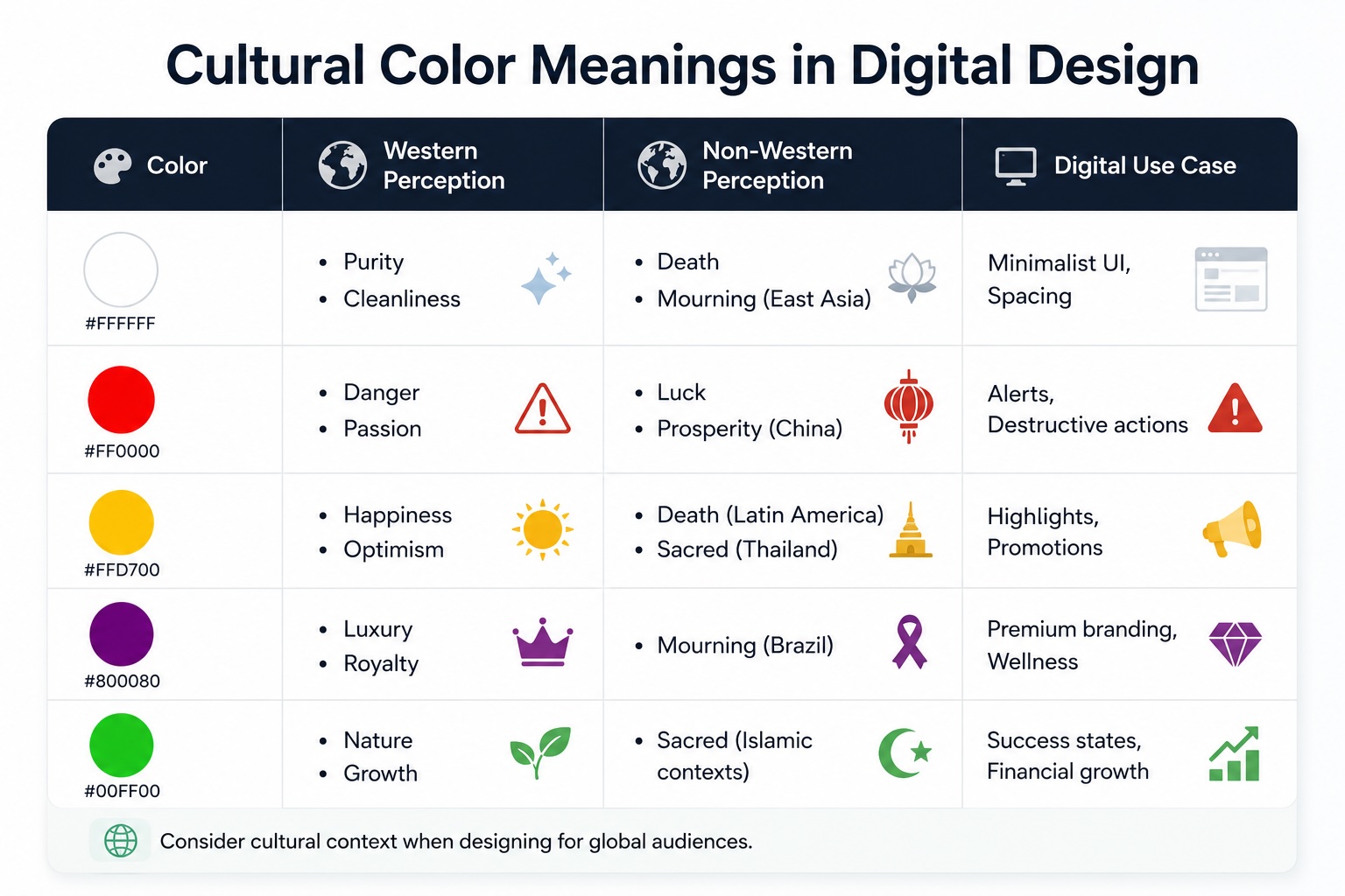
Cultural Color Meanings in UX Design: Western vs Non-Western Perceptions
Color doesn’t just catch your eye – it sparks a reaction in your brain. Within milliseconds, colors interact with the limbic system, the part of your brain that handles emotions and memory. For example, warm colors like red and orange can increase your heart rate and energy levels, while cool tones like blue and green help you relax by engaging your parasympathetic nervous system. These quick reactions explain why certain colors lead to specific emotional responses and behaviors.
The impact of color on behavior is more than just a theory – it’s measurable. A/B tests show that red call-to-action buttons outperform green ones by 21%. Similarly, orange buttons have been found to boost conversions by 32.5% compared to green. Even red error messages are processed faster – 40 milliseconds quicker than blue or gray text. This makes red particularly effective for alerts and high-priority actions.
Emotional Responses to Color
Different colors trigger unique psychological reactions, which designers can use strategically. For instance, blue is often linked to trust, competence, and reliability. That’s why it’s a favorite for financial services and healthcare platforms. Plus, blue-vision deficiency is rare, making it highly accessible.
Red, however, taps into “threat-avoidance” instincts. It’s great for creating urgency, like in impulse-buy scenarios, but it can also increase feelings of risk in situations that require high commitment. Green, on the other hand, encourages “approach motivation”, signaling safety and growth – perfect for financial dashboards or confirmation messages. Yellow grabs attention and conveys optimism, but too much of it can strain the eyes. Meanwhile, orange strikes a balance between energy and friendliness, making it ideal for onboarding flows or creative branding.
Color Perception Across Cultures
Colors don’t mean the same thing everywhere. Ignoring these cultural differences can alienate users. Take white, for example. In Western cultures, it’s a symbol of purity and simplicity, often used in minimalist designs. But in many East Asian cultures, white is tied to death and mourning. Similarly, red often signals danger or passion in the U.S., but in China, it’s associated with luck, prosperity, and celebration.
Here’s a quick breakdown of how colors are perceived differently and their digital applications:
| Color | Western Perception | Non-Western Perception | Digital Use Case |
|---|---|---|---|
| White | Purity, Cleanliness | Death, Mourning (East Asia) | Minimalist UI, Spacing |
| Red | Danger, Passion | Luck, Prosperity (China) | Alerts, Destructive actions |
| Yellow | Happiness, Optimism | Death (Latin America), Sacred (Thailand) | Highlights, Promotions |
| Purple | Luxury, Royalty | Mourning (Brazil) | Premium branding, Wellness |
| Green | Nature, Growth | Sacred (Islamic contexts) | Success states, Financial growth |
For global audiences, it’s crucial to evaluate your color choices based on the cultural contexts of your target users. A palette that builds trust in one region might send the wrong message in another.

Core Principles of Color Theory in UX Design
Color theory in UX design isn’t just about making things look good – it’s about creating interfaces that are effective and accessible. By understanding how color influences behavior, designers can apply these principles to craft user-friendly experiences.
Contrast and Accessibility
Contrast is critical for ensuring users can see and interact with an interface. It’s the difference in brightness between elements like text and backgrounds, buttons and surfaces, or icons and containers. Without adequate contrast, designs can become unusable, especially for the 2.2 billion people worldwide who experience some form of visual impairment.
To address this, the Web Content Accessibility Guidelines (WCAG) outline contrast requirements:
| Element Type | WCAG AA Minimum | WCAG AAA Enhanced |
|---|---|---|
| Normal Text (<18pt) | 4.5:1 | 7:1 |
| Large Text (>18pt or 14pt bold) | 3:1 | 4.5:1 |
| UI Components (buttons, icons, form borders) | 3:1 | N/A |
The stakes are high: 70% of users with visual impairments will leave a site if it’s hard to navigate. In fact, color contrast violations are the most common accessibility issue online, affecting 83.6% of home pages. For instance, a SaaS company worked with Skyrye Design to address a 34% form abandonment rate, which was tied to a submit button with a low contrast ratio of 2.1:1. After adjustments to meet the WCAG minimum of 3:1, abandonment dropped to 19% in just three weeks.
Contrast isn’t just about meeting legal requirements – it’s also a tool for guiding user attention. High-contrast elements naturally draw the eye, making them perfect for calls-to-action. For example, Stripe’s engineering team rebuilt their color system using the CIELAB color space to ensure all default text met WCAG AA standards, proving that semantic token systems can create consistent, accessible designs.
“A well-built semantic token system makes the accessible choice the default choice.” – Stripe Engineering Blog
When designing, avoid pure black (#000000) on white backgrounds; dark grays like #0F172A reduce eye strain. Similarly, avoid light text on dark backgrounds, as it can strain the eyes of sensitive users. And remember, never rely on color alone to convey meaning – pair it with icons, text, or patterns.
Proper contrast ensures usability, but the strategic use of color can also establish a clear visual hierarchy.
Building Visual Hierarchy with Color
Our brains process color almost instantly, using it to form impressions and direct attention before we’re even aware of it. Designers can use this to create a visual hierarchy that highlights key elements and shapes user behavior.
A key principle is that the eye is naturally drawn to the area with the highest contrast. The 60-30-10 rule is a simple way to structure this: dedicate 60% of the interface to a neutral base, 30% to a secondary color, and 10% to a bold accent for elements like calls-to-action. Brightness and saturation also play a role – vivid or bright colors grab attention but can cause fatigue if overused. Warm tones like red and orange feel urgent, while cooler tones like blue and green create depth and calmness.
Testing designs in grayscale can help ensure sufficient contrast between interactive and static elements.
“In good behavioral design, we educate, motivate, and control the attention of users without their conscious effort being required. This is what makes good design feel intuitive.” – Brian Cugelman, PhD
Consistent use of semantic colors – green for success, red for errors, yellow for warnings – helps users quickly interpret information, reducing mental effort and building trust.
While hierarchy organizes elements, harmony ensures the entire design feels cohesive.
Color Harmony and Balance
A harmonious color palette does more than look good – it makes interfaces feel intuitive and approachable. When colors work together, they create a sense of unity that reduces cognitive load. For example, analogous color schemes (colors that sit next to each other on the color wheel) are visually calming and make tasks feel less daunting.
Research shows that color significantly impacts how users perceive products, affecting both brand recognition and conversion rates. But harmony isn’t about using as many colors as possible – it’s about restraint. Limiting palettes to 3–5 colors avoids clutter and keeps the user’s focus where it belongs, reinforcing brand identity and setting expectations.
“Color is a silent ambassador for your brand. It speaks a universal language that can build instant connections, establish credibility, and differentiate you from the competition.” – Magic UI
Design trends are shifting from stark white interfaces to warmer neutrals, like Pantone’s 2026 “Cloud Dancer” (#F8F5F1), which reduces eye strain and creates a more inviting feel. With 81.9% of users enabling dark mode on some devices, designers are also rethinking harmony: light mode relies on shadows for depth, while dark mode uses lighter fills to create elevation.
A semantic token system can simplify this process by assigning colors to roles like surface-elevated or interactive-hover rather than raw HEX codes. This approach not only makes theme switching easier but also ensures accessibility is built into the design from the start.
“The color system is invisible when it works. It’s only visible when it doesn’t.” – Skyrye Design

How to Apply Color Theory in Practice
Understanding how color influences behavior is just the beginning. The real challenge lies in applying that knowledge effectively. These practical techniques can help you turn theory into actionable design choices.
The 60-30-10 Rule for Color Palettes
The 60-30-10 rule is a straightforward way to create balanced and visually appealing designs. Here’s how it works:
- 60% of your design features a dominant neutral color, often used for backgrounds, main content areas, or surfaces. This sets the overall tone.
- 30% is a secondary color, applied to elements like headers, navigation bars, or section dividers, adding structure and variety.
- 10% is reserved for an accent color, specifically for calls-to-action (CTAs), primary buttons, or active states.
Why does this rule work so well? The accent color’s effectiveness lies in its scarcity. As Sky Rye Design explains:
“The accent color’s persuasive power comes from its scarcity. Use it everywhere and it stops functioning”.
This approach ensures CTAs stand out and naturally guide users toward key actions. For instance, Google’s Material Design uses white (60%) for backgrounds, light gray (30%) for structural elements, and bright blue (10%) for CTAs and links.
To maintain consistency, professional teams often map these percentages to semantic tokens instead of hardcoding specific hex values. For example, they might use a token like interactive/primary, which ties into broader design systems.
Before finalizing your palette, run a grayscale test. Convert your design to grayscale and check if CTAs (the 10%) are clearly distinguishable from static elements (the 60%). If they blend together, your contrast needs adjustment.
Once you’ve nailed down a balanced palette, the next step is to ensure accessibility and usability through thorough testing.
Testing and Validating Color Choices
Even the best-designed color palettes need testing to ensure they are accessible and user-friendly. Start by verifying compliance with WCAG 2.2, which requires:
- A minimum contrast ratio of 4.5:1 for normal text.
- At least 3:1 for UI components like buttons and form borders.
Grayscale testing is essential here as well. It ensures interactive elements remain visible and the visual hierarchy holds up without relying solely on color. This is especially critical for users with color blindness – about 8% of men and 0.5% of women experience red-green color blindness.
Don’t rely on color alone to communicate states like errors, warnings, or success messages. Pair colors with icons, labels, or patterns to ensure clarity for everyone.
Here’s a real-world example: In March 2026, a SaaS product audited by Sky Rye Design saw its form abandonment rate drop from 34% to 19% in just three weeks. The issue? A “Submit” button with light gray text on a mid-gray background had a contrast ratio of just 2.1:1. By darkening the text to meet the minimum 3:1 contrast ratio, usability and conversions improved significantly.
Test colors in full layouts rather than isolated swatches. Surrounding colors can influence perception, a phenomenon known as “simultaneous contrast”. Avoid thin white text on bright, saturated backgrounds like red, as it can blur edges and hurt legibility. For dark mode designs, use lighter-than-background fills to indicate depth, since shadows don’t work the same way. Also, reduce saturation and increase lightness for accent colors to prevent them from appearing harsh.
“Choosing accessible color combinations required each designer or engineer to understand the guidelines and select color pairs in each situation. That process doesn’t scale. A well-built semantic token system makes the accessible choice the default choice.” – Stripe Engineering Blog
With more than 81.9% of users enabling dark mode on at least some devices by 2025 – and 83.6% of home pages showing color contrast issues – rigorous testing is not optional. It’s essential for creating designs that are both usable and inclusive.
Ready to create a website that works as intelligently as it looks?
Your users are making decisions before they read a single word. Is your brand using color strategically or just aesthetically? At Visual Soldiers, we build digital experiences that turn design psychology into measurable growth through intentional UX, branding, and conversion-focused web systems. Explore our work or book a strategy call today.
Book a Strategy Call Explore Our WorkConclusion
Color isn’t just about making things look nice – it plays a key role in shaping user behavior. Every color choice sparks emotions and steers actions before users even start processing the finer details.
“Color is not a ‘visual choice.’ It’s a behavioral tool” – Qamarjafari, UX/UI Designer
Research shows that when color is used thoughtfully, it improves cognition, creates clear hierarchies, and makes interfaces more intuitive. For instance, consistent color systems can increase brand recognition by 80%, while high-contrast UI colors enhance readability by 40% and help users complete tasks faster.
Using color effectively means going beyond trends or personal tastes. It requires understanding how different hues impact behavior. Think of blue for building trust, red for urgency in calls-to-action, or green to signify success. Accessibility is just as important – designs should account for the 8% of men with color blindness by ensuring proper contrast ratios and combining color with icons or text labels.
The best designs treat color as a tool, not an afterthought. Techniques like the 60-30-10 rule and accessibility testing ensure that color choices contribute to seamless, user-friendly experiences that deliver real results.
“The colors we choose are the silent language of our digital products, and speaking it fluently is essential for success” – Rodolpho Henrique, Digital Designer at Google
When color is used well, users don’t just notice it – they trust the product works as it should.
FAQs
To pick a CTA color that drives conversions, focus on contrast and visual prominence rather than relying on myths about specific colors. Choose a color that pops against the background, ensuring it catches the eye and aligns with the emotional tone you want to convey. Research indicates that contrast and context have a bigger impact than the actual color choice. The best way to find what resonates with your audience? A/B testing within your design. It’s the most effective method to uncover what truly works.
To align with WCAG accessibility standards, it’s crucial to maintain enough contrast between text and background colors. For normal-sized text, aim for a contrast ratio of at least 4.5:1, while for larger text, a ratio of 3:1 meets the AA standards. Use contrast-checking tools to fine-tune your color choices. Additionally, don’t depend solely on color to communicate information – include text labels or patterns as extra visual cues to ensure accessibility for everyone.
Effectively managing how colors are interpreted across different cultures means understanding their global perceptions. While a few colors might share universal meanings, many are deeply tied to specific cultural contexts. For instance, white often represents purity in Western cultures, but in many Eastern cultures, it is associated with mourning. To make sure your designs resonate positively, take the time to research your audience’s cultural background. This helps you align your color choices with local perspectives, steering clear of unintended negative connotations and ensuring your designs are respectful and appropriate.

Visual Soldiers
Visual Soldiers is an Atlanta-based creative studio specializing in branding, design & digital experiences.