
Color Psychology in Packaging Design
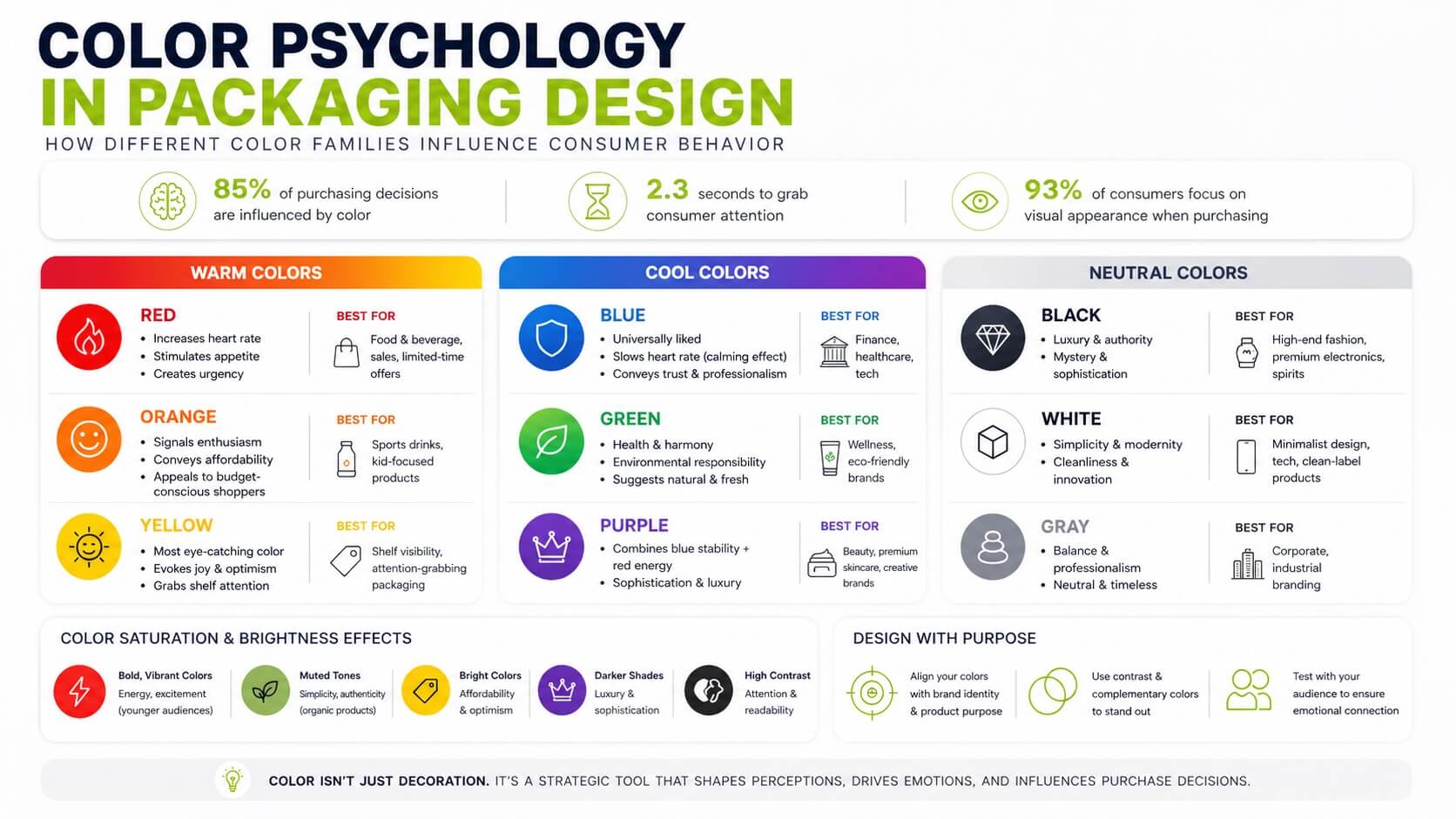
Color psychology plays a key role in packaging design. Why? Because 85% of purchasing decisions are influenced by color, and packaging has just 2.3 seconds to grab attention. The way colors are used – through their brightness, contrast, and saturation – shapes how consumers perceive a product, often before they even read the label. Here’s what you need to know:
- Warm colors (red, orange, yellow) evoke energy, urgency, and optimism. Red stimulates appetite, orange signals affordability, and yellow grabs attention.
- Cool colors (blue, green, purple) create trust, calmness, and sophistication. Blue conveys professionalism, green suggests health, and purple implies luxury.
- Neutral colors (black, white, gray) communicate simplicity, elegance, and balance. Black is often linked to luxury, white to modernity, and gray to professionalism.
Color choices also depend on your target audience and cultural context:
- Younger shoppers prefer vibrant shades; older audiences lean toward muted tones.
- Colors like red, white, and green can carry different meanings across regions, so researching local preferences is essential for global brands.
To design effective packaging:
- Align your color palette with your brand identity and product purpose.
- Use complementary or high-contrast colors to stand out on shelves.
- Test your design with your audience to ensure it resonates emotionally and visually.
Color isn’t just decoration – it’s a tool that shapes consumer behavior and drives sales.
Color Psychology For Custom Packaging And Retail Displays | Point of Purchase | Product Packaging
How Colors Affect Consumer Behavior
Color Psychology Guide for Packaging Design: Warm, Cool, and Neutral Colors
Color is a silent yet powerful force in shaping consumer behavior. It influences decisions almost instantly – well before someone reads a product label or checks the price. In fact, 85% of consumers say color is a key factor in their product choices, and 93% focus on visual appearance when making purchases.
The way colors are presented – through their saturation, brightness, and contrast – plays a major role in how they’re perceived. For instance, bold, vibrant colors like electric blue or lime green convey energy and excitement, making them ideal for products aimed at younger audiences or impulse buyers. On the other hand, muted tones like earthy browns or soft greens suggest simplicity and authenticity, often used for organic or handcrafted items. Bright colors communicate affordability, while darker shades like navy or charcoal exude luxury and sophistication. High contrast ensures important messages stand out, grabbing attention even in busy visual spaces. Let’s take a closer look at how different color families influence consumer behavior.
Warm Colors: Red, Orange, and Yellow
Warm colors – red, orange, and yellow – are attention-grabbing and stir strong emotional responses. Take red, for example: it’s known to increase heart rate and stimulate appetite, which is why it’s a favorite in the food and beverage industries. It also creates urgency, making it a go-to for clearance sales and limited-time offers.
Orange stands out for its ability to signal enthusiasm and affordability. It appeals to budget-conscious shoppers and younger audiences, making it a popular choice for sports drinks and kid-focused products. Meanwhile, yellow is the most eye-catching color, evoking feelings of joy and optimism. It’s often used to make products pop on crowded shelves. A trend to watch for in 2025–2026 is Solar Yellow, a vibrant shade that combines visibility with themes of sustainability and progress. Seasonal shifts, like using pumpkin orange for fall packaging, can increase sales by as much as 25%. Warm colors are also central to the Dopaminergic Design trend, which uses bold, candy-like hues to create instant mood boosts.
Cool Colors: Blue, Green, and Purple
Cool colors – blue, green, and purple – offer a more calming and reassuring experience. Blue is universally liked for its association with logic, safety, and professionalism. Its calming effect can slow the heart rate, helping consumers feel at ease and fostering trust. That’s why industries like finance, healthcare, and tech often lean heavily on blue. For instance, Tiffany & Co.’s iconic “Tiffany Blue” evokes exclusivity and refined craftsmanship.
Green is synonymous with health, harmony, and environmental responsibility, making it a natural choice for wellness products and eco-friendly brands. Purple, on the other hand, combines the stability of blue with the energy of red, making it a favorite for luxury and creative brands. It’s often seen in beauty and premium skincare packaging, where it conveys sophistication and forward-thinking design.
As Ronnie Okaya from Gamut Packaging puts it:
The vibrancy of red breathes life into packaging, evoking feelings of passion and excitement, while the serenity of blue builds a foundation of trust and dependability.
Neutral Colors: Black, White, and Gray
Neutral colors – black, white, and gray – are all about sophistication, cleanliness, and balance. Black is often linked to luxury, mystery, and authority, making it a staple for high-end fashion, premium electronics, and spirits. White conveys simplicity and modernity, as seen in Apple’s sleek white and silver designs that highlight innovation. Gray brings balance and professionalism, frequently used in corporate and industrial branding.
Neutrals play a key role in trends like Neo-Minimalist High Contrast, which focuses on timeless black-and-white designs with clean lines. Another trend, Muted Neutrals + Bold Accents, pairs soft, understated tones with striking neon or electric highlights to create a dynamic visual effect.

How to Apply Color in Packaging Design
Understanding how colors influence emotions is one thing, but applying that knowledge effectively is where the magic happens. The goal is to make smart, intentional choices that connect your brand’s personality with what your audience expects. Let’s break it down.
Aligning Colors with Brand Identity
Your color palette should be a direct reflection of your brand’s personality. Are you playful or sophisticated? Affordable or exclusive? Eco-friendly or tech-forward? Defining these traits first helps guide your color choices, ensuring your packaging sends the right message even before someone spots your logo.
Consistency is just as important. Sticking to the same colors across your packaging, website, ads, and even delivery trucks creates a “visual anchor.” This can boost brand recognition by as much as 80%. Coca-Cola’s iconic red and white is a prime example of how this works.
Color should also align with what your product represents. For instance, green is a natural fit for organic or sustainable products, signaling health and eco-consciousness without saying a word. As packaging expert Lexi Williams puts it, “Colors decide the fate of a business and brand”. In other words, your color palette is more than decoration – it’s a promise.
Creating Effective Color Combinations
Great color combinations start with understanding how colors relate to each other. Complementary colors, like blue and orange, create bold contrasts that catch the eye – perfect for standing out on a crowded shelf. On the other hand, analogous colors, such as red, orange, and yellow, offer a more harmonious and easygoing vibe.
If you want something adventurous, triadic schemes (three evenly spaced colors) can add boldness, while monochromatic palettes (different shades of the same color) deliver a sleek, luxurious feel. A handy rule of thumb is the 60-30-10 rule: use your main color for 60% of the design, a secondary color for 30%, and an accent color for the remaining 10%. This keeps things balanced and avoids visual overload.
High contrast is also crucial for readability. For example, pairing dark blue packaging with bright yellow text ensures important details stand out, even under harsh retail lighting. Certain combinations also carry specific meanings. Purple and gold suggest luxury, yellow and white feel fresh and youthful, while red and black exude boldness. Limiting your palette to two or three colors helps keep your message clear and avoids overwhelming shoppers.
Adapting Colors for Target Audiences
Once you’ve nailed down your color strategy, it’s time to tailor it to your audience. Different groups respond to colors in unique ways. Younger consumers often lean toward vibrant, energetic shades, while older audiences prefer classic, muted tones that convey trust and reliability. Gender can also play a role: men tend to favor bold, saturated colors like blue, black, and gray, while women often prefer softer tones like lavender, teal, and rose.
Cultural context matters, too, especially for global brands. Colors can carry vastly different meanings across regions. For example, white represents purity in Western cultures but symbolizes mourning in some Eastern countries. Red is seen as lucky in China but can signal urgency or danger in North America. And in some places, like Indonesia, green is even considered taboo. Researching these nuances is essential before launching internationally.
| Target Demographic | Preferred Colors/Tones | Psychological Signal |
|---|---|---|
| Children | Bright primaries, Orange, Yellow | Fun, energy, playfulness |
| Men | Blue, Black, Gray, Saturated tones | Strength, authority, stability |
| Women | Lavender, Teal, Rose, Softer shades | Refinement, empathy, beauty |
| Seniors | High-contrast, Muted/Classic tones | Reliability, clarity, legibility |
| Luxury Buyers | Black, Gold, Silver, Deep Purple | Exclusivity, sophistication, status |
| Eco-Conscious | Green, Earthy tones, Muted greens | Nature, health, sustainability |
Testing your color choices is a smart move. Try a “5-second test” with your target audience – if they can’t identify your brand or product type within five seconds, your design might need tweaking. It’s also a good idea to compare your packaging against competitors to ensure it stands out. And don’t forget accessibility – about 8% of men are colorblind, so using design tools to check for visibility issues can make your packaging more inclusive.

Cultural and Psychological Factors in Color Selection
In packaging design, choosing the right colors goes beyond aesthetics – it requires an understanding of cultural nuances and psychological impact. Colors carry different meanings across cultures, shaped by history, religion, and traditions. For global brands, adopting a “think global, act local” approach is critical to avoid misunderstandings or even backlash. As LogoDesign.net explains:
A hue that shows celebration in one country might symbolize mourning in another. For global companies, understanding these cultural factors isn’t optional; it’s essential.
Let’s take a closer look at how color meanings shift across cultures and why these differences matter.
How Color Meanings Vary Across Cultures
Colors don’t have universal meanings. What symbolizes joy in one culture might represent sorrow in another. Take red, for instance: in China, it’s a symbol of luck, joy, and prosperity, often seen in weddings and New Year celebrations. But in South Africa, red is associated with mourning. Similarly, white is linked to purity and weddings in many Western cultures, yet it signifies death and funerals in China, India, and Japan.
Yellow is equally complex. In the U.S., it’s associated with happiness and warmth, but in Mexico and Brazil, it can represent death or mourning, while in Germany, it’s tied to jealousy. Blue, often considered masculine in Western contexts, represents femininity in China. And purple, a color of luxury in the U.S., is linked to mourning in Brazil and Thailand.
Religious associations add another layer of complexity. For example, green is sacred in Islam, symbolizing paradise, while saffron holds spiritual importance in Hinduism. Even pink, often tied to femininity in the West, conveys trust in Korea and renewal in Japan.
| Color | Western Meaning | Eastern/Other Meaning |
|---|---|---|
| Red | Passion, urgency, danger | Luck (China), mourning (South Africa) |
| White | Purity, peace, simplicity | Death, mourning (India, China, Japan) |
| Yellow | Joy, optimism, happiness | Death (Latin America), royalty (China) |
| Green | Nature, health, sustainability | Sacred/paradise (Islam), infidelity (China) |
| Blue | Trust, security, calm | Spirituality (Middle East), femininity (China) |
| Purple | Luxury, wealth, royalty | Mourning (Brazil, Thailand) |
These cultural differences highlight the importance of tailoring color choices to specific markets.
The Psychological Effects of Color Combinations
Colors don’t just stand alone – they interact, creating layered emotional responses. Pairing colors thoughtfully can amplify their psychological impact. For instance, purple and gold are often associated with luxury and exclusivity. Yellow and white together suggest freshness and cleanliness, making them ideal for health and beauty products. Meanwhile, red and black convey boldness and power, while orange and navy blue strike a balance between playfulness and professionalism.
When colors are combined, they tap into multiple emotional triggers, leaving a lasting impression. Elizabeth Holloway from Third Wunder emphasizes the importance of aligning colors with brand values:
By aligning your color palette with your core brand values, you ensure that your visual branding is working in lockstep with your messaging for more influential consumer impressions.
To make sure these combinations resonate, testing with local audiences through A/B tests or focus groups can help fine-tune the emotional impact.
Conclusion
Color is a silent force, shaping how we perceive brands in mere moments. As we’ve seen, it sparks emotional reactions that bypass logic, connecting directly to the limbic system – the part of the brain that drives recognition, trust, and buying behavior.
Successful packaging design carefully blends color psychology with brand identity, audience preferences, and regional sensitivities. A color that symbolizes sophistication in one region might signify mourning elsewhere. Choosing the wrong palette can confuse or even alienate your audience, making thorough testing, market research, and expert guidance critical.
“Color psychology, the study of how colors affect human behavior and emotions, plays a crucial role in shaping consumer perceptions and brand associations.” – Visual Soldiers
Applying these principles to your design strategy can help you create packaging that not only grabs attention but also drives action. For brands aiming to make a lasting impact, partnering with skilled design professionals can be transformative. Visual Soldiers, an Atlanta-based creative agency, specializes in crafting packaging that aligns seamlessly with brand goals and audience needs. Their strategic approach ensures your color choices go beyond aesthetics to deliver measurable results.
In a competitive market where thoughtful color choices can boost brand recognition by as much as 80%, every decision matters.
FAQs
When selecting packaging colors for your brand, think about the emotional response colors can trigger and how they tie into your brand’s personality. Consider what feelings you want your packaging to inspire – whether it’s confidence, energy, or sophistication – and choose shades that align with those emotions. Make sure your color palette is consistent with your overall brand image, connects with the preferences of your target audience, and fits within any relevant cultural or trend-based contexts. This approach will help create a strong, unified, and lasting impression.
Bold, high-contrast color combinations play a major role in catching attention on shelves. Pairing dark shades with bright highlights – like black with yellow – or using complementary colors such as red and white creates a striking visual effect. Colors also carry emotional weight: red and yellow can convey energy, while blue and green often suggest trust. The key is to strike a balance between contrast and harmony, ensuring the design stands out while staying true to the product’s identity.
Testing packaging colors involves creating prototypes with various color schemes and collecting feedback through methods like surveys, focus groups, or A/B testing in actual retail settings. This approach helps determine which colors grab attention, spark the right emotions, and drive purchasing decisions. Since people often make snap judgments based on color, testing ensures your packaging connects with your audience and supports your brand’s objectives.
Visual Soldiers
Visual Soldiers is an Atlanta-based creative studio specializing in branding, design & digital experiences.

