June 23, 2026
Mobile Accessibility Testing: 7 Best Practices
-
Visual Soldiers
- UX/UI Design
- minute read
Mobile Accessibility Testing 7 Best Practices
Quick Summary
Mobile accessibility testing is crucial for making apps usable for everyone, including people with disabilities. Ignoring this can exclude about 25% of U.S. adults and may result in legal issues such as ADA lawsuits. Testing early and frequently can reduce costs and enhance usability for all users. Key practices include starting with standards like WCAG 2.1 Level AA and developing personas for users with disabilities. It's also important to use native assistive tools, such as VoiceOver on iOS and TalkBack on Android, and to combine automated testing with other methods.
Mobile accessibility testing ensures your app works for everyone, including users with disabilities. Ignoring accessibility can exclude 1 in 4 U.S. adults and lead to legal risks like ADA lawsuits. Testing early and often saves costs and improves usability for all users.
Here are 7 key practices to follow:
- Start with standards: Use WCAG 2.1 Level AA and create personas for users with disabilities.
- Use native assistive tools: Test with VoiceOver (iOS) and TalkBack (Android).
- Combine automated and manual testing: Automated tools catch basics, but manual reviews find deeper issues.
- Test on real devices: Simulators miss touch target and motion issues.
- Check color, contrast, and typography: Ensure readability in various lighting and text sizes.
- Test forms and error handling: Labels, focus, and error messages must be clear and accessible.
- Involve users with disabilities: Their feedback reveals usability barriers automation won’t catch.
Accessibility isn’t an afterthought – it’s a continuous process that improves your app for everyone.
Intro to Mobile Accessibility Testing Tools
1. Start With Standards, Personas, and Test Plans
Before diving into testing, it’s important to lay a solid foundation. Begin by defining clear standards, understanding your target users, and setting specific goals for your tests. For mobile accessibility, align these goals with WCAG 2.1 Level AA standards.
Why WCAG 2.1 Level AA? It’s the benchmark often referenced by the Americans with Disabilities Act (ADA). This level strikes a balance between accessibility and practical design considerations. Mobile-specific criteria such as Reflow, Orientation, and Identify Input Purpose ensure the guidelines address challenges unique to small screens. Additionally, requirements like minimum contrast ratios and appropriate touch target sizes are pivotal for usability.
Next, shift your focus to the people who will use your app. Develop detailed personas that incorporate the needs of users with disabilities. For instance, a persona for a user with low vision might include reliance on VoiceOver and the use of Dynamic Type at its largest setting. Another persona, representing someone with limited dexterity, might highlight the need for switch control navigation and large, well-spaced touch targets. The goal is to make accessibility an integral part of the design process, not something added later. Analytics can also provide insights – look at how many of your users rely on system features like larger text or reduced motion.
With personas in place, you can build an effective test plan. Focus on your app’s most critical workflows, often called Red Routes. These are the tasks users must complete to gain value from your app, such as logging in, searching, checking out, or managing an account. Since over 72% of mobile experiences encounter significant accessibility barriers, prioritizing these workflows ensures you address the most impactful issues first. Your test plan should also account for variations in device and operating system behavior, as accessibility features can differ across Android and iOS versions.
“Accessibility is not just for users with disabilities. Larger touch targets help everyone who uses a phone one-handed or with shaky hands. Higher contrast helps in bright sunlight.” – Aasif Khan, Page Reviewer, Appy Pie
Here’s a quick overview of how WCAG principles translate into actionable testing requirements for mobile apps:
| Principle | Mobile Focus | Key Requirement |
|---|---|---|
| Perceivable | Screen readers & visuals | 4.5:1 contrast ratio; alt text for all meaningful images |
| Operable | Touch & gestures | 44pt/48dp minimum touch targets; no gesture-only paths |
| Understandable | Layout & errors | Consistent navigation; error messages with icons and text |
| Robust | Assistive tech | Compatibility with VoiceOver (iOS) and TalkBack (Android) |

2. Test With Native Mobile Assistive Technologies
The next step is to test your app using the assistive technologies that your users depend on. For mobile, this means working with native screen readers like VoiceOver on iOS and TalkBack on Android. Considering that 91% of screen reader users rely on mobile devices to access content, this hands-on testing approach helps align your test plan with real-world user experiences.
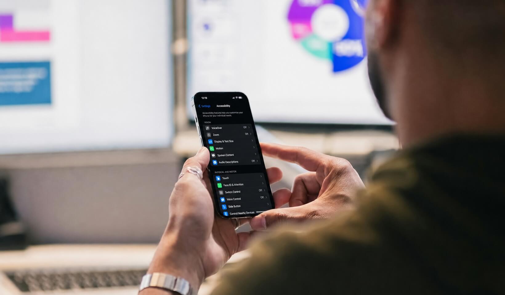
Getting started is straightforward. To activate VoiceOver on iOS, go to Settings > Accessibility > VoiceOver, or simply triple-click the side button. For TalkBack on Android, navigate to Settings > Accessibility > TalkBack, or press and hold both volume keys for three seconds. Once active, you can navigate through elements by swiping right and activate them by double-tapping on both platforms.
Testing with these tools also means understanding their unique behaviors. For example, iOS uses the Rotor, a two-finger rotation gesture, to navigate between headings, links, and form controls. Android, on the other hand, relies on reading controls and context menus for similar navigation tasks. Another key difference lies in how labels are read: iOS uses the accessibilityLabel property, while Android relies on contentDescription. Missing the contentDescription on Android can lead to buttons being announced as generic views in TalkBack, even if they work fine in VoiceOver. As noted by Accessible.org:
“A button that works in VoiceOver may read as a generic view in TalkBack if the developer set the label but missed the Android role.” – Accessible.org
To ensure comprehensive testing, try these techniques:
- On iOS, enable Screen Curtain (a three-finger triple-tap) to black out the display, simulating audio-only navigation.
- On Android, turn on “Display speech output” in TalkBack’s developer settings. This feature overlays live text of what the screen reader is announcing, making it easier to document bugs quickly.
While testing, focus on critical usability aspects like logical focus movement, proper focus trapping in modals, and whether dynamic updates (e.g., error messages or banners) are announced correctly.
Here’s a quick comparison of some key features between VoiceOver and TalkBack:
| Feature | VoiceOver (iOS) | TalkBack (Android) |
|---|---|---|
| Activate Item | Double tap | Double tap |
| Next Element | Swipe right | Swipe right |
| Scroll Page | Three-finger swipe | Two-finger swipe |
| Navigation Menu | Two-finger rotate (Rotor) | Swipe down then right |
| Labeling Property | accessibilityLabel |
contentDescription |
3. Combine Automated Scans With Manual Reviews
Automated tools are great for spotting structural issues like missing labels, low contrast, or small touch targets. However, they only catch about 20–40% of accessibility problems, making human review an essential step. Manual testing helps evaluate things like label relevance, logical focus order, and proper modal behavior – areas where automation falls short.
Manual reviews go beyond the basics, uncovering challenges that real users might face but automated scans often miss. Think of it as a two-step process: use automated tools for quick, repeatable checks, and then rely on manual testing for the details. Tools such as axe-core, Xcode’s Accessibility Inspector (for iOS), and Google’s Accessibility Scanner (for Android) can even integrate into CI/CD pipelines. This setup helps catch accessibility issues early in development, ensuring your foundation is solid.
When it comes to manual testing, focus on one assistive technology at a time. For example, test a screen using only VoiceOver, then separately test with large text enabled. This method isolates issues, making them easier to identify and address.
Here’s a quick comparison of what each method excels at:
| Issue Category | Automated Tools | Manual Testing |
|---|---|---|
| Color Contrast | Text on solid backgrounds | Text on gradients or images |
| Images | Checking for alt-text/labels | Ensuring labels are accurate and useful |
| Navigation | Finding focusable elements | Testing logical focus order and visibility |
| Dynamic Content | Detecting live regions | Verifying timing and clarity of announcements |
| Interactive Elements | Touch target size checks | Testing gesture alternatives and state announcements |

4. Check Layout, Touch Targets, and Motion on Real Devices
After manual and automated testing, it’s essential to test on real devices to ensure everything works as intended. Simulators and emulators can’t fully replicate how users interact with touchscreens. Unlike a mouse cursor, a fingertip covers a much larger area – typically 16–20mm. This means touch targets that seem fine in a simulator might be frustratingly small in real-world use. Testing on physical devices helps uncover these usability issues.
Both Apple and Google provide clear guidelines for touch target sizes. Apple suggests 44×44 points for iOS, while Google recommends 48×48 dp for Android. For web content, WCAG 2.2 Level AA sets a minimum of 24×24 CSS pixels. These dimensions ensure that a 48×48 dp target (about 9mm on screen) is large enough for most users. Additionally, spacing between touch targets is critical – 8dp or more can help prevent accidental taps, especially for users with tremors or limited dexterity.
This issue was highlighted at the CSUN Assistive Technology Conference in May 2025. Accessibility experts from TPGi – Laurie Pagano, Carolina Crespo, and John Lilly – used the Android Accessibility Inspector to evaluate a mobile demo app. They discovered that the “Contact Us” and “Careers” links failed WCAG 2.5.8 (Target Size) because their height was just 19.43dp, making them difficult for users with motor impairments to tap without accidentally hitting nearby elements.
“Small touch targets cause two problems: accidental activations of adjacent elements, and inability to activate the target at all for users with motor impairments.” – Elmonds Kreslins, Lead QA Engineer, RedQA
Motion testing is another critical step when working with physical devices. Users with vestibular disorders can experience dizziness or nausea from certain animations, like parallax scrolling or multi-axis motion effects. To ensure your app accommodates these users, manually test “Reduce Motion” settings on iOS (Settings > Accessibility > Motion) and Android (Settings > Accessibility > Remove animations). Confirm that your app respects these preferences. Additionally, for motion-based actions like shake-to-undo, always provide an alternative button option.
Real-device testing ensures a smoother, more inclusive experience for all users.
5. Test Color, Contrast, and Typography in Real Conditions
When testing accessibility on real devices, it’s essential to pay attention to the visual elements – color, contrast, and typography. While studio setups might seem ideal, they don’t replicate the challenges of real-world environments. For example, direct sunlight or dim lighting can reveal contrast issues that aren’t noticeable on a perfectly calibrated monitor. That’s why it’s critical to test your designs under various lighting conditions.
The WCAG 2.1 AA guidelines provide specific benchmarks for contrast ratios: normal text requires a minimum ratio of 4.5:1, while large text (18pt or larger, or 14pt bold and up) requires a 3:1 ratio. The same 3:1 ratio applies to UI components like icons and button outlines. These standards apply equally to both light and dark modes, as colors that perform well in one mode may fail in the other. In dark mode, for instance, some colors can create a “halation” effect – a glowing appearance that can be especially problematic for users with astigmatism.
| Element Type | WCAG 2.1 AA Ratio | WCAG 2.1 AAA Ratio |
|---|---|---|
| Body text (under 18pt) | 4.5:1 | 7:1 |
| Large text (18pt+ or 14pt bold+) | 3:1 | 4.5:1 |
| UI components (icons, borders) | 3:1 | 3:1 |
| Decorative elements | No requirement | No requirement |
Typography is another area where testing on real devices makes a difference. Tools like iOS Dynamic Type and Android Font Scale allow users to increase text sizes significantly – up to 310% in some cases. At these extreme sizes, text can overlap, clip, or even disappear behind other elements. To ensure readability, set the system font size to 200% and check that all text remains legible and properly aligned.
Color should never be the sole carrier of meaning. Alerts, error messages, and status changes must include icons or text labels alongside color cues. This is especially important because approximately 1 in 12 men experience some form of color blindness. Tools like the Coblis Color Blindness Simulator can help you preview how your design appears to color-deficient users before testing on physical devices.
“Automated testing reveals only a fraction of the issues and is perfect for regular accessibility hygiene. However, to get the full picture, you need to test manually.” – Abra
For contrast auditing, tools like Google’s Accessibility Scanner on Android can automatically flag low-contrast areas and suggest adjustments to foreground and background colors. On iOS, Xcode’s Accessibility Inspector works with both simulators and physical devices, allowing you to audit contrast without changing device settings. After using these tools, verify the readability of your design by testing it in bright light conditions to ensure it’s functional and clear in everyday scenarios.
6. Test Forms, Authentication, and Error Handling
After testing layout and content, it’s time to shift attention to interactive elements like forms and authentication flows. Forms, in particular, play a big role in meeting accessibility standards, as they touch on more WCAG criteria than any other element. A common issue? Noncompliance with WCAG 4.1.2 (Name, Role, Value), which often stems from poorly labeled form controls.
Start by ensuring proper labeling. Every input field should have a programmatically associated label using the <label for="id"> attribute. Placeholder text might seem convenient, but it should never replace a label. For grouped inputs such as radio buttons or checkboxes, use <fieldset> and <legend> to provide the necessary context for screen readers. If a visible label isn’t practical – like for icon-only buttons – add an aria-label to ensure accessibility.
When errors occur, provide clear, actionable feedback. Shift focus to either an error summary or the first invalid field to guide users effectively. Mark problematic fields with aria-invalid="true" and use aria-describedby to connect error messages directly to the affected field. For real-time validation, aria-live="polite" can notify users of errors after they stop typing, without disrupting their workflow. Authentication processes also need special attention to ensure accessibility.
“Knowing something is wrong is only the first step, users need to know how to fix it as well.” – Laura Wissiak, CPACC
Once forms are addressed, turn your focus to authentication flows for a complete accessibility review. These flows can be challenging because automated scanners often can’t navigate login screens, leaving much of the content untested. To work around this, use MFA-exempt service accounts or long-lived session cookies to grant scanners access to restricted areas. On login forms, include attributes like autocomplete="username" and autocomplete="current-password" to make credential entry easier. Also, ensure paste functionality works to support users relying on password managers.
For WCAG 3.3.9 (Level AAA), authentication steps should not rely on puzzles or image-based challenges unless an accessible alternative is offered. Test whether options like biometric authentication or magic links are compatible with assistive technologies, ensuring they are practical for all users.

7. Include Users With Disabilities and Test Continuously
Automated tools can only identify about 20%–40% of WCAG violations. That’s why it’s critical to involve users with disabilities in your testing process. Their feedback provides insights into label clarity, navigation flow, and cognitive load that automation simply can’t detect.
To find participants, consider reaching out to local organizations, university disability services, or using referrals. These options are often more affordable than specialized agencies. Plan for 2–4 weeks to recruit individuals who use assistive tools like VoiceOver, TalkBack, or Switch Control. During testing, encourage participants to use their screen readers at their usual speed to maintain authenticity. Use inclusive language – for instance, ask, “What did you come across?” instead of visual-focused phrases like “What do you see?”.
In-person sessions are particularly valuable. They can reveal subtle but important details, such as how someone holds their device, how they navigate with a Braille display, or how lighting conditions impact their interaction with the interface. These observations can uncover issues that audits and automated tests might miss, offering a richer understanding of the user experience.
Accessibility testing shouldn’t be an afterthought. Instead, it needs to be integrated into your regular development process. Treat accessibility issues as functional bugs, not aesthetic concerns, and include them in your definition of done. Make accessibility testing part of every sprint to avoid accumulating technical debt. Use tools like Axe-core or Accessibility Scanner in your CI/CD pipeline to catch regressions with every pull request. Then, complement these automated checks with manual screen reader testing and usability sessions involving users with disabilities before major releases.
The return on investment is clear: Forrester Research estimates that for every $1 spent on accessibility, organizations see a $100 return.
Common Pitfalls and How to Avoid Them
To keep your mobile accessibility testing effective, it’s crucial to steer clear of common mistakes. These missteps are predictable but entirely avoidable with the right approach.
Over-relying on automated tools can give a false sense of security. While these tools are helpful, they only catch a small portion of accessibility issues. For instance, they can confirm the presence of an accessibility label but can’t assess its usefulness. Imagine a button labeled “button” instead of something meaningful like “Add to cart” – an automated tool would miss this problem entirely. Always complement automated scans with manual screen reader testing, using tools like VoiceOver on iOS or TalkBack on Android, to ensure labels are clear and relevant.
Using only emulators can lead to inaccurate results. Emulators can’t fully replicate real-world behaviors, such as touch precision or how sensors respond in different environments. Skipping real-device testing might result in an app that performs well in a controlled setting but fails to meet users’ needs in practical use.
Don’t overlook dynamic text scaling and orientation changes. Make sure to test layouts at 200% text size and in both portrait and landscape modes. This helps you catch issues like text clipping or overlapping elements.
Focus on one variable at a time. For example, run separate tests for text scaling and screen reader functionality. This approach makes it easier to pinpoint and address specific problems.
“Mobile accessibility is not a feature you add at the end – it’s a quality attribute you test throughout. Every sprint without accessibility testing creates debt that’s exponentially harder to fix later.” – Yuri Kan, Senior QA Lead
Building a mobile app that works for everyone?
Visual Soldiers helps brands create accessible, user-centered digital experiences that improve usability, strengthen compliance, and elevate customer satisfaction. Let's build something better together.
Book a Discovery CallConclusion
Mobile accessibility testing isn’t a task you check off once – it’s an ongoing process that should be woven into every stage of development. By sticking to these seven best practices, you can ensure your mobile app meets accessibility standards every step of the way. This means aligning with WCAG guidelines, testing with real assistive technologies, involving users with disabilities, and maintaining continuous checks.
The stakes are high. In 2024 alone, there were over 8,800 ADA digital accessibility lawsuits filed in the U.S., with 75% targeting small and medium-sized businesses. Fixing accessibility problems after launch can be expensive, but being proactive pays off. Forrester Research reports a $100 return for every $1 spent on accessibility. Beyond avoiding legal risks, this is a smart financial move.
“Mobile accessibility is essential. It improves your product’s usability, reach, and legal compliance.” – Ryan Mack, A11Y Pros
The market opportunity is massive. Globally, over 1.3 billion people live with significant disabilities, representing more than $6 trillion in spending power. This isn’t a niche market – it’s fundamental.
If you’re looking to implement these practices seamlessly, consider working with Visual Soldiers. Based in Atlanta, they specialize in accessibility-focused app design and custom development, including ADA compliance. Their audit-to-remediation cycles typically take 4 to 8 weeks. Prioritizing accessible design isn’t just about compliance – it strengthens your product for all users.
FAQs
During the discovery phase, it’s important to establish clear accessibility objectives. This ensures your project is inclusive from the very beginning. Update your user personas to reflect a diverse audience, including individuals with disabilities. This step adds real-world relevance and ensures you’re designing for everyone.
Begin testing early with screen readers like VoiceOver (iOS) and TalkBack (Android). These tools are crucial for understanding the experience of blind and low-vision users. Combine this hands-on testing with automated accessibility tools to identify common issues quickly, such as poor contrast, missing labels, or touch targets that are too small to use effectively. Early detection of these problems can save time and effort down the road.
Testing on real devices is crucial because emulators often fail to capture hardware-specific accessibility challenges. Make sure to test on both iOS and Android, as each platform has unique assistive tools like VoiceOver and TalkBack. Use multiple devices to account for variations across different versions and models. Before enabling assistive technologies such as screen readers, switch controls, or voice access, reset devices to their default settings to maintain consistent testing conditions.
To make accessibility testing part of every sprint, consider a hybrid approach that blends automated and manual evaluations. Here’s how:
- Automated Testing: Incorporate checks into your CI/CD pipeline to quickly identify issues like missing labels or insufficient color contrast. This helps catch common problems early in the development process.
- Manual Testing: Use assistive technologies such as VoiceOver or TalkBack to manually test for more nuanced issues. Focus on verifying specific states, like modals, form validation errors, and dynamic content behavior after user interactions.
By combining these methods, you can ensure accessibility is treated as an ongoing quality metric rather than something addressed only at the end of a project.
Visual Soldiers
Visual Soldiers is an Atlanta-based creative studio specializing in branding, design & digital experiences.

