February 9, 2024
Top 10 Accessibility Mistakes in UX/UI Design to Avoid
-
Visual Soldiers
- UX/UI Design
- minute read
The importance of accessibility in UX/UI design cannot be overstated. It’s not just about reaching a wider audience; it’s about inclusivity and providing equal access to information and functionality for all users, regardless of their abilities. However, even the most well-intentioned designs can fall short if common accessibility mistakes are overlooked. Here are the top 10 mistakes to avoid, ensuring your designs are both beautiful and accessible to everyone.
Here are the Top 10 Accessibility Mistakes in UX/UI Design to Avoid
1. Overlooking Keyboard Navigation
One common oversight is neglecting keyboard-only users. Many people rely on keyboards to navigate websites due to physical disabilities. Ensuring that all interactive elements are accessible via keyboard is crucial for inclusive design.
2. Ignoring Color Contrast
Color contrast is another area where designs often fall short. Low contrast between text and background can make content unreadable for users with visual impairments. Adhering to WCAG guidelines for color contrast ratios is essential for creating an accessible digital experience.
3. Neglecting Alt Text for Images
Images add value to content, but without alternative text, their meaning is lost to users who rely on screen readers. Providing descriptive alt text for all images ensures that all users can understand the content fully.

4. Disregarding ARIA Landmarks
Accessible Rich Internet Applications (ARIA) landmarks help users with disabilities navigate and interact with web content. Neglecting to use ARIA landmarks can lead to a confusing and inaccessible navigation experience.
5. Complicated Forms
Forms are a fundamental element of many websites but can pose significant barriers when poorly designed. Ensuring forms are accessible means clear labels, simple instructions, and intuitive error messages. Here is a great resource for making your forms accessible.
6. The Biggest Failure: Not Incorporating Accessibility from the Start
Perhaps the most significant failure in UX design is treating accessibility as an afterthought. Incorporating accessibility from the project’s inception is crucial for a truly inclusive design.
7. Ensuring Accessibility in UX Design
Ensuring accessibility requires a proactive approach. This includes adopting a user-centric design philosophy, conducting regular accessibility audits, and involving people with disabilities in user testing.
8. The Biggest Mistake in Interface Design: Prioritizing Aesthetics Over Functionality
While aesthetics are important, they should not come at the expense of functionality and accessibility. An interface that is beautiful but difficult to navigate is not truly well-designed.
9. Utilizing Tools and Resources
A wealth of tools and resources are available to help designers check and improve accessibility, from WCAG guidelines to color contrast checkers and screen reader software. Making use of these tools is essential for creating accessible designs.
10. Continuous Learning and Adaptation
Accessibility standards and technologies are always evolving. Staying informed and being willing to adapt designs based on user feedback and new developments is key to maintaining accessibility.
Conclusion
Avoiding these common accessibility mistakes is essential for creating UX/UI designs that are not only visually appealing but also inclusive and accessible to all users. By prioritizing accessibility at every stage of the design process, we can create digital experiences that truly cater to everyone.
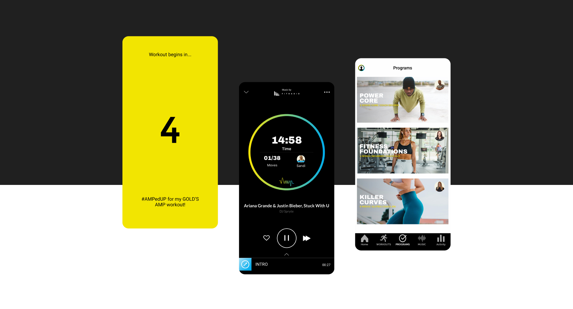
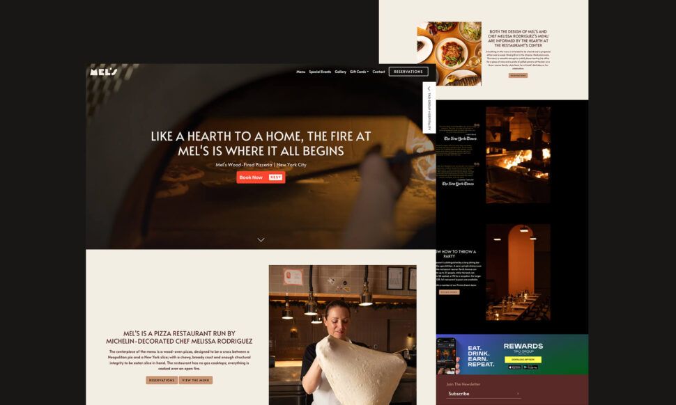
Further Reading For those interested in exploring how to create seamless digital experiences that prioritize both aesthetics and accessibility, the article “Crafting Seamless Digital Experiences” provides valuable insights and inspiration.
Visual Soldiers
Visual Soldiers is an Atlanta-based creative studio specializing in branding, design & digital experiences.

