App Branding Basics: Key Elements
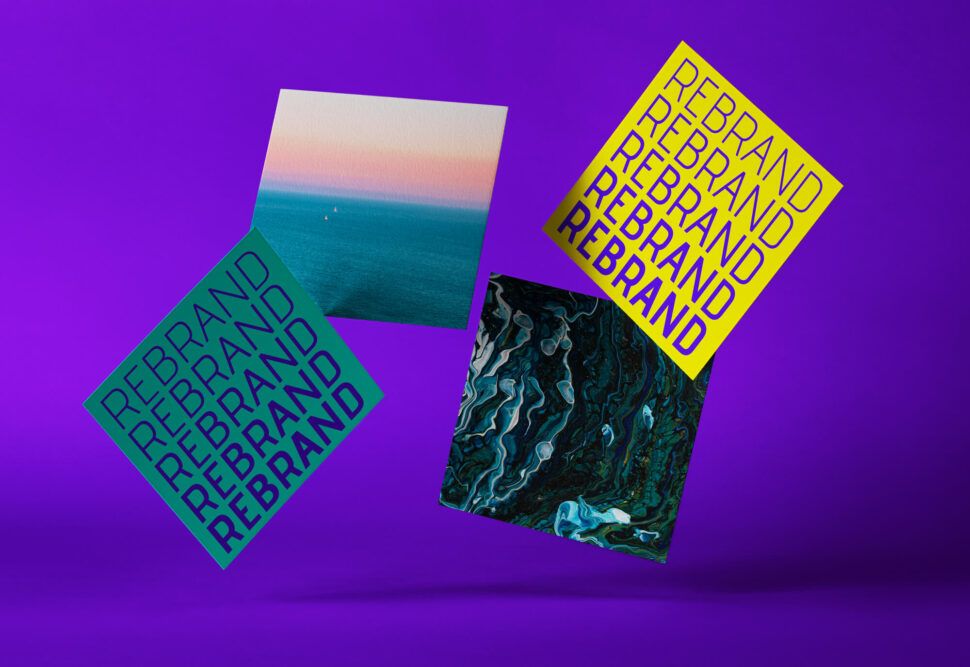
Quick Summary
App branding involves developing a distinct and recognizable identity for a mobile app, which encompasses elements like the app icon, color scheme, typography, and tone of voice. Effective branding captures attention, establishes trust, boosts user retention, and enhances the app's perceived value. Key components include a simple and recognizable app icon that remains clear even at small sizes, and a color scheme that evokes appropriate emotions, such as using blue for trust or green for vitality.
App branding is the process of creating a strong, recognizable identity for your mobile app. It includes everything from your app icon and color scheme to typography and tone of voice. A well-branded app not only grabs attention but also builds trust, improves user retention, and enhances perceived value. Here’s what matters most:
- App Icon: Keep it simple, clear, and recognizable, even at small sizes.
- Color Scheme: Use colors that evoke the right emotions (e.g., blue for trust, green for health) and ensure accessibility for all users.
- Typography: Choose clean, readable fonts and maintain a clear hierarchy for headings and body text.
- Consistency: Ensure design and messaging align across platforms like iOS, Android, and the web.
- Tone of Voice: Define your app’s personality through consistent language and messaging.
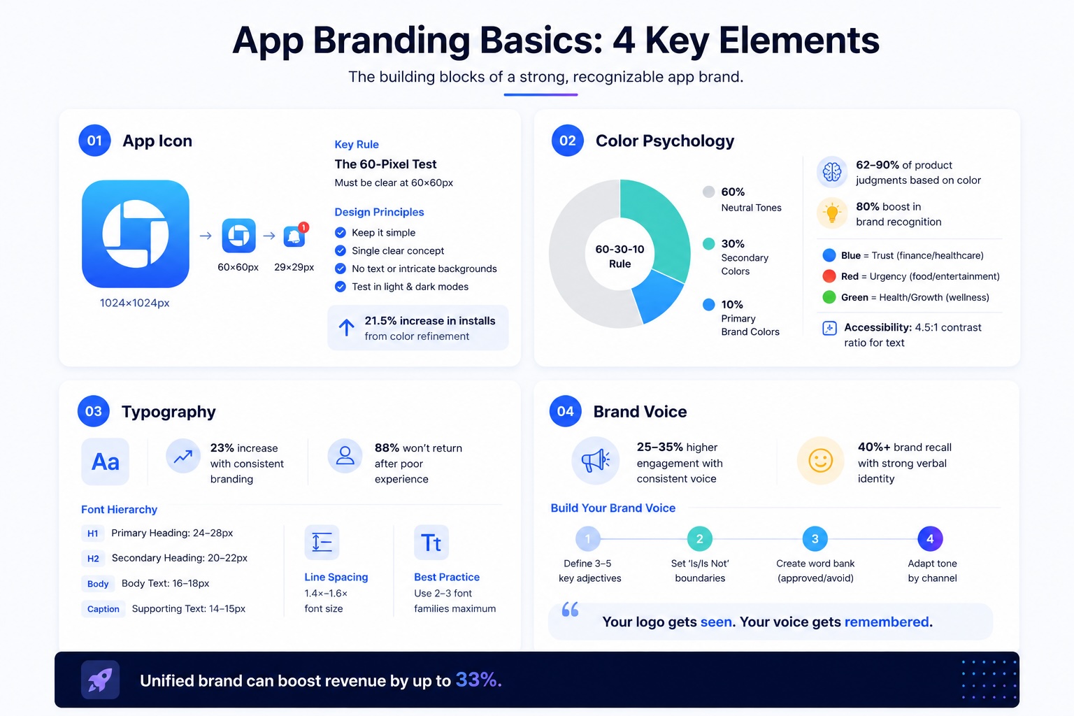
Strong branding helps your app stand out in a crowded marketplace, with stats showing that 90% of customers are willing to pay more for brands they trust, and a unified brand can boost revenue by up to 33%. Every detail, from the app icon to onboarding messages, plays a role in shaping user perception and experience.
Logo Design Basics
An app logo is more than just a visual asset – it’s the face of your brand. It has to work seamlessly across various mobile contexts, from a detailed 1024×1024-pixel store listing to a tiny 29×29-pixel notification tray. This makes clarity and simplicity non-negotiable in your design approach.
Simplicity and Scalability
When designing an app logo, the 60-pixel test is a must. If your logo doesn’t clearly convey its core idea at 60×60 pixels, it’s too complex. Designer Chike Opara emphasizes that simplicity helps people recognize and remember your logo more easily.
To maintain clarity, steer clear of text and intricate backgrounds. These elements can become blurry or unrecognizable at smaller sizes, making your logo harder to identify. Instead, focus on communicating a single, clear concept – don’t try to cram in every feature your app offers.
Platform-specific requirements are another important consideration. For instance, Apple automatically rounds the corners of square icons, while Google Play uses a full-bleed 512×512-pixel format with dynamic masks. Always test your logo in both light and dark modes to ensure it maintains strong contrast and visibility across different environments.
Creating a Memorable Design
A standout logo makes your app instantly recognizable. Incorporate symbols or metaphors that clearly represent your app’s function – a speech bubble for messaging apps or a magnifying glass for search tools, for example. Look at Duolingo’s owl mascot, Duo, which not only humanizes the brand but also makes the app icon unforgettable.
Color is another powerful tool. Use it to evoke specific emotions or themes: blue for reliability in finance apps, red for urgency in lifestyle apps, or green for health and nature in fitness apps. In one case, simply refining the colors of a mobile game icon increased installs by 21.5%.
Adding negative space can elevate your design by embedding hidden symbols, like the arrow in FedEx or the elephant in Evernote. These subtle details add depth without complicating the design. To find the most effective version of your logo, run A/B tests on different variations, tweaking elements like background colors or key features to see which performs better in terms of click-through rates.
A memorable logo not only grabs attention but also reinforces your app’s overall branding.
Integration with App UI
Consistency is key when connecting your logo to your app’s interface. Your logo should reflect the same design elements – like shapes and colors – that define your app’s UI. For example, if your app uses rounded corners and soft hues, your logo should echo that style. If your design leans on sharp, geometric precision, your icon should align with that aesthetic.
Strategic placement of your logo also matters. Use it thoughtfully on key screens like the home header or splash screen, but avoid overusing it throughout the app. Repeated logos can create unnecessary visual clutter and detract from the user experience.
“Strategic branding is about quality over quantity. Misplaced or overused logos can detract from the app’s usability.” – Tech With Landon

Building a Color Scheme
Your app’s color palette plays a key role in shaping user emotions and behaviors. Studies reveal that 62%–90% of initial product judgments are based on color, and users form opinions within just 50 milliseconds of viewing your app.
Color Psychology in App Branding
Colors evoke instant emotional reactions. For example:
- Blue conveys trust and stability, making it a go-to for finance or healthcare apps.
- Red sparks urgency and appetite, ideal for food delivery or entertainment platforms.
- Green symbolizes growth and health, fitting for wellness and eco-conscious brands.
Why does this happen? The brain processes color faster than text or shapes because it activates the amygdala – our emotional processing center – before logical reasoning kicks in. This is why color can boost brand recognition by up to 80%.
To make your palette resonate with your brand, consider its personality. For instance:
- If your app aligns with “The Hero” archetype, bold reds and blues project strength and confidence.
- For “The Sage”, cooler tones like grays and greens communicate wisdom and calm.
When designing, the 60-30-10 rule ensures visual balance. Use:
- 60% neutral tones,
- 30% secondary colors, and
- 10% primary brand colors.
This approach creates a clear visual hierarchy without overwhelming users. Stick to semantic color conventions – green for success, red for errors, yellow for warnings, and blue for information – to ensure users instantly grasp your app’s feedback.
Once your palette’s emotional tone is set, the next focus is ensuring it’s accessible to all users.
Maintaining Accessibility
Your color scheme shouldn’t just look good – it needs to work for everyone. Consider this: color blindness affects around 8% of men and 0.5% of women. Without thoughtful design, millions of users could face challenges navigating your app.
- Contrast ratios matter: Aim for a 4.5:1 ratio for normal text, 3:1 for large text, and 7:1 for primary actions in bright sunlight to meet WCAG 2.1 standards.
- Avoid relying solely on color to convey meaning. Pair colors with text, icons, or patterns so color-blind users can still understand critical information.
Always test your palette on actual devices. Colors can look very different on LCD versus OLED screens, and what looks vibrant on your desktop might appear dull or overly bright on a mobile phone. For dark mode, avoid pure black (#000000); instead, opt for dark grays like #121212 to reduce eye strain and prevent text from “bleeding”.
“Good design is accessible design. When we create inclusive experiences, we don’t just help users with specific needs – we make better products for everyone.” – Simon Lee, Experience Designer
Once your palette is expressive and accessible, it’s crucial to ensure consistency across platforms.
Consistency Across Platforms
Your app’s colors should feel harmonious whether users are on iOS, Android, or the web. Each platform has its own design preferences:
- iOS leans toward clean, vibrant colors that adapt seamlessly between light and dark modes.
- Android’s Material Design encourages bold, saturated hues to establish clear visual hierarchies.
When naming colors in your code, use functional labels like $color-primary-hover instead of descriptive ones like $blue-500. This makes it easier to roll out global updates without hunting through code.
For dark mode, slightly desaturate bright colors to reduce eye strain on OLED screens. Also, pay attention to platform-specific details, such as the blues used in system designs: iOS uses #007AFF, while Android opts for #2196F3. Adapting to these native color schemes ensures your app feels natural rather than out of place.
Finally, test your palette across various devices and lighting conditions to confirm it looks great everywhere your users interact with your app.
Typography and Font Selection
Typography is the finishing touch to your brand’s visual identity, working alongside logos and colors to create a cohesive look. It doesn’t just display text – it sets the mood and ensures readability. Think of it as the background music of your app; even small mistakes can disrupt the user’s experience. In fact, consistent branding, including typography, can increase revenue by up to 23%. On the flip side, 88% of users may not return after a poor experience.
Choosing the Right Typeface
The font you choose speaks volumes about your app’s personality. Fonts like Helvetica or San Francisco project professionalism and trust, while playful fonts can inject creativity and fun. For mobile apps, sans-serif fonts are often the best bet because they are easier to read on small screens compared to serif fonts.
Start with system fonts – San Francisco for iOS and Roboto for Android. If you’re exploring custom fonts, look for ones with features like even stroke thickness, open letterforms, and distinct characters. These details help avoid confusion, especially for similar-looking characters.
“Typefaces for UI should be cooperative.” – Tobias Frere-Jones, Type Designer
Establishing a Font Hierarchy
A clear font hierarchy makes it easy for users to navigate your app. Stick to 2–3 font families – one for headings and one for body text. This keeps the design clean and organized. A three-level hierarchy works well:
- Primary: Used for screen titles.
- Secondary: Ideal for section headers.
- Body: For the main content.
System guidelines also suggest specific font sizes for better readability. For instance, one marketplace app saw a 60% boost in project completion rates after enlarging font sizes and refining its hierarchy. Before the change, 40% of users abandoned proposals due to cramped text.
| Hierarchy Level | Mobile Size | Use Case |
|---|---|---|
| Primary Heading | 24–28px | Screen titles, major headers |
| Secondary Heading | 20–22px | Section breaks, card titles |
| Body Text | 16–18px | Main content, paragraphs |
| Supporting Text | 14–15px | Captions, metadata |
Once your hierarchy is set, double-check that it’s legible across devices.
Readability Across Devices
For mobile readability, keep body text at 16px or larger, and use line spacing between 1.4x and 1.6x the font size to prevent cramped layouts. Aim for line lengths of 50 to 75 characters for easier scanning. Always test your typography on different devices and under various lighting conditions to ensure clarity. A contrast ratio of 7:1 is recommended for text legibility.
Support system-level font scaling, like Dynamic Type on iOS, so users who adjust text size don’t end up with broken layouts. Use scale-independent units like sp (for Android) or rem/em (for the web) to maintain consistency across devices.
“The best mobile typography feels invisible – users should never have to work to read your content, they should glide through it effortlessly.” – Simon Lee, Founder & CEO, We Are Affective


Defining a Brand Tone of Voice
Visuals might grab attention, but it’s your words that leave a lasting impression. Across various platforms, people interact with your brand’s voice far more than its visuals, making a consistent tone essential.
Developing a Brand Personality
Start by identifying 3–5 key adjectives that define your app’s personality. These should align with your mission and values. For instance, a mental health app like Headspace uses a tone that’s “gentle, calming, and supportive” to build trust. On the other hand, Duolingo opts for an “inspiring, inclusive, curious, and quirky” tone to make learning languages fun and engaging.
To refine your brand identity, set clear “Is/Is Not” boundaries. For example, instead of just saying your brand is “confident”, clarify it as “confident, not arrogant” or “warm, not overly sweet”. Build a word bank of approved language and phrases, as well as terms to avoid, to keep your messaging consistent.
“Your brand voice is the consistent personality and character of your brand expressed through words. It’s how you sound in every piece of content.” – Vik Chadha, Founder & CEO of Magnt
Writing Taglines and Messaging
A good tagline is short (3–7 words), memorable, and captures your brand’s essence in a way that works everywhere. To keep messaging clear and effective, create a structured framework: start with one overarching brand promise, add 3–5 value propositions, and back them up with proof points like data or testimonials. Brands that stick to their voice often see 25–35% higher engagement, and those with strong verbal identities report over 40% brand recall – even when their name isn’t mentioned.
This framework ensures your voice stays consistent and impactful across all communications.
Consistency Across Communication Channels
Once you’ve defined your personality and messaging, adapt your tone to suit different channels while keeping your core voice intact. For example, use a celebratory tone for milestones, a calm and patient tone for onboarding, and a clear, transparent tone when addressing issues like service outages.
To maintain alignment, create a scoring system for your team to assess how well copy matches your voice pillars. Regular audits can help catch missteps, like overly casual social media posts or impersonal customer support responses.
“Your logo gets seen. Your voice gets remembered.” – BrandScout
Conclusion
App branding isn’t about isolated pieces – it’s about crafting a complete system where every element works together to create something users instantly recognize. As Mash Bonigala, Creative Director & Brand Strategist at Spellbrand, explains:
“Your brand identity is the complete system that ties all of these elements together into a cohesive, recognizable presence that your customers can identify in a fraction of a second”.
A strong, unified brand identity does more than look good – it builds trust. Considering that first impressions happen in just seconds, a consistent identity reduces mental effort for users, signals professionalism, and fosters confidence. Even small details, like an integrated color palette, can make a big difference. For example, color strategy alone can significantly boost brand recognition. And when done right, a brand identity refresh can increase perceived value by 20% to 40%.
From your app icon to error messages, when typography, colors, and messaging align, users experience something seamless and reassuring.
To achieve this, start by creating a brand guidelines document. This should include your color codes (Hex, RGB), font hierarchies, and tone-of-voice standards. Make sure your app icon remains clear even at its smallest size (29×29 pixels), and review every piece of text – from button labels to loading screens – to ensure your brand personality shines through consistently.
The best apps don’t just solve problems – they create experiences people remember and recommend. At Visual Soldiers, we specialize in building these cohesive branding systems, turning your app into something truly memorable.
FAQs
To see if your app icon is overly complicated, test how it looks at smaller sizes, such as 60px. The main elements should stay distinct and easy to recognize. Designs with too much detail can become blurry or confusing when reduced. Keep the design simple, focusing on a single, clear element that conveys your app’s purpose. Skip any extra details or decorations that could make it harder to identify.
To make your brand colors work well in dark mode, opt for dark gray backgrounds like #121212 instead of pure black. This helps soften the contrast and makes reading easier on the eyes. Ensure your primary, secondary, and neutral colors provide sufficient contrast against these backgrounds for both text and UI elements. Always test your color palette on different devices and under various lighting conditions to ensure it remains accessible and visually comfortable.
A brand style guide for an app should clearly define the essentials needed to keep branding consistent. Here’s what it should include:
- Color palette: Specify the exact colors with their codes (like HEX or RGB) to ensure uniform use across all platforms.
- Typography: Detail the fonts, sizes, and any specific usage rules for headings, body text, and more.
- Logo usage: Provide clear instructions on how the logo should appear, including size, spacing, and acceptable variations.
- Iconography: Set standards for icons, including style, size, and color guidelines.
- Imagery style: Establish a consistent approach to photos or illustrations, ensuring they align with the brand’s tone.
By aligning these elements, you create a visually cohesive and easily recognizable brand identity.
Visual Soldiers
Visual Soldiers is an Atlanta-based creative studio specializing in branding, design & digital experiences.


