March 23, 2025
10 Inspiring Brand Refresh Examples That Transformed Businesses
-
Visual Soldiers
- Branding
- minute read
Pringles new logos
TLDR
This article highlights 10 successful brand refresh examples, showcasing how companies like Coca-Cola, Airbnb, and Burger King modernized their visual identity and messaging to maintain customer loyalty and attract new audiences. Key takeaways include the importance of aligning brand updates with consumer expectations, leveraging design simplicity, and maintaining a consistent brand narrative across all platforms.
Understanding the Importance of a Brand Refresh
As the business landscape evolves, so too must a company’s identity, making a brand refresh an essential strategy for staying relevant and competitive. Understanding the importance of a brand refresh means recognizing that it goes beyond just updating a logo or color palette; it’s an opportunity to realign your brand with the needs and expectations of your audience. Successful brand refresh examples, such as Uber’s transition from their original logo to a simpler, more modern design, illustrate how subtle yet impactful changes can rejuvenate a brand’s image. Additionally, companies like Airbnb and Dunkin’ have shown that a refresh can also extend to refining messaging and service offerings, ensuring that their values resonate with current and prospective customers. These brand refresh examples exemplify how well-executed updates can not only maintain customer loyalty but also attract new market segments, ultimately driving business growth.
Key Elements of a Successful Brand Refresh
A brand refresh is an essential strategy for businesses looking to stay relevant in a rapidly changing market. Key elements of a successful brand refresh include an updated visual identity, an engaging brand story, and a revised marketing strategy. Take a look at notable brand refresh examples that illustrate these concepts in action. For instance, when Dunkin’ revamped its logo and streamlined its name to ‘Dunkin” to signify a focus on coffee, it not only modernized its image but also reinforced its brand message. Similarly, Airbnb’s brand refresh emphasized inclusivity and community through a design overhaul and a new mission statement that resonated with users. These brand refresh examples highlight the importance of aligning a brand’s visual and verbal identity with its core values, thus ensuring it remains appealing and relevant to its target audience.
Case Study 1: Coca-Cola
When discussing effective brand refresh examples, Coca-Cola’s Classic redesign stands out prominently. In 2015, Coca-Cola undertook a strategic overhaul of its iconic red branding, aiming to connect with a younger demographic while honoring its storied heritage. The brand introduced new can designs that showcased bold graphics and limited-time flavors, sparking excitement and nostalgia among consumers. This refresh included a focus on the classic contour bottle, reinforcing brand recognition and loyalty throughout the product line. By successfully blending modern aesthetics with timeless elements, Coca-Cola not only revitalized its image but also increased engagement through interactive campaigns, proving that a thoughtful brand refresh can yield impressive results.
Case Study 2: Airbnb
Airbnb’s logo transformation is a prominent example of a brand refresh that not only revitalized its image but also strengthened its connection with users. Originally, Airbnb’s logo was a simple wordmark that lacked visual distinction. In 2014, the company introduced a new logo, known as the ‘Bélo,’ which represents belonging and community—the core values of the platform. This bold shape resembles a person, a location marker, and a heart, encapsulating the essence of Airbnb’s mission to create a sense of belonging for travelers around the world. The rebranding was executed thoughtfully, with a focus on versatility and emotional connection, making it one of the most effective brand refresh examples in recent years. The success of Airbnb’s logo transformation illustrates the importance of understanding your audience and creating symbols that resonate on a deeper level, positioning the brand as a leader in the travel and hospitality industry.
Case Study 3: Mastercard
In 2016, Mastercard unveiled a simplified logo refresh that maintained its iconic red and yellow overlapping circles while removing the name from the symbol in some contexts. This minimalist approach modernized the brand for digital platforms, enhancing recognition across apps and websites. By emphasizing simplicity and adaptability, Mastercard’s refresh reflected the brand’s commitment to seamless payment experiences while preserving its well-known identity.
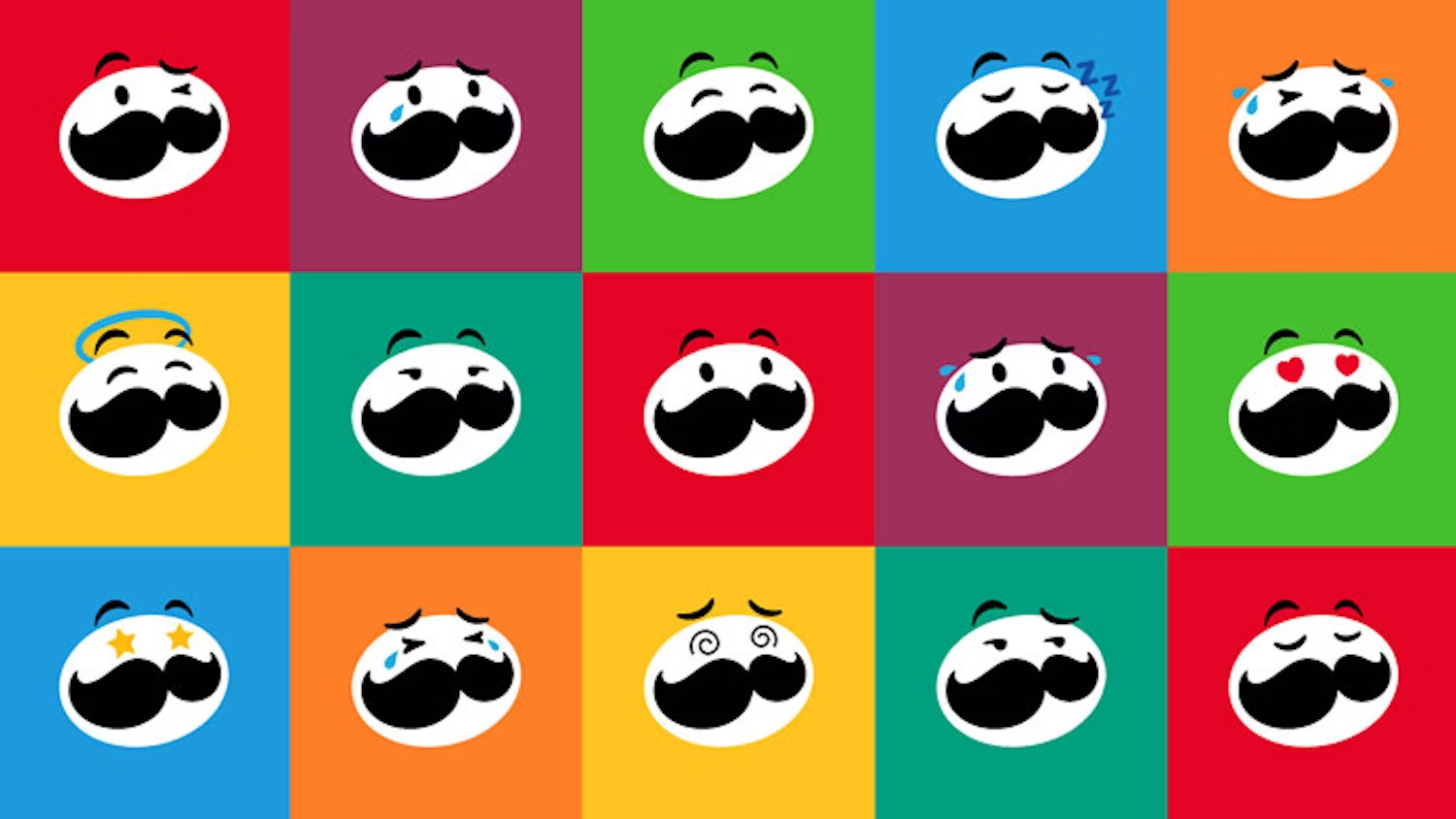
Case Study 4: Pringles
In 2020, Pringles introduced a refreshed brand identity, modernizing its iconic Mr. Pringle mascot with a sleeker and simplified design. The refreshed look featured bolder colors, a more expressive face, and an updated logo. This refresh aimed to align the brand with modern packaging trends while retaining the playful spirit that Pringles is known for, appealing to both nostalgic and new consumers.
Case Study 5: Instagram
Instagram’s 2016 brand refresh marked a bold departure from its vintage camera icon. The new logo featured a minimalist, gradient design that better aligned with the app’s vibrant, creative community. This refresh not only modernized the brand but also unified Instagram’s family of apps under a cohesive visual identity. By embracing simplicity and color, Instagram effectively elevated its branding to match its status as a global platform for creativity and self-expression, driving user engagement and solidifying its place in the social media landscape.


Case Study 6: Burger King
When discussing effective brand refresh examples, Burger King’s 2021 redesign prominently stands out. The fast-food giant revisited its retro roots, unveiling a new logo that harkens back to the brand’s iconic 1970s look. This refresh included a vibrant color palette, playful typography, and packaging that emphasized simplicity and freshness. The move aimed to better reflect Burger King’s commitment to real, quality ingredients. By blending nostalgia with a modern aesthetic, Burger King successfully reconnected with its audience, enhanced its digital presence, and differentiated itself in a highly competitive market.
Case Study 7: Burberry
Burberry’s 2018 brand refresh was a bold move that introduced a new sans-serif logo designed by Peter Saville, departing from the brand’s classic serif font. This contemporary refresh aimed to appeal to a younger, global audience while showcasing Burberry’s forward-thinking approach to fashion. The refresh also included a modern monogram pattern based on the initials of founder Thomas Burberry, which has since become a key design element across the brand’s collections.
Case Study 8: GoDaddy
GoDaddy’s 2020 brand refresh marked a significant transformation. The company shifted from its quirky, cartoonish logo to a sleek, modern wordmark paired with a heart-shaped “G” symbol. This refresh aimed to present GoDaddy as a trusted, customer-focused platform for entrepreneurs. The new design emphasized empowerment and creativity, reflecting the brand’s evolution from a domain registrar to a full-service business solutions provider. The updated branding successfully modernized GoDaddy’s image while maintaining its bold, recognizable presence.
Case Study 9: BMW
In 2020, BMW unveiled a new flat logo design as part of a brand refresh aimed at digital platforms. The new logo features a transparent outer ring, signifying openness and clarity. This minimalist approach reflects BMW’s focus on innovation and sustainability while maintaining its core identity. The refreshed logo emphasizes adaptability across digital media, aligning with the brand’s future-oriented vision.
Case Study 10: Hostess Brands
Your favorite tasty treats will look a little different in 2025! In December 2024, Hostess Brands announced a comprehensive refresh of its visual identity, including a new logo and packaging design for its beloved snacks like Donettes, Twinkies, CupCakes, and Ding Dongs. The updated logo retains the classic heart symbol but introduces a more playful font and brighter color palette, aiming to modernize the brand and appeal to younger generations. The packaging now features enhanced product photography and descriptions, ensuring clarity and attractiveness on store shelves. This initiative reflects Hostess’s dedication to evolving with consumer preferences while preserving the joy and nostalgia associated with its products.
Ready for a refresh?
We can help! Book a call or take our 17 question Brand Tactical Assessment and we’ll send you a personalized report.
Book a Call Take the QuizLessons Learned from Successful Brand Refresh Examples
In today’s market, staying relevant is crucial, and many companies turn to brand refreshes to rejuvenate their identity and connect with consumers anew. Successful brand refresh examples highlight key strategies and lessons learned that can be applied across various industries. Notably, brands like Airbnb and Dunkin’ have undertaken significant refreshes that not only modernized their visuals but also aligned their missions with current consumer values. For instance, Airbnb shifted its focus from merely providing accommodations to fostering belonging, thereby resonating deeper with its audience. Dunkin’, on the other hand, simplified its name from Dunkin’ Donuts to better emphasize its beverage offerings and appeal to a younger demographic. These brand refresh examples underscore the importance of understanding your audience, leveraging modern design trends, and ensuring a consistent message across all platforms. By analyzing successful brand refreshes, companies can glean vital insights into how to effectively evolve without losing their core identity.
Visual Soldiers
Visual Soldiers is an Atlanta-based creative studio specializing in branding, design & digital experiences.
