January 14, 2026
Ultimate Guide to Cross-Platform Design Consistency
-
Visual Soldiers
- Branding
- minute read
Ultimate Guide to Cross-Platform Design Consistency
Cross-platform design consistency ensures a unified user experience across devices like websites, iOS, and Android apps. It strengthens brand identity by standardizing visuals, navigation, and interactions while respecting platform-specific guidelines. Companies like Spotify and Airbnb excel at this by maintaining familiar designs across platforms.
To achieve this, focus on:
- Visual Consistency: Unified colors, typography, and layouts.
- Functional Consistency: Features like search or checkout work similarly across devices.
- Interaction Consistency: Predictable gestures and feedback tailored to input methods.
A strong design system, including design tokens, component libraries, and clear documentation, is key. Tools like Storybook and Percy streamline implementation and testing, while collaboration across teams ensures smooth execution. Regular audits and governance maintain consistency as businesses scale.
For U.S. companies, agencies like Visual Soldiers help unify branding across apps, websites, and tools, ensuring compliance with accessibility standards and regional needs. Consistent design builds trust, reduces errors, and enhances user satisfaction.
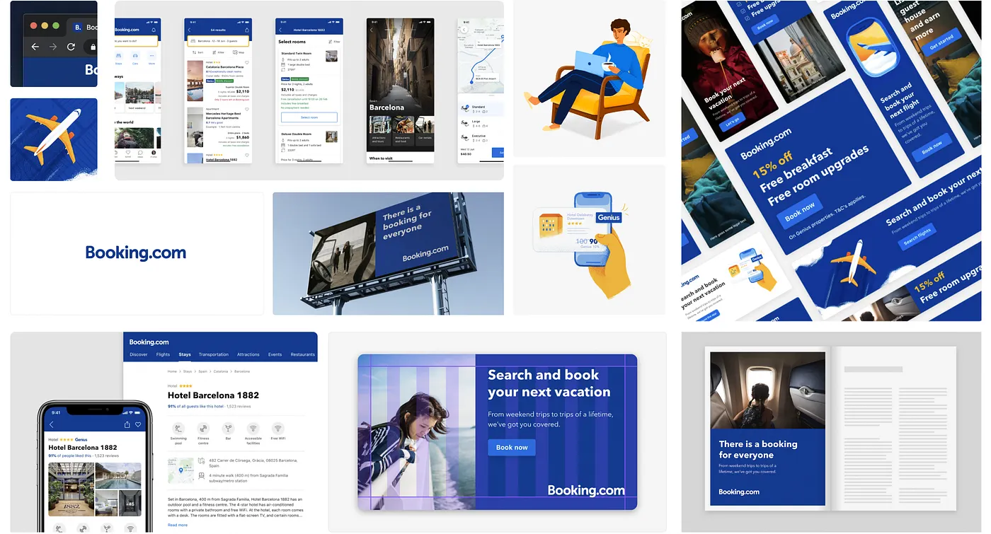
Multi-platform design system at Booking.com
Core Principles of Cross-Platform Consistency
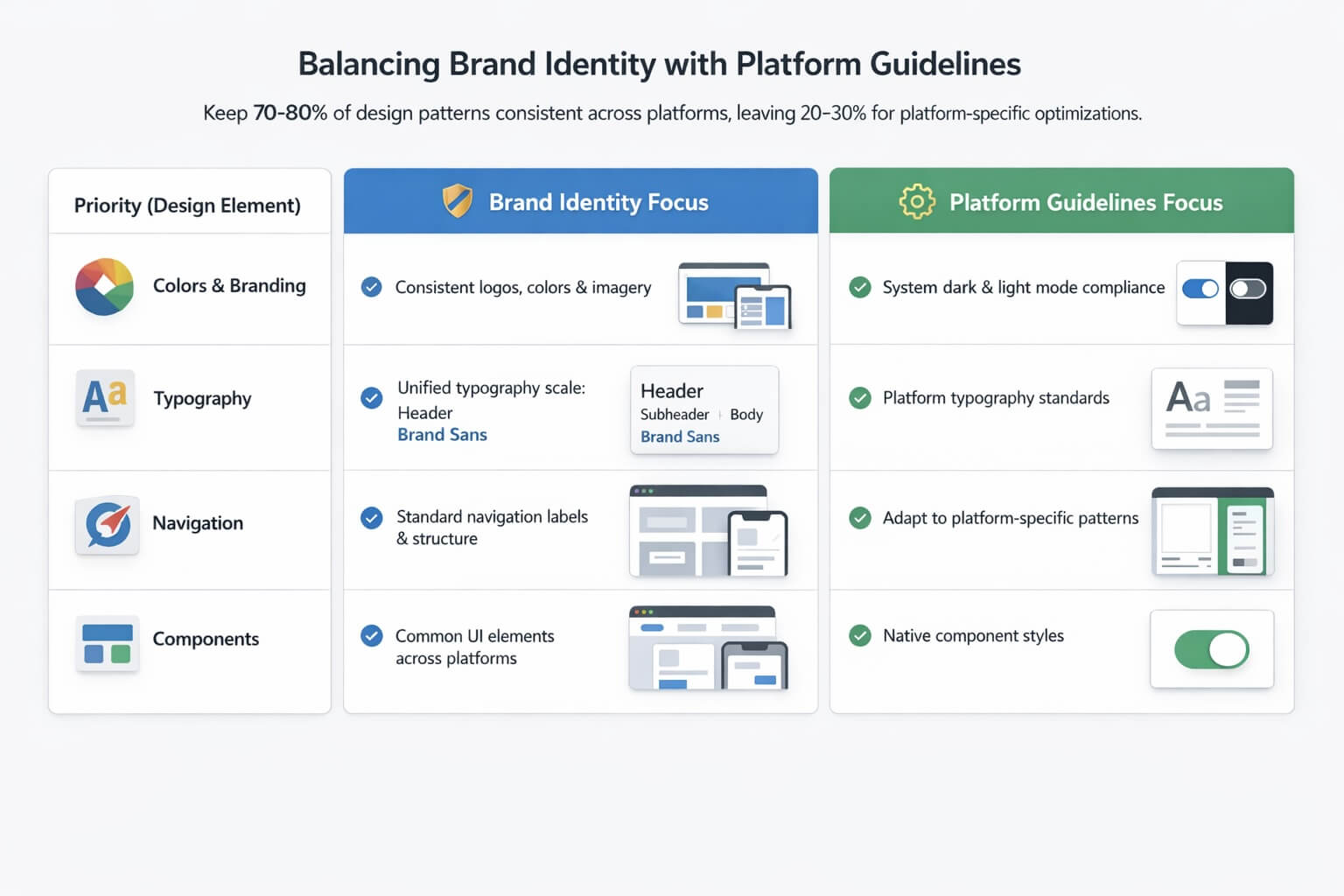
Balancing Brand Identity with Platform-Specific Design Guidelines
Creating a seamless user experience across devices relies on three key principles: visual, functional, and interaction consistency. Each of these plays a distinct role in ensuring users feel at home, no matter which platform they’re using.
Visual consistency is all about maintaining a unified look – colors, typography, spacing, and layouts should stay the same across mobile devices, tablets, and desktops. This ensures users can instantly recognize your brand. Functional consistency focuses on behaviors. Core features like checkout processes or search functions should operate the same way, so users don’t need to relearn them when switching devices. Finally, interaction consistency ensures that interactions – like button responses, gestures, or feedback – are predictable and intuitive, even when tailored for specific inputs like touchscreens or mouse clicks.
Research backs this up: maintaining visual consistency can boost task completion speeds by 25% and lower user errors. Additionally, efficient design systems can save 20–50% of design and development time. Together, these principles reduce cognitive load, making it easier for users to carry their skills seamlessly across platforms.
Visual, Functional, and Interaction Consistency
-
✓
Visual consistency
lays the groundwork for brand recognition. Take Spotify, for instance - it keeps its brand colors, typography, and playlist layouts consistent across platforms. This is often achieved through centralized design tokens, which act as a single source of truth for visual elements like colors, type scales, and spacing.
-
✓
Functional consistency
ensures users encounter familiar behaviors no matter the device. Think of Airbnb’s booking flow - it works the same way whether you’re on a phone or a desktop, even though the layout adapts to different screen sizes. By focusing on key features like search, navigation, and account management, users can easily transition between devices without confusion.
-
✓
Interaction consistency
builds trust by ensuring predictable responses. For example, Spotify’s music controls behave intuitively across platforms. On mobile, users swipe and tap, while on desktop, they click or use keyboard shortcuts. Although the input methods vary, the underlying logic remains consistent, ensuring users feel confident navigating the platform.
Balancing Brand Identity with Platform Guidelines
Once you’ve established these core design principles, the next step is integrating platform-specific conventions. The goal isn’t to choose between your brand identity and platform guidelines – it’s to blend them. For instance, Apple’s Human Interface Guidelines emphasize natural gestures and clarity for iOS, while Material Design on Android focuses on card-based layouts with motion and elevation. These frameworks help ensure your app feels native to each platform.
The key is layering your approach. Respect platform-specific navigation structures and controls while infusing your brand through elements like colors, typography, and imagery. Airbnb is a great example: it adapts its layouts to align with platform standards while preserving its distinct visual style and core functionality.
A practical rule of thumb is to keep 70–80% of design patterns consistent across platforms, leaving 20–30% for platform-specific optimizations. This approach maintains brand cohesion while ensuring usability aligns with user expectations for each platform.
Here’s a quick breakdown of how to balance brand identity with platform-specific requirements:
| Priority | Brand Identity Focus | Platform Guidelines Focus |
|---|---|---|
| Colors & Branding | Maintain consistent brand colors, logo usage, and imagery style | Ensure contrast, accessibility, and compliance with system dark/light modes |
| Typography | Use a consistent type scale and hierarchy that reflects your brand personality | Follow platform typography guidelines for legibility and readability |
| Navigation | Keep consistent section naming and information architecture (e.g., "Home", "Search") | Adapt to platform-specific patterns (e.g., iOS bottom tabs, Android navigation drawer) |
| Components | Use the same component concepts (e.g., buttons, cards, modals) across platforms | Adjust styles and placement to align with native expectations (e.g., iOS vs. Material switches) |
Next, we’ll explore how design systems can help enforce these principles effectively.
Design Systems for Cross-Platform Consistency
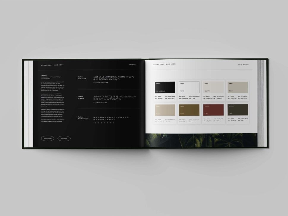
A well-designed system is the backbone of maintaining brand consistency across multiple platforms. At its core, a design system is a dynamic framework that includes design tokens, component libraries, and detailed documentation. Think of it as a shared language that bridges the gap between designers, developers, and product teams, ensuring a seamless user experience whether someone is using iOS, Android, or a web browser.
One of the biggest advantages of design systems is their ability to scale. They take the guesswork out of design decisions and save valuable development time. Instead of designers having to tweak colors or spacing for every platform, a structured system ensures these choices are made once and implemented universally. This efficiency not only simplifies workflows but also ensures that users experience the same cohesive design, no matter where they interact with your brand. Let’s dive into the essential components that make a design system effective.
Design Tokens and Component Libraries
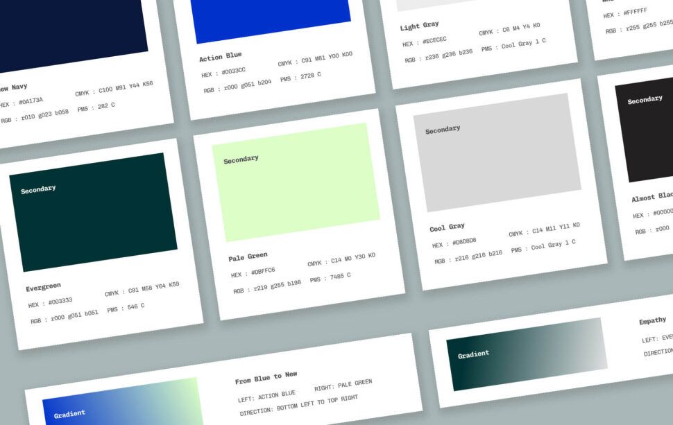
Design tokens are the foundation of any design system, while component libraries bring these tokens to life through reusable, functional UI elements. Tokens are centralized variables that define the core elements of a design – like colors, typography, spacing, and animations. They act as a single source of truth for design decisions, ensuring consistency across all platforms.
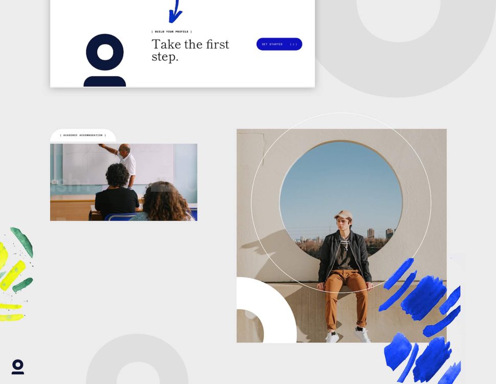
Component libraries build on this foundation by offering pre-built UI elements, such as buttons, forms, and navigation bars, that maintain a uniform appearance and behavior across platforms. Unlike static design files, these components are integrated with code, making them ready for developers to use directly in projects. Tools like Storybook allow teams to test and share these components in isolation, ensuring they work as intended. For example, Spotify uses this approach to deliver consistent playlist controls and navigation across mobile and desktop, adapting layouts for different screen sizes while keeping interactions familiar.
A great real-world example is Booking.com’s Design API. They use design tokens to maintain unified styling across devices. Their Asset Service manages icons and other visual elements centrally, allowing updates to propagate automatically across platforms without requiring manual syncing from individual teams. This centralized approach improves collaboration and creates a seamless user experience.
UI Style Guides and Documentation
UI style guides serve as the instruction manual for using the design system’s building blocks. They outline everything from visual identity and layout rules to responsive breakpoints and interaction patterns, giving teams a clear roadmap for maintaining consistency. These guides are especially important for adapting components to different screen sizes and platform-specific conventions.
Effective documentation goes beyond listing rules – it provides context, examples, and actionable guidance for edge cases. Tools like Zeroheight help teams centralize this documentation, making it easy to access the latest guidelines and track version histories.
For documentation to be truly useful, it should include visual examples of components in various states, specify responsive breakpoints (like 320px for mobile, 768px for tablets, and 1,024px for desktops), and offer platform-specific adaptations. For instance, a button might need a slightly different corner radius or shadow on iOS versus Android, but it should still align with the brand’s overall visual identity. Clear, detailed guidelines like these prevent inconsistencies and speed up implementation across platforms. With these tools and strategies in place, achieving cross-platform consistency becomes far more manageable.
Tools and Processes for Implementation
Achieving a unified cross-platform design requires the right tools and workflows. Implementing a design system that seamlessly connects design, product, and engineering teams ensures consistency becomes a practical reality rather than just an idea. This involves selecting tools that promote collaboration, setting up clear handoff processes, and rigorously testing designs across devices.
Tools for Maintaining Consistency
The right tools make it possible to maintain consistency across platforms, even at scale. For instance, design and prototyping software like UXPin integrates components with code, ensuring prototypes match what developers will ultimately build. This eliminates the common disconnect between design files and their implementation in code. Similarly, component development platforms such as Storybook allow developers to create and test UI components in isolation. This ensures that elements like buttons, forms, and navigation menus function uniformly before being incorporated into the larger application.
Testing tools are equally vital. Visual regression tools like Percy and Chromatic automate the process of identifying inconsistencies across devices. Percy integrates with CI/CD pipelines to run automated tests, while Chromatic focuses on Storybook components, catching visual discrepancies before they make it to production.
| Tool Category | Examples | Key Benefits |
|---|---|---|
| Prototyping Software | UXPin | Code-integrated components for consistent prototyping |
| Component Platforms | Storybook | Isolated development and testing |
| Documentation | Zeroheight | Shared guidelines and examples |
| Testing Tools | Percy, Chromatic | Automated visual regression testing |
These tools lay the groundwork, but collaboration and proactive testing are what truly bring their benefits to life.
Cross-Functional Collaboration
Collaboration across teams is essential for successful implementation. Design handoffs using interactive prototypes ensure engineers are involved early, helping to identify technical constraints before designs are finalized. A great example is Booking.com, where teams collaborate from the outset to ensure design tokens and components work across platforms.
Implementation reviews via pull requests in tools like Storybook allow developers to preview components and provide feedback before changes are merged. This feedback loop catches potential issues early on. Centralized repositories with version control also ensure updates – such as changes to buttons or icons – are automatically applied across platforms, reducing manual errors.
Regular audits and clear ownership of specific components or sections of the design system keep things running smoothly. Assigning responsibility ensures inconsistencies are resolved quickly. Monitoring metrics like the time it takes to fix inconsistencies helps gauge the system’s overall performance.
Once collaboration is in place, rigorous testing ensures designs perform consistently across devices.
Testing for Multi-Device Consistency
Thorough testing is critical for identifying issues with layout, interaction, and accessibility. Responsive design testing ensures layouts adapt to various screen sizes, while usability testing on real devices provides insight into how interactions feel in practice. Combining responsive and adaptive design strategies allows for platform-specific optimizations without sacrificing core functionality.
Accessibility audits guided by WCAG standards, along with tools like Lighthouse, help ensure designs are inclusive and functional for all users, regardless of ability. Visual regression tools add another layer of quality control by capturing screenshots across devices and browsers, flagging pixel-level changes that might indicate inconsistencies. Measuring success through metrics like fewer inconsistency reports, faster resolution times, and high pass rates in automated testing pipelines shows that your quality control processes are scaling effectively.
With these tools and processes in place, maintaining cross-platform consistency becomes a manageable and repeatable practice.
Maintaining and Scaling Design Consistency
Governance and Maintenance of Design Systems
Design systems thrive when there’s clear ownership. A common strategy involves setting up centralized governance with a dedicated team to enforce standards. Alternatively, some organizations adopt a decentralized model, where product teams contribute under the guidance of a central authority. Either way, this structure ensures accountability and helps minimize inconsistencies as the system evolves.
To keep things running smoothly, regular audits and strong version control are essential. These practices ensure updated design tokens are applied automatically and any inconsistencies are caught early. Metrics like the frequency of inconsistency reports and the time taken to resolve them can shed light on how well your governance is working. By monitoring these numbers, teams can quickly identify and address bottlenecks. Tools like Zeroheight also play a key role by offering clear documentation, usage guidelines, and evolving examples that support consistent implementation.
With this governance framework in place, your design system can remain stable and effective over time, continuing to deliver on its promise as your organization grows.
Scaling Across Multiple Products and Teams
Once a strong governance structure is in place, scaling design consistency across products becomes more manageable. Centralized resources, like shared repositories, enable seamless updates to components across multiple products, cutting down on the need for manual coordination. For example, Airbnb ensures a unified experience across its app and website by focusing on core functions like search, maintaining consistency where it matters most.
To keep expanding teams aligned, shared guidelines, training sessions, and early cross-functional workshops are key. These efforts help prevent technical hiccups and ensure everyone is on the same page. Design tokens make it possible to adapt designs regionally while still preserving core brand elements and adhering to platform-specific requirements. Additionally, usability testing and automated visual regression tools catch potential issues at scale before they impact users.
This approach not only supports consistency across multiple products but also accommodates growing teams and regional variations, all while maintaining the brand identity built in earlier stages.


Partnering with Visual Soldiers for Cross-Platform Consistency
Ultimate Guide to Cross-Platform Design Consistency
Visual Soldiers' Approach to Unified Design Systems
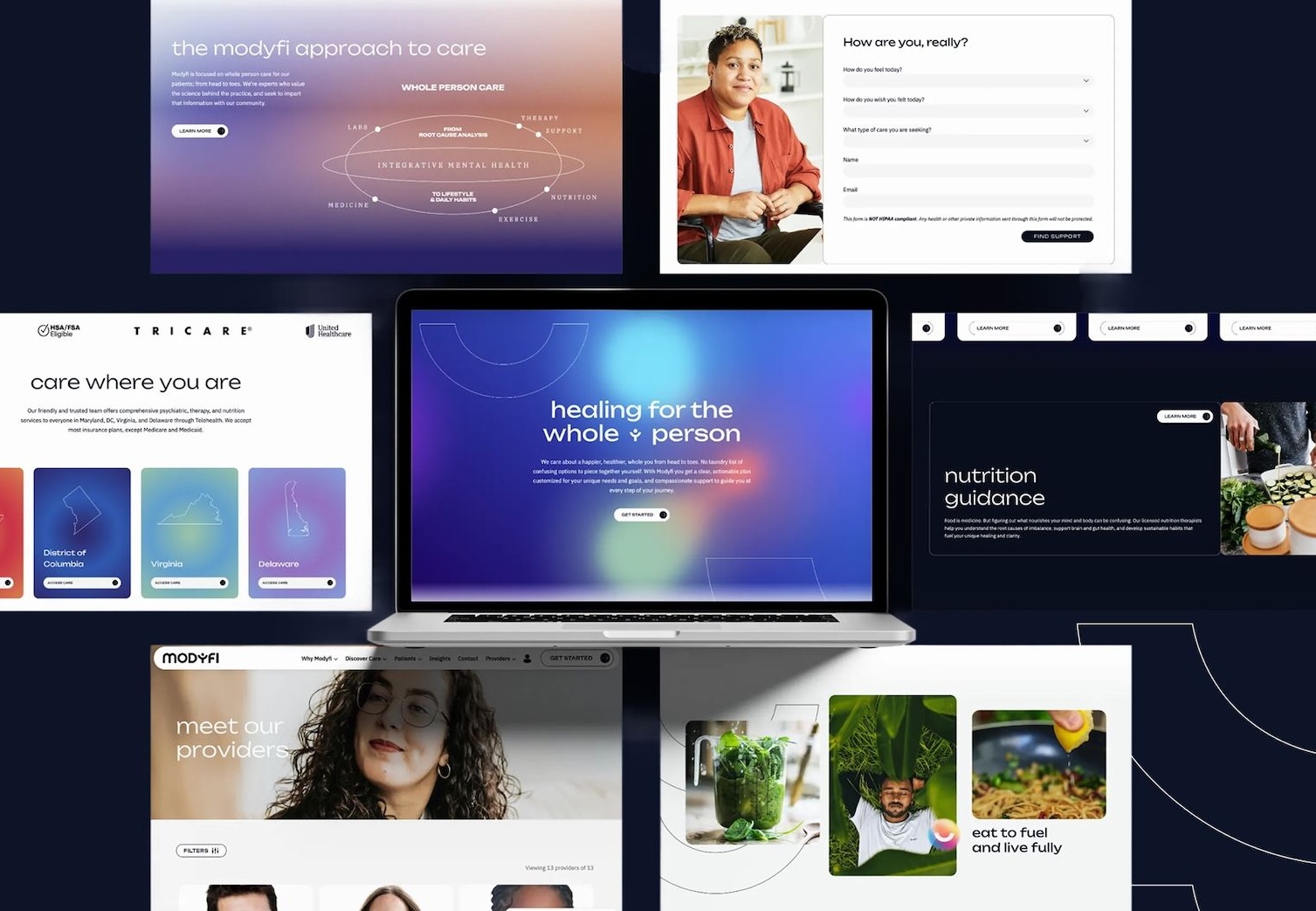
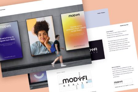
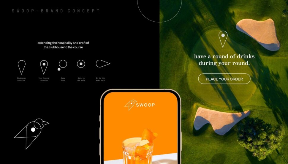
Visual Soldiers specializes in crafting unified design systems that bring together branding, UX/UI, and development across all digital platforms. Their process begins with a thorough discovery and audit phase, where they evaluate brand assets and UI patterns to identify inconsistencies. From there, they create design tokens and reusable components that ensure consistent behavior across platforms like web, iOS, and Android. This approach not only reflects the company’s identity but also aligns with its technical needs.
The team works closely with engineering departments to seamlessly integrate these systems into production workflows. This collaboration ensures updates are applied consistently, avoiding the need for manual adjustments. The result? A cohesive system that unifies branding, UX patterns, and implementation.

A big thank you to Visual Soldiers from the Kids in the Game team! They helped us through a major rebrand, helping us to take a fresh look at our industry, our company, our values, our personality, our messaging, and so on. We had high hopes for the project, and the team exceeded expectations. The whole process felt natural and never rushed, while their turnaround on deliverables was on time and kept the project moving along. Great people to work with and we look forward to continuing our partnership as we grow.
CEO of Kids in the Game
The end product is a dynamic design system that acts as a single source of truth. Teams no longer have to revisit basic design decisions with every new feature or campaign. For businesses in the U.S. managing marketing sites, native apps, and internal tools, this approach eliminates fragmented brand experiences and cuts down on rework, support issues, and inconsistent user journeys. It’s a streamlined solution that can adapt to regional market needs without compromising the brand’s integrity.
Custom Solutions for U.S.-Based Businesses
Visual Soldiers takes this process a step further by tailoring design systems to the unique needs of U.S. businesses. They incorporate conventions like currency formatting ($9,999.99), date structures (MM/DD/YYYY), and imperial measurement units directly into design tokens, components, and content guidelines. Accessibility is also a priority, with adherence to ADA and WCAG standards for color contrast, type sizing, and interaction targets, ensuring products meet the expectations of U.S. users.
They optimize customer-facing interactions, such as quick checkout processes, transparent pricing in USD, and clear tax disclosures. For B2B products, dashboards are designed with large desktop monitors in mind, while mobile-friendly versions cater to field teams.
Through their flexible agency model, Visual Soldiers provides businesses with access to top-tier design and development talent without the burden of hiring full-time staff. This makes it easier for organizations to maintain consistency across marketing materials, digital products, and branding as they grow. Whether it’s a retail brand unifying its e-commerce site, apps, and in-store kiosks, or a SaaS company consolidating multiple UI codebases, Visual Soldiers ensures the system remains scalable and well-governed. They establish ownership models, versioning protocols, audits, and contribution standards to prevent the system from drifting over time.

I’ve been working with Jeff & his team for more than 4 years now and they’ve become our design agency of choice for Tao Group Hospitality! We have a lot of exciting projects and websites in the pipeline and Visual Soldiers is designing them all. Their workflow is very simple and the communication is great. Can’t recommend them enough!
VP, Marketing | Tao Group Hospitality
Conclusion
Cross-platform design consistency isn’t just about making things look good – it’s about earning trust and loyalty by delivering smooth, intuitive experiences across every device. When navigation, interactions, and branding stay consistent on mobile, desktop, and web, users don’t have to waste time figuring out how to use your product. Companies like Spotify and Airbnb are prime examples of how cohesive design can boost user engagement and satisfaction.
The key to achieving this lies in a strong foundation: design systems built with tokens, component libraries, and clear documentation. These act as a single source of truth for your team. As design expert Jina Anne explains:
“Design tokens are a single source of truth for design decisions that can be used across any platform or tool”.
Pairing this foundation with the right tools – such as Storybook for collaboration and Percy for testing – creates a scalable system that reduces inconsistencies and keeps your designs on track.
Long-term success also depends on governance and collaboration. Regular audits, version control, and teamwork across different departments ensure your design system evolves alongside your business. Booking.com’s use of design tokens and a cross-platform Design API demonstrates how this approach improves both internal collaboration and the user experience. Such a collaborative framework also allows for adjustments that cater to regional market preferences.
For businesses in the U.S., Visual Soldiers offers tailored support to help maintain design consistency as you grow. Their flexible agency model connects you with top-tier design and development talent without the need for full-time hires. This makes it easier to keep your digital products consistent and user-friendly, no matter how much your business expands.
FAQs
Design tokens serve as a centralized reference for essential design elements such as colors, typography, spacing, and sizing. By standardizing these components, they help maintain a consistent visual style across various platforms and devices.
With design tokens, updates become more straightforward, and inconsistencies are minimized. This ensures your brand’s visual identity stays intact while providing a smooth and cohesive user experience. They’re an effective way to build design systems that are both scalable and efficient.
Design systems play a crucial role in maintaining a consistent brand identity across different platforms. By standardizing elements such as color schemes, fonts, and layouts, they ensure everything looks and feels unified. This consistency strengthens brand recognition and builds trust with your audience.
Beyond aesthetics, design systems make teamwork smoother. They provide a clear set of guidelines, making it easier for teams to collaborate without confusion. The result? Fewer inconsistencies and a seamless experience for users across every digital and physical interaction.
To ensure your brand identity remains intact across various platforms, focus on maintaining key elements like your logo, color palette, and tone of voice. These features help establish a consistent and recognizable presence, fostering trust and familiarity with your audience.
At the same time, tailor your design to meet the specific guidelines and best practices of each platform. This might include adjusting layouts, navigation styles, or content formatting. By doing so, you can improve the user experience while staying true to your brand’s essence. Finding this balance ensures your brand appears unified and polished, no matter where your audience engages with it.
Visual Soldiers
Visual Soldiers is an Atlanta-based creative studio specializing in branding, design & digital experiences.
