October 20, 2025
Packaging Design: Print vs Digital Considerations
-
Visual Soldiers
- Design
- minute read
Packaging Design: Print vs Digital Considerations
Packaging design is about creating the right impression, whether on a store shelf or an online platform. Here’s the key takeaway: Print packaging excels in physical retail with its tactile appeal, while digital packaging thrives in e-commerce with flexibility and interactivity. Both have their strengths, but choosing the right approach depends on your audience, goals, and budget.
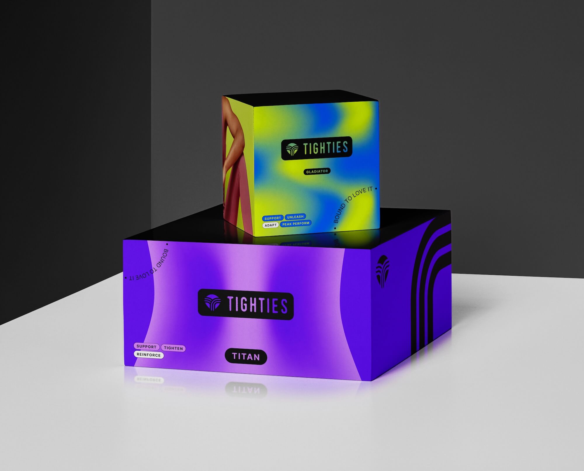
- Print Packaging: Known for high-end finishes (like embossing and foil), it offers a durable, physical experience but comes with higher costs and longer production times. Ideal for luxury products or consistent branding in stores.
- Digital Packaging: Focuses on screen optimization, quick updates, and interactive features like animations or AR. It’s cost-effective and better suited for e-commerce and fast-changing campaigns.
Quick Comparison
| Factor | Print Packaging | Digital Packaging |
|---|---|---|
| Cost | High upfront costs | Lower initial expenses |
| Flexibility | Limited; fixed once printed | High; supports easy updates |
| Color Accuracy | Reliable with proper calibration | Varies across screens |
| Interaction | Physical, sensory experience | Interactive animations, AR |
| Scalability | Expensive at scale | Easy and cost-efficient |
| Timeline | Longer production cycles | Faster design-to-launch |
To decide, focus on your audience’s preferences and your product’s needs. Print works well for premium markets, while digital is ideal for e-commerce and dynamic branding. A mix of both can maximize impact.
Lithography VS Digital Printing | Custom Packaging | Manufacturing
Material and Production Requirements
Creating packaging for print and digital platforms requires different materials and production approaches.
Print packaging uses tangible materials like paperboard, corrugated cardboard, and rigid boxes. Each material serves a specific purpose: paperboard provides a smooth surface ideal for high-quality printing, while corrugated cardboard offers durability and strength. These material choices directly impact the printing techniques and finishing options available, ensuring the final product balances visual appeal with functionality.
On the other hand, digital packaging assets are crafted exclusively for online platforms and digital interfaces. Designers focus on creating digital mockups and assets tailored for websites, mobile apps, and social media. Here, the priorities shift from physical durability to factors like screen resolution and color calibration. Designs must be optimized for various digital environments, which influences how they’re produced and refined.
Another key difference lies in production timelines. Print packaging requires more time for planning and execution, while digital assets allow for quicker updates and easier scalability. These distinctions in material and production processes naturally lead us to the next critical topic: color accuracy and resolution standards across these mediums.
Color and Resolution Standards
When it comes to packaging, color accuracy and resolution standards vary significantly between print and digital formats.
For print packaging, the CMYK color model (Cyan, Magenta, Yellow, Key/Black) is the go-to standard. This subtractive method layers tiny dots of ink to create colors. However, CMYK can only replicate about 40% of Pantone colors, which limits its ability to produce vibrant hues. To address this, designers often rely on the Pantone Matching System (PMS) for consistent, pre-mixed colors across different print jobs and materials. It’s worth noting that the type of paper used can also affect color vibrancy – coated paper reflects about 20% more vibrancy, while uncoated paper absorbs up to 30% more ink, which can dull the final look.
On the other hand, digital design prioritizes screen-based precision. Digital assets use the RGB color model along with hex codes for exact color definitions. Since RGB colors can’t be directly printed, converting designs from digital to print can sometimes lead to a loss of vibrancy. For instance, Photoshop’s automatic conversion process can reduce vibrancy by as much as 15%.
Resolution requirements also differ. For print, clarity demands a minimum of 300 DPI (dots per inch), whereas digital designs depend on pixel dimensions tailored to various screen densities.
Recent advancements are starting to narrow the gap between print and digital challenges. For example, Pantone’s LIVE ecosystem now synchronizes colors across fabrics, plastics, and digital screens, speeding up approval processes by 40%. Additionally, new compostable stocks with Pantone certification are set to debut in early 2024, offering sustainable materials that maintain accurate colors.
Trends also play a key role in packaging design. The annual Pantone Color of the Year heavily influences branding choices. In 2023, Viva Magenta (PMS 18-1750) took center stage, while earthy neutrals and eco-conscious designs are expected to gain traction moving forward. Understanding these nuances in color and resolution is essential for creating a cohesive and impactful brand presence across both print and digital platforms.
User Experience and Interaction Methods
When it comes to user experience, the tactile qualities of print packaging and the dynamic features of digital formats create distinct ways to engage users and connect with brands. Each medium brings its own strengths to the table.
Print packaging thrives on physical interactions and sensory appeal. The unboxing experience becomes a storytelling moment, with premium materials, unique textures, and finishes like soft-touch coatings or embossed logos adding to the overall impression. These tactile details create a connection that digital formats can’t replicate.
The weight and dimensions of a package also play a role in shaping perceptions. For instance, a matte finish might communicate elegance, while a glossy finish can suggest vibrancy or freshness. Beyond aesthetics, the layered design of print packaging – flaps to open, seals to peel, or compartments to explore – adds depth to the user experience.
Digital packaging, on the other hand, leverages interactivity to draw users in. Features like animations, clickable elements, and hover effects provide instant feedback and make navigation intuitive. Video integration takes it a step further, offering product demonstrations, 360-degree views, or even augmented reality experiences. These tools allow users to engage with products in ways that static images simply can’t match.
Accessibility is a key consideration for digital experiences. To meet ADA standards, digital packaging must include features like alt text, appropriate color contrasts (around 4.5:1), keyboard-friendly navigation, and screen reader compatibility. Keeping these elements in mind ensures that the content is usable for a broader audience.
Another critical factor is performance. Fast loading times are essential, so optimizing images, compressing videos, and streamlining interactive features help keep users engaged. Mobile optimization is equally important, as more users rely on their phones to interact with digital content. Real-time personalization – such as location-based recommendations, tailored promotions, or local store availability – further enhances the experience by making it feel relevant and immediate.
Both print and digital formats share a need for a consistent brand voice and clear visual hierarchy, though they achieve this differently. Print relies on physical cues like texture, size, and placement to guide attention, while digital uses elements like color transitions, animations, and interactive feedback to create engaging journeys. Up next, we’ll dive into the tools and techniques that make these experiences possible.

Design Tools and Methods
Creating effective print and digital packaging design involves specialized tools and techniques that enhance both creativity and efficiency.
Print packaging design relies on Adobe’s Creative Suite as the go-to toolkit. Adobe Illustrator is indispensable for crafting vector-based graphics and logos, while Adobe InDesign shines in layout-heavy projects, especially those requiring precise typography and multi-page coordination. These tools handle CMYK color spaces, spot colors, and essential print-specific features like bleeds, crop marks, and dieline creation. For image editing and working with high-resolution photography or intricate visual effects, Adobe Photoshop completes the lineup. Together, these tools ensure precision and minimize errors throughout the production process.
Print workflows demand meticulous planning since post-production changes can be expensive. However, digital printing has transformed prototyping, allowing designers to produce high-quality samples quickly and affordably without needing printing plates. These prototypes help validate everything from structural integrity to visual impact and user experience before moving into full-scale production.
On the other hand, digital packaging design focuses on speed, adaptability, and collaboration. Tools like Figma have gained popularity for enabling real-time teamwork and seamless version control. Adobe XD offers strong prototyping features for creating interactive mockups, while Sketch is preferred for its user-friendly interface and extensive plugin options. These tools are ideal for crafting responsive designs that adjust to various screen sizes and incorporate animations, transitions, and micro-interactions to enhance user engagement.
Prototyping methods differ significantly between print and digital mediums. Print design often involves physical prototypes, allowing designers to test and refine concepts iteratively, reducing errors and saving resources in the long term. Meanwhile, digital workflows benefit from tools like 3D rendering and dieline development, which help visualize designs before committing to physical production.
Collaboration and version control are essential for digital packaging workflows. Tools such as InVision, Marvel, and Zeplin streamline feedback collection and ensure smooth transitions between teams. These platforms make it easier to manage revisions and maintain consistency throughout the design process.
Personalization is another area where these mediums diverge. Digital tools can integrate dynamic content systems, enabling real-time customization based on user data, location, or preferences. While print packaging offers fewer options, it can still use variable data printing to personalize text, images, or promotional elements like QR codes.
Many designers now adopt hybrid approaches, blending tools from both domains to optimize workflows. For example, initial sketches might start in Procreate or Adobe Fresco, move to Illustrator for refinement, be prototyped in Figma, and finally prepared for production using software like ArtiosCAD for structural design or Esko for managing print production.
Ultimately, the choice of tools depends on the project’s requirements, team dynamics, and deadlines. By combining traditional and digital methods, designers can create cohesive and impactful brand experiences.


Pros and Cons
When deciding between print and digital packaging, understanding their strengths and limitations can help you align your choices with your goals, budget, and timeline. Each has its own perks and challenges that can shape your design strategy. Here’s a breakdown to make the comparison clearer.
Print packaging offers a physical, high-end experience. Its tactile qualities allow for sophisticated finishes like embossing, foil stamping, and specialty coatings – things digital formats can’t replicate. It also provides consistent color reproduction when properly calibrated, ensuring your brand colors stay true. However, print often demands higher upfront costs, longer production timelines, and minimal flexibility for last-minute changes.
Digital packaging, on the other hand, is more flexible and budget-friendly. It supports rapid updates, multi-variation testing, and personalization without the need for reprinting. Digital formats can also include interactive elements like animations or augmented reality to boost engagement. That said, color accuracy can vary across devices, and consistent display quality isn’t always guaranteed.
| Factor | Print Packaging | Digital Packaging |
|---|---|---|
| Initial Cost | High, due to setup and production investments | Lower, with fewer upfront expenses |
| Flexibility | Limited; changes require a new production run | High; supports quick updates and modifications |
| Quality Control | Reliable when calibrated for precise color | May vary across devices and platforms |
| Scalability | Costly as volume increases | Easily scaled with minimal added cost |
| Interaction Options | Tactile, physical experiences | Interactive features like animations or AR |
| Environmental Impact | Higher, due to materials and shipping | Lower, with reduced physical waste |
| Timeline | Longer production cycles | Faster turnaround from design to deployment |
| Personalization | Limited to static variations | Real-time, dynamic customization |
Costs and Flexibility
Print packaging requires a substantial financial commitment upfront, while digital options typically have lower initial costs. Flexibility is another key difference – print designs are locked in once production starts, making changes expensive and time-consuming. Digital formats, however, allow for iterative updates, such as A/B testing or seasonal adjustments, with ease.
Quality and Environmental Considerations
Print excels in delivering high-resolution visuals and precise color matching using systems like Pantone. Digital packaging, while dynamic, can struggle with consistent color accuracy due to varying screen resolutions and devices. On the environmental side, print generates physical waste and consumes more resources, while digital has a smaller material footprint but still relies on energy-intensive digital infrastructure.
Scalability and Interaction
Scaling up print packaging means higher costs for materials, production, and shipping. In contrast, digital packaging can be distributed globally with little additional expense. Interaction also sets them apart – print engages through tactile experiences like texture and weight, while digital introduces features like augmented reality, product customization tools, and social media integrations.
Finding the Right Balance
Smart brands often combine both methods to maximize their impact. For example, premium print packaging might be reserved for flagship products, while digital solutions are ideal for seasonal campaigns or markets needing quick turnarounds.
When choosing between these options, think about your audience’s preferences. Luxury consumers may lean toward the premium feel of print, while tech-savvy shoppers might appreciate the adaptability and interactivity of digital formats.
Conclusion
Deciding between print and digital packaging design comes down to finding what works best for your specific needs. Each option offers distinct benefits that cater to different business objectives and customer preferences.
Print packaging is ideal for premium markets, luxury products, or when consistent branding in physical retail spaces is key. It delivers a tactile, high-end experience that can leave a lasting impression and help establish a strong presence in upscale markets.
On the other hand, digital packaging is the go-to choice when flexibility, speed, and cost savings are important. It’s particularly well-suited for e-commerce brands, seasonal promotions, or businesses experimenting with various approaches. The dynamic and interactive nature of digital packaging makes it especially appealing to tech-savvy consumers and direct-to-consumer brands. Combining the strengths of both approaches can create a well-rounded strategy that boosts brand performance.
A hybrid approach, blending print’s premium quality with digital’s adaptability, allows you to tailor campaigns effectively while keeping costs manageable. This strategy ensures you can meet diverse customer expectations without compromising on quality or efficiency.
To make the right choice, focus on three critical factors: your audience’s preferences, your budget, and your timeline. As we’ve explored earlier, print delivers a luxurious, hands-on experience, while digital offers versatile and interactive solutions. With U.S. consumers increasingly valuing both quality and convenience, understanding whether your audience prioritizes the tangible appeal of print or the engaging features of digital will help guide your decision.
Ultimately, your packaging design should align with your brand identity. Whether you choose print, digital, or a mix of both, your packaging must clearly communicate your brand’s values and meet your customers’ expectations in an increasingly competitive market.
FAQs
When deciding between print and digital packaging, it’s all about what suits your product and goals best. Print packaging shines when you’re dealing with large production runs or designs that demand high-quality finishes, like foil stamping or spot UV effects. It’s a smart choice for bulk orders, thanks to its cost efficiency and ability to deliver vibrant colors with precise details.
On the flip side, digital packaging is the go-to option for smaller-scale needs, such as e-commerce products, prototypes, or personalized designs. It’s known for its quick turnaround times, lower minimum order requirements, and flexibility to adapt to frequent updates or customizations.
To make the right choice, think about your budget, the size of your order, and how much customization your packaging requires. Each option has its strengths, so it’s all about finding the best fit for your brand’s needs.
One of the biggest hurdles in getting colors to look just right when moving from digital screens to print lies in the difference between color models. Screens operate on the RGB color model, which can produce a broader range of colors. On the other hand, printers use the CMYK model, which has a smaller color range. This often means that some of the vibrant hues you see on your screen might not replicate exactly when printed.
Another tricky part is maintaining consistent color calibration across different devices and printers. Factors like monitor settings, the type of printing equipment, and even the materials used can alter how colors appear. To reduce these inconsistencies, it’s crucial to work with calibrated monitors, rely on high-quality proofs, and use standardized color profiles such as the Pantone Matching System (PMS) to achieve more accurate color matching.
Combining print and digital methods in packaging design lets your brand tap into the strengths of both techniques. Digital printing works best for small batches, quick turnarounds, and adapting to trends or seasonal campaigns. It offers flexibility and keeps costs manageable. Meanwhile, offset printing delivers top-notch quality and precise color accuracy, which is crucial for maintaining a polished and consistent brand image.
A blended approach can be a game-changer. Use digital printing for prototypes or limited-edition runs, and rely on offset printing for large-scale production. This strategy keeps you nimble while ensuring your packaging maintains high-quality standards, boosting both the practicality and appeal of your brand.
Visual Soldiers
Visual Soldiers is an Atlanta-based creative studio specializing in branding, design & digital experiences.