Micro Branding Guide for Startups
Quick Summary
Micro branding is a streamlined approach to creating a consistent brand image without needing a comprehensive brand system. It's about focusing on a few essential brand elements that are most visible to the audience and ensuring they are used consistently. This method is particularly useful when time and budget are limited, and only a few marketing channels are important. A micro branding kit should be kept minimal, typically including a logo, two to four colors, one or two fonts, voice guidelines, and templates for posts and emails. It's crucial that the logo is versatile enough to be effective even at small sizes, such as 16x16 pixels. Additionally, setting up social media templates for common aspect ratios, like 1:1 and 4:5, ensures a uniform look across different platforms.
You do not need a big brand system to look clear and consistent. I’d sum up micro branding like this: pick the few brand parts people see most, make them match, and use them the same way every time.
Here’s the short version:
- I’d use micro branding when time is short, budget is tight, and only a few channels matter
- I’d keep the kit small: logo, 2–4 colors, 1–2 fonts, voice rules, and post/email templates
- I’d make sure the logo still works at 16×16 pixels
- I’d set social templates for 1:1, 4:5, and 9:16 formats
- I’d write simple microcopy for buttons, errors, and confirmations
- I’d track early results with engagement, click-through rate, traffic, and conversion rate
- I’d move to a larger brand system when there are more products, more team members, or more markets
A small brand kit can go a long way. For many startups, solo operators, and product launches, spending $2,000 to $5,000 on the right brand basics can do more than a much larger system that gets used unevenly.
What matters most is not how many files I make. It’s whether the same look and tone show up across a landing page, social post, email header, product label, and profile image.
If I were reading this article for answers fast, here’s what I’d want to know upfront:
- What it is: a stripped-down brand system for high-use touchpoints
- What it includes: visual rules, writing rules, and ready-to-use templates
- Where it works best: MVPs, personal brands, one-product launches, and short campaigns
- How to build it: start with one goal, one message, and the few assets I’ll use first
- How to measure it: check consistency and look at weekly, monthly, and quarterly performance
This article explains how to build that small system, where it fits best, and how to tell when it’s time to go beyond it.
What Micro Branding Is and Why It Has Business Value
Micro branding helps a business look credible and consistent fast on the few channels that matter most. The idea is simple: build ONLY the assets you need right now, then use them well. That means logos, social assets, packaging details, and microcopy that give people a clear, steady impression from the start.
This matters most for startups, personal brands, and small launches that need to look polished on a limited budget.
Micro branding is about speed, focus, and early credibility. A full brand identity is built for broader, long-term positioning.
It also keeps teams aligned. If a small team, a freelance designer, or a marketing partner is working from the same compact brand kit, the output stays consistent. That saves time and cuts down on the back-and-forth that often slows small projects.
What Micro Branding Includes
The core assets in a micro brand are intentionally limited. It starts with a simple logo mark that still works at small sizes, including a favicon. Then you set two to four exact HEX color codes, one or two typefaces, and 3–5 voice rules that shape your copy tone.
On the production side, micro branding also means having reusable templates for the formats you use. Think 9:16 and 1:1 posts. If those are your main formats, build for them first and use them to ship content fast.
| Element | Micro Brand Requirement | Purpose |
|---|---|---|
| Logo | Simple mark + favicon | Recognition at small sizes |
| Colors | 2–4 precise HEX codes | Emotional resonance and consistent recognition |
| Fonts | 1–2 sans-serif families | Readability on mobile and small digital surfaces |
| Copy | 3–5 personality adjectives | Consistent voice across social and interface microcopy |
| Templates | 9:16 and 1:1 aspect ratios | Fast content production for Reels, Stories, and Feeds |
This is not about building a huge asset library. It’s about choosing a small set of rules you can repeat without drift.
How Small Touchpoints Build Recognition
Repeated colors, marks, and voice cues train recognition across small surfaces. That matters even more in digital spaces, where attention is short and people scroll fast.
A repeated visual pattern across a handful of touchpoints usually does more than a sprawling brand system used inconsistently. In plain English: discipline beats volume when you’re working at a small scale.
That recognition comes from a few repeatable visual and verbal rules, not a giant pile of files.
Where Micro Branding Works Best
Micro branding works best when your scope is defined, your channels are known, and your goal is fast recognition, not a full market repositioning.
Use micro branding when your offer, platform, and launch window are already clear. In that setup, a compact brand system can do a lot of heavy lifting without turning into a long, expensive brand project.
Those repeatable rules are the next step.

The Core Elements of a Micro Brand System
A micro brand system works when a small set of brand rules shows up the same way across every touchpoint.
| Element | Why it matters | Recognition value |
|---|---|---|
| Logo rule | Instant visual identifier at any size | High |
| Color rule | Consistency and emotional connection | High |
| Type rule | Readability and tone | Medium |
| Voice rule | Personality and trust | High |
| Social rule | Consistency and speed | High |
| Packaging rule | Unboxing experience and recall | Medium |
Start with what people notice first: logo, color, and type.
Logo, Color, and Typography That Work at Small Sizes
Your logo has to work at 16×16 pixels, which is the size of a browser favicon. That’s tiny. So skip thin strokes, tiny details, and cramped spacing. A clean mark or wordmark with strong contrast is the starting point. Many U.S. startups use two versions: a full horizontal logo and a compact icon or monogram built for circular social avatars and app icons.
For color, keep it simple: one primary color, one neutral, and one accent. A 60–30–10 split works well, with neutrals taking up most of the layout, the primary color grounding main brand areas, and the accent saved for buttons and badges. And yes, contrast matters. If text or icons get hard to read on a small screen, the system starts to fall apart fast.
For type, use one display face and one easy-to-read body face. Set a small scale for H1, H2, body, and button text, then use it the same way across your site and email templates. In most cases, 2–3 typefaces are enough.
Once the visual rules are in place, the next step is the language people interact with.
Microcopy and Voice Rules
Microcopy is where brand personality shows up in day-to-day use. Button labels, helper text, error messages, confirmations, and empty states may seem small, but they’re often the lines users read most closely. Those little moments shape whether your brand feels warm, clear, or stiff.
You don’t need a huge document to set the tone. A one-page voice guide is enough to start. Pick 3–5 voice descriptors, add a short do/don’t list, and show a few before-and-after rewrites for common copy situations. Then build a small phrase library with one example for each:
- CTA: Get started
- Error: Something went wrong. Please try again or contact support.
- Confirmation: You’re all set – thanks for joining us.
For buttons, use a verb + outcome structure instead of vague labels like Submit or OK. That way, the action feels clearer. Over time, this phrase library becomes the go-to reference when someone writes social copy, an email, or a product UI label.
Then bring those same rules into the templates people see most often.
Social, Email, and Packaging Assets to Standardize
Use the same system across social, email, and packaging so each touchpoint feels connected.
For social, standardize 3–6 post templates along with profile and cover images. Lock in the basics: logo placement, headline style, color use, and CTA area. Build for the sizes you already use most – 1080×1080 px or 1080×1350 px for feed posts, and 1080×1920 px for Stories and Reels. Then you can swap text and images without starting over each time.
Email branding is simpler than it sounds. Keep a consistent header, a set footer, and a signature block with contact details, social icons, and an unsubscribe link. Use fonts that work well across inboxes, and keep line length easy to read on mobile.
Physical touchpoints matter too, especially for product-based brands. A logo sticker, a colored strip, and a short thank-you insert with the same voice can make the unboxing feel more memorable. Something like Packed with care in [City, State] – thanks for supporting a small business ties the offline experience back to the brand people saw online.

When to Use Micro Branding Instead of a Full Brand Build
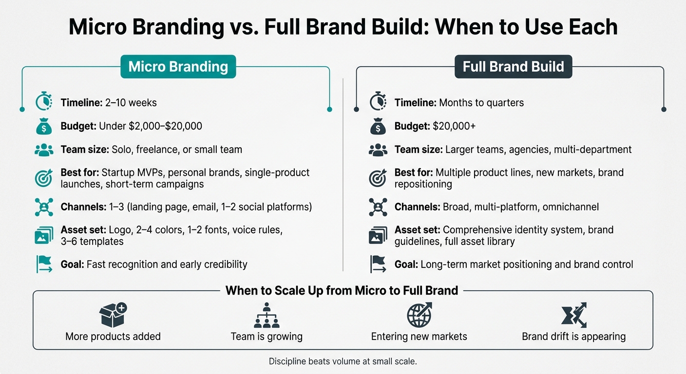
Micro Branding vs. Full Brand Build: When to Use Each
Once the core pieces are set, the next step is simple: figure out fit.
Use micro branding when the scope is narrow, time is short, money is tight, and only a small number of channels matter. Go with a full brand build when the offer, audience, or channel mix is broader.
That choice shapes which touchpoints need the most care.
| Use Case | Timeline | Budget Level | Recommended Asset Set | Typical U.S. Channels |
|---|---|---|---|---|
| Startup MVP | 4–6 weeks | Low (often under $2,000–$5,000) | Logo, palette, type, landing page, pitch deck, sales sheet, onboarding emails | Landing page, LinkedIn, email, one or two social channels |
| Personal Brand / Expert | 2–4 weeks | Low (DIY to freelance) | Logo or monogram, profile image, banner, newsletter header, lead magnet cover, email signature | LinkedIn, X, Substack, YouTube |
| Single-Product Launch | 6–10 weeks | Moderate ($5,000–$20,000) | Product name, secondary logo lockup, accent color or pattern, ecommerce product page, packaging, ad templates | Amazon, Shopify, paid social ads |
| Campaign-Based Marketing | 3–8 weeks | Variable | Campaign landing page, ad variants, email sequence, event graphics | Meta Ads, email, event pages, local print |
Startup Launches, MVPs, and Early Traction Stages
At the pre-seed or seed stage, micro branding helps a company look polished enough to win the meeting without pulling time away from product work.
At this point, the asset set should stay lean: a logo system or wordmark, a 2–3 color palette, a typography pair, a landing page, a pitch deck, and onboarding and confirmation emails. The nice part is that these pieces can do double duty. Deck slides can turn into sales one-pagers, landing page visuals can show up again in emails, and the logo mark can work as an app icon or social avatar. That keeps the look steady without pushing up costs.
Personal Brands, Niche Offers, and Single-Product Initiatives
For consultants, creators, and subject-matter experts, recognition often comes from seeing the same visual cues again and again across a small set of touchpoints. A matching headshot, LinkedIn banner, newsletter header, and lead magnet cover can help people connect the dots faster.
The same idea applies to messaging. A short positioning statement used across website bios, email signatures, and social profiles can strengthen how your expertise comes across without forcing a full redo of your content plan. If you’re working on a niche product or sub-brand, add a separate accent color, a product lockup, and a few templates for the product page and ads, while still leaning on the parent brand’s core system.
Short-Term Campaigns and Signs You Need More Than a Micro Brand
Short-term campaigns tend to work best when the same small set of visual rules shows up across every asset. Seasonal promos, event launches, and local market pushes are a good fit for a campaign kit: an accent color or graphic motif added to the current brand and used the same way across social ad sets, email sequences, and event pages.
In most cases, three to five reusable templates are enough. Think a hero image layout, an offer highlight, and a countdown reminder. That usually covers the full campaign run without forcing the team to rebuild assets every time.
Still, micro branding only goes so far. Once you add multiple product lines, more people making content, or new markets that call for tighter brand control, a larger identity system starts to make more sense. That shift in scope shapes the next kit you build.
How to Build and Measure a Micro Branding System
Set Goals, Messaging, and Priority Touchpoints
Start small. Pick one objective, one positioning sentence, one value statement, and 3–4 messaging pillars.
That gives you a tight system instead of a messy one.
From there, choose the touchpoints that matter most right now, like a landing page, pitch deck, welcome email, or product label. The goal is to keep the system focused and easy to use. Stick to touchpoints you already plan to launch so you’re not making extra work for no reason.
Assemble a Launch-Ready Micro Brand Kit
A micro brand kit should be small, usable, and easy to repeat. Here are the minimum launch items and what each one does in the system.
| Deliverable | Launch-Ready Details |
|---|---|
| Logo files + icon variations | Export as SVG, PNG (transparent), and favicon ICO; name files by size and use case (e.g., logo-icon-32px.png) |
| Color palette references | Save as HEX, RGB, and CMYK values in a single reference sheet; include usage notes (primary, neutral, accent) |
| Typography rules | Document font names, weights, and sizes for H1, H2, body, and button; include web-safe fallbacks |
| Social media templates | Build at 1080×1080 px and 1080×1920 px; lock logo placement, color zones, and CTA area before distributing |
| Email header styles | Set fixed pixel width (600 px standard); include logo, brand color band, and fallback font stack |
| Pitch deck cover design | Save as editable source file; lock brand colors, typeface, and logo position; export as PDF for sharing |
| Microcopy pattern library | List approved CTA labels, error messages, and confirmation lines; include one do/don't example per pattern |
| Packaging or merchandise specs | Document print-ready file format, bleed size, color mode (CMYK), and approved logo placement zone |
Think of this kit as your brand’s grab-and-go bag. If someone on your team needs to make a post, send an email, or prep a deck, they shouldn’t have to guess.
Measure Recognition, Consistency, and Early Performance
After launch, track the signals tied to the touchpoints in your kit. Don’t measure everything. Measure what maps to what you actually shipped.
| Review Frequency | Metrics | When to Revise |
|---|---|---|
| Weekly | Social media engagement (likes, shares); email click-through rates | Engagement is flat or declining, or clicks stay low |
| Monthly | Website traffic trends; brand mentions; landing page conversion rates | Traffic growth stalls, mentions stay limited, or conversions lag |
| Quarterly | Visual consistency audit; customer feedback/reviews; team efficiency metrics | Assets feel inconsistent, feedback is mixed, or the team is spending too much time recreating work |
| Biannually | Competitive positioning analysis; brand recall surveys | The brand no longer feels clearly differentiated, or recall remains low |
Review the same assets side by side so drift is easy to spot. A quarterly visual consistency audit works well for this. Pull recent social posts, email headers, landing page screenshots, and packaging samples into one place, then compare them against the kit.
If those pieces don’t look like they came from the same brand, tighten the system before you put more money into distribution or try to reach more people.
Big Brands Start With Smart Foundations. Let's Build Yours.
We help ambitious businesses turn ideas into impactful brand experiences. From strategic positioning and logo design to comprehensive identity systems, digital experiences, and ongoing creative support, we build brands designed to stand out and evolve alongside your business.
Book a Discovery CallFAQs
Micro branding focuses on a small set of high-impact touchpoints, like logos, color, typography, social assets, packaging details, and microcopy, to build recognition and consistency within a narrower scope.
A full brand system goes further. It includes standards and guidelines that tie visual and messaging elements together across more channels and interactions.
Start with your brand foundation: your mission statement, core values, value proposition, and target audience.
Then lock in the basics: a simple, memorable logo, a steady color palette, a clean typography system, and a clear tone of voice. These pieces help keep your brand easy to recognize and steady across key touchpoints.
It’s often time to move past micro branding when your business starts to grow, change direction, or step into new markets.
A few signs tend to stand out:
- You’re launching new product lines
- You’re going after different audiences
- Your team or customers are running into brand inconsistencies that create confusion
If engagement starts to dip, or feedback shows your brand no longer lines up with your goals, that’s a strong sign you may need a more structured design system.
A review of your brand guidelines every 12 to 18 months can help you spot these shifts early and get ready before small issues turn into bigger ones.

Visual Soldiers
Visual Soldiers is an Atlanta-based creative studio specializing in branding, design & digital experiences.