September 9, 2026
Inclusive Design Principles for Web Accessibility
-
Visual Soldiers
- Web Development
- minute read
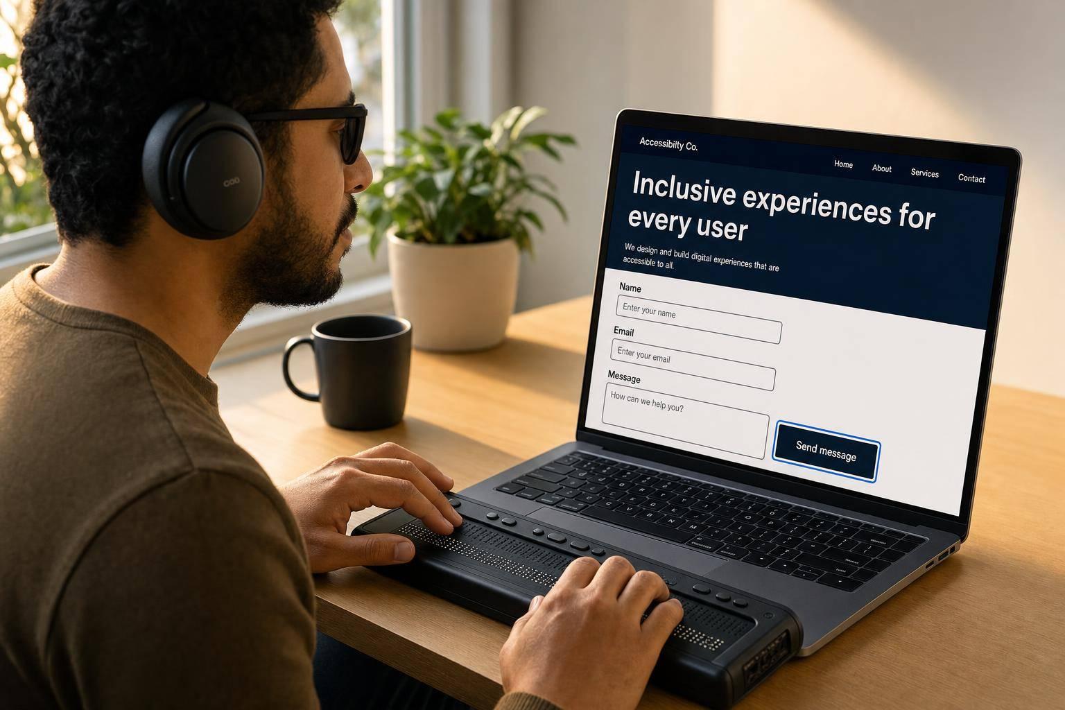
Inclusive Design Principles for Web Accessibility
Quick Summary
The article highlights ongoing issues with website accessibility, noting that as of 2026, a significant 95.9% of home pages had detectable failures according to WCAG 2 standards. Additionally, there were 3,117 website accessibility lawsuits in U.S. federal courts in 2025. The main takeaway is the importance of building websites with accessibility in mind from the start. This involves testing with disabled users and applying the POUR principles—Perceivable, Operable, Understandable, and Robust—to ensure each page, form, and feature is accessible. Key elements for accessibility include providing clear labels, strong contrast, and ensuring keyboard navigability.
If I had to sum up the article in one plain answer, it’s this: build for access from the start, test with disabled users, and use POUR – Perceivable, Operable, Understandable, and Robust – as a simple check for every page, form, and feature. That means clear labels, strong contrast, keyboard access, captions, semantic HTML, and fewer patterns that make tasks harder.
Here’s the short version:
- Accessibility, usability, and inclusive design are not the same thing. Accessibility is about equal access. Usability is about ease of use. Inclusive design is the process of reducing exclusion early.
- Common web patterns still shut people out. The big ones are color-only cues, low-contrast text, hidden focus states, small tap targets, weak form labels, auto-play, and custom widgets that fail on keyboard.
- POUR gives teams a simple review method.
- Perceivable: people can see, hear, or otherwise get the content
- Operable: people can use the site without a mouse
- Understandable: people can follow what’s happening and fix mistakes
- Robust: code works with browsers and assistive tech
- Good fixes help more than one group. Better headings, simpler forms, visible errors, progress steps, and less motion can help people with disabilities, mobile users, older adults, and people under stress.
- Testing matters. Automated tools only catch part of the problem. Manual keyboard checks, screen reader testing, and user testing with disabled participants show what scans miss.
- This should happen across the whole product process. Set WCAG goals in planning, document accessible components in design, build with semantic HTML in development, test before launch, and audit every 6 to 12 months.
Bottom line: if you want more people to finish forms, check out, sign up, and use your site without friction, accessibility has to be part of how the site gets made – not something you try to patch later.
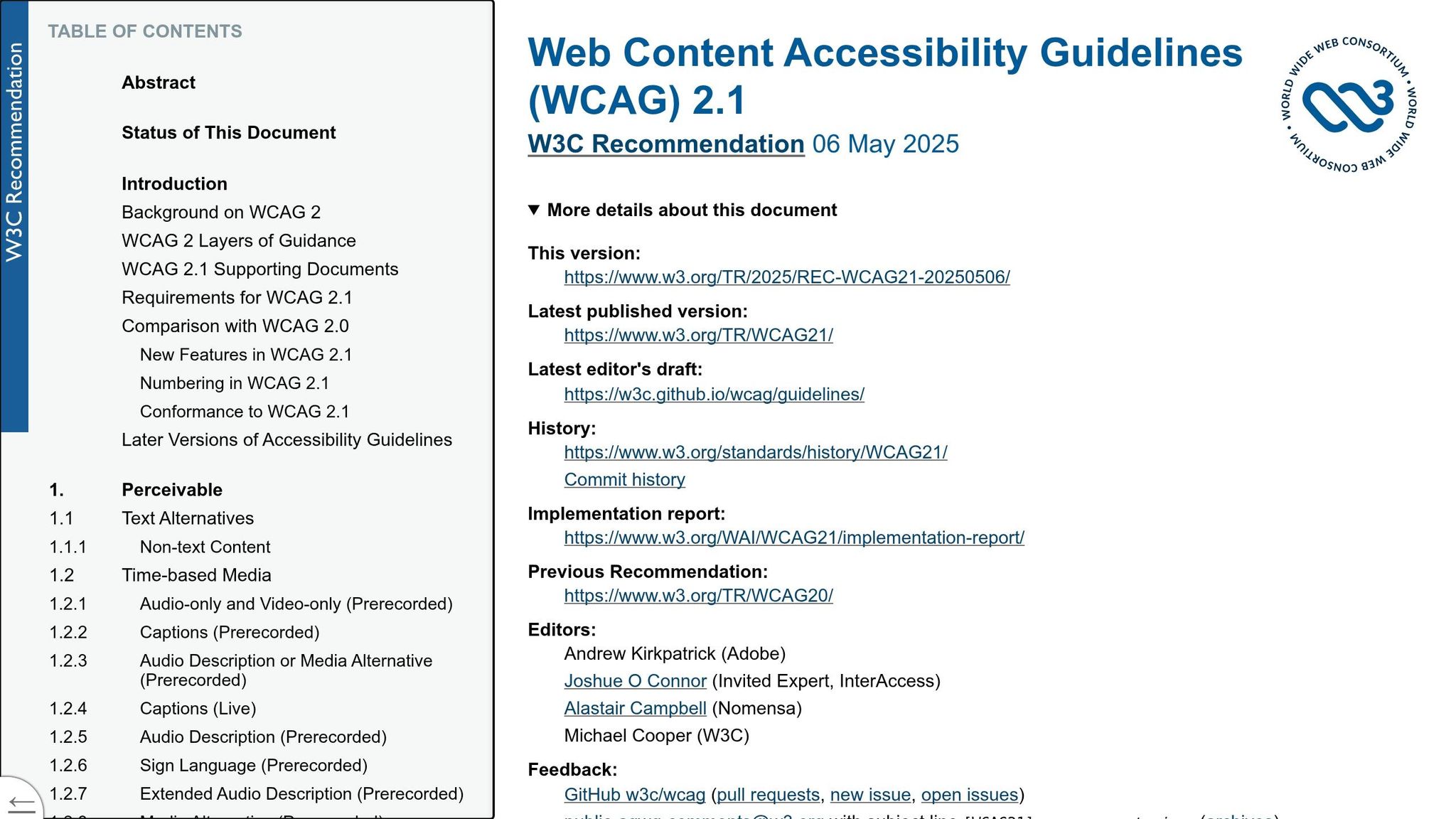
Core Principles That Reduce Exclusion in Web Design
Once you define inclusive design, the next move is to spot the patterns that shut people out. Most of the time, exclusion isn’t intentional. It shows up when a team designs for an assumed “average” user and never stops to question who that leaves out.
Microsoft’s inclusive design framework points to three ideas: spot exclusion, learn from different users, and fix one barrier well enough to help many. Those ideas help teams catch problems before launch. POUR turns them into practical design checks.
How Common Web Patterns Exclude Users
A lot of exclusion comes from ordinary patterns on everyday marketing and brand sites. WebAIM’s 2026 scan of one million home pages found that 95.9% had detectable WCAG 2 failures, with an average of 56.1 errors per page, up from 94.8% the year before.
Some of the biggest offenders are simple things that get missed all the time:
- Color-only cues
- Low-contrast text
- Hidden focus states
- Small tap targets
Each one can block people with low vision, color vision deficiencies, or limited motor control. And the trouble doesn’t stop there. Auto-playing carousels, multi-step forms with no progress indicators, and custom widgets that don’t work with a keyboard add mental strain and can stop users with cognitive disabilities from finishing a task. They also trip up plenty of other people.
Real user testing is what shows which of these patterns actually block tasks.
Learn from Diverse Users to Improve Experiences for Everyone
Automated scans catch a real, but narrow, set of issues. Nielsen Norman Group says testing with people who have disabilities is the only reliable way to tell whether a design is both accessible and usable. Tools can’t spot everything. They miss broken interaction paths, confusing error messages, and navigation flows that pass technical checks but still fall apart in practice.
For example, a user with low vision might point out that a dense pricing table is hard to scan. The fix could be clearer headings, better contrast, and more white space. That change also helps a rushed mobile user or someone dealing with mental overload. The same thing happens with forms: if you simplify a multi-step flow to reduce cognitive strain, it often becomes faster and easier for everyone.
That’s the “fix one barrier well enough to help many” idea in action. Solve for one group, and the upside often spreads far beyond that group. That’s why user testing should be part of every design cycle.
Give Users Equitable and Comparable Experiences
Equitable means each user can finish the same task without losing access to key content or function. Keyboard, screen reader, and touch paths can all work, but the end result needs to be comparable.
In practice, that means clearly labeling every form field instead of leaning on placeholder text that disappears on focus. It means writing error messages that say what went wrong and how to fix it. It also means making sure filters, modals, and other interactive elements work fully without a mouse. Use familiar U.S. formats like MM/DD/YYYY and $1,200.00, and spell them out in labels.
| Common Exclusion Pattern | Most Affected | Fix |
|---|---|---|
| Color-only error indicators | Color-blind users, dim screens | Pair color with text labels or icons |
| Low-contrast body text | Low vision, older adults, bright-light mobile users | Meet WCAG AA contrast minimums in design phase |
| Hidden keyboard focus styles | Keyboard and switch-device users | Design custom, brand-aligned focus indicators |
| Small or crowded tap targets | Motor impairments, mobile users | Increase size and spacing of interactive controls |
| Placeholder-only form labels | Screen reader users, cognitive disabilities | Use persistent visible labels above every field |

Applying the POUR Framework to UX and UI Decisions
Those exclusion patterns – color-only cues, hidden focus, keyboard traps, and weak labels – tie straight back to POUR at the component level. This isn’t something you check at the very end with a scan. POUR has to shape each component decision as you build.
Perceivable and Operable Interfaces
Every image needs an alt attribute. For images that carry meaning, write alt text that says what matters. For decorative images, use empty alt="" so screen readers can skip them. For video, captions are required for prerecorded content. Transcripts help people who are deaf or hard of hearing, and they also apply to audio content like podcasts.
For readability, use 16px body text, 1.5 line spacing, and at least a 4.5:1 contrast ratio for normal text. Large text needs at least 3:1. Keep line lengths under 80 characters, and never turn off pinch-to-zoom on responsive layouts.
Every interactive element – menus, modals, carousels, accordions – needs to work with a keyboard alone. That includes Tab, Shift+Tab, Enter, Space, and arrow keys. Add a “Skip to main content” link at the top of each page. If you replace the browser’s default outline, swap it with a custom focus ring or background change that’s just as visible. Don’t hide focus. Touch targets should be at least 44×44 CSS pixels.
Once people can reach the controls, the next step is simple: can they tell what those controls do?
Understandable and Robust Implementations
Understandable interfaces use plain language and familiar patterns. Keep navigation labels the same in wording and position across every page. Button text should tell users what happens next – “Schedule a demo” or “Download the report (PDF, 2 MB)” – instead of fuzzy copy like “Click here.” Put inline error text near the field that caused the problem, and make sure assistive tech announces it.
Robust code starts with semantic HTML. Use <button> for actions, <a> for navigation, and native form controls for inputs. That way, assistive tech gets the same structure sighted users do. Use ARIA only when native HTML can’t supply the needed role, state, or label. Then test across the tools and browsers people use: NVDA, JAWS, and VoiceOver on Chrome, Firefox, Safari, and Edge.
POUR Principles Mapped to Design Decisions
Use this quick map during design reviews.
| POUR Principle | What It Means on a Website | Concrete UX/UI Practice |
|---|---|---|
| Perceivable | Users can access all content regardless of how they sense it | Descriptive alt text on product images; captions on promotional videos; 4.5:1 contrast ratio for body text; logical <h1>–<h3> heading hierarchy on landing pages |
| Operable | All functionality works without a mouse | Keyboard access to menus, modals, and forms; visible custom focus indicators; "Skip to main content" link; 44×44px minimum tap targets |
| Understandable | Users can predict and recover from interactions | Clear form labels; inline error messages near the relevant field; consistent nav labels and placement across pages; descriptive CTA button text |
| Robust | Content works across browsers and assistive technologies | Semantic HTML elements over generic divs; ARIA used only where native HTML falls short; tested with NVDA, JAWS, and VoiceOver; valid, well-structured markup |
Designing for Cognitive, Sensory, and Motor Accessibility
The next step is turning POUR into the barriers people actually run into. POUR sets the standard. This section connects that standard to cognitive, sensory, and motor needs.
Cognitive and Neurodiversity Needs
Users with ADHD, dyslexia, autism, brain injury, or cognitive fatigue often move through interfaces in different ways. Dense paragraphs, busy layouts, and auto-playing elements add friction. That friction can push people to give up on a task, especially on mobile, where screen space is tight.
The aim is easier processing, not watered-down ideas. Plain language, active voice, and short paragraphs of 2–4 sentences help people scan, pause, and get back on track. Descriptive headings work like signposts. Consistent navigation helps too: same labels, same positions, on every page. That way, users don’t have to learn the layout all over again each time they land somewhere new.
Multi-step flows like checkout or account registration need extra care. Progress indicators and autosave can cut down mental fatigue. Error messages should tell people exactly what to fix. For example, Enter a 10-digit U.S. phone number, such as 404-555-1234 is much more useful than Invalid input. It’s also smart to remove nonessential motion, or let users control it, on checkout, signup, and similar pages. The prefers-reduced-motion CSS media query helps sites respect that setting at the system level.
These changes can lower abandonment in checkout, registration, and long forms.
Visual, Auditory, and Motor Needs
Visual accessibility is about more than contrast ratios. Low-vision users need text that can scale without breaking the layout. Error states and status cues shouldn’t depend on color alone. On dashboards and other data-heavy pages, charts need high-contrast lines, pattern fills, and text summaries of the main takeaways so the information stays readable no matter how someone sees color.
For auditory needs, sound should be paired with visible text cues for alerts and notifications. Status changes should never be shared by audio alone. This also helps people watching muted video on their phone.
Motor accessibility often comes down to keyboard access and time limits. Skip strict time limits when you can. If a session timeout is needed for security, show a clear warning and give users a way to extend the session before their data vanishes. Enough space between interactive elements helps prevent accidental taps, which matters a lot in forms where mistakes are costly. Mobile-friendly focus order and touch target size also matter for screen reader users.
User Needs Matched to Practical Website Changes
The table below matches each need to one practical website change.
| User Need Category | Inclusive Design Strategy |
|---|---|
| Cognitive load reduction | Short paragraphs, plain language, descriptive headings, and consistent navigation across all pages |
| Task completion support | Step-by-step flows with progress indicators, autosave, and confirmation screens before finalizing |
| Attention management | Limit auto-playing media and pop-ups on conversion pages; support prefers-reduced-motion |
| Users who need more time | No strict timeouts on forms; session extension warnings; no drag-only interactions without alternatives |
Building Inclusive Design into the Product Lifecycle
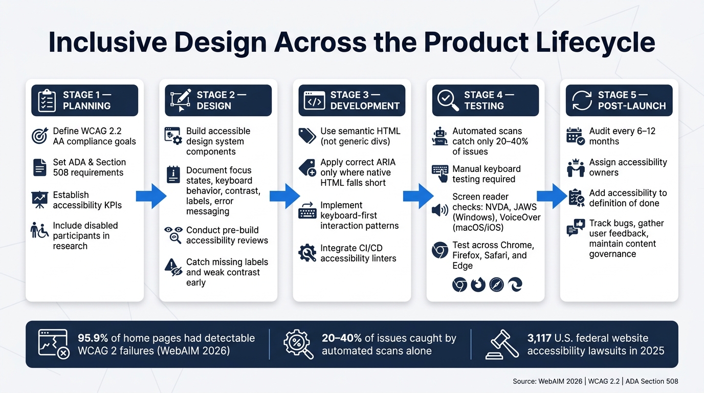
Inclusive Design Across the Product Lifecycle: WCAG Accessibility Checklist
Accessibility isn’t something you tack on at the end. It needs to run through the whole product lifecycle: planning, design, development, testing, and maintenance.
From Discovery to Launch
It starts by turning inclusive design into a clear project requirement.
During discovery, teams should set concrete goals, including WCAG 2.2 AA compliance, ADA and Section 508 requirements, and accessibility KPIs tied to task success. Teams should also bring disabled participants into the research process through local advocacy groups or disability research panels for interviews and task-based testing.
Those research findings should guide perceivable, operable, understandable, and robust decisions before any build work begins. Then those decisions need to feed into the design system. Every component – navigation menus, form fields, modal dialogs, and media players – should have documented accessibility specs before a developer writes a single line of code.
That documentation should spell out:
- Focus states
- Keyboard behavior
- Contrast
- Labels
- Error messaging
Pre-build reviews for menus, complex forms, and media can catch problems like missing labels or weak contrast while fixes are still less expensive.
Testing, Governance, and Continuous Improvement
No single testing method is enough.
Automated scans are fast, but they catch only 20% to 40% of real issues. Manual keyboard testing and screen reader checks are still needed to find the problems automated tools miss, including confusing link text, unlabeled icons, and focus traps inside interactive components. That means testing with NVDA or JAWS on Windows and VoiceOver on macOS and iOS.
After launch, teams should assign owners, add accessibility to the definition of done, and audit every 6 to 12 months. This stage-by-stage view helps keep accessibility from slipping once the site or product is live.
| Lifecycle Stage | Key Inclusive Design Activities |
|---|---|
| Planning | Define WCAG 2.2 AA goals, ADA/Section 508 requirements, KPIs, and budget |
| Design | Build accessible design system components with documented specs and conduct pre-build reviews |
| Development | Use semantic HTML, correct ARIA, keyboard-first patterns, and CI/CD accessibility linters |
| Testing | Run automated scans, manual keyboard tests, and screen reader checks (NVDA, JAWS, VoiceOver) |
| Post-Launch | Schedule periodic audits, track bugs, update the system, gather user feedback, and maintain content governance |
Visual Soldiers can support lifecycle accessibility work across UX strategy, accessible design systems, development, and audits – helping teams build these practices into their day-to-day process instead of treating them like one-off projects.
Build a better experience for everyone.
isual Soldiers creates accessible, high-performing digital experiences designed with inclusion from the start. Let’s build something better.
Book a Discovery Call Learn About ADA ComplianceConclusion: Key Principles to Carry Forward
Once teams make these practices routine, accessibility becomes part of how work gets done.
Inclusive design begins with a simple idea: notice who gets left out. From there, the POUR framework gives teams a steady way to make perceivable, operable, understandable, and robust decisions across design and development. Addressing cognitive, sensory, and motor needs isn’t a niche issue. It makes sites clearer, lowers friction, and makes the experience easier for everyone.
The organizations that get the strongest results treat accessibility as an ongoing quality attribute, not a one-time phase. A B2B technology company that improved performance and accessibility across roughly 4,200 pages saw 17% lower bounce rates and generated $7.2 million in additional annual operating profit. Accessible sites reduce friction, improve completion rates, and lower risk.
FAQs
Accessibility work needs to start at the beginning of a project, not get tacked on at the end. Bring it into discovery and design from day one.
Set clear accessibility goals, include people with disabilities in your user personas, and weave accessible design principles into your workflow early. That helps you avoid costly retrofitting and ship a product that’s functional, inclusive, and compliant.
Use a layered approach. Automated scans usually catch only 20%–50% of accessibility issues, so they shouldn’t be your only check.
Add manual testing too:
- Keyboard testing
- Screen reader checks
- Testing on physical devices
Most importantly, test with people who rely on assistive technologies. Watching them complete key tasks can reveal problems with usability, navigation, and cognitive load that automated tools often miss.
Start with the fixes that make the biggest difference.
Improve color contrast so text meets WCAG AA at 4.5:1 or higher. Add descriptive alt text for images that carry meaning. Make sure people can use the full site with a keyboard, and give focused elements a clear visible focus state. For forms, use clear labels and inline error messages so people know what each field needs and what went wrong.
After that, run automated audits with tools like axe or Lighthouse to catch common issues. Then do a short manual pass with a keyboard and a screen reader to spot anything the tools miss.

Visual Soldiers
Visual Soldiers is an Atlanta-based creative studio specializing in branding, design & digital experiences.