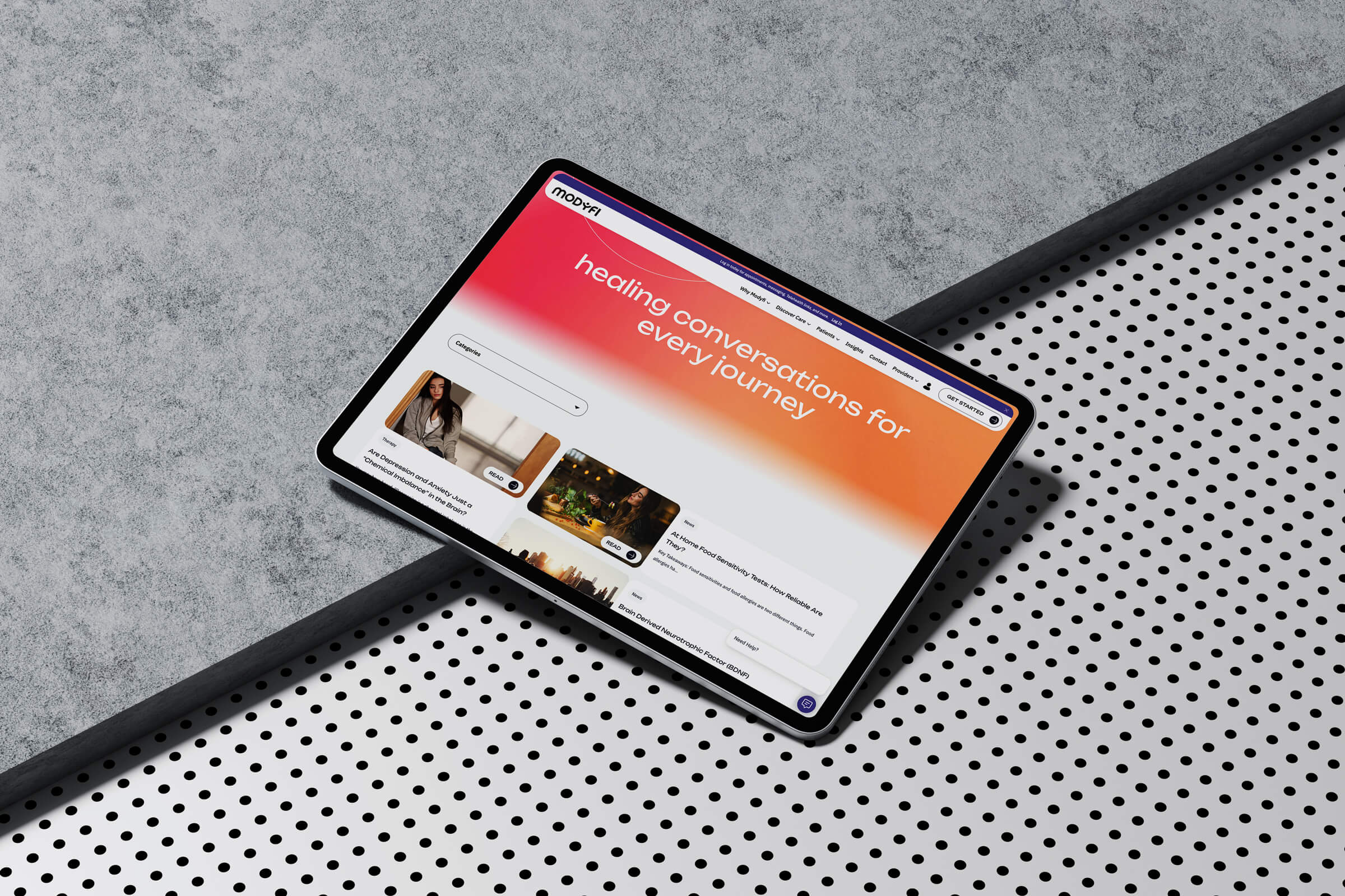
10 Web Design Trends Dominating 2026
Web design in 2026 is all about blending cutting-edge technology with user-focused experiences. Whether you’re building a new site or updating an old one, these trends can help you create faster, more engaging, and more efficient designs. Here’s a quick look at the top trends shaping websites this year:
- Anti-Design: Deliberate imperfections, clashing colors, and raw layouts are breaking traditional design norms to stand out.
- Experimental Navigation: Unique menus, gesture-based controls, and radial layouts are rethinking how users move through websites.
- Bold Typography: Oversized, dynamic fonts are turning text into eye-catching visuals while maintaining readability.
- Eco-Friendly Design: Lightweight code, optimized images, and energy-efficient hosting are reducing digital carbon footprints.
- Micro-Interactions: Small animations and real-time feedback make websites feel more interactive and responsive.
- Large Blocks & High Contrast: Striking color schemes and bold layouts improve readability and highlight key information.
- Interactive 3D Content: Users can now manipulate 3D models directly in their browsers, offering immersive experiences.
- Smart Video Integration: Context-aware videos adapt to user behavior, device, and connection speed for smoother playback.
- Custom Illustrations: Personalized graphics replace generic stock images, creating a stronger connection with users.
- Voice & VR Interfaces: Voice commands and virtual reality are making websites more hands-free and immersive.
These trends aren’t just about aesthetics – they’re reshaping how users interact with websites, delivering faster, more intuitive, and visually striking experiences. Ready to dive deeper into these trends? Let’s break them down.
10 Web Design Trends 2026 to Spruce Up Your Site
1. Anti-Design and Intentional Imperfection
Anti-design is shaking up traditional web design norms. This trend thrives on deliberate chaos – think misaligned layouts, clashing colors, and rough, unpolished elements. Imagine broken grids, hand-drawn doodles layered with digital graphics, or typography that looks like a happy accident rather than a calculated choice.
It’s a pushback against the pristine minimalism that dominated the 2010s. Now, you’ll find websites with pixelated images, awkward spacing, and color pairings that shouldn’t work but somehow do. The focus here isn’t on perfection – it’s on creating something raw and real. This bold approach opens the door to deeper conversations about how design choices affect users and how they’re technically executed.
Impact on User Experience
Anti-design doesn’t just look different – it changes how users experience a site. When visitors land on a page with hand-drawn navigation or magazine-style torn photo edges, it grabs their attention. In a sea of polished, cookie-cutter designs, this imperfection feels refreshingly genuine.
It’s particularly effective for creative agencies, indie artists, or brands targeting younger audiences who value authenticity over polish. The rough edges signal that the content was crafted by real people – not a faceless corporate machine. This unexpected, human touch keeps users engaged and curious about what they’ll see next.
Use of Technology
Pulling off intentional imperfection requires modern coding techniques. Tools like CSS and JavaScript make it possible to create these “messy” designs without compromising performance. Designers use CSS transforms for skewed layouts, custom fonts for that hand-drawn vibe, and JavaScript libraries to add glitchy animations. SVG graphics are another favorite, offering scalable illustrations that retain their rough, imperfect charm across devices.
Typography plays a huge role in this trend. Variable fonts allow for subtle inconsistencies, mimicking hand-lettered or photocopied text. CSS blend modes help create those unexpected color combinations while still meeting accessibility standards by managing contrast effectively.
Even with all the experimentation, accessibility and performance remain priorities. Thanks to progressive enhancement, the core content stays functional even if advanced visual effects fail to load. This balance shows that anti-design can be bold without being reckless.
Implementation for Designers
Start small by introducing one imperfect feature, like a hand-drawn border around a button, and see how users react. Establish boundaries for your creative chaos – use a limited color palette even if the colors clash, or ensure spacing feels consistent even when elements appear scattered. The key is to make the design feel intentional, not broken. Navigation should still work, text must remain readable, and essential user actions need to stay smooth.
Your brand’s personality should guide how far you take it. Anti-design isn’t for everyone. While it might be a perfect fit for a quirky indie brand or a creative studio, it’s probably not the best choice for a bank or medical practice. The trick is aligning the design with your brand’s values and your audience’s expectations.
Alignment with Digital Trends
Anti-design reflects a broader cultural shift toward valuing originality over perfection. This movement mirrors trends in photography, fashion, and art that celebrate flaws and individuality. By embracing imperfection, designs feel more human and relatable.
The rise of no-code tools and template-driven design has also fueled this trend. When anyone can build a polished website, imperfection becomes a way to stand out and showcase creativity. Anti-design proves that artistic vision and technical skill still matter more than simply following the rules.
Interestingly, this approach can also be more resource-efficient. Anti-design often relies on simpler graphics, basic animations, and lightweight elements, which load faster and use fewer resources. That “unfinished” look isn’t just visually striking – it can also be a greener, more sustainable way to design for the web.
2. Experimental Navigation
Designers are stepping away from traditional menu bars and hamburger icons, trying out ideas like floating navigation bubbles and gesture-based controls. This marks a bold move from conventional web layouts, making navigation a key part of the visual storytelling rather than just a functional necessity.
This trend reflects how users are evolving alongside digital interfaces. With years of experience using smartphones, tablets, and interactive media, today’s users are ready for navigation that surprises them and leaves a lasting impression. Creative approaches like radial menus and morphing elements seamlessly weave navigation into the overall design, transforming how users move through a site while also reshaping their journey.
Impact on User Experience
Experimental navigation can leave a strong first impression and encourage deeper engagement. Imagine a site where navigation unfolds like origami or breadcrumbs follow a curved path – these elements instantly signal a unique experience. This sense of novelty not only captivates users but also encourages them to explore more content, even areas they might typically overlook.
However, creativity must balance with usability to keep users engaged. No matter how imaginative the navigation, users still need to figure out how to move around the site quickly and intuitively. The most successful designs blend bold visuals with clear cues, guiding users naturally without confusion or frustration.
Mobile responsiveness is especially critical with experimental designs. On smaller screens, touch interactions like taps, swipes, and pinches require careful planning. What works well on a desktop with hover effects might need a completely different approach for mobile, ensuring users can interact seamlessly across devices.
Use of Technology
Modern CSS and JavaScript frameworks make these designs possible with smooth animations and responsive layouts. Tools like GSAP (GreenSock Animation Platform) allow for real-time, behavior-driven effects, making navigation feel fluid and interactive.
Progressive Web App (PWA) technologies elevate experimental navigation with app-like features. Elements like touch gestures, haptic feedback, and offline functionality can be integrated, while service workers ensure fast loading by caching assets locally.
Implementation for Designers
Start with a solid information architecture before adding creative touches. Even the most inventive navigation must help users find what they need quickly. Begin with wireframes to establish clear pathways, then layer in experimental elements that enhance – rather than complicate – the user experience.
Test prototypes across devices and scenarios to ensure usability. Early user testing can reveal whether visitors can easily complete tasks like finding contact information or navigating between sections. This feedback is crucial for refining the design.
Plan for fallback options to accommodate all users. Features like keyboard navigation and screen reader compatibility ensure accessibility, allowing you to reach a broader audience without sacrificing creativity.
Optimize performance to handle complex animations or interactions. Tools like Chrome DevTools can help monitor frame rates and loading times, ensuring smooth navigation. Lazy loading assets and using efficient animation techniques can maintain speed and responsiveness across devices.
Alignment with Digital Trends
Experimental navigation aligns with the push for experience-driven design, helping brands stand out in a crowded market. By surprising and delighting users, these designs create positive brand associations and encourage sharing through social media or word-of-mouth.
Emerging technologies like voice interfaces and gesture controls are reshaping web navigation. As users grow accustomed to interacting with smart speakers, voice assistants, and motion-controlled devices, they expect websites to offer similarly intuitive interactions – whether through voice commands, eye tracking, or subtle mouse movements.
Consistency across platforms is another challenge for navigation design. Users now move between websites, mobile apps, smart TVs, and even AR/VR devices. Navigation that adapts seamlessly across these platforms not only meets current needs but also prepares for future technological shifts.
3. Bold Typography
As web design continues to evolve, bold typography is stepping into the spotlight, redefining how users engage with content. Oversized fonts and striking letterforms are no longer just text – they’re visual statements. This trend pushes beyond conventional text hierarchy, transforming words into eye-catching design elements that convey both information and brand personality.
Designers are experimenting with typefaces in ways that challenge traditional norms. Mixing font styles within a single headline, using variable fonts that shift dynamically, and crafting custom lettering are just a few ways typography is being elevated. These techniques ensure that text doesn’t just support visuals – it becomes an integral part of the storytelling.
Impact on User Experience
Bold typography plays a key role in guiding users through content. Large headlines and dramatic text create a clear visual hierarchy, helping users quickly understand what’s most important. This approach reduces mental effort, making navigation smoother and more intuitive.
However, experimental typography comes with accessibility challenges. Custom fonts must be compatible with screen readers, and designers need to ensure adequate contrast and spacing for users with visual or reading difficulties. Striking the right balance between creativity and inclusivity is crucial for reaching a diverse audience.
Use of Technology
Variable fonts are revolutionizing how bold typography is implemented online. These fonts pack multiple variations – like weight and style – into a single file, enabling seamless transitions and animations without bloating file sizes. With many font libraries now offering these options, they’re more accessible than ever for designers working across different budgets.
WebGL and Canvas APIs introduce interactive possibilities for typography. Designers can create text that responds to user actions – like scrolling or mouse movements – through real-time animations, adding a dynamic edge to their designs. These tools open up exciting opportunities for blending creativity with functionality.
Implementation for Designers
Start with a solid typographic hierarchy. Before diving into experimental designs, establish clear relationships between headlines, subheads, and body text. This ensures that bold elements enhance readability rather than detract from it.
Optimize typography for performance across devices and networks. Custom fonts can slow down load times, especially on mobile. Use techniques like font-display: swap in CSS to display fallback fonts while custom ones load. Responsive typography is also key to maintaining clarity and impact across screen sizes.
Pair bold display fonts with simple, readable body text. This combination ensures headlines grab attention without sacrificing comfort during longer reading sessions.
Factor in font licensing and hosting costs. Premium typefaces can elevate designs but may come with additional expenses, so plan accordingly.
Alignment with Digital Trends
Bold typography caters to the era of quick content consumption. With users scanning rather than reading, large and impactful text delivers key messages instantly, aligning perfectly with today’s fast-paced digital habits.
Social media amplifies the need for standout text-based graphics. Websites employing bold typography often create headlines and quotes that are easily shareable, extending their reach across platforms.
Assistive technologies are shaping typography into more accessible formats. As content is consumed through voice interfaces and screen readers, typography must serve both as a visual design element and as clear, semantic content. This dual role influences how designers balance creativity with usability, ensuring bold typography remains both impactful and inclusive. It’s a trend that not only grabs attention but also aligns with the forward-thinking mindset shaping the future of web design.
4. Eco-Friendly Web Design
As environmental awareness grows, web design is evolving to include sustainable practices that help reduce the carbon footprint of websites. This approach involves using optimized code, energy-efficient hosting, and thoughtful design choices to minimize the energy consumed by servers and user devices.
Sustainable web design doesn’t just benefit the planet – it also enhances website performance. Lightweight assets, clean code, and optimized images improve loading speeds and user satisfaction.
Impact on User Experience
Eco-friendly web design can significantly improve the user experience. Faster loading times and smoother interactions are achieved by compressing files, optimizing images, and removing unnecessary code. These changes not only save energy but also make websites more accessible for users with slower connections or limited data plans.
Features like dark mode and simplified navigation further reduce energy consumption while making websites easier to use. These efficiency gains create a strong foundation for incorporating advanced technologies that lower energy usage even further.
Use of Technology
Leveraging technology is key to sustainable web design. Using renewable-energy-powered Content Delivery Networks (CDNs) and Progressive Web Apps (PWAs) can reduce the distance data travels while offering app-like functionality with minimal storage needs.
Modern image formats like WebP and AVIF compress files without sacrificing quality, speeding up page loads and lowering energy consumption. Techniques like lazy loading and code splitting ensure that only essential resources are loaded initially, reducing server strain while maintaining a rich user experience.
Implementation for Designers
To start, conduct a website audit to pinpoint energy-draining elements. Tools like the Website Carbon Calculator can measure a site’s environmental impact and help set improvement goals. Focus on reducing file sizes, optimizing images, and removing unused CSS and JavaScript.
Choose hosting providers that offer carbon-neutral or carbon-negative options. Implement efficient caching strategies – such as browser, server, and CDN caching – to reduce server requests and energy use while boosting site performance.
Adopting a mobile-first design approach is another critical step. Mobile devices generally consume less energy than desktops, and responsive designs that prioritize mobile performance naturally align with sustainable practices.
Consider the entire user journey when making design choices. Streamlined checkout processes, easy navigation, and clear calls-to-action not only enhance usability but also reduce the energy required to complete tasks.
Alignment with Digital Trends
Sustainability is becoming a priority for many businesses, driving demand for eco-friendly web solutions. Companies are increasingly viewing their digital carbon footprint as part of their broader environmental responsibility. This shift creates opportunities for designers who integrate sustainable practices into their work.
Eco-friendly optimizations also offer an SEO advantage. Search engines now prioritize page speed and performance in their rankings, and faster, more efficient websites tend to rank higher in search results.
Consumer awareness of the environmental impact of digital activities is growing, especially among younger audiences. Brands that highlight their commitment to sustainability can strengthen their reputation and build customer loyalty.
Additionally, regulatory changes around digital sustainability are emerging in various regions. By adopting eco-friendly design techniques now, designers can stay ahead of potential mandates and position themselves as leaders in sustainable web development.
5. Micro-Interactions and Animations
By 2026, micro-interactions are transforming static websites into lively, responsive experiences. These small but precise elements, like buttons that pulse when hovered over or form fields that highlight errors, guide users with clear visual cues and instant feedback. They create interaction patterns that feel intuitive and purposeful, making digital experiences more engaging.
Modern websites now use contextual animations that adapt in real time to user actions, such as scrolling or device orientation. These responsive touches not only improve usability but also enhance overall user satisfaction.
Impact on User Experience
Micro-interactions act as digital signposts, guiding users and offering immediate feedback. For example, they can turn error messages into helpful prompts, making it easier for users to understand what went wrong and how to fix it.
Loading animations have also evolved. Instead of generic spinners, they now display real-time progress bars, keeping users engaged during wait times and reducing the frustration of delays. Similarly, form fields now offer real-time validation with smooth transitions or gentle shake animations to highlight issues without being jarring. Success states are celebrated with subtle effects like confetti or checkmark animations, reinforcing positive actions.
These thoughtful details add an emotional layer to user experiences, creating moments of delight that strengthen brand connections and encourage repeat visits. Over time, users become familiar with these interactions, making navigation feel more intuitive and enjoyable.
Use of Technology
Advancements in tools like CSS animations and JavaScript libraries have made it easier to create complex interactions without compromising performance. Browsers now use hardware acceleration to ensure smooth animations, even on mobile devices.
The Web Animation API (WAAPI) has become a popular choice for dynamic animations that respond in real time to user input or system events. Developers can use it to create animations that pause, reverse, or change direction seamlessly, resulting in highly interactive designs.
The Intersection Observer API powers scroll-triggered animations, activating effects only when elements enter the viewport. This approach reduces unnecessary processing, conserves battery life, and is ideal for features like parallax scrolling or progressive content reveals.
Lottie animations have gained popularity for their ability to deliver crisp, vector-based micro-interactions. These lightweight files maintain quality across all screen sizes and are often used in onboarding sequences or to guide users through less familiar parts of an interface.
Implementation for Designers
To make the most of these tools, designers should focus on practical applications. Start by identifying specific user actions that could benefit from visual feedback or guidance. Every micro-interaction should solve a usability challenge or improve understanding – decorative animations without purpose can distract more than they help.
Use natural timing and easing curves for feedback that feels smooth and quick. Tailor animation durations to match the context of the interaction.
Consistency is crucial. By standardizing animation durations, easing curves, and color transitions, designers can create a cohesive experience across a website. Documenting these standards in a design system ensures uniformity across pages and among team members.
Performance is another key consideration. Focus on animating properties like transform and opacity, which can be offloaded to the GPU for better performance. Avoid animating properties like width, height, or position, as they force the browser to recalculate layouts, slowing down the experience.
Accessibility should never be overlooked. Designers should include options to disable animations for users with vestibular disorders or those who prefer reduced motion. The CSS prefers-reduced-motion media query makes it possible to provide alternative experiences that maintain functionality without causing discomfort.
Alignment with Digital Trends
Micro-interactions are evolving alongside digital trends. Mobile-first design has pushed for touch-friendly interactions, like swipe-to-delete and pull-to-refresh, often paired with animations that provide clear feedback. These gestures are now standard and help ensure seamless usability across devices.
Voice interfaces are also incorporating micro-interactions, using visual elements to confirm voice commands or display real-time status updates. By combining audio and visual feedback, these hybrid designs create more robust and adaptable interactions.
Artificial intelligence is beginning to play a role as well. Predictive animations, for instance, can anticipate user needs by pre-loading hover states or adjusting animation timing based on behavior. This makes interfaces feel more responsive and tailored to individual users.
Progressive web apps (PWAs) are another area where micro-interactions shine. They use features like app-like transitions, gesture cues, and simulated haptic feedback to create smooth, integrated experiences.
Finally, there’s a growing emphasis on efficiency. Designers are working to create animations that deliver meaningful impact while consuming minimal resources. This not only enhances performance across various devices and network conditions but also aligns with efforts to reduce environmental impact in design practices.
6. Large Blocks and High Contrast
The use of large blocks combined with high-contrast color schemes is transforming web design in 2026, blending bold visuals with practical functionality. Designers are leaning into striking color pairings, like dark blue with neon orange, to create designs that make a strong impression.
High-contrast design does more than just look good – it serves a purpose. It naturally guides users through a webpage, making it easier to scan and understand the content hierarchy. This approach not only grabs attention but also reshapes how users interact with digital spaces.
Impact on User Experience
By combining bold visuals with usability, large blocks and high-contrast designs improve how users process information. These designs are excellent at cutting through the clutter of digital content, grabbing attention, and delivering a fresh, modern aesthetic. At the same time, they enhance readability and reduce eye strain, especially for users who spend long hours online. This balance of form and function makes the experience both focused and engaging.
Use of Technology
Dark mode, a popular feature in high-contrast designs, isn’t just visually appealing – it’s practical, too. It helps extend mobile battery life by lowering screen brightness, making it a smart choice for energy-conscious users. This tech-savvy approach adds another layer of functionality to high-contrast design.
Implementation for Designers
To create effective large block designs, designers need to pay close attention to color contrast ratios that meet modern usability standards. Ensuring strong contrast between text and background is critical for accessibility, helping websites remain usable for everyone and meeting WCAG and ADA compliance requirements. Thoughtful use of contrasting colors can also help establish a clear visual hierarchy and separate different sections of a webpage.
Alignment with Digital Trends
This design trend fits perfectly with the increasing focus on accessibility-first approaches. By supporting users with visual impairments and enhancing usability for all, high-contrast designs play a key role in improving the overall digital experience.
7. Interactive 3D Models and Content
Interactive 3D content is bringing a whole new level of engagement to websites, transforming the way users interact with digital spaces. Rather than simply scrolling through static pages, visitors can now explore products and environments in a hands-on way – rotating, zooming, and manipulating 3D objects directly in their browser. This shift turns traditional web browsing into an immersive, almost tactile experience.
With recent advancements in technology, these 3D experiences are now smoother and more accessible across a range of devices. From virtual tours that let users preview furniture in a room to car design explorations, it’s clear that 3D content is no longer just a novelty – it’s becoming a standard feature.
Impact on User Experience
Interactive 3D models give users the chance to engage with products and concepts in a way that feels more real. By allowing them to view objects from multiple angles and interact with key features, these models make online browsing more engaging. This deeper level of interaction helps create a stronger connection between users and the content, making it easier for them to understand scale, texture, and functionality – things that are often hard to convey in a traditional online format. It’s a step closer to replicating the in-person shopping or exploration experience.
Use of Technology
The backbone of modern 3D web content lies in tools like WebGL and frameworks such as Three.js, which enable high-quality visuals directly in browsers. To ensure a seamless experience, progressive loading techniques are used, where core elements of a 3D model load first, followed by finer details.
WebXR integration takes things even further, blending 3D models with augmented reality (AR). This means users can do things like visualize how a piece of furniture would look in their living room or try on accessories using their smartphone cameras. Cloud-based 3D rendering services are also making these technologies more accessible, especially for smaller businesses, by lowering the technical and financial barriers to entry.
Implementation for Designers
For designers, creating effective 3D experiences is all about balance. File sizes need to be optimized to ensure models load quickly without sacrificing quality. Interaction should feel intuitive, allowing users to explore without needing detailed instructions. Subtle cues, like animations or glowing effects, can highlight interactive elements and guide users naturally.
It’s also important to consider accessibility. Providing fallback options such as high-quality static images or simplified 3D versions ensures users with older devices or slower internet connections can still enjoy the experience.
Alignment with Digital Trends
Interactive 3D content aligns perfectly with the push toward more immersive and personalized digital experiences. It’s not just about aesthetics – it’s about storytelling. These models help brands connect with audiences by offering a richer, more engaging way to showcase their products or ideas.
Additionally, virtual 3D experiences can reduce the need for physical product samples or showrooms, supporting more environmentally friendly practices. When paired with e-commerce platforms and social sharing features, 3D content becomes a powerful tool for modern digital marketing, enhancing both storytelling and brand engagement.


8. Smart Video Integration
Smart video integration is changing the way websites deliver content by offering adaptive, personalized, and context-aware videos. These systems analyze user behavior, device capabilities, and viewing preferences to provide optimized experiences in real-time. Instead of being just a passive feature, videos become dynamic, responsive elements that actively boost user engagement.
This technology goes well beyond basic autoplay functions. It uses AI-driven content selection, adaptive streaming, and interactive overlays. For example, smart videos can automatically adjust resolution based on internet speed, tailor content to user demographics, and even pause or resume depending on whether the user is actively watching or scrolling.
Impact on User Experience
Smart video integration enhances browsing by making it more tailored and efficient. Users don’t need to deal with buffering or irrelevant content. The system adapts video quality to the user’s connection, ensuring smooth playback no matter the network conditions.
Interactive features take the experience further. Clickable hotspots can provide extra details, and branching storylines let viewers choose their journey through the video. These elements keep users engaged longer and make the content more valuable compared to traditional, linear videos.
There are also notable accessibility improvements. Smart video systems can automatically generate captions, adjust playback speeds to suit user preferences, and include audio descriptions for those who need them. These features ensure video content is inclusive for people with varying needs and preferences, aligning with the growing focus on personalized digital experiences.
Use of Technology
Behind the scenes, machine learning and real-time analytics power these intelligent video systems. Content Delivery Networks (CDNs) with edge computing capabilities process data instantly, ensuring minimal delays and high performance.
Adaptive bitrate streaming plays a key role by switching between video quality levels based on available bandwidth, ensuring uninterrupted playback. WebRTC technology enables live, interactive video elements and two-way communication directly in the browser.
AI-powered analytics track metrics like watch time, interaction rates, and where users drop off. This data helps refine content recommendations and optimize how videos are placed on websites. Progressive web app technologies ensure these features work consistently across devices and platforms.
Implementation for Designers
For designers, smart video integration is about creating videos that fit seamlessly into the website’s overall narrative. Videos should be strategically placed to align with user goals, and adaptive video backgrounds should include options to disable motion for users who prefer a static experience.
Performance optimization is key. Designers should collaborate with developers to ensure proper lazy loading, efficient compression, and fallback options for users with slower connections. Thumbnails and preview images should accurately represent the video content to encourage clicks and engagement.
Interactive elements should feel natural and easy to use. Subtle visual cues can highlight interactive areas, while clear controls help users navigate their options. Testing across different devices and connection speeds ensures these features enhance, rather than disrupt, the user experience. Thoughtful integration of smart video sets the stage for even more immersive digital strategies.
Alignment with Digital Trends
Smart video integration aligns with the growing demand for tailored, data-driven content. As users increasingly expect relevant and engaging experiences, this technology provides the tools to meet those expectations without sacrificing performance.
It also supports eco-conscious web design by reducing unnecessary data usage. By serving the right video quality and content, smart video systems cut down on bandwidth and energy consumption, contributing to more sustainable digital practices.
When paired with social media and e-commerce platforms, smart videos become powerful marketing tools. They can dynamically show product details, pricing, and availability based on user location and preferences, creating more effective paths to conversion and supporting business goals.
9. Custom Illustrations and Graphics
Custom illustrations and graphics are stepping in to replace generic stock images, offering brands a way to create more meaningful connections with their users. Instead of simply decorating a page, these visuals tell unique stories and help websites stand out in a crowded digital world. They also make it easier to explain complex ideas through personalized artwork, giving users a more engaging experience.
These custom visuals are now being integrated directly into website interfaces, making navigation smoother and improving overall understanding. While stock photos can feel impersonal and overused, custom illustrations show that a brand values quality and originality. The result? A user experience that feels both intuitive and memorable.
Impact on User Experience
Custom illustrations do more than just look good – they simplify tough concepts using visual metaphors and icons. This reduces mental effort for users and makes tasks easier to complete. When these visuals match a brand’s tone and message, they create a seamless and polished experience.
They also improve accessibility by offering visual cues that complement written content. This helps users with different learning styles absorb information more effectively. Custom illustrations can guide users through navigation by establishing clear visual hierarchies and drawing attention to important actions.
Another big advantage is the emotional connection these graphics create. Unlike stock images, which can feel detached, custom illustrations reflect a brand’s personality and values. This makes users more likely to remember the experience and return to a site that feels distinct and meaningful.
Use of Technology
Today’s design tools make creating custom graphics easier and more efficient. Programs like Adobe Illustrator and Figma allow designers to craft scalable, high-quality visuals that look great on any device. The SVG format has become a go-to choice for web illustrations because it offers sharp visuals while keeping file sizes small.
AI-powered design tools are also helping speed up the process. They can generate initial ideas, suggest color schemes, and handle repetitive tasks, freeing designers to focus on creative and strategic aspects. However, the best results still come from human creativity, ensuring the visuals align with the brand and meet user needs.
Animation tools like Lottie are another game-changer. They let designers create lightweight, interactive illustrations that respond to user actions. These tools bridge the gap between static images and more complex animations, enhancing the user experience without overloading the website.
Implementation for Designers
For custom illustration projects to succeed, designers need to start with clear brand guidelines and a solid understanding of their audience. Knowing the brand’s personality and communication goals ensures the visuals are not just attractive but also functional and purposeful.
Maintaining consistency across all graphics is key. Style guides that define elements like color palettes, line weights, and shading techniques help keep the visuals cohesive, even when multiple designers are involved. This consistency strengthens the overall design system.
Practical considerations like file compression, lazy loading for non-essential visuals, and fallback options for slower connections are also important. Using progressive enhancement ensures the site remains functional even if some graphics don’t load, while still offering a richer experience when resources are available.
Finally, testing custom illustrations with real users is essential. A/B testing can reveal whether these visuals improve metrics like task completion rates, bounce rates, or conversions compared to stock images. These insights help justify the investment and guide future design choices.
Alignment with Digital Trends
Custom illustrations fit right into the growing demand for personalized digital experiences. They allow brands to craft visual languages that reflect their specific values and resonate with their audience. This goes beyond aesthetics, shaping how users perceive and interact with digital products.
When done thoughtfully, custom illustrations also align with sustainable design practices. SVG graphics, for instance, often have smaller file sizes than high-resolution photos, which reduces bandwidth use and energy consumption – an increasingly important factor as environmental concerns shape design decisions.
Custom graphics also shine on social media. They maintain brand recognition across platforms and work well in email campaigns, social posts, and other digital touchpoints. This consistency strengthens messaging and boosts marketing efforts.
As voice interfaces and accessibility grow in importance, custom illustrations play a key role as visual anchors. They complement audio content and support users with varying abilities, enhancing inclusivity without replacing other interaction methods. Thoughtfully designed graphics make digital experiences more welcoming for everyone.
Ready to bring your website into the future?
Let’s design a digital experience that stands out in 2026 and beyond.
Book a Strategy Call10. Voice-Activated Interfaces and Virtual Reality
Voice-activated interfaces and virtual reality (VR) are transforming how users interact with websites by offering immersive and hands-free experiences. With voice commands simplifying navigation and VR creating dynamic three-dimensional environments, these technologies are becoming integral to modern web design. They not only enhance usability but also bring a sense of realism and engagement to online interactions.
This shift reflects evolving user expectations. People now look for websites that respond naturally to their input and provide experiences that go beyond static, two-dimensional screens. It’s a step toward a more intuitive and interactive web.
Impact on User Experience
Voice commands make websites more accessible by enabling hands-free navigation, form filling, media control, and search functions through natural speech. This is particularly beneficial for individuals with visual impairments, motor disabilities, or those who prefer hands-free interaction, ensuring a more inclusive web experience.
On the other hand, VR elevates user engagement by creating memorable interactions. For instance, real estate platforms can offer virtual property tours, furniture retailers can show how items fit into a customer’s space, and educational websites can create immersive learning modules. These features help bridge the gap between online browsing and real-world experiences.
Combining voice and VR also caters to multitasking users. Imagine exploring a virtual showroom while using voice commands to ask questions or get more details about a product. This dual-input approach mirrors natural human interactions, reduces mental effort, and makes complex tasks feel simpler and more intuitive.
Use of Technology
Modern tools are making voice and VR experiences more accessible:
- The Web Speech API allows browsers to process spoken commands without extra plugins. It supports multiple languages, processes speech locally to address privacy concerns, and works across most modern browsers.
- WebXR, the successor to WebVR, enables browsers to support both virtual and augmented reality experiences. It eliminates the need for separate apps and works seamlessly with popular VR headsets like Meta Quest and HTC Vive, as well as mobile devices for basic augmented reality.
- Libraries like Three.js and A-Frame provide the foundation for building VR content. Three.js offers powerful 3D graphics, while A-Frame simplifies VR creation for designers without extensive coding knowledge. Both tools are optimized for different devices and internet speeds.
Additionally, cloud services now handle the heavy lifting for voice recognition and VR rendering, ensuring smooth and reliable performance.
Implementation for Designers
Designers embracing these technologies need to focus on creating intuitive and responsive interactions. For voice features, use natural speech patterns and provide clear visual feedback to indicate when the system is listening, processing, or encountering errors.
When incorporating VR, adopt a progressive enhancement strategy. Ensure the core website content functions seamlessly on traditional browsers, with VR as an optional upgrade for users with compatible devices. Start with simple features like 360-degree views or basic 3D models before diving into more complex virtual environments.
Performance is key. Voice commands should respond within 2-3 seconds to feel natural, and VR experiences need consistent frame rates to avoid motion sickness. Use efficient file formats, lazy loading for VR assets, and adjustable quality settings to accommodate various devices.
Testing is crucial. Voice recognition can be affected by background noise, accents, or microphone quality, while VR performance depends heavily on hardware. Always provide fallback options and alternative navigation paths for situations where these technologies are unavailable or underperforming.
Alignment with Digital Trends
Voice and VR interfaces align with the growing demand for personalized digital experiences. Voice commands can tailor content to individual preferences, while VR environments can adapt to user interests and behaviors, making websites feel more engaging and relevant.
These technologies also contribute to eco-conscious design practices. Voice interfaces can reduce the need for heavy visual elements, potentially lowering bandwidth usage. Meanwhile, VR can serve as a substitute for physical demonstrations or travel, cutting down on environmental impact.
As smart home devices and voice assistants become more common, users expect similar voice interaction capabilities across digital platforms. Websites that integrate these features feel more modern and connected to users’ broader digital habits, enhancing brand recognition and user trust.
Voice and VR are shaping the future of web design, perfectly complementing trends like smart video integration and eco-conscious design. With mobile-first design still leading the way, voice interfaces are particularly useful on small screens, where typing can be cumbersome. Meanwhile, mobile VR capabilities are improving rapidly, opening up new possibilities for engaging users in ways that traditional responsive design cannot achieve.
Conclusion
The web design trends of 2026 highlight a clear focus on meaningful user engagement and responsible practices. These trends signal a move toward crafting websites that prioritize accessibility, environmental awareness, and genuine human connection.
On the creative side, approaches like anti-design challenge the monotony of generic layouts, while experimental navigation reimagines how users interact with websites, making their experiences more intuitive and memorable. Bold typography continues to cut through the noise of crowded online spaces, and eco-conscious design principles are gaining traction as businesses take their environmental impact more seriously.
On the technical front, elements such as micro-interactions, high-contrast layouts, 3D visuals, smart video integration, and custom illustrations all contribute to creating immersive and tailored user experiences. These features not only enhance engagement but also play a vital role in improving user retention, boosting conversions, and shaping a positive brand image.
Emerging technologies like voice interfaces and virtual reality are transforming traditional websites into adaptive, interactive platforms that respond to user preferences in real time. As these tools become more accessible, they’re likely to shift from being cutting-edge features to standard expectations.
For businesses and designers, the challenge lies in adopting these trends thoughtfully. Not every trend will fit every brand or audience, but understanding these shifts can guide smarter design choices. The key is to embrace trends that align with your brand’s identity and meet the needs of your users.
The standout websites of 2026 will be those that skillfully blend multiple trends into seamless, user-first experiences. Whether it’s pairing bold typography with micro-interactions, integrating eco-friendly practices with custom visuals, or combining voice navigation with 3D elements, success lies in how well these components work together.
As the year unfolds, these trends will continue to evolve, shaped by advancements in technology, shifts in user behavior, and new societal values. The websites that succeed will stay adaptable, responding to these changes while staying true to their mission: delivering effective and meaningful experiences for their users.
FAQs
To make anti-design work effectively, you need to strike a balance between bold creativity and practical functionality. Anti-design thrives on breaking conventional rules – think asymmetrical layouts, bold contrasts, or clashing colors – to craft a look that stands out. But while embracing this unconventional style, it’s important to keep the site intuitive and easy to navigate. No one wants to feel lost or frustrated trying to figure out how to use a website.
Accessibility should also be a top priority. Design with everyone in mind, including users with disabilities. This means ensuring text is readable, colors have enough contrast, and assistive technologies are supported. When you combine these thoughtful details with the raw, unpolished charm of anti-design, you can create a visually striking experience that’s still user-friendly and inclusive.
Creating websites that are kinder to the environment without sacrificing performance or user experience requires a thoughtful approach. Start by prioritizing efficient code – this not only speeds up load times but also cuts down on energy use. Incorporating inclusive design principles ensures that your site is easy for everyone to navigate, regardless of their abilities.
Another important step is choosing hosting providers powered by renewable energy, which helps lower the carbon footprint of your website. Simplify the site’s layout and avoid overloading it with unnecessary features or large media files that can bog it down. By blending environmentally conscious practices with user-focused design, you can build a site that’s both green and effective.
Voice-activated interfaces and virtual reality (VR) are reshaping the way people engage with websites, offering more natural and engaging experiences. With voice commands, users can navigate hands-free, making tasks easier and boosting accessibility. On the other hand, VR introduces interactive 3D environments, which are especially useful in fields like e-commerce and gaming, where immersion can make a huge difference.
That said, these technologies aren’t without hurdles. They require advanced technical expertise, can be expensive to develop, and must work seamlessly across various devices. Designers also face the challenge of ensuring these tools enhance the user experience rather than feeling overwhelming or out of place. Balancing innovation with usability is key.
Visual Soldiers
Visual Soldiers is an Atlanta-based creative studio specializing in branding, design & digital experiences.
