Responsive Web Development Services
Responsive Web Development
Seamless websites for a multi-device world
At Visual Soldiers, we craft responsive websites that deliver seamless experiences across all devices. Responsive web development is critical for businesses to succeed online. Whether you’re a startup or a global enterprise, our solutions are designed to meet your needs with performance, accessibility, and scalability at the forefront.
Why Choose Responsive Web Development?
Google prioritizes mobile-friendly websites in search results, and responsive design ensures your site meets these standards. By optimizing for all devices, you’ll improve usability, reduce bounce rates, and enhance your SEO performance, driving more organic traffic to your site.
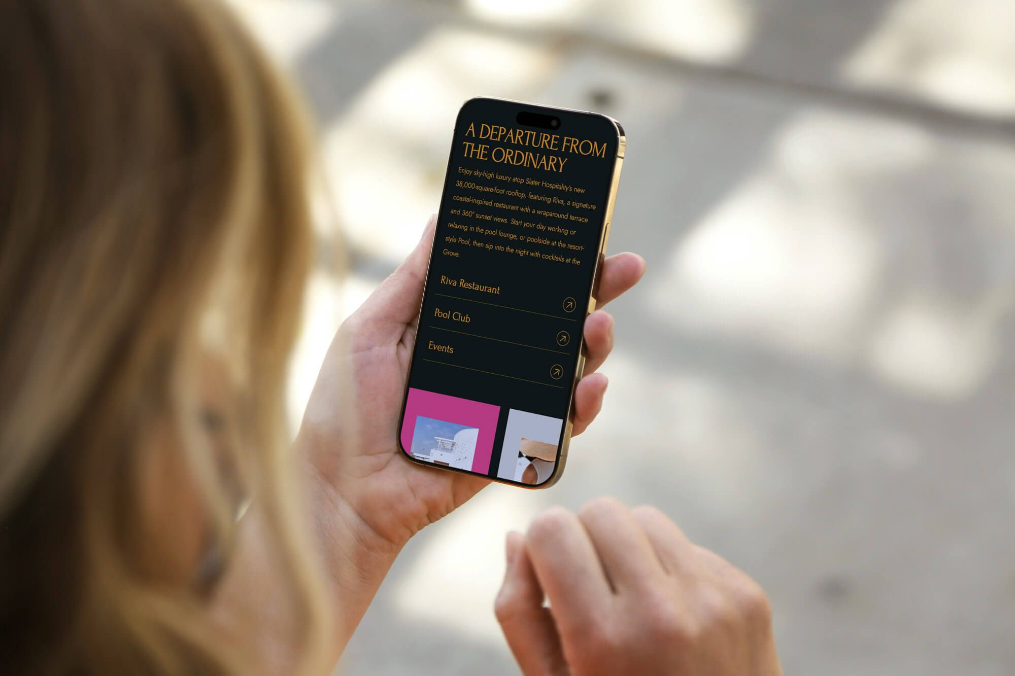
Responsive web development ensures your website looks great and functions seamlessly on any device. By adapting layouts and features to fit screen sizes, it creates a smooth, user-friendly experience that keeps visitors engaged and encourages them to explore further.
With a single responsive website, you eliminate the need for separate desktop and mobile versions, saving time and resources. This streamlined approach reduces maintenance costs and ensures consistent performance across all devices.
Case Studies
Ready to transform your website into a mobile-friendly powerhouse? Get in touch to learn how our Responsive Web Development can help you succeed.
Key Features of Responsive Web Development
-
✓
Mobile-First Approach
Designed to prioritize smaller screens.
-
✓
SEO-Ready Development
Built-in best practices for speed, usability, and search engine optimization.
-
✓
Custom Frameworks
Tailored to your industry and business goals.
-
✓
Accessibility Compliance
WCAG adherence ensures inclusivity.
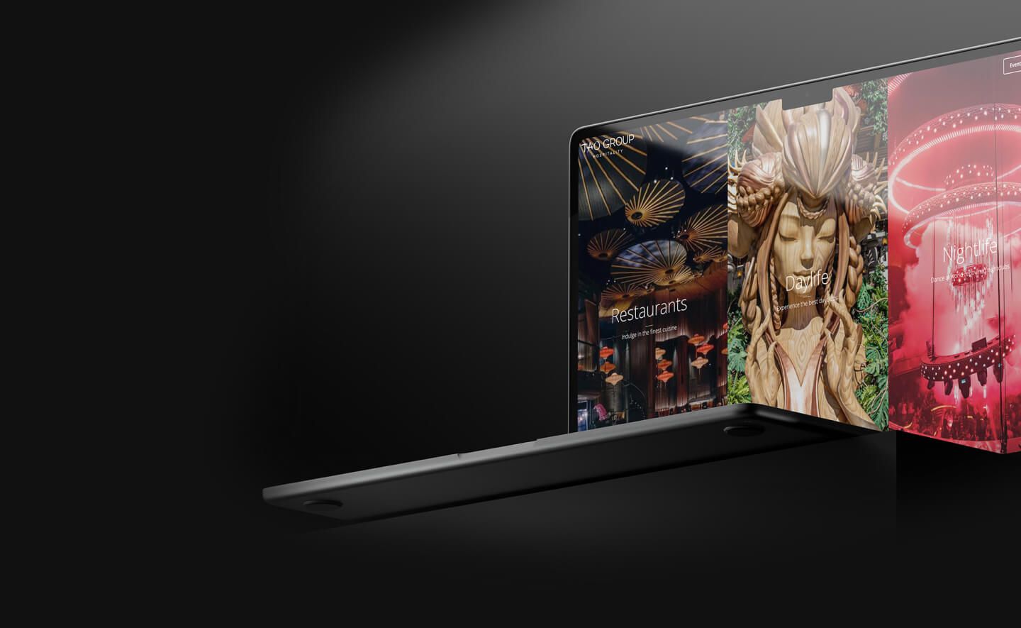
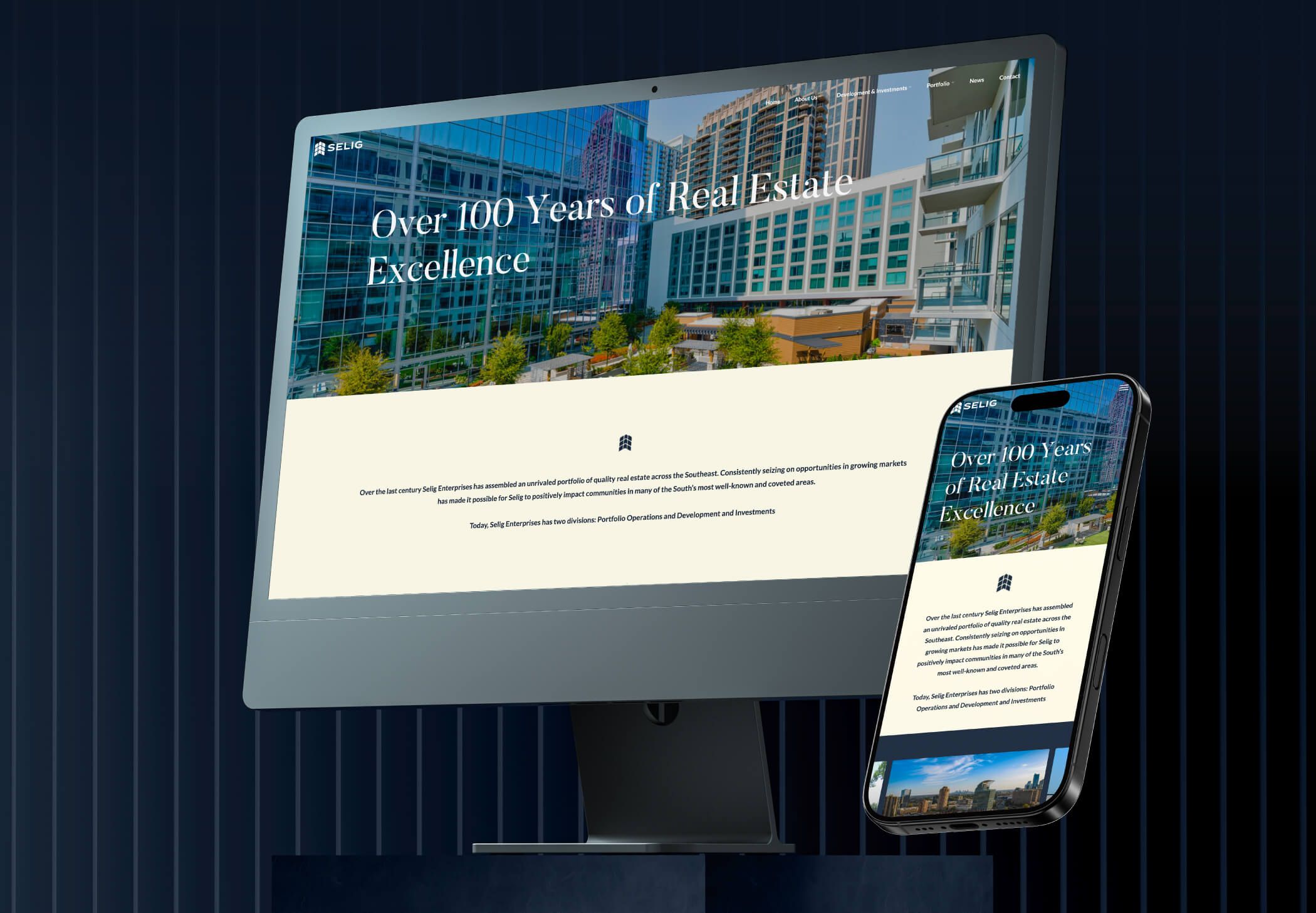
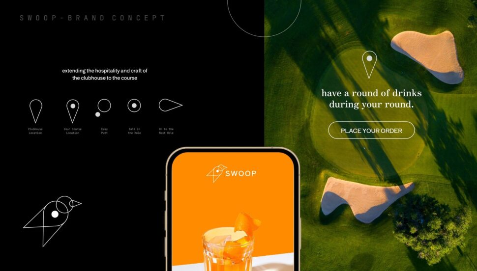
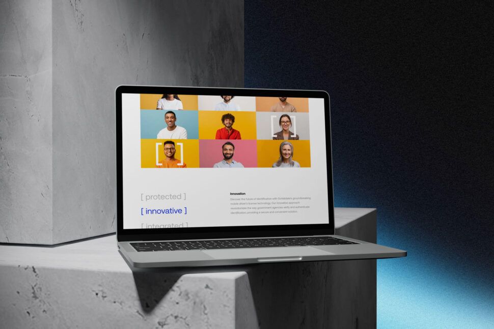
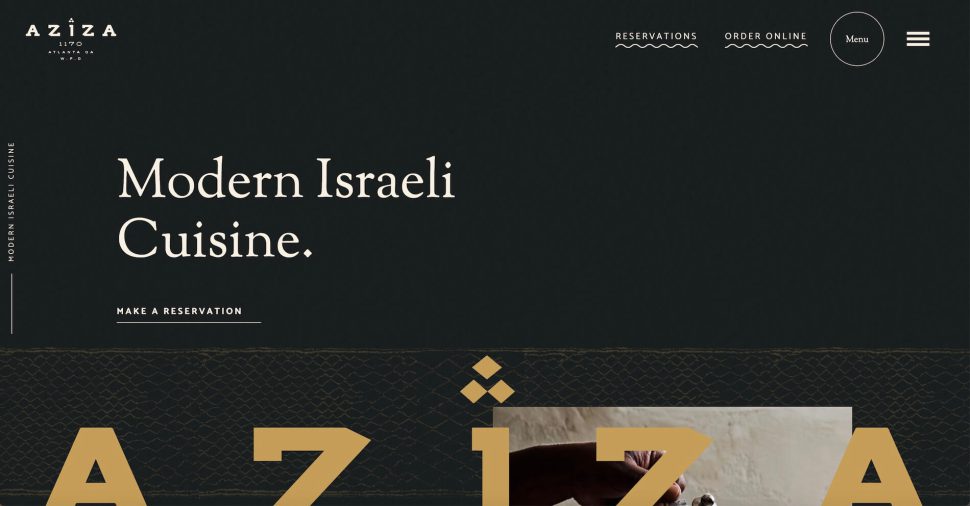
Across industries ranging from technology and retail to hospitality and professional services, we’ve crafted responsive web solutions that prioritize user experience and performance.
Our approach is rooted in understanding the unique challenges of each sector, enabling us to deliver designs that not only look great but also drive measurable results.
Such a pleasure working with Visual Soldiers. The website they produced was EXACTLY what we had hoped for, possibly even better. If you are looking for a solid, quick responding, all over it company to help your website dreams to come true.. look no further! Thank you Visual Soldiers!
 Amy Landsman
Executive Assistant | Chef Chris Santos
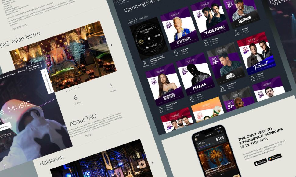
I’ve been working with Jeff & his team for more than 4 years now and they’ve become our design agency of choice for Tao Group Hospitality! We have a lot of exciting projects and websites in the pipeline and Visual Soldiers is designing them all. Their workflow is very simple and the communication is great. Can’t recommend them enough!
 Justin Levy
VP, Marketing | Tao Group Hospitality
Visual Soldiers has a super talented team who really knows how to listen to client needs and understand client goals.
 Bruno S. Borges
With past design firms, we have always been in a position of playing catch-up in terms of current design trends. With Visual Soldiers, we have consistently stayed on the forefront of UI design and are now consistently rated one of the top in our class.
 Russell Greene
Founder & CEO of Fit Radio
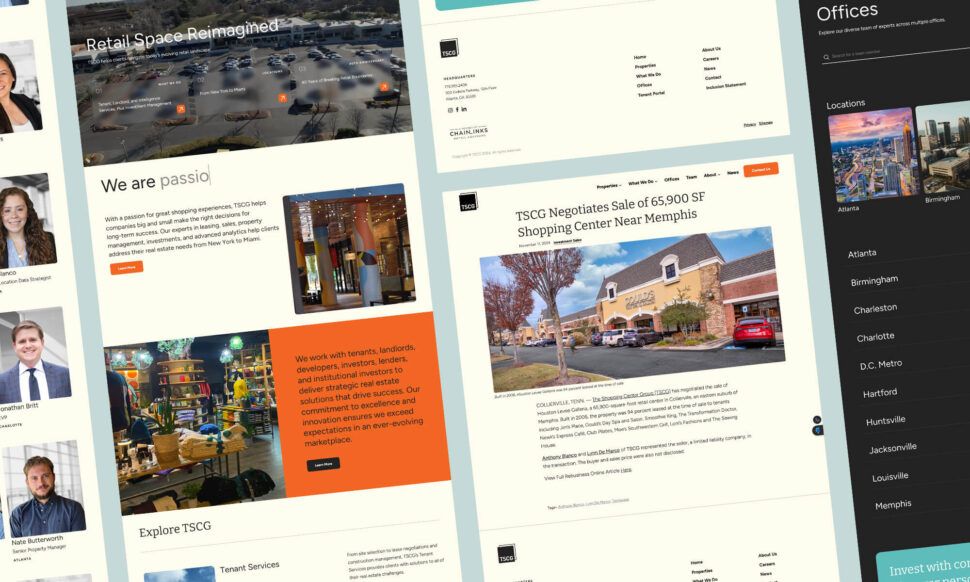
Working with Visual Soldiers was a good experience. As a content provider through Against the Grain Productions, I partnered with them on a project for TSCG, and they exceeded expectations. They were responsive, easy to collaborate with, and excellent creative problem solvers. Their state-of-the-art website design impressed not only on the front end, delivering a great looking, easy to navigate site, but also on the back end, making it simple for TSCG to manage and update content. Highly recommend their team!
 Robert Williams
Owner of Agianst The Grain Communications
FAQ
Responsive web development involves designing and coding a website to adapt seamlessly to any screen size, ensuring optimal viewing and interaction across devices like smartphones, tablets, and desktops.
Google ranks mobile-friendly websites higher in search results. A responsive design improves user experience, reduces bounce rates, and aligns with Google’s mobile-first indexing strategy.
Responsive sites adjust layouts, images, and functionality dynamically to fit different screen sizes. This ensures users have an easy, enjoyable experience regardless of the device they’re using.
Yes! We can analyze your current site and implement responsive design techniques, ensuring it meets modern standards without starting from scratch.
The timeline depends on the complexity and size of your project. On average, a responsive website can take 4-8 weeks, including design, development, and testing.
Every industry benefits from responsive web development. E-commerce stores, blogs, service providers, and corporations need responsive websites to improve engagement, sales, and conversions.
Responsive design eliminates the need to maintain separate desktop and mobile versions of your site, reducing development and maintenance costs over time.
Read on about Web Development


Marketing driven enterprise websites build for speed and scalability.
Get in touch today to see how we can change the trajectory of your organization.
Book a Call