Understanding the Essentials of Book Cover Design
Designing a book cover is an intricate process that combines art, marketing, and psychology. It requires understanding what attracts readers while remaining true to the content’s spirit. Above all, the cover should capture potential readers’ attention, compelling them to take a closer look.
The Importance of Target Audience
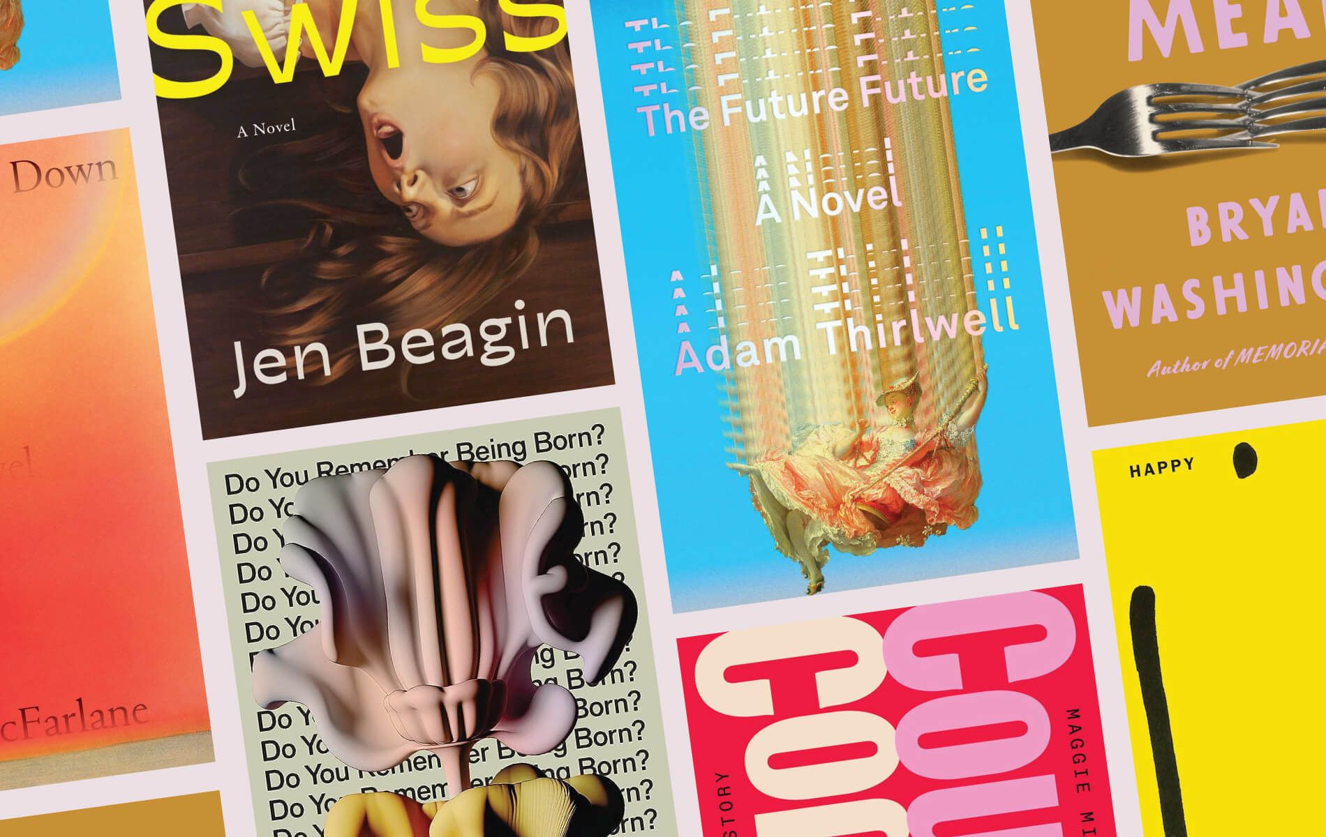
Before starting your design, identify your target audience. Consider factors like age, interests, and even the genres they prefer. A thriller, for instance, often features bold, large typography and darker color palettes. Conversely, romance novels might use softer colors and elegant script fonts.
Integrating Imagery and Graphics
Choosing the right images is crucial. These should align with the book’s theme without revealing too much about the plot. Mystery books benefit from shadowy figures or obscured images, which suggest secrecy. Historical fiction might incorporate historical landmarks or period attire. In every case, the imagery should hint at the story’s essence without giving everything away.
Typography that Talks
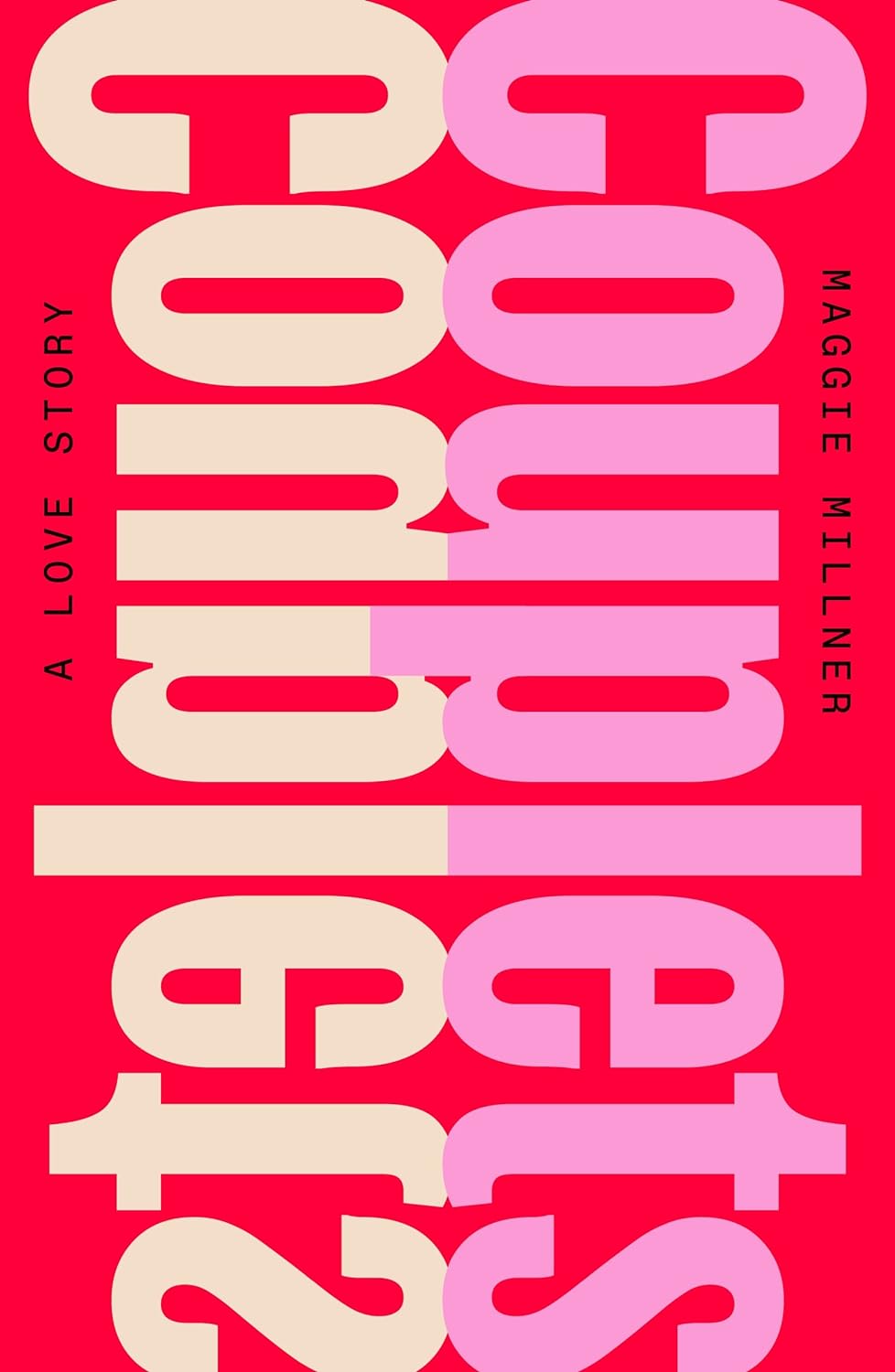
Typography is not just a tool to display text; it’s an integral part of your book’s visual appeal. The typeface chosen can reflect the time period of the book, the emotion of the narrative, or the seriousness of the topic. Ensure it’s legible from a distance to catch the eye of potential readers. It’s also effective to contrast the typeface used for the title with the author’s name and other cover text to draw attention where it’s most needed.
Color Psychology
Colors convey emotions and set the mood even before the book is opened. Bright colors often suggest excitement and adventure. On the other hand, muted tones might be used to convey serious topics. Choosing the right color scheme is fundamental to creating an emotional connection with potential readers. Want to learn more about color psychology? Check out our article on The Impact of Color Psychology in Branding.

Layout and Composition
The arrangement of elements on the cover should guide the eye through the cover naturally. Start with the most important element, usually the title, followed by secondary images or text. Maintain a balance between imagery and text to avoid clutter, which can detract from the cover’s impact.
Final Touches and Previewing
After designing, review your cover in various formats. Sometimes, what works in a digital form might not translate well into a printed format. Check your design in different sizes, as it should stand out even as a thumbnail. This is crucial in a digital marketplace where visuals often initially appear as small images.
Testing Audience Reaction
Getting feedback is vital. Use focus groups or social media platforms to test potential covers. Understand that you might not always receive the feedback you expect, but constructive criticism can be incredibly beneficial. Be ready to tweak your design based on the audience’s responses to ensure the final product resonates well with them.


Consistency Across Series
If your book is part of a series, maintain consistency in the style of the covers. This not only enhances brand recognition but also creates a cohesive look when they’re displayed together. Elements like consistent fonts, color schemes, and layout can help achieve this uniformity.
Conclusion
Cover design is pivotal in the journey of a book. It’s the first interaction a reader has with your work, and as such, it should be impactful. Combine aesthetics with strategic marketing, and ensure your design speaks to the intended audience. Remember, a well-designed cover not only intrigues but also promises the reader that the story within is worth their time and investment.
Visual Soldiers
Visual Soldiers is an Atlanta-based creative studio specializing in branding, design & digital experiences.
