December 4, 2023
How to Master the Art of Typography Design: A Digital Agency’s Perspective on Design and Branding
-
Visual Soldiers
- Design
- minute read
Pangram Pangram
As a digital agency specializing in graphic design and branding, we understand the profound impact of typography on brand identity and communication. In this guide, we’ll explore how to master the art of typography, a crucial skill for creating compelling and effective designs.
Understanding Typography's Role in Branding
Typography is more than just choosing fonts; it’s a vital tool in conveying a brand’s voice and personality. Mastering the art of typography means understanding how type choices can significantly influence brand perception and user experience.
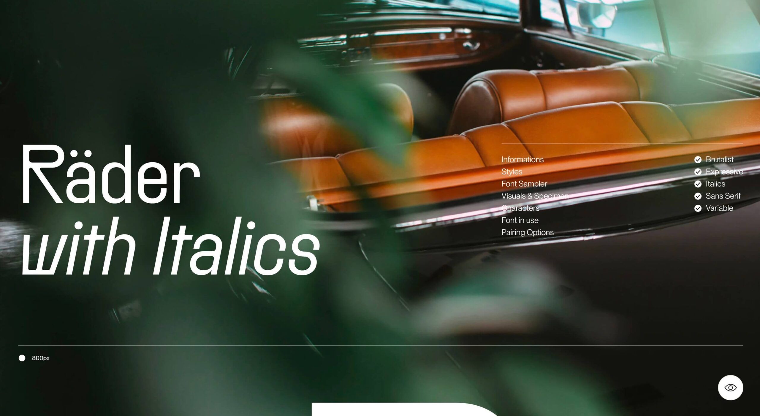
Choosing the Right Typeface
Reflecting Brand Personality
The choice of typeface is a direct reflection of your brand’s character. Whether it’s the trustworthiness of serif fonts or the modernity of sans-serif, selecting the right typeface is a key step in how to master the art of typography.
Diverse Applications
Consider how your chosen typeface will look across various mediums, from print to digital, ensuring consistency in your brand’s voice.
Balancing Legibility and Readability
Ensuring Clear Communication
Legibility and readability are the foundation of effective typography. It’s not just about making text look good but also about ensuring that it communicates the intended message clearly and effectively.
Optimizing User Experience
A well-designed typographic layout enhances user experience, making information easily accessible and digestible.
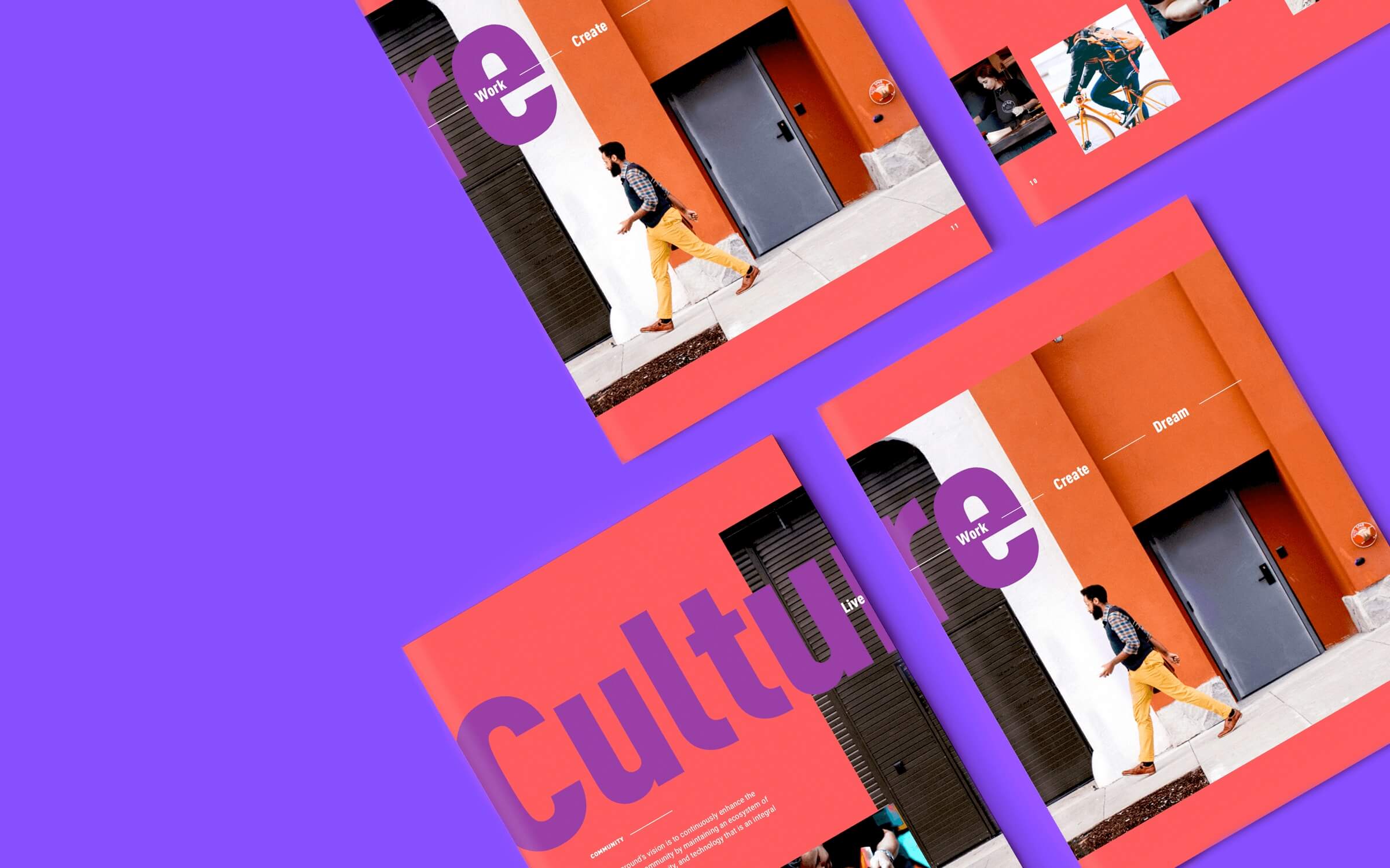
Implementing Hierarchy and Contrast
Guiding the Viewer's Eye
Using different font sizes, weights, and styles creates a visual hierarchy, guiding the viewer’s attention to the most important elements first. This is a crucial aspect of how to master the art of typography.
Creating Visual Interest
Contrast in typography not only adds visual interest but also improves readability, making it easier for viewers to navigate through the content.

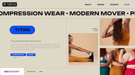
The Strategic Use of Color
Enhancing Brand Identity
Color in typography can reinforce brand identity and evoke emotional responses. Choosing the right color palette is essential in creating a cohesive and memorable brand experience.
Mastering Kerning, Leading, and Tracking
The Details that Matter
Attention to kerning, leading, and tracking is what sets professional typography apart. These subtle adjustments can greatly improve the overall aesthetic and readability of your text.
Responsive Typography in Digital Design
Adapting to Different Screens
In the digital realm, typography must be adaptable to various screen sizes and resolutions. Responsive typography ensures that your content is legible and appealing across all devices, a key factor in how to master the art of typography.
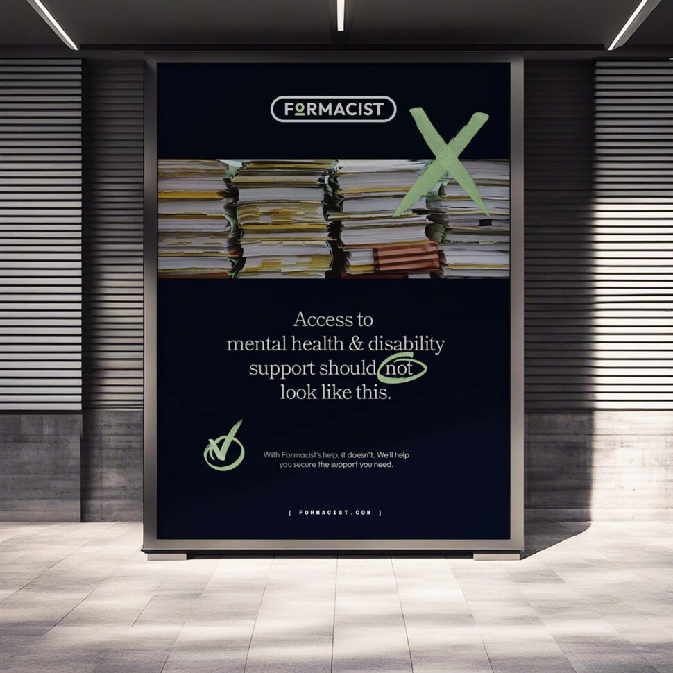
Typography as a Storytelling Tool
Conveying Brand Narrative
Typography can be used to tell your brand’s story, conveying messages beyond words. The right typographic choices can create a strong emotional connection with your audience.
Conclusion: Elevating Your Brand with Typography
In conclusion, understanding “how to master the art of typography” is essential for any digital agency focused on graphic design and branding. It’s not just about making text look attractive; it’s about using typography as a strategic tool to enhance brand identity, improve user experience, and effectively communicate your message. By mastering these principles, you can elevate your brand and create designs that resonate with your audience.
Visual Soldiers
Visual Soldiers is an Atlanta-based creative studio specializing in branding, design & digital experiences.

