Ultimate Guide to Social Media Visual Design
Social media visuals are your brand’s first impression. They grab attention, tell your story, and drive engagement. Here’s why they matter and how to get them right:
- Visuals outperform text: Posts with visuals get 94% more views; videos drive 1,200% more shares.
- Consistency builds trust: Unified colors, typography, and design boost brand recognition by 80%.
- Mobile-first design is critical: 83% of social media browsing happens on mobile.
- Accessibility expands reach: High-contrast text, alt-text, and captions ensure inclusivity.
This guide covers design principles (color, typography, hierarchy), platform-specific requirements (dimensions, formats), and workflow tips for creating visuals that stand out. Whether you’re designing for Instagram, TikTok, LinkedIn, or Facebook, the key is to combine sharp visuals with accessibility and consistency. Let’s dive into the details.
Creative Social Media Post Design
Basic Principles of Social Media Visual Design
Crafting effective social media visuals starts with mastering key design principles. These fundamentals help ensure your content grabs attention and communicates your message clearly.
Color Psychology and Brand Consistency
Color is more than just a visual element – it’s a psychological powerhouse. Studies show that up to 90% of quick decisions about products are influenced by color, and 85% of shoppers say color is the main reason they choose to buy something. For instance, red can create a sense of urgency, making it perfect for “Buy Now” buttons or sales promotions. Blue conveys calmness and trust, which is why many tech and professional brands use it. Yellow exudes energy and optimism, while green represents growth, health, and prosperity.
To create visually appealing designs, use the color wheel to develop schemes like monochromatic, analogous, or complementary combinations. These guide the viewer’s eye naturally toward important elements, such as a call-to-action. Interestingly, on Pinterest, colors like red, purple, and pink tend to encourage sharing, whereas green, black, blue, and yellow might have the opposite effect.
“Color is not just a visual element – it’s also emotional.” – Roy Olende, Author
Consistency is key when it comes to branding. Use precise hex codes (e.g., #FF6B6B) across all platforms to avoid slight variations. A social media style guide that locks in your specific color palette can help your team maintain a cohesive look. Also, remember that color meanings can vary across cultures – white, for example, symbolizes purity in Western contexts but may signify grief in some Eastern traditions.
Once your color scheme is set, it’s time to focus on typography to ensure your message is both stylish and easy to read.
Typography and Readability
Typography does more than display words – it reflects your brand’s personality. But if your text is hard to read, your audience might scroll right past it. Fonts that are too small, overly decorative, or lack contrast with the background can make your content less effective.
“What do you do with type? Read it! So why do so many people make it so damned difficult to do just that?” – Max Luzuriaga, Web Designer and Developer
For mobile-friendly designs, sans-serif fonts are a safe bet – they’re easier to read on small screens. The Web Content Accessibility Guidelines (WCAG) suggest a minimum contrast ratio of 4.5:1 between text and background for readability. Stick to no more than three different typefaces in a single design. When pairing fonts, mix a serif with a sans-serif and follow the “keep it the same or change it a lot” rule to ensure clear contrast.
Keep your text bold, concise, and well-spaced. Avoid color combinations like green/red or blue/yellow, which can be hard to read. With the text sorted, the next step is to arrange your design elements in a way that guides the viewer’s attention.
Visual Hierarchy and Balance
Visual hierarchy is all about organizing elements so viewers instantly understand what’s most important. Since the brain processes visuals much faster than text, directing the audience’s gaze is critical.
Larger elements naturally draw attention. Restrict size variations to three levels – small, medium, and large. Use these sizes strategically: large for primary messages, medium for supporting information, and small for finer details. Pair size with color and contrast for maximum impact – bright, bold colors and typography naturally stand out.
White space, or negative space, is your ally. It frames key content and prevents designs from feeling cluttered. Most people scan visuals in an F- or Z-pattern, so placing important elements in the upper left or along the left side can improve visibility.
A quick way to test your design is the squint test: squint at your graphic or apply a blur to see if the main elements still stand out. Group related items, like a headline and its sub-text, to show they belong together. For balance, consider dynamic, asymmetrical layouts.
| Design Element | Best Practice |
|---|---|
| Size Variations | Limit to 3 (small, medium, large) |
| Font Count | Use a maximum of 3 typefaces |
| Color Palette | Stick to 2 primary + 2 secondary colors |
| Text Contrast | Maintain a 4.5:1 ratio (WCAG standard) |
| Key Element Placement | Focus on upper left or left side (F/Z patterns) |
Designing for Accessibility and Inclusivity
Creating visuals that everyone can access is more than just a good practice – it’s a necessity. In the U.S., 25% of people live with a disability, and globally, around 2.2 billion individuals experience vision impairment. Designing with accessibility in mind helps you reach a broader audience. As Alexa Heinrich, Social Strategist and Creator of Accessible Social, explains:
“Creating accessible social media means ensuring that everyone can access your content. No matter their physical or cognitive abilities”.
Text Contrast and Readability Standards
Contrast ratios are key to making text readable rather than a frustrating blur. The Web Content Accessibility Guidelines (WCAG) offer clear benchmarks: body text under 18pt must meet a 4.5:1 contrast ratio for Level AA compliance, while larger text (18pt or bigger, or 14pt bold) requires a minimum of 3:1. For those aiming for the stricter Level AAA standard, the ratios jump to 7:1 for small text and 4.5:1 for large text.
Before publishing, use tools like Adobe Color‘s contrast analyzer or the WebAIM Contrast Checker to ensure your hex codes meet these standards. For mobile, stick to simple sans-serif fonts like Arial or Verdana, and keep paragraph text at a minimum size of 12pt (16px).
| Element Type | WCAG AA (Minimum) | WCAG AAA (Enhanced) |
|---|---|---|
| Body Text (<18pt regular / <14pt bold) | 4.5:1 | 7:1 |
| Large Text (>18pt regular / >14pt bold) | 3:1 | 4.5:1 |
| Icons and Actionable Graphics | 3:1 | 4.5:1 |
Another critical tip: ensure your content can zoom up to 400% without forcing users to scroll horizontally. This feature is vital for individuals with low vision who depend on browser zoom functionality.
Once your text is optimized, turn your attention to choosing accessible color palettes.
Color Palettes for Color Vision Deficiencies
After addressing text clarity, focus on color palettes that accommodate users with color vision deficiencies. Relying solely on color cues isn’t enough – add icons, patterns, or text labels to ensure everyone understands the message. With 8% of men and 0.5% of women experiencing some form of color blindness, this consideration affects a significant portion of your audience.
Use tools like a color blindness simulator to see how your designs appear to users with conditions like deuteranopia, protanopia, or tritanopia. Adobe Color includes this functionality, and the Accessible Brand Colors tool can help you create compliant palettes.
In addition to color adjustments, enhance accessibility with these practical tips:
- Use CamelCase hashtags (e.g., #SocialMediaDesign instead of #socialmediadesign) so screen readers can differentiate words.
- Place emojis after text to avoid disrupting screen reader flow.
- Avoid using ALL CAPS, as screen readers may struggle to read them naturally.
“Marketers should care about the experience that their followers have when they engage with their brand on social media”.
When you prioritize accessibility, you’re doing more than meeting guidelines – you’re creating a better, more inclusive experience for everyone.

Platform-Specific Design Requirements
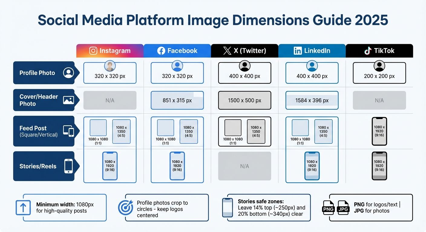
Social Media Platform Image Dimensions and Specifications Guide 2025
Creating visuals tailored to each platform’s specifications is key to making an impact. While following core design principles and accessibility standards is a must, each platform has its own technical requirements. For example, what works on LinkedIn might fall flat on TikTok, and square Instagram posts often look awkward on X. Ignoring these specifics can waste effort and hurt performance. Consider this: 63.3% of businesses use images and videos as a central part of their marketing strategy.
Mobile-first design has taken over social media. Over 80% of Facebook users, for instance, access the platform exclusively on mobile devices. This shift has driven the popularity of vertical formats like 9:16, now the standard for short-form video across TikTok, Instagram Reels, YouTube Shorts, and Facebook Stories. Even Instagram has adapted, rolling out a 3:4 aspect ratio (1012 x 1350 px) for its “tall grid” in early 2025 to better align with the vertical content users prefer. To succeed, you need to nail the precise image dimensions and aspect ratios for each platform.
Image Dimensions and Aspect Ratios
Using the right image dimensions ensures your visuals look sharp and professional, avoiding blurry or awkwardly cropped images. A minimum width of 1080 pixels is standard for high-quality feed posts across most platforms. For profile photos, remember that platforms like Instagram, Facebook, X, and LinkedIn crop square uploads into circles, so keep key elements like logos centered.
| Platform | Profile Photo | Cover/Header Photo | Feed Post (Square/Vertical) | Stories/Reels |
|---|---|---|---|---|
| 320 x 320 px | N/A | 1080 x 1080 (1:1) / 1080 x 1350 (4:5) | 1080 x 1920 (9:16) | |
| 320 x 320 px | 851 x 315 px | 1080 x 1080 (1:1) / 1080 x 1350 (4:5) | 1080 x 1920 (9:16) | |
| X (Twitter) | 400 x 400 px | 1500 x 500 px | 1080 x 1080 (1:1) / 1080 x 1350 (4:5) | N/A |
| 400 x 400 px | 1584 x 396 px | 1080 x 1080 (1:1) / 1080 x 1350 (4:5) | 1080 x 1920 (9:16) | |
| TikTok | 200 x 200 px | N/A | 1080 x 1920 (9:16) | 1080 x 1920 (9:16) |
For Stories and Reels, leave about 14% of the top (≈250px) and 20% of the bottom (≈340px) free of text or key visuals to avoid interference with platform UI elements. File formats also matter: use PNG for logos and text to maintain clarity and avoid compression artifacts, while JPG works best for photographs.
While technical accuracy is essential, aligning your content with audience preferences can take your visuals to the next level.
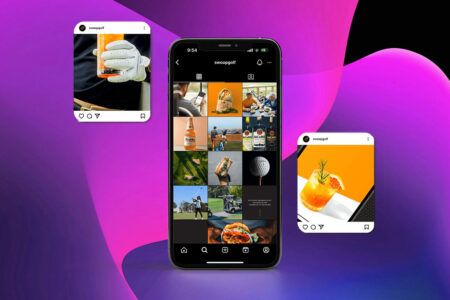
Content Formats and Audience Preferences
Each platform thrives on specific content formats that resonate with its users. For instance, Instagram carousels generate twice the engagement of single-image posts, making them perfect for storytelling or step-by-step guides. On X, tweets with images are three times more likely to spark engagement compared to text-only posts. Striking infographics packed with valuable information can help your content stand out in the fast-moving feed.
LinkedIn audiences lean toward professional, polished visuals. Cool tones like grays and blues, serif fonts, and document-style carousels can position your brand as trustworthy and authoritative. On Instagram, vibrant, high-resolution images with emotional appeal and creative compositions perform best. TikTok, with over 1 billion monthly active users and a predominantly young audience (nearly half are under 30), demands fast-paced, authentic content. Since many users watch videos with the sound off, clear text overlays and captions are a must.
“A one-size-fits-all approach to visual content is a guaranteed way to waste resources.” – Stravix
To make your visuals even more effective, consider accessibility and engagement strategies. Adding descriptive alt text to images not only helps visually impaired users but also improves your content’s visibility in search algorithms. Video content, in particular, is a powerhouse for engagement – it can generate up to 1200% more shares than text and image posts combined. Focus on formats that bring movement and storytelling to life, and you’ll capture attention in a crowded digital space.


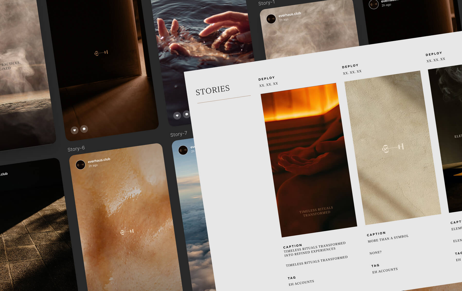
Building Design Systems and Templates
When it comes to creating visuals for social media, a solid design system lays the foundation for maintaining a cohesive and recognizable brand presence. By combining consistent design principles with practical tools, you can ensure every piece of content aligns with your brand’s identity, no matter who creates it.
A design system acts as your go-to framework for producing visuals that feel unified across platforms. It includes reusable elements like color codes, fonts, button styles, and icons. These components make it easier for your audience to instantly recognize your brand as they scroll through their feeds.
Start by identifying your core components. Create a brand style guide that outlines essential elements such as logo usage, primary and accent color palettes, typography rules, and design tokens (like “primary-color” variables) to enable quick updates across templates. Include an icon library with clear usage guidelines and ensure accessibility standards are met for color contrast and spacing. Centralized documentation like this helps your team stay on the same page, even when working under tight deadlines.
Creating Reusable Templates
Templates are a lifesaver when it comes to producing content efficiently. Design templates tailored to specific platform dimensions – like 1:1 or 4:5 for Instagram feeds and 9:16 for Stories and Reels – to avoid awkward cropping or formatting issues. Each template should feature fixed brand elements, while leaving editable areas for swapping out images, headlines, or promotional text.
Using the same fonts, colors, and logos across all templates reinforces your brand identity. Over time, this repetition creates a look that your audience instantly associates with your brand, even before reading a caption. Keep your templates clean and simple – stick to a maximum of three typefaces and avoid unnecessary clutter.
“Designers and marketers know they have ‘achieved perfection’ not when there is nothing left to add, but when there is nothing left to take away”.
This streamlined approach ties neatly into the platform-specific strategies discussed earlier.
Maintaining Brand Consistency
Consistency doesn’t mean every post looks exactly the same – it’s about ensuring your core visual language is always recognizable, even as you adapt to different platforms and campaigns. One way to achieve this is through content batching: create multiple visuals in one session to ensure they follow the same design standards and flow. Use shared digital assets to avoid outdated or mismatched elements.
Striking the right balance is crucial. While your logo placement, color palette, and typography should remain consistent, the tone and style can be adjusted to suit each platform’s unique audience. Keep in mind that up to 90% of snap judgments about your brand are influenced by color, so sticking to your signature palette across all touchpoints is essential for building trust and recognition. A unified visual language not only boosts brand recognition but also enhances engagement across every social media channel.
Step-by-Step Workflow for Social Media Visuals
A well-defined workflow simplifies the design process and minimizes revisions by focusing on detailed planning from the start. This approach ensures every visual not only looks appealing but also achieves its intended purpose.
Planning Before Design
Start by identifying your audience and setting clear objectives. Understanding audience demographics and behavior allows you to tailor visuals for each platform. For example, a LinkedIn post aimed at professionals will have a much different tone and design than an Instagram Story designed for a younger, visually-driven audience.
Every visual should align with a specific marketing goal, whether it’s boosting brand awareness, generating leads, or driving website traffic. Stick to content themes that reflect your brand identity. A common content strategy involves balancing 40% original content with 60% curated content, offering a practical guideline for planning.
Once your plan is in place, move forward with a thorough review process.
Review and Quality Checks
After creating your design, check for consistency in fonts, color schemes, and imagery while ensuring platform-specific requirements are met. Verify that each image matches the correct dimensions for its platform.
Add alt tags (up to 125 characters) to improve SEO and accessibility. As Mark Valderrama, CEO & Founder of Aquarium Store Depot, puts it:
“Alt tags help search engines index visual content more accurately and ensure they appear in front of the right audience”.
Ensure text overlays are easy to read and maintain strong contrast, especially on smaller screens. Also, confirm that you have proper usage rights for any stock or user-generated content.
Finally, optimize file size and load speed to ensure seamless performance.
Optimizing for Performance
File size plays a critical role in load speed, particularly on mobile devices. Use tools like TinyPNG or Photoshop to compress files while maintaining high visual quality. Select the right file format – JPEGs are ideal for standard photos, while PNGs are better for images with text or logos that require sharpness.
Test your visuals on multiple screen sizes to avoid any layout issues. Gerrid Smith, Chief Marketing Officer at Joy Organics, highlights this point:
“It’s vital to have a photo that looks good across any platform, and any screen size is important”.
Turn Scroll-Stopping Visuals Into Brand Authority
Your social presence isn’t just content. It’s perception. It’s credibility. It’s the difference between being noticed and being forgotten. If your brand is ready to look as powerful as it truly is, let’s build something that performs.
Start Your ProjectConclusion
Let’s recap the essentials for maintaining your brand’s visual identity across every social platform.
Key Design Principles to Keep in Mind
Creating effective visuals for social media boils down to a few fundamental principles. First, a clear visual hierarchy helps guide your audience’s attention using elements like proximity, alignment, and contrast. Next, consider color psychology – for example, calming blues can evoke trust, while bold oranges encourage action. Don’t overlook typography either; easily readable fonts can instantly set you apart from competitors.
Make smart use of white space to avoid clutter and emphasize key messages. Always design with each platform’s specific requirements in mind to optimize engagement. And remember, accessibility is non-negotiable – high contrast, descriptive alt-text, and captions for sound-off videos not only improve usability but also help you connect with a broader audience.
By sticking to these principles, you’ll be better equipped to refine your visual strategy.
What’s Next for Your Brand?
Start with a thorough review of your current visual content. Check that your assets meet accessibility standards, include alt-text, and align with a cohesive brand identity. To stay consistent, create a style guide that outlines your color schemes, typography, and logo usage – this will serve as a go-to resource for maintaining your brand’s look and feel across all platforms.
Consider adopting a four-pillar content strategy: Educate, Entertain, Inspire, and Promote. This approach ensures variety while keeping your messaging focused. If you need help scaling your visuals, teaming up with a design agency like Visual Soldiers can provide the expertise to elevate your content.
FAQs
To make your social media visuals more inclusive, start by using clear and concise alt text for images and GIFs. Keep descriptions under 125 characters, and skip phrases like “image of”, since screen readers already indicate the element is an image. For GIFs, include a short explanation of the motion and its purpose, and think about offering a static alternative for users who may not be able to view animations.
When adding text to visuals, ensure the color contrast aligns with WCAG AA standards (a minimum ratio of 4.5:1) so it’s readable for people with visual impairments. Stick to plain, web-safe fonts and steer clear of decorative typefaces that could be hard for screen readers to interpret. For videos, always provide captions, and use emojis sparingly – only when they add value, not unnecessary clutter.
Lastly, take advantage of accessibility tools built into platforms like Twitter and Facebook. These can help you verify that your alt text and visual elements are easy to understand and navigate. Incorporating these steps into your workflow ensures your content reaches a broader audience while staying inclusive.
To keep your brand consistent across social media, it’s all about maintaining a unified look and voice. This means aligning your logo, colors, fonts, tone, and imagery while tailoring your approach to fit each platform’s unique style. Why does this matter? Consistency strengthens trust, boosts recognition, and can even lead to higher revenue over time.
Here’s how to do it:
- Develop a style guide: Lay out clear rules for your logo usage, color palette, fonts, and messaging. Be sure to include platform-specific tips so your brand stays flexible but always on-brand.
- Leverage templates and design systems: These tools can save time while ensuring your posts, ads, and stories all share a consistent look and feel.
- Keep your assets up-to-date: Regularly check that your visuals and messaging align with your guidelines and meet the latest requirements of each platform.
At Visual Soldiers, we’re experts in helping brands create seamless systems that make their identity stand out on platforms like Instagram, LinkedIn, and TikTok.
Choosing the right color scheme begins with understanding your brand’s personality and the emotions you aim to inspire. Colors play a powerful role in shaping perception – think of blue, which often conveys trust and calm, or red, which can spark excitement or a sense of urgency. Start by defining your brand’s traits (like professional, playful, or bold) and match them with the principles of color psychology. Choose a primary color that embodies your core message, add secondary colors to create depth, and include an accent color for highlights or calls to action. Aim for a palette of three to five colors to maintain a clean and consistent look.
Once you’ve chosen your palette, test it for readability and accessibility. Make sure there’s strong contrast between text and background, especially for mobile users, and avoid relying solely on color to convey critical information. Consistency is essential – using the same colors and tones across all platforms strengthens brand recognition.
If you need professional help, Visual Soldiers specializes in crafting custom color strategies and cohesive visuals designed to resonate with your audience and align with your goals.
Visual Soldiers
Visual Soldiers is an Atlanta-based creative studio specializing in branding, design & digital experiences.