July 9, 2024
Adopting a Mobile-First Design: A Step-by-Step Guide
-
Visual Soldiers
- Web Development
- minute read

Why Adopt a Mobile-First Design?
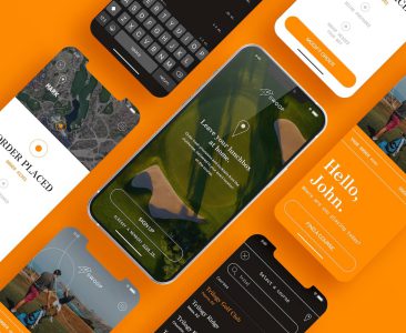
More users are accessing websites through mobile devices than ever before. Adopting a mobile-first design ensures your site caters to this growing audience. It prioritizes mobile interfaces, thus offering a smooth and intuitive user experience regardless of the device.
Understanding Mobile-First Design
Mobile-first design focuses on creating a website for mobile devices initially, then scaling up for larger screens. This approach guarantees that essential features and content are optimized for mobile users, offering seamless navigation and interaction.
Steps to Adopting a Mobile-First Design
Step 1: Conduct Thorough Research
Begin by understanding your target audience and their device usage habits. Pinpoint the types of mobile devices they use most frequently. This data helps inform your design choices to ensure compatibility and user-friendliness.
Step 2: Prioritize Core Content
Identify the most critical information and features your users need. Display this content prominently on your mobile interface. By prioritizing core content, you eliminate unnecessary clutter and streamline the user experience.
Step 3: Use Responsive Design Techniques
Responsive design adapts your site’s layout to various screen sizes. Start with a flexible grid layout that can easily adjust to different resolutions. Use responsive images that scale according to the device’s display capabilities.
Step 4: Optimize Navigation
Navigation should be simple and intuitive for mobile users. Utilize collapsible menus and sticky headers to enhance ease of use. Ensure that navigation elements are touch-friendly with adequate spacing.
Step 5: Improve Page Load Speed
Mobile users expect fast-loading pages. Minimize file sizes and reduce server requests to speed up load times. Use tools like Google’s PageSpeed Insights to identify and rectify performance bottlenecks.
Step 6: Conduct Rigorous Testing
Test your mobile-first design on various devices and screen sizes. Use both real devices and emulators to identify any potential issues. Make necessary adjustments to ensure consistency and usability across all platforms.


Benefits of Mobile-First Design
A mobile-first design offers numerous advantages. Improved user experience on mobile devices often leads to higher engagement and lower bounce rates. Additionally, search engines prioritize mobile-friendly sites, potentially boosting your search rankings. Learn more about the benefits of mobile-first design in this article, Maximizing ROI with Mobile–First Design.
Conclusion
Adopting a mobile-first design ensures your website meets the demands of modern users. By following these steps, you enhance usability, performance, and search engine visibility. Embrace mobile-first design to stay ahead in a mobile-centric world.
Visual Soldiers
Visual Soldiers is an Atlanta-based creative studio specializing in branding, design & digital experiences.
