February 14, 2024
Mobile-First Design Practices for 2024: Optimizing User Experience
-
Visual Soldiers
- Web Design
- minute read
With more and more people accessing the internet through mobile devices, designing mobile-first websites has become essential for businesses. As we move into a new web landscape, there are several exciting trends emerging in mobile-first design that can significantly enhance the user experience. Below we dive into the best mobile-first design practices in 2024.
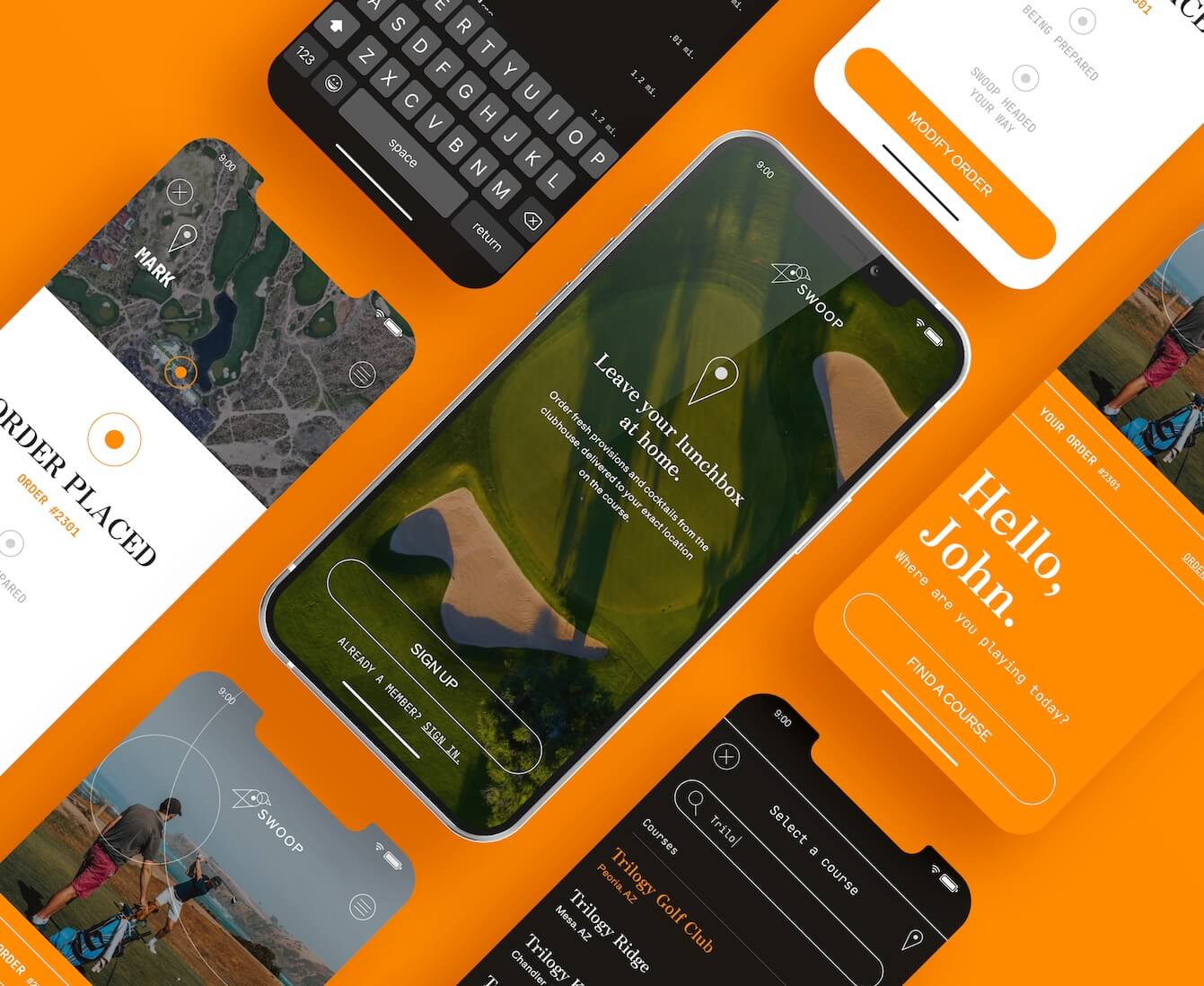
One of the key mobile-first design practices for 2024 is the use of gesture-based interactions.
With technologies such as touch, voice, and motion control evolving rapidly, users will have more intuitive ways to interact with mobile interfaces. This will make navigation smoother and more engaging, ultimately improving the overall user experience.
Another trend is the adoption of dark mode.
With its sleek and modern aesthetics, dark mode reduces eye strain, saves battery life, and provides a unique visual experience. Many popular apps and operating systems have already implemented dark mode, and its popularity is expected to continue growing in 2024.
Additionally, incorporating microinteractions into mobile designs can enhance user engagement and delight.
Microinteractions are subtle animations or visual feedback triggered by user actions like tapping or swiping. These small design elements can make the user experience more enjoyable and memorable.
By embracing these mobile-first design trends, businesses can create websites that are not only visually appealing but also optimized for user engagement and conversion. So, stay ahead of the curve and leverage these trends to provide an exceptional mobile experience for your users in 2024.
Mobile-first design statistics
When users have numerous options at their fingertips, optimizing user experience has become crucial for businesses. A seamless and engaging mobile experience can make or break a brand’s success. According to research, 88% of users are less likely to return to a website after a bad mobile experience, while 52% of users are less likely to engage with a brand due to poor mobile design.
Mobile-first design ensures that websites are tailored specifically for mobile devices, providing a responsive and user-friendly experience. By optimizing user experience, businesses can increase user satisfaction, boost engagement, and ultimately drive conversions and revenue.
Key principles of mobile-first design
Statistics show the increasing dominance of mobile devices in internet usage and the importance of mobile-first design. As of 2021, mobile devices accounted for more than 54% of website traffic worldwide. This highlights the need for businesses to prioritize mobile optimization to cater to the majority of their audience.
Studies have shown that 57% of users will not recommend a business with a poorly designed mobile site, while 40% of users will abandon a website if it takes more than 3 seconds to load. These numbers emphasize the significance of mobile-first design in attracting and retaining users.
Latest mobile-first design practices for 2024
To create effective mobile-first designs, it’s essential to follow key principles that prioritize user experience. These principles include:
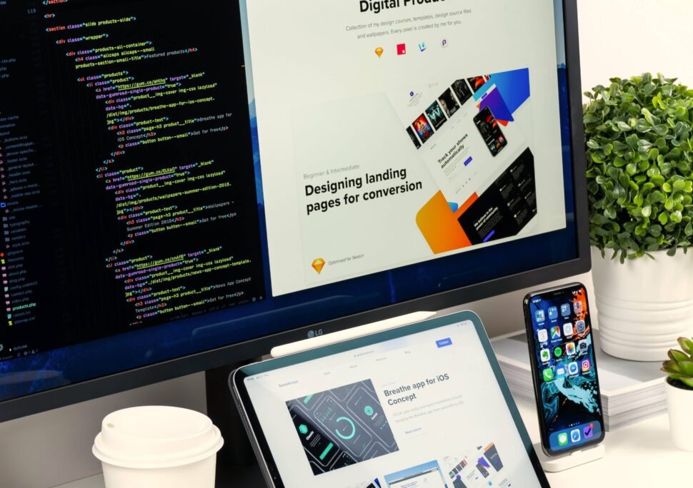
Responsive Web Design
Responsive web design ensures that websites adapt to different screen sizes and resolutions, providing a consistent experience across devices. This approach eliminates the need for separate mobile and desktop versions, streamlining the development process and making it easier to maintain and update the website.
Simplified Navigation and Intuitive User Interface
Mobile interfaces should have simple and intuitive navigation to enable effortless browsing and information access. Clear and concise menus, easily recognizable icons, and logical page hierarchy are crucial elements of a user-friendly mobile design. By reducing clutter and focusing on essential elements, businesses can enhance user experience and guide users towards their desired actions.
Integration of Voice Search and AI Technology
Voice search has gained significant popularity in recent years, with 55% of users now using voice commands on their mobile devices. Integrating voice search capabilities into mobile designs allows users to interact with the website using natural language, making it more convenient and accessible. Additionally, AI-powered chatbots and virtual assistants can provide personalized assistance and improve user engagement.
Emphasis on Speed and Performance
Mobile users expect fast-loading websites, and even a few seconds of delay can lead to high bounce rates. Optimizing website speed and performance is crucial for mobile-first design. Techniques such as image compression, minification of code, and caching can significantly improve loading times and ensure a smooth browsing experience.


Responsive web design
As we look towards the future of mobile-first design, several trends are emerging that can shape the user experience in 2024. These trends include:
Gesture-Based Interactions
Gesture-based interactions are becoming more prevalent as technologies such as touch, voice, and motion control evolve. These interactions provide users with more intuitive ways to navigate through mobile interfaces, making the experience more engaging and immersive. Whether it’s swiping, pinching, or using voice commands, gesture-based interactions offer a natural and seamless user experience.
Dark Mode
Dark mode has gained immense popularity in recent years, and it’s expected to continue growing in 2024. With its sleek and modern aesthetics, dark mode not only enhances visual appeal but also offers practical benefits. Dark mode reduces eye strain, especially in low-light conditions, and can save battery life on OLED screens. Its popularity is evident from the widespread adoption by popular apps and operating systems.
Microinteractions
Microinteractions are subtle animations or visual feedback triggered by user actions, such as tapping or swiping. These small design elements can make a significant impact on the user experience, providing feedback, guiding users, and adding an element of delight. Whether it’s a subtle button animation or a playful loading spinner, microinteractions can make the user experience more enjoyable, memorable, and engaging.
Simplified navigation and intuitive user interface
Optimizing user experience through a mobile-first approach will continue to be a crucial mobile-first design practice in 2024 for your digital marketing strategy. By staying up to date with the latest design trends and incorporating them into mobile interfaces, businesses can create websites that are visually appealing, engaging, and conversion optimized.
Gesture-based interactions, dark mode, and microinteractions are just a few of the trends that will shape the user experience in 2024. It’s essential for businesses to adapt and embrace these trends to provide exceptional mobile experiences that stand out from the competition. By prioritizing user experience, businesses can build stronger relationships with their audience, increase brand loyalty, and ultimately drive business growth in the mobile era.
Integration of voice search and AI technology
In the fast-paced mobile browsing world, users expect seamless navigation and intuitive user interfaces. To meet these expectations, mobile-first design trends in 2024 will focus on simplifying navigation and enhancing the user interface.
Streamlined Menus and Content Hierarchy
One of the key elements of optimizing user experience in mobile-first design is the implementation of streamlined menus and content hierarchy. This involves carefully organizing and prioritizing content to ensure that users can easily find what they are looking for.
By adopting a minimalist approach, mobile websites can present users with a clean and uncluttered interface, making it easier for them to navigate and find the information they need. This can be achieved by utilizing collapsible menus, hidden navigation bars, and strategically placed call-to-action buttons.
Clear and Intuitive Icons and Buttons
In 2024, mobile-first design will also focus on using clear and intuitive icons and buttons to enhance the user experience. This includes using universally recognized symbols and labels that users can easily understand and interact with.
By incorporating familiar icons, such as a magnifying glass for search or a shopping cart for the cart functionality, users can quickly identify and use these features without needing to read lengthy instructions. Additionally, using easily clickable buttons with clear visual cues will make it effortless for users to interact with the mobile interface.
Responsive Design and Adaptive Layouts
Another crucial aspect of mobile-first design practices in 2024 is the implementation of responsive design and adaptive layouts. With the wide range of mobile devices available in the market, it is essential for websites to adapt and display optimally on various screen sizes and resolutions.
Responsive design ensures that a website automatically adjusts its layout and content to fit different screen sizes, providing users with a consistent and pleasant viewing experience. Adaptive layouts take this a step further by customizing the design based on the user’s device, providing an optimized interface tailored to their specific needs.


Emphasis on speed and performance
As voice recognition technology continues to improve, the integration of voice search and AI technology will play a significant role in mobile-first design trends for 2024. This advancement will revolutionize the way users interact with mobile interfaces and search for information.
Enhanced Voice Commands and Conversational Interfaces
Mobile-first design practices in 2024 will focus on enhancing voice commands and creating conversational interfaces that provide users with a more natural and intuitive way to interact with their mobile devices.
By leveraging AI technology and natural language processing, mobile interfaces can understand and respond to user commands more accurately. This not only improves the user experience but also opens up new possibilities for hands-free interactions, making mobile browsing more accessible for individuals with disabilities.
Personalized Recommendations and Predictive Analytics
With the integration of AI technology, mobile-first design in 2024 will also aim to provide users with personalized recommendations and predictive analytics. By analyzing user behavior and preferences, mobile interfaces can offer tailored content and suggestions that are relevant to each individual user.
This level of personalization enhances the user experience by saving users’ time and effort in searching for relevant information or products. By anticipating their needs and presenting them with personalized recommendations, mobile interfaces can create a more intuitive and engaging browsing experience.
Conclusion: The future of mobile-first design
Speed and performance are critical factors in mobile-first design. In 2024, the emphasis on speed and performance will continue to grow, with new technologies and techniques being employed to optimize loading times and overall performance.
Accelerated Mobile Pages (AMP)
Accelerated Mobile Pages (AMP) is a technology that aims to enhance mobile browsing speed by creating lightweight versions of web pages. These stripped-down versions load quickly and provide users with a seamless browsing experience, even on slower connections.
By implementing AMP, mobile-first design can significantly improve the loading times of web pages, reducing bounce rates and increasing user engagement. This technology is particularly beneficial for content-heavy websites, such as news publications or e-commerce platforms.
Caching and Content Delivery Networks (CDNs)
Another approach to improving speed and performance in mobile-first design is the utilization of caching and Content Delivery Networks (CDNs). Caching involves storing frequently accessed data locally on the user’s device, reducing the need to fetch data from the server repeatedly.
Content Delivery Networks, on the other hand, distribute website content across multiple servers worldwide, ensuring that users can access the nearest server, reducing latency and improving loading times. By leveraging caching and CDNs, mobile-first design can deliver content faster, providing users with a seamless browsing experience.
Visual Soldiers
Visual Soldiers is an Atlanta-based creative studio specializing in branding, design & digital experiences.
