July 29, 2026
Guide to Responsive Micro-Interactions in Web Design
-
Visual Soldiers
- UX/UI Design
- minute read
Guide to Responsive Micro-Interactions in Web Design
Quick Summary
Responsive micro-interactions are small yet significant design elements that play a crucial role in enhancing user experience. These interactions, such as a button changing color upon being clicked or a loading spinner appearing during data processing, serve specific purposes beyond mere aesthetics. They provide essential feedback, confirm user actions, and help guide navigation throughout the interface. Micro-interactions are defined as single, self-contained events within a user interface, comprising a trigger, rules, and feedback. Their thoughtful implementation can significantly improve usability and boost user satisfaction, making them an important aspect of modern digital design.
Responsive micro-interactions are small, purposeful design elements that enhance user experience by providing feedback, confirming actions, and guiding navigation. These interactions, like a button changing color when clicked or a loading spinner during data processing, are more than just visual flair – they improve usability and user satisfaction.
Key Takeaways:
- What They Are: Micro-interactions are single, self-contained events in a user interface, consisting of a trigger, rules, feedback, and loops/modes.
- Why They Matter: They reduce form errors by up to 40%, boost conversions by 25–35%, and make interfaces feel faster and more intuitive.
- Responsive Design: Adjusts interactions for different devices, input methods, and user preferences (e.g.,
prefers-reduced-motionfor accessibility). - Best Practices:
- Keep animations between 150–300ms for smoothness.
- Use ease-out for entering elements and ease-in for exiting.
- Focus on animating
transformandopacityfor better performance.
- Accessibility: Replace heavy animations with subtle alternatives for users with motion sensitivities and ensure compatibility with screen readers.
- Performance Tips: Test on mid-range devices, optimize GPU usage, and limit simultaneous animations based on device capabilities.
Responsive micro-interactions are not just functional – they reflect attention to detail and enhance the overall user experience. By following these principles, you can create interfaces that feel polished, intuitive, and inclusive.
Key Principles of Responsive Micro-Interactions
Design Principles for Micro-Interactions
Micro-interactions are all about serving a clear purpose. They should confirm actions, signal state changes, or reduce uncertainty for users. Before designing any interaction, ask yourself: does it fulfill one of these roles? If not, it’s better to skip it.
Timing plays a critical role in how users perceive these interactions. For instance, UI animations should generally last between 150–300ms. Anything under 100ms feels nearly instant, while animations over 500ms can come across as sluggish. Even a slight variation, like 50ms, can make the difference between something feeling crisp or dragging.
Easing is just as crucial as timing. When elements appear on the screen, use an ease-out transition (fast start, slow finish). For elements exiting, go for ease-in (slow start, fast finish). Avoid linear motion – it tends to feel unnatural. Here’s a quick reference for durations and easing based on interaction type:
| Interaction Type | Recommended Duration | Easing |
|---|---|---|
| Button Hover/Active | 150ms – 200ms | ease-out |
| Form Validation | 200ms – 300ms | ease-in-out or spring |
| Modal/Drawer Slide | 250ms – 350ms | ease-out (entry) / ease-in (exit) |
| Scroll Reveals | 400ms – 600ms | ease-out |
Another important factor is matching the animation style to the brand. For example, financial apps might need calm, steady animations, while creative tools can embrace a more dynamic energy. These design principles ensure micro-interactions feel intentional and aligned with the user experience.
Accessibility and Inclusivity Considerations
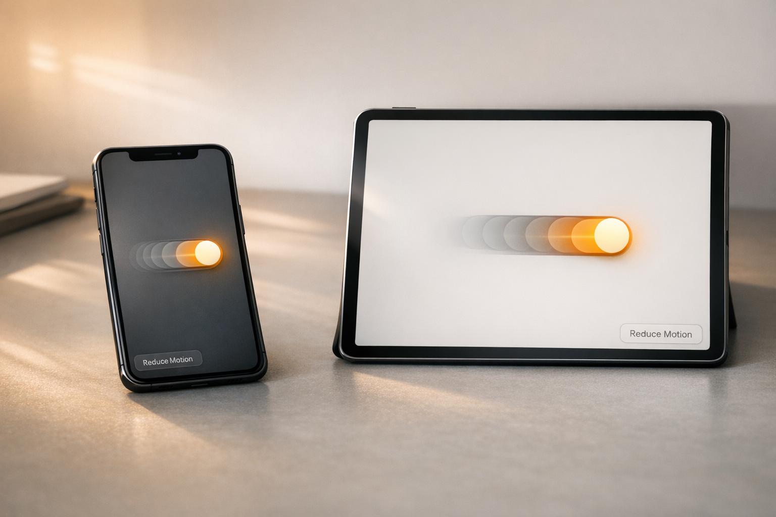
Micro-interactions should work for everyone, including users with motion sensitivities or disabilities. Around 35% of users experience vestibular disorders or discomfort from heavy animations. To address this, use the @media (prefers-reduced-motion: no-preference) query. This allows non-essential animations to run only for users who haven’t disabled motion at the OS level.
However, don’t simply remove animations for these users – replace them with alternative feedback, like changes in color or opacity. For example, if a button uses motion to confirm an action, a subtle color shift can achieve the same goal without causing discomfort. Also, avoid relying solely on color to indicate state changes. For instance, if a form error is marked with a red border, add an icon or text label so users with color vision deficiencies can easily understand the issue.
Keyboard and screen reader users should also have equal access to micro-interactions. Ensure interactive elements have a visible focus state using focus-visible. Use ARIA attributes like role="alert" or aria-live to announce dynamic changes, such as form validation messages when a field loses focus. By following these steps, micro-interactions can remain inclusive and functional for all users.
Balancing Performance and Responsiveness
For smooth animations, stick to animating transform and opacity properties. These are handled by the browser’s compositor thread, avoiding costly layout recalculations. On the other hand, animating properties like width, height, or margin forces the browser to reprocess the entire layout, which can hurt performance metrics like Cumulative Layout Shift (CLS).
To maintain a fluid 60fps experience, remember that developers have about 16.6ms per frame to work with. Exceeding this time can lead to dropped frames and a choppy experience. Set motion budgets – limits on how many elements animate at once – based on the device. Here’s a general guideline:
- Mobile: 3–5 elements
- Tablets: 4–7 elements
- Desktop: 6–10 elements
For mobile devices, keep animations under 200ms. Touch interactions feel more immediate than mouse clicks, so longer animations can make the interface feel unresponsive. Always test on mid-range Android devices or simulate slower hardware using 4x CPU throttling in browser DevTools. This ensures animations run smoothly on less powerful devices.
Finally, use the CSS will-change property wisely. It signals the browser to optimize specific elements by promoting them to their own compositor layer, but overusing it can drain memory and slow performance. Save it for elements that animate frequently and need extra optimization. Following these performance tips ensures micro-interactions remain smooth and responsive, ready to enhance user flows in the next steps.

How to Design Responsive Micro-Interactions
Mapping Micro-Interactions to User Flows
Start by reviewing your user flows to identify key moments where interactions need to feel responsive and provide feedback. Focus on essential flows like sign-up or checkout processes, and highlight every instance where the interface changes state – such as button clicks, data loading, or error messages. These moments form a micro-interaction backlog: a prioritized list of opportunities to improve user feedback.
Once you’ve outlined these moments, use the established four-part framework to refine each one. Pay special attention to paths that directly impact conversions, like real-time inline validation during checkout. These small adjustments can significantly reduce form abandonment. This mapping process gives you a strong foundation for selecting the right tools to prototype and implement these interactions.
“Micro-interactions are where personality lives.” – reStruggle
Tools for Designing and Prototyping
After identifying key interaction points, the next step is choosing the right tools to bring them to life.
- Figma: Perfect for UI design and basic prototyping, thanks to features like Smart Animate and consistent layer naming.
- ProtoPie: Great for creating complex, multi-state interactions with conditional logic.
- Framer Motion: Ideal for React environments, offering simple production-ready motion with properties like
whileHoverandwhileTap. - Rive: Best for lightweight animations and interactive illustrations, with built-in state machines for smooth performance.
| Tool | Best For | Key Strength |
|---|---|---|
| Figma | UI design & basic prototyping | Component variants and Smart Animate |
| ProtoPie | High-fidelity logic & interactions | Conditional logic and toggle states |
| Framer Motion | React production environments | Simple whileHover/whileTap implementation |
| Rive | Interactive illustrations | State machines and runtime performance |
Incorporating Branding into Micro-Interactions
Micro-interactions shouldn’t just function well – they should reflect your brand’s identity. Motion design, in particular, plays a huge role in reinforcing this. For example, a spring easing with a slight bounce can convey playfulness and friendliness, while a clean ease-out fade suggests professionalism and elegance. Even if two products use the same animation duration, their motion styles should feel distinct, aligning with their respective brand voices.
To maintain consistency, use motion tokens – predefined values for durations and easing curves integrated into your design system. Similar to color tokens, these ensure a cohesive experience across the product.
“A product where every interaction responds in the same way feels refined. A product where each feature was designed independently… feels unfinished.” – UIGuides
Also, don’t limit brand colors to static elements. Incorporate them into dynamic states like focus highlights, success indicators, and error messages. These small but meaningful details can elevate the overall user experience. Considering that 75% of users judge a company’s credibility based on website design quality, polished micro-interactions can make a lasting impression.
At Visual Soldiers, we apply these principles to ensure that every micro-interaction not only engages users but also strengthens the brand’s identity.
How to Implement Responsive Micro-Interactions in Code
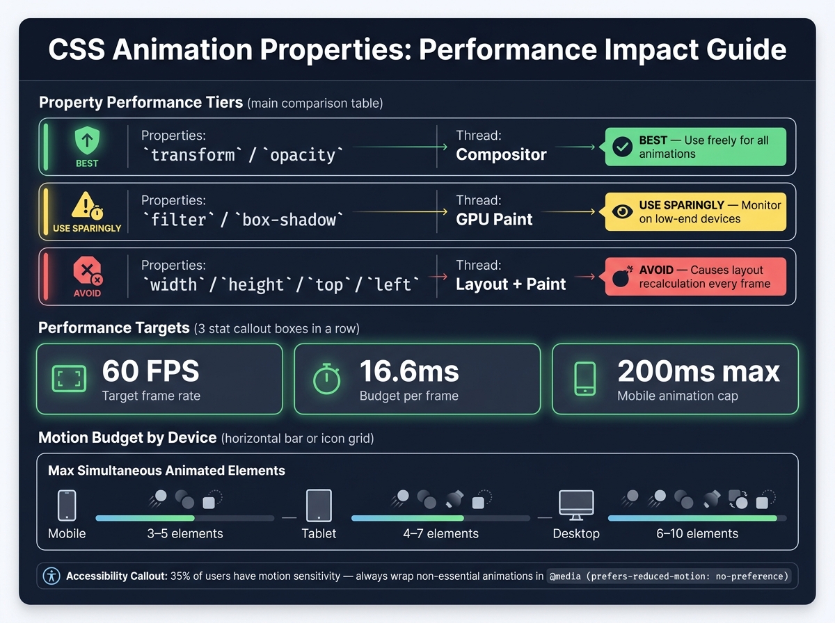
Responsive Micro-Interactions: Animation Properties & Performance Guide
Choosing the Right Implementation Approach
This phase is all about turning design ideas into functional code, ensuring micro-interactions work smoothly across different devices. The tools you choose depend on how complex the interaction is. For simpler effects like hover states, focus rings, button clicks, or toggles, CSS transitions and animations are your best bet. These run directly on the browser’s compositor thread, avoiding competition with JavaScript for processing power.
For more advanced interactions – like conditional sequences, physics-based movements, or multi-step animations – JavaScript becomes essential. If you’re working with React, Framer Motion (renamed “Motion” in 2026) is a popular choice. For timeline-heavy animations, GSAP 4 is the go-to tool. If you’re looking for a balance, the Web Animations API (WAAPI) offers JavaScript-level control with performance close to CSS.
“CSS transitions and animations handle the majority of microinteractions efficiently. For button hovers, card lifts, and simple state changes, CSS is faster and lighter than JavaScript alternatives.” – Studio Aurora
A golden rule to follow: never use transition: all. It forces the browser to evaluate every possible property change, which can cause layout thrashing. Instead, specify properties explicitly, like transition: transform 200ms ease-out, opacity 150ms ease-out.
Techniques for Responsiveness
Once you’ve chosen your implementation method, fine-tune your code to adapt to different devices and input methods. Media queries like pointer: coarse (for touch devices) and hover: none (for screens without hover states) are invaluable. On mobile, replace hover effects with clear visual indicators, such as borders, icons, or color changes.
Container queries have become a standard tool by 2026. Unlike viewport-based media queries, these allow you to adjust interactions based on the size of a parent container, which is especially handy in modular layouts. For scroll-based effects, native CSS features like @scroll-timeline and view-timeline now eliminate the need for JavaScript scroll listeners, reducing overhead and ensuring smoother animations.
Animation timing also plays a role in responsiveness. A 300ms transition might feel right on a desktop but could seem sluggish on a mobile device, where users expect quicker feedback. Using a consistent animation token scale – with values like 100ms, 200ms, and 300ms defined in your design system – helps maintain balance across devices.
Optimizing for Performance
To ensure a smooth experience, focus on optimizing your animations. Stick to animating transform and opacity properties since these use GPU compositing and avoid triggering layout or paint recalculations. Properties like width, height, top, or left should be avoided for animations, as they force the browser to recalculate the layout on every frame.
| Property | Performance Impact | Recommendation |
|---|---|---|
transform / opacity |
Low (Compositor) | Best for all animations |
filter / box-shadow |
Medium (GPU) | Use sparingly |
width / height / top / left |
High (Layout/Paint) | Avoid for animations |
Your aim should be 60fps, which gives you a budget of 16.6ms per frame. Test your animations on real mid-tier devices – like a three-year-old Android phone – to ensure they perform well under realistic conditions. If you can’t hit 60fps, simplify the motion.
For heavy assets like 3D scenes, Rive files, or large Lottie animations, use IntersectionObserver to lazy-load them only when they’re about to enter the viewport. Apply will-change: transform sparingly – it’s a performance hint for elements you know will animate, but using it too broadly can unnecessarily reserve GPU memory.
Lastly, respect users who prefer reduced motion. Wrap non-essential animations in @media (prefers-reduced-motion: no-preference). About 35% of users experience some level of motion sensitivity, so offering static or crossfade alternatives ensures accessibility while still conveying state changes. These optimizations lay the groundwork for a seamless, inclusive experience.
Testing and Improving Responsive Micro-Interactions
After rolling out micro-interactions, thorough testing and ongoing refinements are key to ensuring they perform consistently across all devices.
Functional and Cross-Device Testing
Testing on actual devices is essential to understand how micro-interactions behave in real-world conditions. Simulators often fall short, especially when it comes to capturing haptic feedback or how a device handles animations under low battery or power-saving modes.
Focus your testing on three main device categories: small phones (4–5 inches), medium phones (5.5–6.2 inches), and larger devices like tablets (6.3 inches and up). Make sure to include various operating systems like iOS, Android, and Windows Mobile, and don’t overlook older or budget devices. An animation that feels smooth on a high-end phone might lag on a three-year-old mid-range Android.
“The most polished micro-interaction means nothing if it doesn’t work consistently across the devices your users actually own.” – weareaffective.com
Check that touch targets meet the minimum size (44px) and that animations adapt properly to orientation changes. Rotating a tablet can sometimes cause animations to clip or overlap unexpectedly. Also, ensure that prefers-reduced-motion settings work as intended for users who need reduced visual effects. To deliver a seamless experience, aim for response times under 100ms and maintain a steady 60fps throughout the animation sequence.
These tests provide the foundation for usability tweaks and ongoing improvements.
Usability and Analytics Evaluation
Analytics take your testing a step further by showing how users interact with your micro-interactions in real-life scenarios. Functional testing tells you if the feature works; analytics reveal how users respond to it. Use tools like event listeners, session recordings, and heatmaps to track interaction patterns and identify areas where users hesitate.
For instance, in March 2026, Lenka Studio replaced static red error messages in a SaaS client’s form with a subtle shake animation (a 4px horizontal offset) and inline validation. After testing this on mid-range Android and iOS devices, they saw a 23% drop in form abandonment. This kind of success stems from observing user behavior and making targeted adjustments – not from guesswork.
When it comes to forms, research suggests validating input fields on blur (when a user exits a field) instead of on every keystroke. This approach reduces frustration without compromising clarity. A/B testing animation durations – like comparing 150ms to 300ms – can help you find the timing that feels most natural for your audience. Well-implemented micro-interactions have been shown to boost user satisfaction scores from 3.2/5 to 4.1/5 and improve task completion rates from 78% to 89%.
Building a Continuous Improvement Workflow
Think of micro-interactions as dynamic components that evolve over time. Like any other part of your design system, they benefit from versioning, documentation, and a clear handoff process.
Start by creating a dedicated Interaction Spec page in your design files. This should document every detail – animated states, easing curves, and timing values. From there, formalize these details into motion tokens – named constants like motion-quick: 200ms ease-out or motion-standard: 300ms cubic-bezier(0.4, 0, 0.2, 1) – that developers can reference directly instead of hard-coding values. Versioning these tokens (e.g., motion/standard-v2) ensures compatibility as designs evolve.
| Token Name | Duration | Easing Curve | Use Case |
|---|---|---|---|
motion-instant |
100ms | ease-in-out | Checkboxes, state toggles |
motion-quick |
200ms | ease-out | Tooltips, dropdowns |
motion-standard |
300ms | cubic-bezier(0.4, 0, 0.2, 1) | Modals, drawers |
motion-expressive |
500ms | cubic-bezier(0.34, 1.56, 0.64, 1) | Onboarding, celebrations |
Prioritize refining high-traffic areas first, like onboarding or checkout flows, since these directly impact user conversion. Require a spec frame for any new animated component before launch, and include a developer checklist to confirm proper use of motion tokens, easing curves, and compliance with prefers-reduced-motion settings.
“A spec that requires a meeting to explain has failed.” – Lenka Studio
Small Interactions. Big Impact.
The best digital experiences are built in the details. From intuitive interactions to seamless motion, Visual Soldiers designs digital experiences that feel as good as they look. Ready to make every interaction count? Let’s build something better.
Book a Discovery CallConclusion
Responsive micro-interactions combine practicality with a touch of personality. Done right, they confirm user actions, ease uncertainty, guide navigation, and elevate the overall interface. As Danny Findon-Kent, Senior UI/UX Designer at KIJO, puts it, motion design reflects technical skill, attention to detail, and confidence in a product or service.
For example, animated call-to-action buttons can drive higher conversions, while real-time validation helps reduce form abandonment – both of which can directly impact business performance. In fact, around 75% of users assess a company’s credibility based on the quality of its website design, making motion design a necessity for businesses looking to build trust and engagement.
To achieve the best results, stick to transitions lasting 150–300ms, focus on animating properties like transform and opacity for smoother GPU performance, and respect user preferences by adhering to prefers-reduced-motion settings. Additionally, documenting motion tokens ensures that every animation has a clear, intentional purpose.
FAQs
Micro-interactions are the subtle design elements that can make or break a user’s experience. Start by addressing the essentials – like providing feedback for commonly used elements. For example, add hover and click states to buttons so users get clear confirmation that their actions are registered.
Next, tackle areas where uncertainty can creep in. Include loading indicators, such as spinners or skeleton screens, to show that a process is underway. Real-time form validation is another must-have, as it helps users correct errors immediately rather than after submitting a form.
Once you’ve nailed these basics, you can move on to enhancing secondary elements. Consider adding navigation transitions or scroll-based animations to give your interface a more polished and engaging feel. These small touches can elevate your design and create a seamless experience for users.
To make your content accessible, it’s important to respect the system-level prefers-reduced-motion setting. This can be done using a simple CSS media query to globally or selectively disable transitions and animations:
@media (prefers-reduced-motion: reduce) { .element { transition: none !important; animation: none !important; } } Instead of relying on motion, consider using static alternatives like color changes or text-based indicators. This way, functionality remains intact for users who prefer reduced movement.
To keep animations smooth and quick on mobile, prioritize hardware-accelerated properties like transform and opacity. These take advantage of the GPU, helping you avoid costly recalculations. Stick to CSS for your animations, aim for short durations (around 100-200ms), and always test on actual devices under throttled conditions to mimic real-world performance.
Be mindful of user preferences by using media queries to accommodate reduced motion settings. Keep simultaneous animations to a minimum and remove any that aren’t essential. This not only improves performance but also avoids overwhelming the user with too much visual activity.

Visual Soldiers
Visual Soldiers is an Atlanta-based creative studio specializing in branding, design & digital experiences.