September 14, 2024
How to Improve User Experience with Effective UI Design
- Visual Soldiers
- UX/UI Design
- minute read
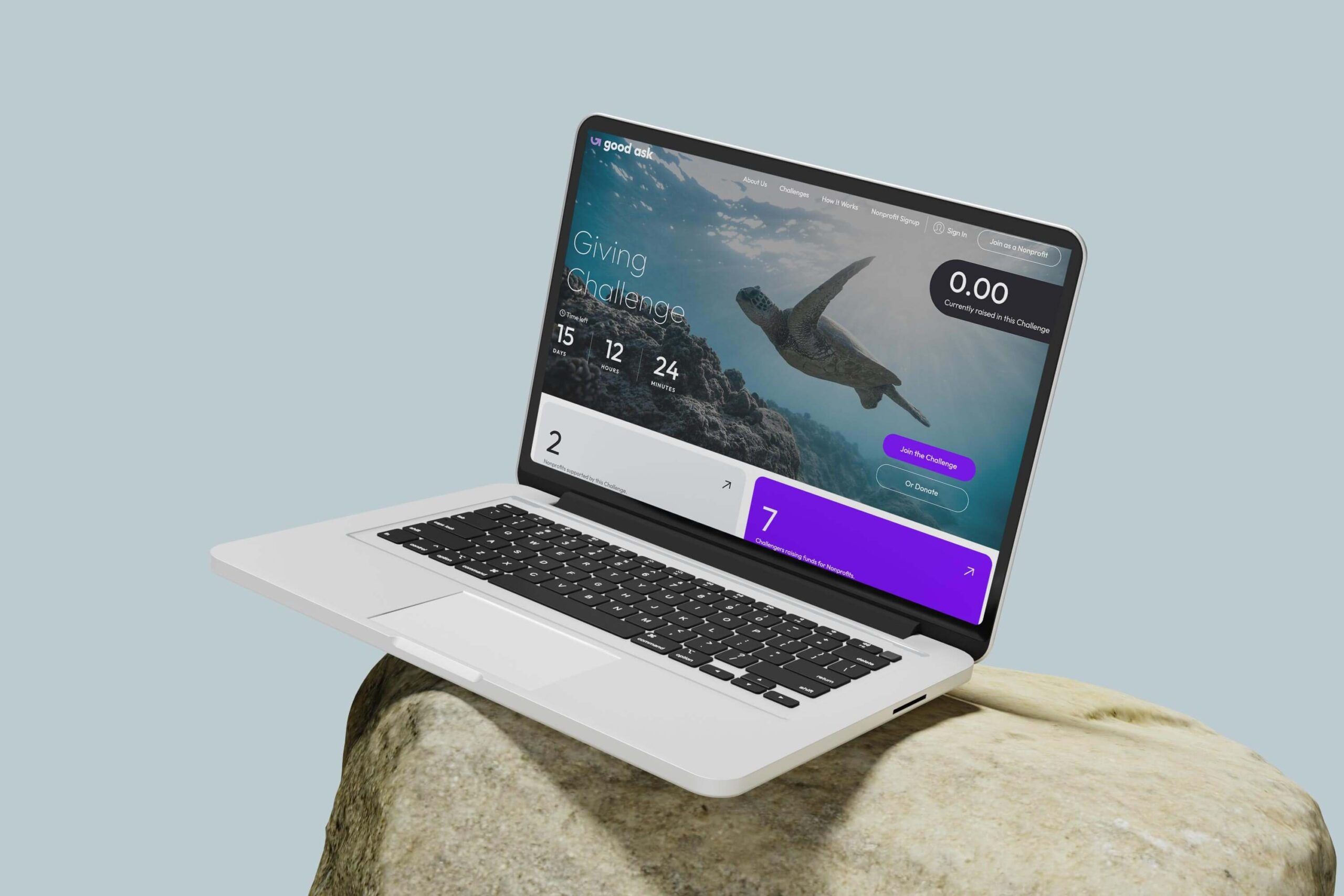
Improving user experience with effective UI design isn’t just nice-to-have; it’s a competitive necessity. Let’s face it, if your website or app isn’t user-friendly, folks will bounce faster than you can say, “back button”. This article dives into the heart of what makes UI design so crucial for user experience. We’ll break down the basics, explore the essential elements, and share some cool best practices to help you keep your audience engaged and coming back for more.
Think of UI design as the friendly face that greets users when they visit your site, guiding them smoothly through their journey. It’s the button that feels just right to click, the text that’s easy on the eyes, and the navigation that feels intuitive. Good UI design can make or break a user’s experience, influencing behavior, satisfaction, and ultimately, loyalty. So, whether you’re a marketing pro, a business owner, or just someone keen on sharpening their digital toolkit, we’ve got the insights you need.
Understanding UI Design and Its Impact on User Experience
Definition and Importance of UI Design
User Interface (UI) design is the process of crafting visual elements and interactive aspects of a digital product, such as websites and mobile apps. It’s all about creating intuitive and visually appealing interfaces that enhance the user experience (UX). Think of UI as the bridge between users and the technology they interact with. Without it, users would be lost, frustrated, and, let’s face it, they’d probably leave your site faster than you can say UI design.
So, why is UI design so important? Well, a great UI does more than just look pretty. It helps users achieve their goals quickly and easily, which, in turn, boosts their overall satisfaction. A well-designed interface invites users in and keeps them engaged. From increasing your site’s usability to making it visually captivating, UI design can, quite literally, make or break your digital product.
Key UI Design Principles: Simplicity, Consistency, and Feedback
Simplicity
Less is definitely more in the world of UI design. Simplicity is all about creating a clean and straightforward interface. Avoid cluttering the screen with unnecessary elements. Focus on what’s essential and make it easy for users to find what they need. When you keep things simple, you minimize cognitive load, making it easier for users to process information and navigate your site.
Consistency
Ever notice how a well-designed site feels coherent and harmonious? That’s consistency at work. Using the same design patterns, colors, and typography across your site helps create a unified look and feel. When your design elements are consistent, users know what to expect, reducing confusion and enhancing their overall experience. Consistency builds trust—and trust keeps users coming back.
Feedback
Nobody likes being left in the dark, especially not users navigating your site. Providing feedback is crucial. Whether it’s a subtle animation, a progress bar, or a simple message saying Great job!—feedback reassures users that they’re on the right track. It keeps them informed and engaged. Without it, users might feel lost and unsure if their actions are having the desired effect.
When you get these principles right, your UI design becomes a powerful tool for enhancing user experience. It’s not just about making things look good—it’s about making them work seamlessly. By focusing on simplicity, consistency, and feedback, you can create interfaces that users will love. And a little love from your users goes a long way. Let’s get designing!
Essential Elements of Effective UI Design
Visual Hierarchy and Layout
Visual hierarchy and layout are the backbones of effective UI design. This concept is all about guiding your users’ eyes to the most important elements first. Think of it like a traffic cop, directing where the eye should go next.
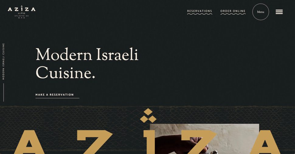
Creating a clear visual hierarchy involves playing around with size, color, and spacing. Larger elements catch the eye first, so make sure your CTAs (calls-to-action) are prominent. Use contrasting colors to make key pieces pop and keep it all organized with a clean layout. No one wants to feel like they’re navigating a maze, so keep it simple and structured.
Typography and Readability
Typography isn’t just about choosing a pretty font (although, that’s part of it). It’s about making sure your content is legible and inviting. When it comes to readability, less is more. Stick to a couple of fonts and use them consistently.
Hierarchy comes into play here too. Headings should stand out, but not be overwhelming. Your body text should be comfortable to read on any device. Think about line height and spacing as well; too cramped, and your users might get frustrated. Too spaced out, and it’ll look like you’re trying to fill space.
Color Schemes and Aesthetics
Color schemes do more than just make your design look pretty—they set the tone and influence emotions. Choose a palette that aligns with your brand and stick to it. Consistency is key here.
High contrast is essential for accessibility. Make sure text stands out against the background and consider the color blind amongst your users too. A little tip: use tools like color contrast checkers to ensure your choices are readable for everyone.
Interactive Elements: Buttons, Icons, and Navigation
Interactive elements are like the “hotspots” in your UI design—they trigger user interaction and actions. Buttons should look clickable. Use shadows, gradients, or underlines to signify their interactivity.
Navigation should be intuitive. If users can’t find what they’re looking for, they’ll simply leave. Make sure menus are easy to access and logically organized. Icons should be universally recognizable (think magnifying glass for search) and aesthetically aligned with your overall design. Having a smart and well-thought-out design for these elements can make or break the user experience. Remember, the goal is always to make the user’s journey as frictionless and enjoyable as possible. An effective UI design isn’t just about looking good—it’s about working well too.
Best Practices for Enhancing User Experience through UI Design
Implementing User-Centered Design Approach
It’s all about putting the user at the core of your design process. Start by understanding their needs, preferences, and pain points. Conduct surveys, create user personas, and map out their journeys. This will help you design interfaces that are intuitive and truly cater to the end user’s expectations. Remember, a happy user is more likely to stick around and engage with your platform.
Conducting User Testing and Feedback Analysis
No matter how brilliant you think your design is, the final verdict is always in the hands of the users. Conducting user testing is crucial. Set up usability tests where real users interact with your designs. Observe their behavior, note any hiccups they face, and gather feedback. It’s like getting a sneak peek into the user’s mind. Analyze this feedback thoroughly to identify common issues and areas for improvement. This approach ensures your design is not just theoretically good but practically flawless too.
Iterative Design and Continuous Improvement
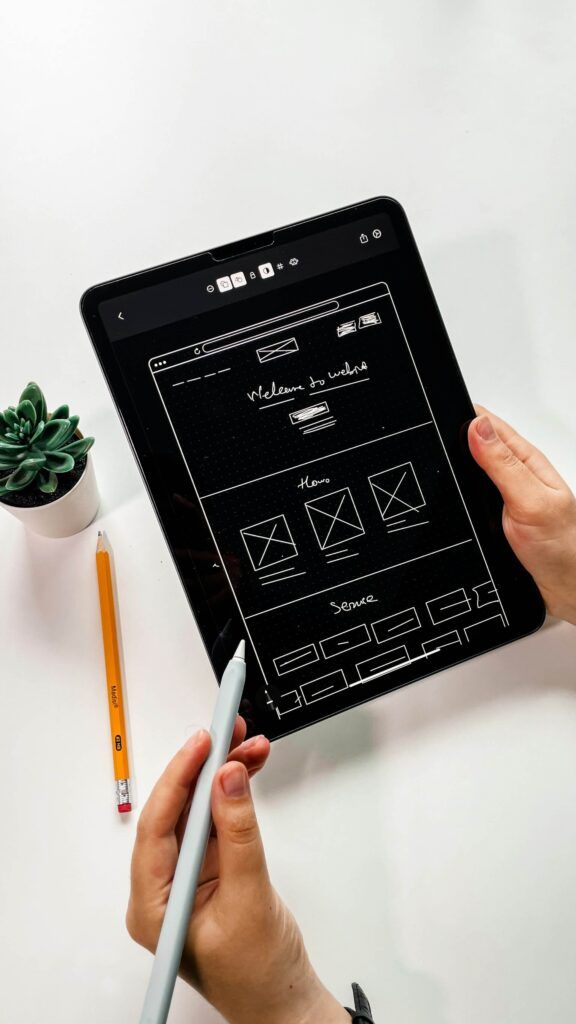
Design is not a one-time job. It’s an ongoing process of refining and enhancing. The iterative design process involves creating prototypes, testing them, gathering feedback, and making necessary adjustments. Rinse and repeat. This cycle of continuous improvement ensures your UI design evolves with user expectations and needs. Don’t be afraid to go back to the drawing board – it’s all part of the game. Embrace changes and stay flexible.
Leveraging Advanced Tools and Prototyping Platforms
In today’s tech-savvy world, you’re not alone in your design journey. There are numerous advanced tools and prototyping platforms out there to make your life easier. Whether it’s Sketch, Figma, Adobe XD, or InVision, these platforms offer powerful features for designing, prototyping, and collaborating. They help you visualize the final product, conduct interactive tests, and gather feedback from team members or stakeholders. Using these tools can significantly enhance your design workflow and ensure a more polished, user-friendly interface.
Effective UI design is our jam.
We'll ensure your website not only looks stellar but also functions seamlessly.
Book a CallConclusion
Improving user experience through effective UI design isn’t just about making things look pretty—it’s about making them work seamlessly for the user. A well-thought-out UI design can greatly influence how users interact with your site or app, driving their overall satisfaction and engagement. Remember, simplicity is key. Consistent elements and providing clear feedback can make your design intuitive and user-friendly.
To truly enhance user experience, always keep the user at the center of your design process. Conduct regular user testing and gather feedback to understand what works and what doesn’t. This isn’t a one-time thing—iterative design and continuous improvement are crucial. Advanced tools and prototyping platforms can be your best friends in bringing those improvements to life. Don’t forget the essential elements that make up a strong UI design. The layout should draw attention to the most important parts, typography should be clear and easy to read, and your color schemes should be appealing yet functional. Interactive elements like buttons and navigation icons should be straightforward and contribute to an effortless user journey.
In short, effective UI design is a blend of art and science, requiring attention to detail, empathy for the user, and a willingness to iterate. Whether you’re a marketing professional, a business owner, or someone hunting for top-notch marketing services, investing in good UI design will pay off in spades. Here at Visual Soldiers, we specialize in creative services that put the user first, helping you craft digital experiences that truly resonate. Cheers to creating designs that look hot and make people’s lives just a bit easier!
