August 13, 2024
Mastering Negative Space in Graphic Design: Tips and Techniques
-
Visual Soldiers
- Design
- minute read

Negative space, also known as white space, is a crucial yet often overlooked component of graphic design. It refers to the empty areas around and between the elements of a design, such as images, text, and shapes. While it may initially appear insignificant, negative space plays an integral role in creating visually appealing and effective designs. By strategically using negative space, designers can create a focal point, improve visual hierarchy, enhance readability, and add a sense of balance and elegance to their work. The mastery of negative space is a powerful tool that can transform a cluttered, overwhelming design into one that feels open, inviting, and easy to navigate. To truly harness the potential of negative space, it is essential to understand its importance, study examples of effective usage, and learn specific techniques for incorporating it into various design elements.
Understanding Negative Space in Graphic Design
Definition of Negative Space
Negative space, also known as white space, is the area in a design that is left unmarked. This space is essential as it defines the boundaries of positive space and helps bring a balance to the overall composition. Negative space doesn’t necessarily have to be white; it can be any color or even a blurred area in the background. Understanding how to effectively use negative space in graphic design can dramatically boost the visual appeal and function of your work.
Importance of Negative Space in Graphic Design
The significance of negative space in design cannot be overstated. It provides the breathing room your elements need to deliver your message clearly. Proper use of negative space can elevate the sophistication of a design, making it look more polished and professional. Additionally, well-utilized negative space can enhance the user experience by making navigation more intuitive and reducing cognitive load. When considering how to effectively use negative space in graphic design, always remember that less can be more.
Examples of Effective Use of Negative Space
To grasp the power of negative space, let’s look at some successful examples:
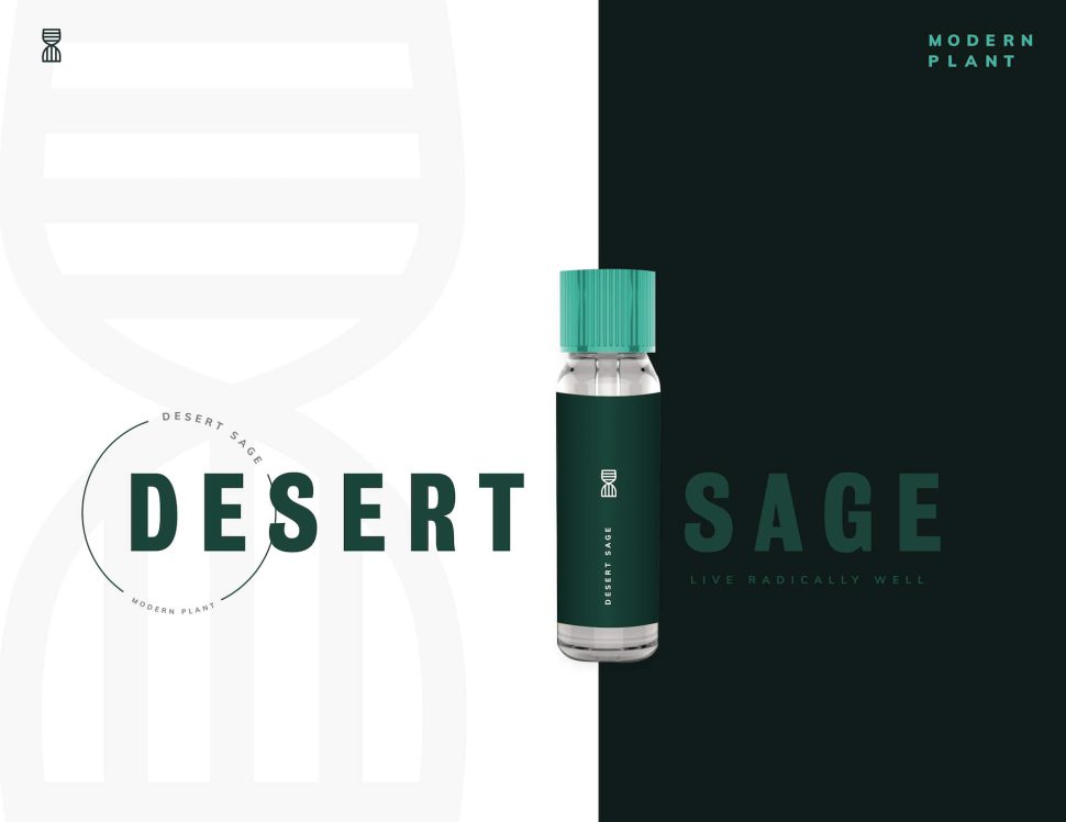
- FedEx Logo: The hidden arrow between the ‘E’ and ‘X’ is a classic illustration of creativity meeting function through negative space.
- Apple’s Branding: Apple’s website and products exemplify minimalist design, relying heavily on negative space to emphasize their products and messages.
- WWF Logo: The clever use of negative space in the World Wildlife Fund’s panda logo effectively communicates the organization’s identity and mission.
Whether you are creating a logo, a website, or any other design project, leveraging negative space can give your work a clean and elegant look. So, how will you use negative space to enhance your next design project?

Techniques to Effectively Use Negative Space in Your Designs
Create a Focal Point
One of the most powerful ways to effectively use negative space in graphic design is to create a focal point. By surrounding your main subject with ample negative space, you automatically draw the viewer’s attention to that subject. This technique allows the audience to know precisely where to look, eliminating distractions and making your design more impactful. Good use of negative space ensures that the focal point of the design stands out clearly, adding emphasis and importance.
Improve Visual Hierarchy
Visual hierarchy is essential for guiding the viewer’s eye through the design in a deliberate and effective manner. Utilizing negative space well can significantly improve the visual hierarchy of your composition. By prioritizing elements through size, placement, and the space that surrounds them, you can lead users to first notice the most critical parts of your design. This method ensures that the information is communicated efficiently and engagingly.
Enhance Readability and Clarity
When understanding how to effectively use negative space in graphic design, enhancing readability and clarity should be one of your top priorities. Negative space around text blocks can make the content much easier to read. Adequate spacing ensures that text doesn’t feel cramped or overwhelming, enabling readers to process information more smoothly. Additionally, well-spaced text can highlight the importance and individuality of specific sections, making your message clearer.
Add a Sense of Balance and Elegance
Negative space is not merely an empty area; it’s a crucial design element that can bring balance and elegance to your compositions. A harmonious balance between positive and negative space can make the overall design appear more sophisticated and aesthetically pleasing. When balanced correctly, negative space allows each element within your design to breathe and coexist seamlessly. This equilibrium creates an elegant and professional look and feel.

Tips for Incorporating Negative Space in Various Design Elements
Understanding how to effectively use negative space in graphic design involves knowing how to apply it across different design elements. Here are a few tips for incorporating negative space in text, images, and logos:
-
✓
Text
Ensure that there is enough space between lines and paragraphs to enhance readability. Avoid cramming too much text into a limited area. Use padding and margins appropriately to create a clean, readable layout.
-
✓
Images
When working with images, consider the surrounding space to draw focus to the subject. Use cropping techniques to highlight essential parts and let the rest of the space 'breathe.'
-
✓
Logos
Many iconic logos use negative space to tell a story or convey a message subtly. Focus on simplicity and clarity, allowing the negative space to add depth and meaning to your design.
By implementing these techniques, you can ensure that your designs are not only visually appealing but also effective in communicating your key messages. Negative space, when used correctly, can elevate any design from ordinary to extraordinary.
Mastering negative space in graphic design is both an art and a science that can vastly enhance your visual compositions. By understanding the essence of negative space— the blank or empty areas surrounding the main elements of a design—you can transform ordinary layouts into extraordinary visual narratives. Negative space isn’t merely about empty areas; it’s a powerful tool that can emphasize focal points, improve the readability of your text, create a balanced aesthetic, and augment the overall user experience.
Creating a focal point within your design can guide the viewer’s eye to the most crucial parts of the message. By strategically leveraging negative space, you can elevate the main elements, making them stand out more effectively against less crucial aspects. Similarly, negative space is instrumental in establishing a clear visual hierarchy. It enables elements to breathe, allowing viewers to differentiate between primary and secondary information at a glance.
Moreover, readability and clarity are enhanced through the judicious use of negative space. Cluttered designs can overwhelm viewers, making it difficult for them to absorb information. Negative space helps in breaking down information into digestible chunks, enhancing comprehension and retention. It also contributes to a sense of balance and elegance in designs, creating a harmonious and aesthetically pleasing visual.
In practical terms, incorporating negative space into various design elements requires mindful planning and execution. Whether you’re designing text, images, or logos, the negative space should be used to complement and elevate the primary components rather than compete with them.
In conclusion, negative space is far from being a simple backdrop in graphic design. It’s a versatile and dynamic element that, when used effectively, can significantly enhance the impact and functionality of your designs. By mastering the use of negative space, you not only refine the aesthetic appeal of your work but also improve its practicality and user-friendliness.
So, how will you start incorporating negative space into your graphic design projects?
Visual Soldiers
Visual Soldiers is an Atlanta-based creative studio specializing in branding, design & digital experiences.


