August 28, 2024
Overcoming Challenges in Mobile-First Design: Effective Solutions
-
Visual Soldiers
- Web Development
- minute read
Mobile-first design isn’t just a buzzword—it’s a necessity. With the vast majority of internet users accessing sites via their smartphones, mobile-first design presents a number of challenges. Essentially, designing for mobile first means developing the mobile version of your website with a primary focus and later scaling it up for larger screens like tablets and desktops. This approach ensures an optimized and seamless user experience across all devices, making your content more accessible and engaging.
However, as transformative as mobile-first design can be, it has its hurdles. The shift toward prioritizing mobile can dramatically impact the user experience if not done right. From limited screen space necessitating careful content prioritization to performance issues and user interaction challenges, there are plenty of obstacles to navigate. But fear not because understanding the key challenges and solutions in mobile-first design can help you create superior digital experiences.
This article dives into the everyday challenges many face with mobile-first design and provides practical solutions to overcome them. It doesn’t matter if you’re a seasoned designer, a marketing professional, or a business owner looking to enhance your digital presence—knowing these insights can make all the difference. So, let’s get to it and explore how tackling these challenges can lead to more responsive, faster, and user-friendly websites. Ever wondered how you can turn design challenges into opportunities?
Introduction to Mobile-First Design
Definition and Importance of Mobile-First Design
The concept of mobile-first design isn’t just another buzzword in the digital design realm; it’s a fundamental shift in how we approach web development and user experience. So, what exactly is mobile-first design? In simple terms, it’s the practice of designing an online experience for mobile devices first, before scaling up for larger screens like desktops and tablets. This method ensures that the core functionality is robust and intuitive on smaller devices, which are often more challenging to design for.
Given that our world is increasingly smartphone-centric, prioritizing mobile designs is not just smart—it’s essential. Users now expect streamlined, quick, and aesthetically pleasing experiences on their mobile devices. Anything less, and you risk losing a significant chunk of your audience. Thus, the importance of mobile-first design can’t be overstated; it’s all about catering to user habits and expectations.
Emerging Trend and Its Impact on User Experience
The mobile-first approach has emerged as not just a trend, but a necessity. The idea stems from the fact that the majority of internet users now access the web through their mobile devices. A study even showed that over 50% of global web traffic comes from mobile. This shift has substantially transformed user experience dynamics.
Adopting mobile-first design can drastically improve user satisfaction. When users encounter a site that’s optimized for their device, they’re more likely to engage and convert into customers. The navigation feels natural, content is easily digestible, and interactions are smooth. And because the core experience is designed for mobile, scaling up to larger screens becomes more seamless.
Overview of Common Challenges and Solutions in Mobile-First Design
Of course, tackling mobile-first design isn’t without its hurdles. As you gear up to optimize for mobile, you’ll face several challenges that can test even the most seasoned designers and developers. Here’s an overview of some common issues and high-level solutions:
- Limited Screen Space and Content Prioritization: Mobile screens are smaller, which means you’ve got less real estate to work with. Prioritizing content becomes crucial—what’s essential, and what can be left out? The key lies in focusing on important user needs.
- Performance Issues and Page Load Speed: Mobile users want fast-loading pages, but factors like high-resolution images and complex code can slow things down. Efficient coding practices and image optimization can help mitigate these issues.
- User Interaction and Touch Navigation Difficulties: Unlike desktop users, mobile users rely on touch for navigation. Designing intuitive touch controls can be challenging but provides a significantly better user experience.
- Adaptability to Various Device Sizes and Resolutions: With an array of devices out there, ensuring a consistent experience across all of them can be tricky. Flexible, responsive layouts are the way to go here.
Recognizing these challenges is the first step. The next is to dive into specific strategies and solutions that tackle these issues head-on, paving the way for a flawless mobile-first experience. Stay tuned as we delve deeper into each of these challenges and how to effectively solve them.
Challenges and Solutions in Mobile-First Design
Common Challenges in Mobile-First Design
1. Limited Screen Space and Content Prioritization
One of the most apparent challenges in mobile-first design is dealing with limited screen space. On a desktop, you have the luxury of real estate to showcase various elements, features, and pieces of content. However, mobile screens are much smaller, demanding creative ways to prioritize content.
The trick lies in understanding what’s most essential for your user. Focus on core functionalities and important content, stripping away anything that doesn’t serve a crucial purpose. For instance, use collapsible menus or accordions to keep the interface clean and free from clutter.
2. Performance Issues and Page Load Speed
Users expect mobile websites to load just as quickly, if not faster, than their desktop counterparts. When dealing with mobile devices, performance optimization becomes a critical aspect of your design and development process. Slow-loading pages lead to high bounce rates, user frustration, and can even affect your site’s ranking on search engines.
To address this, ensure that your images are optimized for the web through appropriate resizing and compression techniques. Consider using lazy loading for images and videos, which loads content only when it’s needed. Efficient coding practices and reducing unnecessary scripts or plugins can also make a significant difference.
3. User Interaction and Touch Navigation Difficulties
Unlike desktops, mobile devices rely heavily on touch navigation, presenting challenges unique to mobile-first design. Buttons can be too small, links too close together, or gestures might not be intuitive, leading to a frustrating user experience.
To overcome these issues, design with touch in mind. Use larger buttons and make sure they are spaced adequately to prevent accidental taps. Integrate smooth gestures and ensure that important actions are easily accessible with the thumb, often known as designing for the “thumb zone.” Test usability early and often with real users to fine-tune interactions.
4. Adaptability to Various Device Sizes and Resolutions
Mobile-first design doesn’t end with just smartphones. Today’s ecosystem includes tablets, mini-tablets, phablets, and devices of various resolutions and aspect ratios. Ensuring that your design adapts fluidly to these myriad screen sizes without compromising functionality or aesthetics is a daunting task.
Responsive Web Design (RWD) techniques like flexible grids, scalable images, and media queries can help manage this adaptability. For more complex projects, you might consider adaptive design methods, which serve different layouts optimized for various devices.
Visual Soldiers can assist you with simplifying these complexities. Our expert team helps marketing professionals and business owners with cutting-edge creative solutions tailored specifically to navigate these common challenges in mobile-first design.
Mobile-first design comes with its own set of hurdles, but understanding these challenges is the first step toward crafting exceptional responsive interfaces. Ready to face these challenges head-on?


Effective Solutions for Mobile-First Design
So, you’re knee-deep into the world of mobile-first design and finding yourself grappling with some sticky challenges. That’s perfectly normal! Making sure your website shines across all devices is no small feat. But don’t worry, we’ve got some effective solutions to make your mobile-first design journey a bit smoother. Let’s dive in!
Implementing Responsive and Adaptive Design Techniques
First off, let’s talk about making your design flexible. Responsive and adaptive design techniques are your best friends here. These methods ensure your website looks fab on both mobile and desktop screens. A responsive design adjusts seamlessly to different screen sizes by using fluid grids, flexible images, and media queries. On the other hand, adaptive design uses multiple fixed layout sizes, creating designs for various screen widths.
Wondering which one to go for? If you want a one-size-fits-all solution, responsive design might be your go-to. It’s simple and requires less maintenance. But if your site needs to cater to specific screen sizes with different layouts, adaptive design could be the better choice.
Optimizing Page Load Speeds Through Efficient Coding and Media Usage
Let’s be honest here: nobody likes a slow website. Speed is critical, especially on mobile devices where users expect things to load almost instantaneously. So, how can you boost those load times?
First, keep your code lean. Minifying CSS, JavaScript, and HTML files can significantly reduce loading times. Additionally, prioritize loading above-the-fold content first. This ensures users see something while the rest of the page loads in the background.
Next, be mindful of your media files. Compress images without losing quality and consider using newer image formats like WebP for smaller file sizes. And let’s not forget about videos. Loading videos via lazy loading and using appropriate file formats can drastically reduce initial load times.
Enhancing User Interface (UI) with Intuitive Touch Controls
Now, it’s not just about how fast things load—it’s also about how users interact with your site. Mobile users are all about touch, so making sure your UI is touch-friendly is crucial.
Start by making tappable elements large enough to be easily clicked with a finger. Buttons should be at least 44×44 pixels, and make sure there’s enough space between them to avoid accidental taps. Also, think about how users naturally hold their phones. Place essential controls within the thumb’s reach area (basically, the lower half of the screen).
Start by making tappable elements large enough to be easily clicked with a finger. Buttons should be at least 44×44 pixels, and make sure there’s enough space between them to avoid accidental taps. Also, think about how users naturally hold their phones. Place essential controls within the thumb’s reach area (basically, the lower half of the screen).
Utilizing Flexible Grids and Layouts to Ensure Compatibility Across Devices
Finally, let’s solve the puzzle of ensuring compatibility across a myriad of devices. This is where flexible grids and layouts come in handy. Using a grid system allows you to organize content in a way that scales seamlessly across different screen sizes.
Consider using a CSS framework like Bootstrap or Foundation. These frameworks provide predefined grid systems that make creating flexible layouts a breeze. You can specify how many columns an element should span on various devices, ensuring a consistent look and feel no matter where your users are visiting from.
Another tip? Use relative units like percentages and ems instead of absolute units like pixels. This way, your layouts can adapt fluidly to different screen sizes and resolutions, providing a more consistent user experience.
And there you have it! Addressing the challenges of mobile-first design is all about flexibility, speed, touch-friendliness, and cross-device compatibility. Keep these solutions in mind, and you’ll be well on your way to creating stunning mobile-first designs. Need a hand with the creative aspects? We’ve got your back at Visual Soldiers, offering expert creative services to bring your vision to life.
Ready to start tackling your mobile-first design challenges and solutions?

Case Studies and Best Practices in Mobile-First Design
When tackling the challenges and solutions in mobile-first design, sometimes there’s no better teacher than real-world examples. By examining successful case studies and adopting industry best practices, we can glean valuable insights and future-proof our strategies.
Real-World Examples of Successful Mobile-First Design Implementations
Understanding how others have effectively overcome challenges in mobile-first design can inspire and guide us. Let’s dive into three notable case studies.
Case Study 1: Airbnb
Airbnb is an exemplary case of how a focus on mobile-first design can yield significant benefits. The company prioritized a seamless user experience on mobile devices before expanding to desktops. This approach included:
– Streamlined content: Prioritizing what users need most while on the go.
– Intuitive navigation: Simplifying the process of finding and booking accommodations.
– Responsive images and media: Ensuring quick load times and a visually appealing experience across different screen sizes.
By recognizing the shift towards mobile usage, Airbnb enabled an intuitive, enjoyable user journey that works harmoniously on any device.
Case Study 2: Starbucks
Starbucks revamped its mobile app with a strong mobile-first design. The redesign was aimed at making the ordering and payment process as seamless as possible. Key elements included:
– Personalization: Leveraging user data to offer personalized recommendations and deals.
– Easy navigation: Users can swiftly browse menu items and place orders with minimal effort.
– Quick load times: Optimized backend to handle thousands of simultaneous transactions smoothly.
The result? A significant increase in mobile orders and customer satisfaction, demonstrating how addressing challenges in mobile-first design can drive business success.
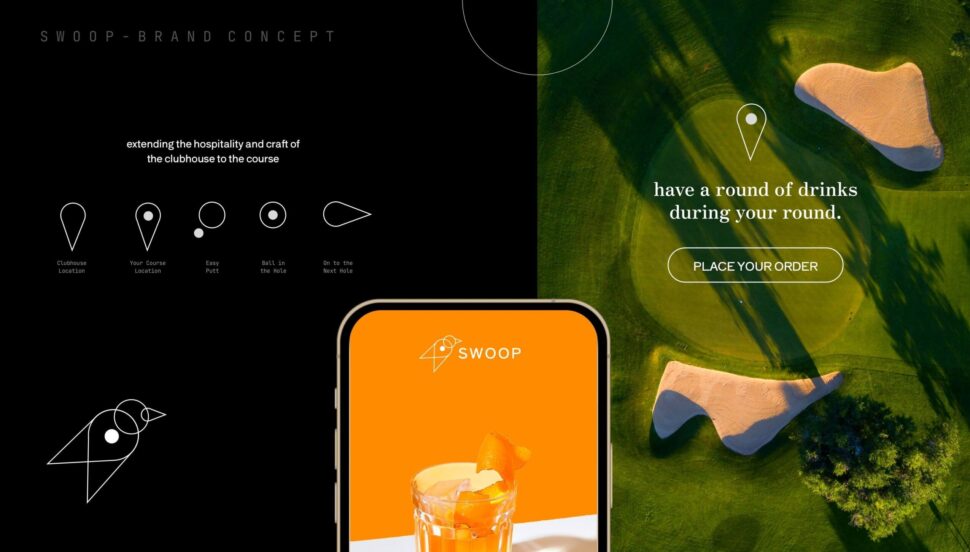
Case Study 3: Swoop
Swoop is an app and lifestyle brand that elevates food & beverage services at golf courses. The app allows golfers to make more memorable rounds by bringing modern culinary convenience and speed to a timeless sport. Key strategies were:
– Minimalist design: Emphasizing essential features and straightforward navigation.
– Scalability: Ensuring the app and mobile site works perfectly on various devices and screen sizes.
– Performance optimization: Reducing file sizes and improving code efficiency for faster load times.
Swoop’s ability to maintain a consistent, high-quality experience across both mobile and desktop platforms is a testament to their effective mobile-first strategy.

Best Practices for Designers and Developers
Now that we’ve seen some successful implementations, let’s talk about best practices to help overcome challenges and find solutions in mobile-first design.
1. Prioritize Content
Design with the smallest screens in mind and identify the most critical content. Remember, users can quickly become frustrated if they have to search for essential information or features.
– Hierarchy: Establish a clear content hierarchy to guide users to the most important information.
– User tasks: Focus on tasks users are likely to perform on mobile devices and make those as simple as possible.
2. Optimize Performance
Ensuring fast load times is crucial for a positive the mobile user experience. Here are some strategies to achieve this:
– Efficient coding: Minimize CSS and JavaScript files and compress them where possible.
– Image optimization: Use responsive images and modern formats like WebP to reduce load times without sacrificing quality.
– Caching: Utilize browser caching and content delivery networks (CDNs) to enhance speed.
3. Enhance Touch Controls
A smooth, effortless navigation experience is key. Optimizing touch controls helps in overcoming interaction challenges.
– Touchable areas: Ensure buttons and interactive elements are large enough to be tapped comfortably.
– Gesture support: Incorporate intuitive gestures such as swipes and pinches where appropriate.
– Feedback: Provide immediate feedback, like visual or haptic responses, to touch inputs.
4. Flexible Layouts
Using flexible grids and layouts ensures that your design adapts to various screen sizes and resolutions.
– Media queries: Implement media queries in your CSS to adjust styles based on device characteristics.
– Fluid grids: Use percentage-based widths for elements rather than fixed pixel sizes.
– Breakpoints: Identify key breakpoints where your design transitions to best fit different devices.
Future-Proofing Mobile-First Design Strategies
As technology evolves, so too must our approach to mobile-first design. Here are some ways to future-proof your designs:
– Stay updated: Keep up with the latest developments in device capabilities and web technologies.
– Modular design: Adopt a modular design approach to make updating and maintaining your design easier as new devices emerge.
– User testing: Regularly conduct usability tests across different devices to identify and solve potential issues early on.
We're experts in delivering these creative services, helping marketing professionals and businesses excel in the mobile-first era.
By keeping our finger on the pulse of emerging trends and best practices, we can help you navigate the ever-changing digital landscape.
Book a CallSo, how can you leverage these best practices to overcome your mobile-first design challenges?
In conclusion, navigating the challenges and solutions in mobile-first design requires a blend of creativity, technical savvy, and user empathy. Understanding the limitations, such as small screen real estate and varying device capabilities, is just the start. Prioritizing content and optimizing performance are integral steps in ensuring that users have a seamless experience.
By adopting responsive and adaptive design techniques, you can make your site as versatile as the devices accessing it. Speed remains king, so streamline your code and use media smartly to keep load times brisk. User interface enhancements will foster easier navigation with intuitive touch interactions, and flexible grids ensure your presentation looks great on any screen.
The case studies and best practices highlighted show that the path to effective mobile-first designs is well-trodden but ripe for innovation. Designers and developers who stay ahead of the curve embrace these strategies to craft experiences that are not just functional but delightful.
If you’re seeking expert creative services to tackle the intricate challenges of mobile-first design, Visual Soldiers can help guide your journey. By weaving functional needs with aesthetic appeal, we can transform challenges into streamlined solutions.
What aspect of mobile-first design are you most excited to improve?
Visual Soldiers
Visual Soldiers is an Atlanta-based creative studio specializing in branding, design & digital experiences.
