5 App Design Case Studies for Better UX
Want to improve your app’s user experience? Learn from these five case studies that showcase how top apps tackled UX challenges to drive engagement, retention, and satisfaction. Each example highlights a specific problem, the design solution, and the measurable results:
- Spotify: Boosted engagement with collaborative playlists and social sharing features.
- Duolingo: Increased retention by gamifying language learning with streaks, leaderboards, and rewards.
- Postmates Unlimited: Reduced support tickets by simplifying navigation and clarifying subscription details.
- Fitbit: Improved usability by aligning features with user personas and needs.
- Intuit: Enhanced accessibility through better typography, navigation, and readability.
These real-world examples emphasize the importance of user research, clear design, and iterative testing. Whether you’re streamlining navigation, gamifying interactions, or improving accessibility, these strategies can help you create an app that users love. Dive deeper to see how these apps turned design decisions into measurable success.
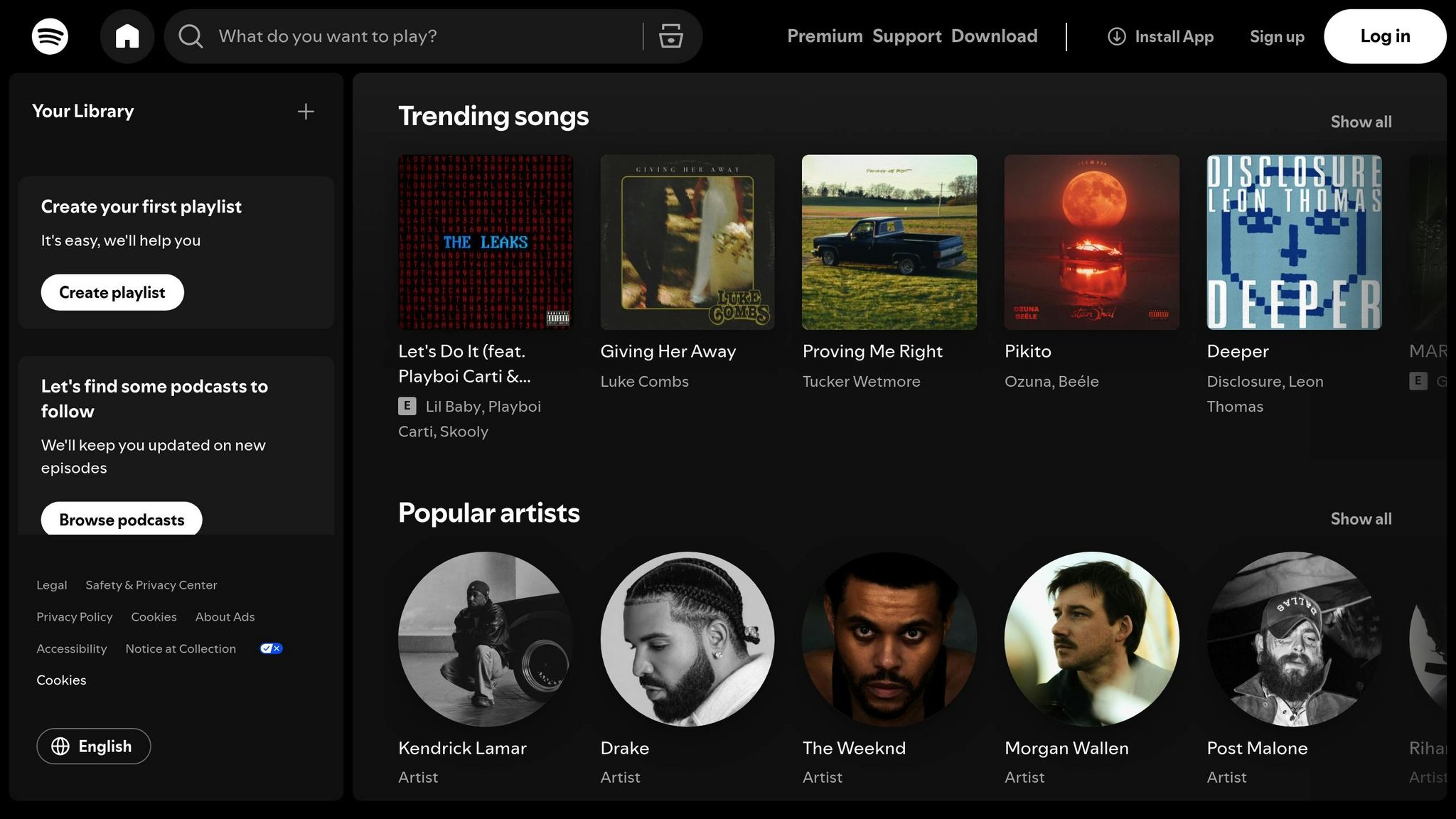
Spotify: Adding Social Features to Increase User Engagement
The Challenge: Limited Social Interaction
Spotify noticed a missing piece in its user experience: the ability to share and collaborate on music easily within the app. While it excelled at helping users discover and enjoy music individually, it lacked robust tools for social interaction. This gap meant users often turned to external platforms to share songs or coordinate playlists, which reduced the time they spent engaging with Spotify itself.
To address this, Spotify decided to bring social features directly into the app.
The Solution: Collaborative Playlists and Social Sharing
One of Spotify’s key moves was the introduction of collaborative playlists, a feature that let multiple users add songs to the same playlist in real time. This made group playlist creation seamless and fun, as contributors were clearly identified within the interface. It wasn’t just about functionality – it was about creating a shared musical experience.
Spotify also revamped its social sharing tools, making it easier for users to share music directly through the app or on platforms like Facebook, Instagram, and Twitter. Features like “Discover Weekly” and the hugely popular “Wrapped” campaign turned Spotify’s personalized recommendations into shareable moments, sparking conversations and connections around music.
The Results: Higher Retention and User Satisfaction
These updates had a noticeable impact. Users who took advantage of collaborative playlists and enhanced sharing options showed stronger engagement and loyalty. By the third quarter of 2024, Spotify had grown to over 602 million monthly active users and 236 million premium subscribers, a testament to the effectiveness of these social features. By evolving from a solo listening app into a platform for shared music discovery, Spotify became an even more integral part of its users’ lives.
Duolingo: Using Gamification to Improve Learning and Retention
The Challenge: Keeping Users Engaged in Educational Apps
Educational apps often face a harsh reality – users tend to abandon them shortly after downloading. Language learning apps are no exception. Duolingo discovered that many learners lost motivation without immediate feedback or rewards to keep them engaged. Without meaningful incentives to practice daily, users would drop off before making real progress in their language goals.
To tackle this, Duolingo reimagined its approach, weaving in game-like elements to make learning more engaging and habit-forming.
The Solution: Turning Learning Into a Game
Duolingo transformed its app into a game-like experience by incorporating several clever mechanics designed to boost daily engagement.
One of the standout features is the use of experience points (XP) and a daily goal meter. These provide instant feedback, giving users a sense of accomplishment after every session. This immediate reward system helps learners feel progress in real-time, encouraging them to keep going.
Another powerful tool is streaks – a feature that tracks how many consecutive days users practice. Milestones like 7, 30, or even 365-day streaks are celebrated, tapping into the psychological principle of loss aversion. Once users build a streak, they’re motivated to maintain it and avoid “breaking the chain.” To ease frustration, Duolingo added a “streak freeze” option, allowing users to protect their progress if they miss a day.
Leaderboards add a social competition element. Users are grouped into weekly leagues where they compete based on XP earned. Top performers advance to higher leagues, while others risk being demoted. This feature appeals to competitive learners, driving them to engage more frequently and intensively.
Duolingo also introduced badges, virtual currency, and a “hearts” system that limits the number of mistakes per session. These layers of gamification create a cohesive and engaging experience that keeps users coming back.
The app’s lessons are intentionally designed to be short and modular, typically under five minutes. This format fits seamlessly into busy schedules, making it easy for users to squeeze in a quick session during a commute or before bed. Combined with instant feedback on every answer and cheerful encouragement from Duo, the app’s owl mascot, the experience feels more like a fun mobile game than a study session.
Duolingo also uses playful push notifications to nudge users back into the app, further reinforcing daily engagement.
Together, these features transform language learning into an enjoyable, bite-sized activity that users are eager to repeat.
The Results: A Global Success Story
Duolingo’s gamified approach has had a massive impact on its growth and user retention.
The results speak for themselves. The app now boasts hundreds of millions of registered users worldwide, with tens of millions actively using it each month. It consistently ranks among the top-rated education apps in app stores, with an average rating of 4.5 out of 5 based on millions of reviews.
Studies on gamified learning frequently cite Duolingo as an example of success. Research shows that features like points and badges correlate with higher course completion rates and longer periods of active use compared to non-gamified apps. Data also reveals that streak length is a strong predictor of retention – users with long streaks are significantly more likely to stick with the app over time.
The short lesson format also plays a key role, as users are more likely to complete a quick three-to-five-minute session than abandon longer ones. This reinforces the daily habit, keeping learners engaged over the long term.
Duolingo’s success has made it a model for other educational apps. Many newer platforms for coding, math, and test prep now replicate its features – streaks, XP systems, daily goals, and competitive leagues – highlighting a growing trend of integrating game mechanics into learning tools. By embedding gamification into the core learning process, Duolingo created an experience that not only keeps users engaged but also helps them build habits that lead to real progress.

Postmates Unlimited: Improving Usability to Fix User Pain Points
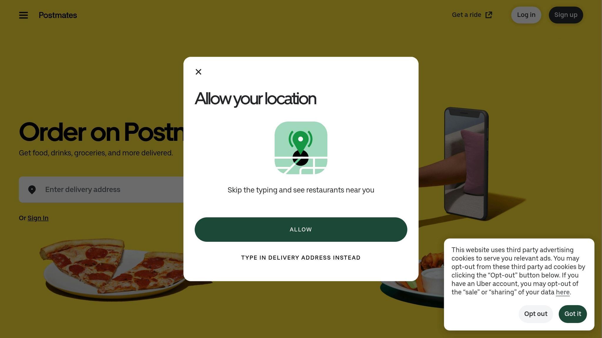
The Challenge: High Support Ticket Volume and Poor User Experience
Postmates Unlimited was grappling with a growing issue: users were frequently reaching out to support over billing confusion and navigation struggles. The main culprit? Subscription details that were unclear and hard to find. Many users didn’t understand renewal dates, cancellation policies, or why they were being charged. As a result, support tickets like “Why was I charged?” became all too common. Key information was either buried in hard-to-access screens or presented in ways that left users scratching their heads. On top of that, navigating the app to complete simple tasks often felt like a maze, leading to user frustration, task abandonment, and even more support inquiries.
The app’s backend systems weren’t helping matters either. They weren’t built to handle the complexity of dynamic features like promotions, surge pricing, and subscription logic at scale. During peak meal times in the U.S., the app would slow down or crash entirely, leaving users stuck with generic error messages and no clear way to resolve their issues. These combined problems made it clear that a major overhaul was needed – one that addressed both the app’s interface and its technical backbone.
The Solution: Streamlined Navigation and Scalable Infrastructure
To tackle these challenges, the Postmates team focused on two key areas: the user experience and the app’s technical foundation. They started by digging into support tickets, categorizing them into themes like billing, membership, orders, and navigation, and ranking these issues based on how often they occurred and their impact on users. Mapping out user journeys revealed exactly where people were running into trouble. Usability tests with U.S.-based customers on both iOS and Android highlighted specific pain points, such as confusion during checkout, difficulty finding membership settings, and drop-offs when pricing wasn’t clear.
Armed with this data, the team made several impactful changes. They created a centralized “Unlimited” hub within the account section, where users could easily check their plan details, renewal dates (clearly shown in MM/DD/YYYY format), and benefits. Navigation was simplified to prioritize core actions like search, browse, and reorder, while less critical options were moved to secondary menus to reduce clutter. The checkout process got a much-needed facelift, with an itemized fee breakdown that displayed prices in U.S. dollars (e.g., $9.99) for full transparency. Support tools were embedded directly into key workflows, making it easier for users to find FAQs and resolve issues without leaving the app. Even the app’s microcopy was updated with clear, straightforward U.S. English, such as “Free delivery on eligible orders over $12,” to set accurate expectations.
On the technical side, engineers restructured the subscription system into modular services, allowing for near real-time updates on membership status, billing cycles, and eligibility checks. They introduced robust event logging and monitoring for critical actions like trial sign-ups, renewals, cancellations, and orders. These updates helped the team quickly identify and fix problems. Performance improvements ensured the app stayed responsive during high-traffic periods, and new error-handling features gave users clear, friendly messages when something went wrong, reducing the need for support intervention.
The Results: Fewer Support Tickets and Happier Users
The results were clear and measurable. By comparing support metrics before and after the updates, Postmates saw a noticeable drop in tickets related to billing, membership, and navigation. Metrics like tickets per 1,000 active users and per 1,000 orders showed significant improvement. Similar subscription-based apps have reported reductions in support tickets of 20–40% after similar UX and infrastructure updates, along with better resolution rates for first-contact and self-service issues.
User feedback in app store reviews also painted a positive picture. Comments shifted to describe the experience as “easy,” “clear,” and “worth it,” and complaints about billing confusion and unclear subscription details became less frequent. Sentiment analysis of these reviews confirmed that the changes were making a difference. Comparable redesigns in other apps have shown star rating improvements of 0.2–0.5 over time, and Postmates began seeing similar trends.
This case study highlights how targeted updates to design and infrastructure can directly improve user satisfaction while reducing the burden on support teams. For companies facing similar hurdles, Postmates’ approach serves as a solid example: use support tickets to guide research, map out user journeys, design with transparency in mind, and ensure close collaboration between design and engineering teams to deliver scalable, user-friendly solutions.
Fitbit: Using User Personas to Improve Design Alignment
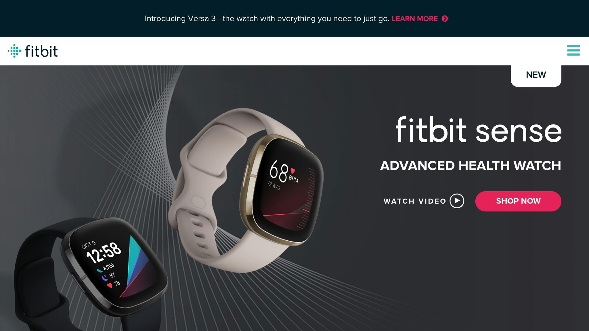
The Challenge: Features Misaligned with User Goals
Fitbit’s app once struggled with a disconnect between its features and what users truly wanted. Early versions were packed with detailed charts, social badges, and secondary metrics like weekly graphs and complex comparisons. While these features seemed impressive, they didn’t resonate with most users.
Casual users wanted quick answers to simple questions like, “Did I hit my step goal today?” or “How does my sleep this week compare to last week?” On the other hand, power users craved detailed data and export options to track their fitness progress. This mismatch left advanced features underutilized and caused many users to abandon setup flows for goals and notifications.
User reviews and support tickets revealed the frustration: metrics were buried, navigation felt confusing, and neither casual nor advanced users felt the app worked for them. The problem wasn’t a lack of features – it was that the design relied on assumptions instead of real user behavior. Trying to cater to everyone, the app ended up satisfying very few.
This misalignment pushed Fitbit to rethink its design approach.
The Solution: Building Personas and Testing Iteratively
To tackle these issues, Fitbit’s team turned to their users for answers. They analyzed usage data, conducted surveys, and interviewed users to create detailed personas.
Three key personas emerged:
- Everyday Mover: Focused on simple step goals, weight management, and basic encouragement. These users checked the app briefly throughout the day to monitor progress.
- Fitness Enthusiast: Interested in workout intensity, heart rate zones, GPS tracking, and long-term progress. They valued detailed summaries and trend insights.
- Health Monitor: Often older users or those managing health conditions, they prioritized sleep quality, resting heart rate, and long-term trends they could share with doctors. They needed clear, easy-to-read data and exportable summaries.
With these personas in mind, Fitbit redesigned the app. The new interface featured a simplified, goal-focused home dashboard with glanceable cards that users could rearrange. For Everyday Movers, the app emphasized daily goals, streaks, and encouragement while reducing clutter. Fitness Enthusiasts got enhanced workout logging and detailed summaries with heart rate zones, pace, and route maps. Health Monitors benefited from better typography, higher contrast, and easier navigation for reviewing trends and exporting data.
Accessibility improvements were a priority for all users. Larger fonts, higher-contrast colors, and better spacing made the app easier to scan on small screens. Buttons and sliders were redesigned with larger touch targets for one-handed use, and clearer labeling helped users unfamiliar with fitness jargon.
Fitbit validated these changes through iterative testing. They conducted usability tests with a diverse group of U.S. users, asking participants to complete tasks like checking sleep data, starting a workout, or changing step goals. These tests led to refinements in button placement, icons, and text. Real-world testing in gyms and public spaces further confirmed the design choices.
The Results: Increased Engagement and Satisfaction
The persona-driven redesign transformed how users interacted with the app. Features that were once overlooked – like workout logging and sleep insights – became central to the routines of Fitness Enthusiasts and Health Monitors. Data showed more frequent app sessions, longer streaks for step goals, and higher completion rates for setup flows.
The redesign also boosted engagement metrics, including session frequency, Net Promoter Score (NPS), and in-app ratings. By tailoring the interface to distinct user needs, Fitbit not only improved usability but also enhanced the app’s overall value.
For U.S.-based app teams looking to replicate this success, Fitbit’s approach offers a clear guide: start by segmenting users with analytics, conduct interviews and surveys to understand their needs, and develop a few well-defined personas. Then, audit the app to identify friction points, streamline key workflows, and validate changes through usability testing. Linking design updates to business metrics – like increased daily active users or reduced support tickets – demonstrates the impact of a persona-driven strategy.
Agencies like Visual Soldiers can adopt this process to help clients improve their apps. By running workshops to map user segments, validating personas through research, and designing interfaces tailored to each persona, agencies can deliver measurable results like higher monthly active users or increased subscription revenue. This approach consistently drives better adoption and satisfaction across diverse audiences.


Intuit: Improving Accessibility and Content Usability
Intuit, like many leading app developers, has focused on making its financial tools more accessible and user-friendly. By refining typography, navigation, and search, the company transformed its content-heavy app into an easier-to-use platform. Here’s how they tackled the challenge.
The Challenge: Accessibility Barriers and Poor Readability
Before its redesign, Intuit’s app faced serious readability and accessibility issues. Small fonts, cramped spacing, low contrast, and overly complex navigation made it difficult for users to manage their finances. These problems were especially frustrating for older adults, users with visual impairments, and anyone unfamiliar with the app’s interface.
The data painted a clear picture: users often zoomed in, abandoned cluttered screens, and struggled to complete basic tasks. Support tickets poured in, with many complaints coming from older adults and users with vision challenges who couldn’t read critical financial details. The app’s design shortcomings created significant obstacles for groups like retirees managing accounts, low-vision users tracking expenses, and people relying on screen readers to handle tax documents. For a financial app, where precision and clarity are essential, these issues eroded trust and usability.
To address these challenges, Intuit’s team dove into the problem. They conducted usability tests with affected groups, audited the app against WCAG accessibility standards, analyzed screen recordings, and interviewed users of assistive technologies. This research revealed where the app’s typography, navigation labels, and content structure were failing users in real-world scenarios.
The Solution: Better Typography and Search Functions
Armed with research insights, Intuit revamped its app design. The team introduced a new typographic system with larger fonts, increased line spacing, and a clear hierarchy for headings. These changes made financial information easier to scan and digest. Consistent spacing between sections reduced visual clutter, helping users process content more efficiently.
The redesign also ensured proper text contrast and standardized typeface usage across the app. Error messages, hints, and feedback styles were made consistent, ensuring readability in various lighting conditions – whether users were checking balances during the day or reviewing tax forms late at night.
Navigation saw a complete overhaul. Intuit replaced confusing labels with plain language and grouped related tools into intuitive categories. High-priority tasks were moved to the top of the menu, while a sidebar-style layout made it easier to find frequently used features. The team simplified the menu structure, added visual cues to show users their current location, and ensured help and support were always accessible. These updates reduced the learning curve for all users, whether they were new to the app or returning after a break.
Search functionality also got a major upgrade. Intuit redesigned the search experience to handle plain-language queries like “How do I track expenses?” Autocomplete suggestions helped users find what they needed faster, while filters allowed them to narrow results by task or product area. The system linked common user terms to official feature names, so even those unfamiliar with Intuit’s terminology could locate the right tools. A prominently placed search bar ensured users could access help without interrupting their workflow.
To complement these structural changes, the team introduced clean layouts and supporting visuals. Financial content was broken into manageable sections, making it less intimidating and easier to navigate.
The Results: Broader User Appeal and Higher Engagement
The redesign delivered measurable improvements in usability. Task completion rates for content-heavy workflows increased, and users engaged more with articles and help topics. Navigation and search times dropped significantly, while support tickets related to “can’t find” or “can’t read” issues declined. Customer satisfaction scores for content clarity and ease of navigation also rose in subsequent U.S. product releases.
These changes made the app more accessible for older adults, small-business owners, and users with vision or cognitive challenges. Positive feedback highlighted improved readability and usability, with increased engagement in previously overlooked educational content. The app also saw higher activation and retention rates among users in these key demographics.
For teams aiming to replicate Intuit’s success, the process is clear: start with an accessibility and content audit using WCAG and platform guidelines. Use data and support logs to identify key pain points, and test with users of diverse abilities to uncover barriers early. Focus on typography, spacing, and navigation improvements, as these often yield the biggest impact with minimal engineering effort. Prioritize high-traffic areas and adopt platform-native accessibility features to maximize results.
Ultimately, treating accessibility as a core product requirement – not an afterthought – is essential. This is especially true for financial apps, where users depend on clear, accessible content to make important decisions. Agencies like Visual Soldiers have embraced similar strategies to create apps that meet the needs of diverse users.
Key Takeaways: Lessons from Successful App Designs
Drawing from the case studies above, a few strategies consistently stand out in successful app design. These strategies – grounded in user research, clean interfaces, iterative testing, and team collaboration – highlight three key principles that drive better user experiences:
Prioritize User Research and Testing
Every successful app redesign begins with understanding what users truly need. Take Duolingo, for instance – they used user data to refine their gamification system, which led to higher daily active use and retention. Postmates Unlimited identified navigation issues by analyzing support tickets, reducing complaints and boosting app ratings. Fitbit developed user personas and ran quick usability tests to ensure features aligned with real-life needs, leading to greater feature adoption. Similarly, Intuit focused on accessibility by evaluating contrast ratios, font sizes, and content clarity, which expanded its audience and increased engagement.
Even with smaller budgets, U.S.-based teams can adopt these practices. Start with simple surveys and interviews, then conduct 5–8 remote usability sessions to test core workflows. Use funnel data to spot friction points, analyze drop-offs, and validate improvements through A/B testing. A weekly 30–60-minute usability session can uncover issues early, saving time and money on major redesigns.
A 2023 UX research report found that products conducting regular usability tests experienced up to 83% higher user satisfaction compared to those that didn’t [UXcel, 2023]. Decisions driven by research lead to measurable gains in engagement, retention, and revenue.
Focus on Simplicity and Usability
Streamlined navigation and clean interfaces consistently lead to happier users. A 2024 study revealed that improving information architecture reduced task completion times by an average of 35% [UXcel, 2024]. Successful apps keep navigation shallow, reduce unnecessary visual clutter, and use progressive disclosure – showing users only what they need at each step.
For U.S. audiences, this means using familiar formats like MM/DD/YYYY for dates, imperial units, and clear pricing in USD (e.g., $9.99). Typography matters too: legible font sizes, generous line spacing, and breaking content into scannable sections improve readability. Meeting WCAG contrast ratios and using plain language for error messages and onboarding flows make apps more accessible. In fact, accessible design can expand your user base by up to 25% [Interaction Design Foundation, 2024], especially among older adults and those with disabilities. Simplicity doesn’t just reduce friction – it builds trust and makes apps more welcoming.
Work Across Teams for Complete Solutions
Great app design happens when teams collaborate seamlessly. Designers, developers, product managers, content creators, and data analysts must work together to define problems and set measurable goals. Designers and engineers can co-review workflows to ensure that UX decisions translate into efficient, accessible code. Regular design reviews, iterative testing, and centralized design systems help maintain consistency and alignment.
This approach mirrors how agencies like Visual Soldiers operate – with multidisciplinary teams creating unified app experiences that balance usability, branding, and technical requirements for U.S. clients.

With past design firms, we have always been in a position of playing catch-up in terms of current design trends. With Visual Soldiers, we have consistently stayed on the forefront of UI design and are now consistently rated one of the top in our class.
Founder & CEO of Fit Radio
To keep design agile, focus on small, frequent updates instead of large, infrequent redesigns. Incorporate design reviews into every sprint, maintain prototypes that evolve with the product, and use feature flags or staged rollouts to test changes with smaller U.S. user groups before scaling up.
Treat UX as an ongoing effort rather than a one-time task. By tying improvements to clear metrics – daily active users, session length, retention rates, conversion rates, support ticket volume, and customer satisfaction – you can show how better UX reduces churn, increases revenue in USD, and lowers support costs. This makes a strong case for continued investment in great design.
FAQs
Incorporating user personas into app design is a smart way to make sure your product aligns with what your audience needs and expects. By crafting detailed, fictional profiles grounded in real user data, designers gain a clearer picture of user behaviors, goals, and challenges.
This method helps focus design decisions around the user, resulting in better usability and a more seamless experience. For instance, user personas can influence choices about navigation, layout, and features, ensuring these elements reflect what matters most to your users.
Duolingo uses a variety of gamification techniques to keep language learning enjoyable and interactive. For example, it rewards users with daily streaks for practicing consistently, while experience points (XP) track progress and help unlock new levels. The app also features leaderboards, sparking friendly competition among users, and offers in-app rewards, like virtual currency, for completing lessons and challenges.
These features do more than just make learning fun – they encourage users to stick with it. By turning practice into a game, Duolingo keeps learners coming back, boosting both engagement and long-term retention.
Improving app design to be more accessible and easy to use means prioritizing the needs of all users and creating an inclusive experience. A great example of this is Intuit’s approach, where they focused on elements like clear typography, high-contrast color schemes, and intuitive navigation to make their app more user-friendly.
They also tackled accessibility by adding features such as screen reader compatibility and keyboard navigation. These updates not only enhanced usability but also ensured the app met accessibility standards, offering a better experience for a wide range of users.
Visual Soldiers
Visual Soldiers is an Atlanta-based creative studio specializing in branding, design & digital experiences.

