November 3, 2025
User Experience Problems and Simple Solutions
-
Visual Soldiers
- UX/UI Design
- minute read

User Experience Problems and Simple Solutions
User experience (UX) issues can frustrate users and hurt businesses. Common problems include:
- Confusing navigation: Overly complex menus and poor visual hierarchy make it hard for users to find what they need.
- Slow loading speeds: Pages that take longer than 2-3 seconds to load risk losing visitors.
- Poor mobile design: Non-responsive websites alienate over 50% of users who browse on mobile.
- Cluttered interfaces: Overwhelming layouts with too much content lead to decision paralysis.
- Accessibility barriers: Many websites fail to meet ADA standards, excluding users with disabilities.
Quick Fixes:
- Simplify navigation with clear labels, breadcrumbs, and search functionality.
- Speed up load times by compressing images, using caching, and optimizing code.
- Prioritize mobile-first design with responsive layouts and touch-friendly elements.
- Clean up interfaces by limiting content, using white space, and reducing pop-ups.
- Improve accessibility with proper color contrast, alt text, captions, and keyboard navigation.
Addressing these issues improves usability, reduces bounce rates, and increases conversions. Tools like Google Analytics, Figma, and WAVE can help identify and fix problems efficiently.
Diagnose and Fix UX/UI Problems
5 Common User Experience Problems in Digital Design
In the United States, digital design issues can disrupt user engagement and hurt revenue. These challenges also impact accessibility and tarnish brand reputation. By identifying these common pitfalls, creative professionals and digital marketers can uncover what’s holding their digital products back. Below, we’ll break down these problems and offer practical solutions.
Poor Navigation and Confusing Layouts
When menus are overly complex, labels are unclear, or breadcrumb navigation is missing, users often feel lost. Many websites struggle with organizing their content in a way that aligns with user expectations. Key pages often end up buried several clicks deep, frustrating visitors.
On top of that, issues with visual hierarchy make navigation harder. If all elements seem equally important, users can’t easily figure out what to do next. Poor contrast between navigation elements and backgrounds, inconsistent button styles, and misplaced calls-to-action only add to the confusion.
Slow Website Loading Speeds
Page speed is critical – users expect websites to load within 2-3 seconds. Anything longer, and you risk losing them.
Common culprits for slow loading times include uncompressed high-resolution images, bloated code from unused CSS, and excessive scripts. Many sites load entire libraries for just one function or use multiple versions of similar scripts. Hosting providers that can’t handle traffic spikes or poorly optimized databases also drag down server response times, further frustrating users.
Websites That Don’t Work on Mobile Devices
Failing to deliver a mobile-friendly experience alienates a huge portion of your audience. Mobile traffic now accounts for over 50% of web usage in the United States, so non-responsive designs are a major problem.
Issues like improperly scaled images, desktop-only interactions, and designs that aren’t optimized for mobile networks make things worse. Heavy desktop layouts that load slowly on mobile connections create an especially frustrating experience for users on the go.
Overcrowded Interfaces With Too Much Content
When websites try to show everything at once, users feel overwhelmed. This flood of information can lead to decision paralysis and higher bounce rates.
Overcrowded interfaces often feature too many graphics, multiple calls-to-action, and intrusive pop-ups. Without clear content prioritization, users struggle to focus. Equal emphasis on primary and secondary content, lack of white space, and poor content hierarchy make it hard for users to figure out what’s truly important.
Websites That Exclude Users With Disabilities
Accessibility barriers prevent people with disabilities from fully engaging with digital products. The Americans with Disabilities Act (ADA) mandates digital accessibility, yet many websites fail to meet even basic compliance standards.
Common issues include insufficient color contrast, missing alt text for images, non-resizable text, and interfaces that require precise mouse control. Audio content without captions and videos without transcripts further exclude users with hearing impairments, leaving many feeling shut out of the digital experience.

How to Fix Each UX Problem
Now that the main UX problems have been identified, here’s how to address them with practical solutions. These fixes don’t require massive budgets – just focused adjustments that directly tackle the issues discussed earlier, creating a smoother and more user-friendly experience.
How to Fix Navigation and Layout Issues
To improve navigation and layout, start by simplifying your menu structure. Keep the main navigation to seven items or fewer, as this aligns with how users naturally process information. Use clear, descriptive labels – replace vague terms like “Solutions” with something more direct, like “Services”, or swap “Resources” for “Help Center” if it better conveys the purpose.
Add breadcrumb navigation to every page beyond your homepage. This feature helps users understand their location on your site and makes it easier to backtrack. Place breadcrumbs consistently below the main navigation for easy access.
Establish a clear visual hierarchy by emphasizing key elements. Use larger fonts for primary headings, bold text for essential details, and consistent button styles throughout your site to guide user attention.
Incorporate a search function prominently in your header to allow users to quickly locate specific content. Enhance the search experience with filters and sorting options, making it easier for users to narrow their results.
How to Speed Up Website Load Times
Speeding up load times is a critical step in improving user experience. Begin by compressing and optimizing images – keep them under 100KB whenever possible and use efficient formats like WebP. Implement lazy loading so images only appear as users scroll.
Enable browser caching to store frequently accessed files on users’ devices. Set cache expiration times for static resources, such as images, CSS, and JavaScript, to at least one month. This reduces redundant downloads for returning visitors.
Leverage a Content Delivery Network (CDN) to serve content from servers closer to your users, cutting down loading times significantly. Popular options include Cloudflare, Amazon CloudFront, and KeyCDN.
Streamline your code by removing unused CSS and JavaScript. Websites often load entire libraries when only a fraction of the code is used. Regularly audit your site and eliminate unnecessary scripts or stylesheets.
If your site experiences traffic surges that overwhelm shared hosting plans, consider upgrading your hosting to a VPS or dedicated server for better performance.
How to Make Websites Work Better on Mobile
With over half of U.S. web users browsing on mobile, optimizing for smaller screens is essential. Start by adopting a mobile-first approach, designing the mobile version of your site first before scaling up to desktop. This ensures core functionality works seamlessly on mobile devices.
Test your site on actual devices, including popular smartphones like iPhones and Samsung Galaxy models. Pay attention to touch targets, scrolling behavior, and loading speeds over cellular networks.
Refine touch interactions by making buttons and links at least 44 pixels tall and wide, ensuring they’re easy to tap. Leave enough space between clickable elements to prevent accidental taps.
Simplify navigation with a hamburger menu or a bottom navigation bar. Focus on essential menu items and consider using icons paired with labels for clarity. Make sure the search function is easily accessible on mobile.
To address mobile-specific loading times, serve smaller images to mobile users and avoid heavy background videos or animations that drain data and battery life.
How to Clean Up Crowded Interfaces
Streamlining crowded interfaces starts with applying the 80/20 rule. Highlight the 20% of content and features that matter most, giving them prominence while moving secondary information to separate pages or sections.
Use ample white space to draw attention to key content. This not only improves focus but also makes your site feel more polished and trustworthy.
Limit calls-to-action (CTAs) to one primary action per page. When multiple buttons compete for attention, users often choose none. Decide on the most important action for each page, make that button stand out, and tone down secondary options.
Organize content by grouping related items with clear section breaks. This makes it easier for users to scan and understand how different pieces of information connect.
Avoid clutter caused by unnecessary pop-ups. If pop-ups are necessary, limit them to one per visit and ensure they are easy to close. Consider less intrusive options like slide-in notifications or banner messages.
How to Make Websites Accessible to All Users
Improving accessibility not only meets ADA standards but also enhances the overall user experience. Start by ensuring color contrast meets WCAG AA standards. Use online tools to check that text has a contrast ratio of at least 4.5:1 against its background, improving readability for all users.
Add descriptive alt text to all images that convey information. Keep it concise but informative, explaining what the image shows and why it’s relevant. For decorative images, use empty alt attributes (alt=””) so screen readers can skip them.
Ensure your site supports keyboard navigation for all interactive elements. Users should be able to tab through your site and activate buttons, links, and form fields with just a keyboard. Make sure the focus indicator is clearly visible during navigation.
Include captions for videos and transcripts for audio content. Captions help users with hearing impairments, while transcripts benefit anyone in sound-sensitive environments. While YouTube’s automatic captions are a good start, manual editing ensures better accuracy.
Structure your content with proper heading tags like H1, H2, and H3 in logical order. Screen readers rely on these tags for navigation, so avoid skipping levels or using headings solely for styling purposes.
Finally, test your site with accessibility tools such as WAVE, axe, or Lighthouse to identify and address common issues. Keep in mind that automated tools only catch about 30% of problems, so manual testing and user feedback are equally important.


Tools and Methods for Better UX
Now that we’ve tackled key UX issues and their solutions, let’s dive into the tools that can help you implement those fixes. Using the right tools makes addressing UX challenges much easier. These platforms provide user insights, simplify design processes, and ensure your site works seamlessly across devices. Whether you’re working with a tight budget or have room to splurge, there’s a tool for you. They enhance the earlier fixes by streamlining research, design, and testing.
User Research and Testing Tools
To truly understand how users interact with your site, these tools offer valuable data and insights:
- UserTesting connects you with real users who navigate your site while sharing their thoughts. This firsthand feedback is invaluable for spotting usability issues.
- Hotjar is an affordable option for tracking user behavior. Its heatmaps show where visitors click, scroll, and linger, while session recordings capture moments of confusion – like clicking on non-functional elements or abandoning forms.
- Optimal Workshop specializes in testing navigation and content structure. Its card sorting feature clarifies how users expect information to be organized, while tree testing evaluates whether your menu layout feels intuitive.
- Google Analytics is a must-have for analyzing user behavior. By setting up goal tracking, you can identify where users drop off during crucial actions like completing a purchase or submitting a form. The Behavior Flow report also reveals common exit points on your site.
- Maze focuses on usability testing for prototypes and wireframes. It tracks metrics like task success rates, completion times, and click patterns, and it integrates seamlessly with tools like Figma.
Design and Prototyping Tools
These design tools make it easy to create and refine user-friendly interfaces:
- Figma has become a go-to for collaborative design. Its real-time feedback feature helps teams work together efficiently, reducing miscommunication between designers and developers. Plus, it offers both free and premium plans.
- Adobe XD is known for its advanced prototyping features, including voice interactions. It’s a great choice for experimenting with cutting-edge interface ideas and supports free and premium options.
- Sketch is popular among Mac users for its robust plugin ecosystem and vector editing capabilities. It’s especially useful for maintaining consistency in large design systems and simplifies sharing via cloud services.
- Balsamiq is perfect for creating quick, low-fidelity wireframes. This tool focuses on layout and functionality, making it easier to keep discussions centered on the big picture.
- InVision turns static designs into interactive prototypes. Its click-through prototypes allow stakeholders to experience user flows without needing additional development. Flexible plans make it adaptable to different project sizes.
These tools complement accessibility and performance checks by enabling quick adjustments and refinements.
Tools for Checking Accessibility and Performance
Ensuring your site is accessible and performs well is critical. These tools help you catch issues early:
-
✓
WAVE (Web Accessibility Evaluation Tool)
is a free browser-based tool that highlights accessibility issues directly on your pages, such as missing alt text or poor color contrast.
-
✓
axe DevTools
integrates with Chrome and Firefox developer tools, making accessibility testing a seamless part of your workflow. The free version addresses common issues, while the pro version offers advanced features for team collaboration.
axe DevTools -
✓
Google PageSpeed Insights
provides a free performance analysis, offering recommendations to improve load times and Core Web Vitals metrics, which can affect search rankings.
Google PageSpeed Insights -
✓
GTmetrix
delivers detailed performance reports, including waterfall charts that break down how your page loads.
GTmetrix -
✓
Lighthouse
built into Chrome DevTools, offers comprehensive audits covering performance, accessibility, SEO, and best practices. Regular audits can help you catch and address problems before they escalate.
-
✓
Color Oracle
is a free desktop app that simulates how your site looks to users with different types of color blindness. This ensures your color choices are inclusive, especially in visual elements like charts and graphs.
Color Oracle -
✓
Stark
integrates with Figma, Sketch, and Adobe XD to check color contrast and simulate color blindness during the design phase. By catching potential issues early, it helps you embed accessible design practices into your workflow.
Stark
These tools ensure your site not only looks good but also works well for everyone, keeping accessibility and performance at the forefront of your UX strategy.
Next Steps for Better User Experience
A bad user experience isn’t just frustrating – it hits businesses where it hurts: their bottom line. Poor navigation, slow-loading pages, or confusing layouts can lead to higher bounce rates, lost conversions, and customers who simply don’t come back. It’s a direct cost that no business can afford to ignore.
To address this, having a clear, structured plan is essential. Start with user research to uncover hidden issues that might not be immediately obvious. Then, conduct regular testing to identify and resolve problems before they start driving users away.
Focus on the most pressing issues first. Tackle the critical pain points that affect your users the most, and then work down the list. This step-by-step approach ensures steady progress without stretching your team or budget too thin.
That said, making meaningful UX improvements often requires specialized skills. For example, ensuring your site meets ADA compliance standards involves technical expertise to integrate accessibility seamlessly. Skilled UX professionals know how to balance accessibility, performance, and design, creating a user-friendly experience that works for everyone. Partnering with experienced teams can make all the difference.
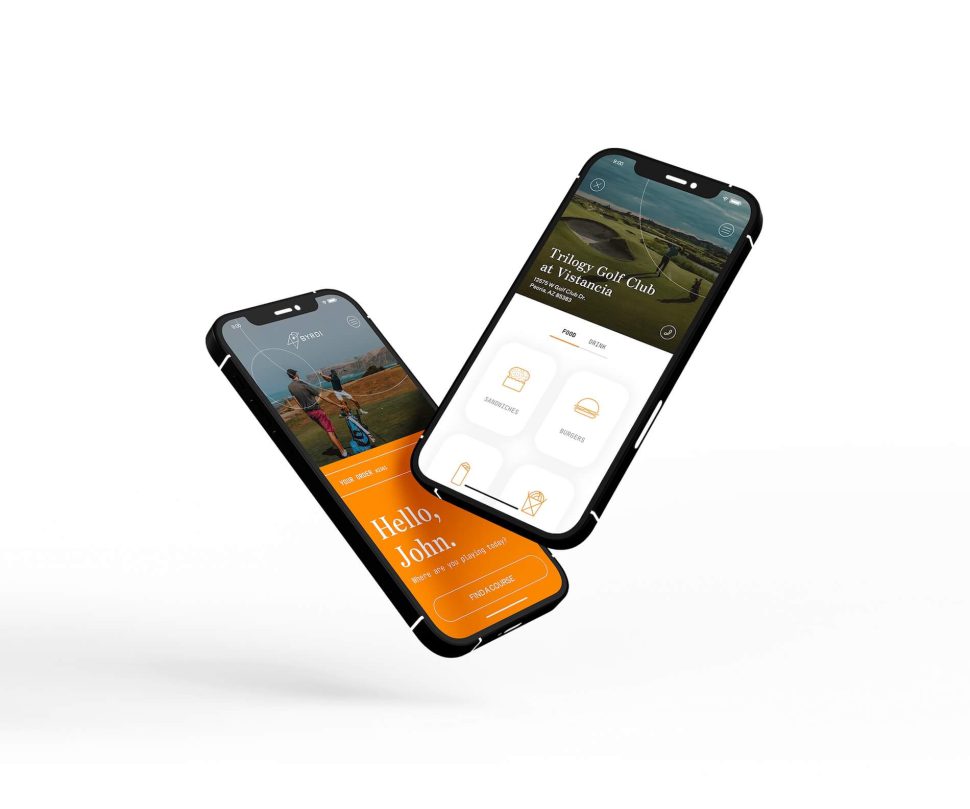
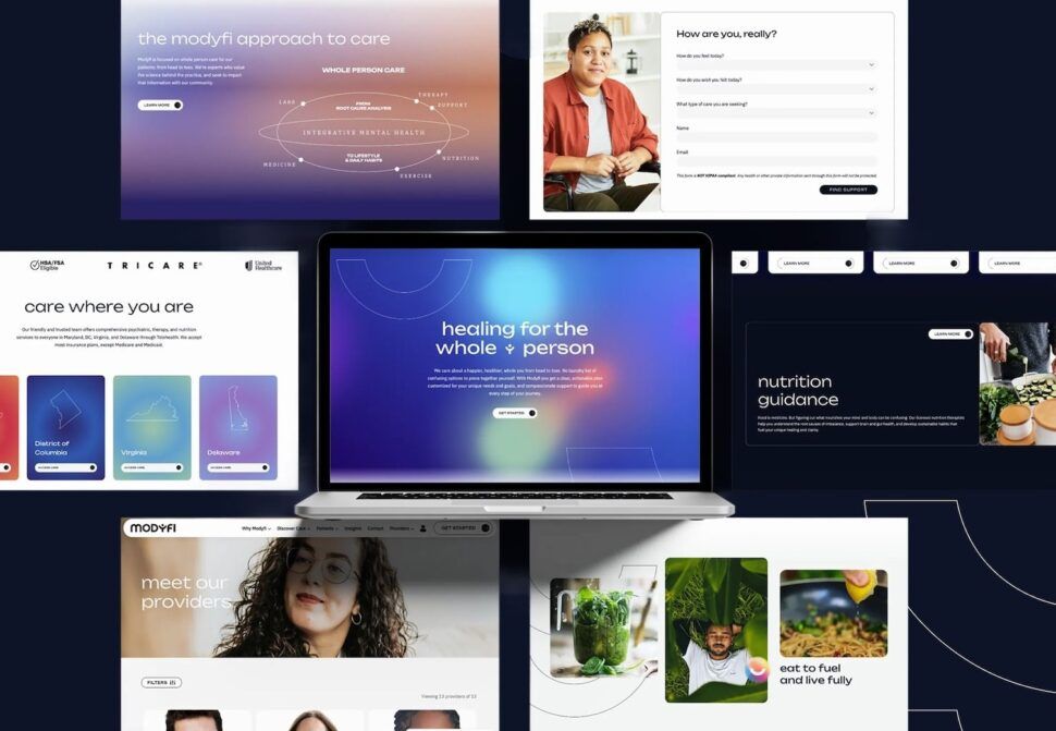
One example is Visual Soldiers, an Atlanta-based team that specializes in creating tailored UX solutions for creative agencies and digital marketers. They combine brand strategy, user experience design, and custom development to deliver websites that not only look great but also perform efficiently. With their expertise in ADA compliance and UX/UI design, they transform clunky, ineffective interfaces into systems that drive conversions.
Whether you’re looking for a complete overhaul or just need help fixing specific problem areas, working with professionals can fast-track results. Tackling complex challenges like accessibility and performance optimization is often more efficient and effective with a dedicated team.
In today’s competitive market, users expect seamless, intuitive experiences. Meeting those expectations isn’t optional – it’s essential.
Stop losing users to poor UX. Get a professional audit from our team.
Book a Discovery CallFAQs
If you suspect your website’s navigation might be frustrating users, start by running usability tests with actual users. Techniques like card sorting and tree testing can help you understand how intuitive your navigation structure is and whether people can easily locate the information they’re looking for.
Take a close look at your menu labels – are they clear and descriptive? Also, assess how well your content is organized. If you notice users frequently leaving pages or struggling to complete tasks, these could be red flags signaling navigation problems. Keep an eye on user feedback, web analytics, and behavior patterns regularly. These insights can reveal trouble spots and help you decide where to make improvements.
Making your website accessible means ensuring that everyone, including people with disabilities, can use and interact with it without difficulty. Start by using high-contrast colors between text and backgrounds to make content easier to read. Don’t depend solely on color to convey important information – add extra cues like patterns or text labels to get the message across.
Keep navigation clear and predictable by incorporating tools like site maps, search bars, and breadcrumbs. These features help users understand where they are and how to move around your site. For forms, use descriptive labels so users know exactly what to input, and make sure buttons and links are easy to recognize and click. When it comes to multimedia, always include alternatives like captions for videos or transcripts for audio files so that everyone can access the content.
Lastly, make sure your site supports keyboard navigation for those who can’t use a mouse. Avoid sudden or unexpected changes when users interact with elements, as this can be confusing or frustrating. These steps can help make your site welcoming and usable for all visitors.
Designing for mobile devices has become a necessity, as smartphones and tablets dominate the way people access the internet. Taking a mobile-first approach ensures your website or app works seamlessly on smaller screens, offering a smooth and intuitive experience from the get-go.
To make mobile-first design work, prioritize the essential content and features that mobile users need most. Create layouts and functionalities specifically for smaller screens, and then expand and refine them for larger devices like tablets and desktops. This method keeps your design streamlined, efficient, and ready to engage the broadest audience possible.
Visual Soldiers
Visual Soldiers is an Atlanta-based creative studio specializing in branding, design & digital experiences.
