
Designing for mobile users first ensures your website is fast, functional, and user-friendly across all devices. This strategy prioritizes small screens, focusing on core content and essential actions, then expands features for larger devices.
Why Mobile-First Matters:
- 60%+ of web traffic comes from mobile devices.
- A 1-second delay in loading can reduce conversions by 7%.
- Google uses mobile-first indexing to rank your site.
Key Steps:
- Plan Your Content: Identify what’s crucial for mobile users and eliminate unnecessary elements.
- Wireframe: Start with a simple, single-column layout for small screens.
- Visual Design: Use clean typography, touch-friendly buttons, and lightweight visuals.
- Responsive Development: Write CSS for mobile first, then scale up with media queries.
- Optimize Performance: Compress images, lazy-load content, and minimize code.
- Test Thoroughly: Use real devices and tools like BrowserStack to ensure smooth functionality.
- Ensure Accessibility: Follow WCAG standards for usability by all users.
By starting with mobile-first principles, you’ll create a faster, more focused experience that works across devices while improving search rankings and user satisfaction.
Build a Responsive, Mobile First Website - HTML5 & CSS3
Planning and Content Prioritization
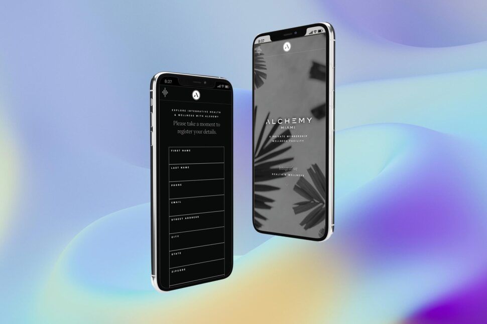
Before diving into wireframing, take a step back and plan your mobile layout carefully. Start by building a content inventory – a detailed list of every page, section, text block, image, form, call-to-action (CTA), and navigation item your site will include. Use tools like spreadsheets or collaborative platforms to organize this information. Then, sort each element into one of three categories: “must-have on mobile”, “nice-to-have for tablet/desktop”, or “remove entirely.” This step forces you to focus on what truly matters for mobile users, cutting out anything that doesn’t directly support their needs or your business goals. This inventory becomes the foundation for designing a layout that reflects real-world mobile behavior.
Next, prioritize content based on what mobile users value most. Identify the top three tasks users are likely to perform on their phones – like finding a store location, checking a price, or completing a purchase. These tasks, along with any essential information, should be front and center. Secondary content, such as in-depth brand stories or legal disclaimers, can be tucked into expandable sections or moved further down the page.
Simplify your navigation to fit the constraints of mobile screens. Stick to three to five essential menu items – think Home, Shop, Cart, Account, and Support – and place less important links in a secondary menu or footer. Use clear, action-focused labels, and avoid overly complex menus with deep subcategories. For U.S. users, ensure common actions like viewing prices, finding local hours, or contacting customer service are easy to access. This streamlined approach ensures users can quickly find what they need.
When it comes to CTAs, less is more. Focus on one or two primary actions per screen, such as a “Buy Now” button with a clear price (e.g., $49.99) or a “Get a Quote” form. Position these buttons within easy thumb reach, typically near the bottom of the screen, and size them around 44×44 px for usability. Secondary actions should be designed to stand out less, ensuring they don’t compete for attention. This helps reduce cognitive load and keeps users focused on the main goal.
Lastly, align your content decisions with performance goals. Every image, video, and third-party script on a mobile site affects speed and usability, so make sure each asset serves a clear purpose. Agencies like Visual Soldiers often combine content audits, UX strategy, and brand alignment during their discovery phase to create a mobile-first content plan. This ensures the final design is fast, focused, and free from unnecessary distractions, keeping the user experience smooth and goal-oriented.

Designing for Mobile Screens
Once you’ve carefully planned and prioritized your content, it’s time to bring your strategy to life with a mobile-friendly design.
Wireframing for Mobile
Begin with low-fidelity wireframes, using simple gray boxes to represent buttons, text, and images. This method keeps everyone focused on the structure and user flow, rather than getting sidetracked by colors or fonts. Tools like Figma, Sketch, Balsamiq, or FigJam make it easy to iterate quickly and collaborate effectively with your team.
Design with common smartphone widths in mind – typically between 360–414 px for Android and iOS devices. A single-column layout with a clear vertical hierarchy works best, ensuring that key actions are placed above the fold for immediate visibility. Keep navigation simple: a top bar with your logo, one primary action, and a menu icon is often enough. Alternatively, consider a bottom navigation bar with 3–5 main destinations that users frequently access.
Use a 4- or 8-point spacing system to maintain consistent padding, which simplifies scaling later. Place key controls in thumb-friendly zones, typically in the lower half of the screen, to make one-handed use more comfortable. Avoid overwhelming users with deep menu structures; instead, keep your main menu concise and group related links under clear labels to reduce mental effort. For U.S.-based users, remember to format prices in USD (e.g., $1,299.00), use the MM/DD/YYYY date format, and account for multi-line addresses that may wrap on smaller screens. Once your wireframes are validated, you can move on to refining the visual design.
Developing Visual Design
With your wireframes as a foundation, it’s time to focus on the visual details. Start by creating a mobile-first design system that defines colors, typography, spacing, and components specifically for small screens. Use a base body text size of 14–16 pt and choose a highly legible font. Stick to a single font family with 2–3 weights to minimize visual clutter and improve loading speeds.
Interactive elements should be sized appropriately – 44×44 px for Apple devices or 48×48 dp for Android – to prevent accidental taps, especially for critical actions like “Delete” or “Confirm Purchase.” Maintain clear spacing between these elements. Ensure text is easy to read in all lighting conditions by using high contrast between text and background, following WCAG AA standards. To communicate meaning, combine colors with icons or labels, so the design remains effective even in grayscale.
Optimize performance by using lightweight visuals. Resize images specifically for mobile, compress them with modern formats, and avoid using oversized desktop assets. Limit the use of multiple web fonts or heavy JavaScript libraries. Simple, flat UI elements and subtle effects work better than heavy shadows or large background videos, which can slow down page rendering. Implement lazy-loading for below-the-fold content to ensure primary content appears quickly. Agencies like Visual Soldiers excel at balancing strong branding with asset optimization, delivering mobile pages that look great and load quickly, even on typical U.S. 4G/LTE connections.
| Design Aspect | Mobile Wireframe Focus | Mobile Visual Design Focus |
|---|---|---|
| Layout | Single-column, linear flow | Spacing, alignment, and visual hierarchy using color and typography |
| Navigation | Minimal items, clear structure | Thumb-friendly zones, bottom navigation bars, and large tap targets |
| Interactions | Define primary tasks and key user flows | Tap, swipe, and clear feedback animations without relying on hover states |
| Content | Prioritize essentials, condense extras | Readable text, scannable sections, and strong calls-to-action |
| Performance | Limit elements per screen | Compressed assets, minimal fonts, and lightweight effects |
| Accessibility | Clear structure and labels | High contrast, proper target sizes, alt text, and visible focus states for better usability |


Implementing Responsive Design
Once your mobile visual design is ready, it’s time to translate those designs into functional code that works smoothly across all screen sizes. The trick lies in crafting CSS that builds on your mobile layout as the base and then scales up for tablets and desktops. This mobile-first approach ensures your design evolves seamlessly into code that’s both flexible and efficient.
Using Media Queries Effectively
Start by writing default CSS rules tailored for mobile screens (typically 320–414 px wide). Focus on single-column layouts, full-width buttons, and touch-friendly spacing. From there, use @media (min-width: ...) queries to add enhancements for larger devices. For instance, you can introduce multi-column layouts for tablets using @media (min-width: 768px) and add sidebars or hover effects for desktops with @media (min-width: 1024px).
Instead of targeting specific devices, choose breakpoints based on your content’s natural flow. A common structure includes mobile as the default (0–767 px), tablet (@media (min-width: 768px)), and desktop (@media (min-width: 1024px)). Use relative units like rem, %, or vw to ensure elements scale fluidly. Modern CSS tools like Flexbox and CSS Grid make layouts easier to manage. For example, CSS Grid’s repeat(auto-fit, minmax(250px, 1fr)) can effortlessly transform a single-column mobile layout into a multi-column desktop design. To maintain clarity, group your media query rules by component (like navigation, cards, or forms). This method keeps your mobile-first strategy intact, ensuring functionality improves progressively without compromising performance.
Optimizing Performance for Mobile
Responsive design isn’t just about flexible layouts – it’s also about speed. A slow-loading site can cost you: 53% of mobile users will leave if a page takes more than 3 seconds to load, and even a 1-second delay can cut conversions by 7%. To avoid this, start by compressing images. Tools like TinyPNG can shrink file sizes by 50–70% without sacrificing visible quality. Use loading="lazy" on <img> tags to defer loading images below the fold, cutting initial page weight by 20–30%.
Streamline your code by minifying CSS and JavaScript, which can reduce file sizes by 20–30%. Tools like PurgeCSS can go further, eliminating unused styles and trimming bundles by up to 80%. Enable Gzip or Brotli compression on your server to save 60–80% on transfer size. For users in the U.S. on 4G/LTE, these optimizations can be the difference between a smooth experience and a frustrating wait. Use responsive image techniques like srcset and the <picture> element to serve appropriately sized images – there’s no need to send a 2,400 px desktop image to a 375 px mobile screen. Regularly run Google Lighthouse to monitor performance, aiming for a mobile score above 90/100 to meet Core Web Vitals standards, which are essential for search rankings under mobile-first indexing.
Leading agencies like Visual Soldiers bake performance optimization into their process, balancing sleek branding with compressed assets and efficient code to deliver fast, visually striking websites.
Testing and Deployment
Your mobile-first design is ready to go, but before launching, you need to ensure it performs flawlessly in real-world conditions. This step helps catch potential issues, guarantees accessibility for all users, and sets the stage for a successful launch.
Testing Across Devices
Start with Chrome DevTools emulators to check layouts across screen sizes (320–768px), but don’t stop there. Real devices are critical for testing touch response and network performance. If you don’t have an extensive collection of devices, cloud-based platforms like BrowserStack or LambdaTest can be lifesavers. These tools let you test on thousands of real devices, including popular models like the iPhone 12–15 and Samsung Galaxy S series. According to BrowserStack, testing on 10–20 devices – spanning both iOS and Android – can cover most of your audience.
Pay attention to Core Web Vitals: aim for a Largest Contentful Paint (LCP) under 2.5 seconds, First Contentful Paint (FCP) under 1.8 seconds, and Time to Interactive (TTI) under 5 seconds. Also, make sure touch targets meet the 44px × 44px minimum size and that swipe gestures are smooth. With 55% of global web traffic coming from mobile devices, skipping detailed testing could mean alienating half your potential audience.
Once you’ve confirmed functionality across devices, it’s time to prioritize accessibility compliance.
Ensuring ADA Compliance
Accessibility isn’t just a legal requirement under the ADA – it’s also a way to ensure your site works for everyone, including the 15% of Americans with disabilities. Start with automated tools like WAVE or axe DevTools to identify common issues such as low color contrast (aim for a 4.5:1 ratio), missing alt text, or improperly sized touch areas. However, automation only catches about 30% of accessibility problems, so manual testing is a must. Use screen readers like VoiceOver (iOS) or TalkBack (Android) on real devices to check usability.
Make sure your site is fully navigable via keyboard, with clear focus indicators and logical focus order. Text should resize up to 200% without breaking layouts, and dynamic elements like modals should include ARIA labels. Run a Google Lighthouse accessibility audit and aim for a perfect score of 100. For more thorough checks, follow the VPAT checklist to meet WCAG 2.1 AA standards. Considering that 98% of websites fail basic accessibility tests, this step not only reduces legal risks but also sets your site apart. Companies that emphasize accessibility often see 20–30% improvements in usability for all users – not just those with disabilities.
Deployment Best Practices
Use a Git-based CI/CD pipeline with platforms like Vercel or Netlify for smooth deployment. Before going live, push your site to a staging environment for one last round of cross-device and accessibility testing. Optimize performance by enabling Gzip or Brotli compression and using a CDN like Cloudflare or AWS CloudFront to keep latency under 100ms for users in the U.S.
Minify CSS and JavaScript, enable HTTP/2, and set cache headers to speed up repeat visits. Aim for a performance budget of under 170KB for mobile pages to ensure load times stay under 2 seconds. Use tools like Hotjar to analyze user behavior through heatmaps and make data-driven improvements. With 53% of users abandoning mobile pages that take longer than 3 seconds to load, continuous optimization is critical to retaining visitors.
Agencies such as Visual Soldiers incorporate performance monitoring and accessibility checks throughout the deployment process, ensuring your site launches quickly and remains compliant as it grows.
Ready to Go Mobile-First the Right Way?
At Visual Soldiers, we design and build fast, accessible, mobile-first websites that look beautiful and actually perform. If your site isn’t winning on mobile, you’re missing real opportunity. Let’s fix that together.
Book a Discovery CallConclusion
By embracing the mobile-first strategy laid out above, you can create interfaces that truly cater to the devices people rely on most. This approach follows a clear path: focus content around mobile user goals, design with phones as the priority, use responsive layouts with progressive enhancement, and validate everything through thorough testing. These steps lay the groundwork for modern, user-friendly web experiences.
The benefits of this strategy are undeniable. Slow-loading sites drive users away, cutting into conversions, while optimized mobile experiences keep them engaged. Additionally, Google’s mobile-first indexing ensures that prioritizing mobile design boosts your search visibility. These tangible outcomes highlight why mobile-first design is no longer optional – it’s essential.
Unlike traditional responsive design, which often shrinks desktop content to fit smaller screens, mobile-first design starts with the core features needed for mobile users. This approach ensures faster, more focused, and user-friendly experiences that naturally expand to larger screens. Designing with constraints in mind leads to clarity and efficiency, benefiting users across all devices.
Ready to put this into action? Start by analyzing your traffic to see how mobile compares to desktop usage. Run a mobile-friendly performance test, and prototype a key user flow with mobile-first principles. Create a simple checklist for your team: prioritize mobile viewports for all new features, test on actual devices, and ensure accessibility from the beginning. If you need expert guidance, agencies like Visual Soldiers, an Atlanta-based creative agency specializing in branding, web design, app design, UX, and custom development, can provide tailored mobile-first solutions for your brand.
As we approach 2025, mobile-first design is critical to staying competitive, meeting user needs, and delivering impactful experiences. Start your next project with mobile users in mind, and build from there.
FAQs
Mobile-first design focuses on creating streamlined, optimized content tailored for mobile users, which significantly boosts website performance. This method delivers faster load times, better responsiveness, and a seamless user experience – key factors in keeping visitors engaged and satisfied.
By putting mobile devices first, the design eliminates unnecessary code and ensures resources are used effectively. This approach not only helps reduce bounce rates but also enhances overall site speed, making it a practical solution for meeting the demands of today’s mobile-driven audience in the US market.
Mobile-first design begins by crafting an ideal experience for smaller screens. It emphasizes touch-friendly interactions, streamlined performance, and simplicity. Once the foundation for mobile devices is set, the design is then adjusted and expanded to work seamlessly on larger screens.
On the other hand, traditional responsive design starts with a desktop layout and scales it down for smaller devices. This method can sometimes result in mobile experiences that feel less polished or well-suited compared to those created with a mobile-first approach.
Accessibility plays a key role in mobile-first design, ensuring that everyone, including individuals with disabilities, can easily interact with your content. By prioritizing accessibility, you create a user-friendly experience that accommodates a wide range of needs, from those with visual or motor challenges to people using assistive technologies.
Beyond inclusivity, accessible design expands your audience, boosts usability, and keeps your work in line with legal and ethical guidelines. Focusing on accessibility not only improves the overall user experience but also enhances your brand’s credibility and reach.
Visual Soldiers
Visual Soldiers is an Atlanta-based creative studio specializing in branding, design & digital experiences.


