Design can feel a lot like navigating a maze. There’s an endless array of colors, fonts, and layouts to choose from, and making sure everything fits together seamlessly can be a bit of a puzzle. That’s where the Unity Principle of Design comes into play. It’s like your trusty map, guiding you to create visually appealing and coherent designs. But what exactly is the Unity Principle of Design? Simply put, it’s a fundamental concept ensuring that every element of your design works harmoniously as a whole. Whether you’re working on a website, a brand logo, or even a room layout, unity helps bind every component, making the overall design feel complete and consistent.
Unity in design plays a crucial role in grabbing and retaining the audience’s attention. When every element works together in a cohesive manner, the design not only looks polished but also communicates the intended message more effectively. Without unity, even the most creative ideas can fall flat, appearing chaotic and disjointed. Think of unity as the unsung hero that brings clarity and cohesiveness to your work, making it both aesthetically appealing and functionally robust.
But achieving unity isn’t just about slapping some elements together and hoping for the best. It’s aligned closely with other essential design principles like balance, contrast, and rhythm. Understanding how these principles interplay is key to mastering the Unity Principle of Design itself.
In this article, we’ll dive deep into the key elements that contribute to unity, from consistency in color schemes and cohesive use of typography to harmonious layouts and balanced proportions. We’ll also look at practical applications across various design fields like graphic design, web design, interior design, and even fashion design. You’ll get handy tips for achieving unity in your designs, learn about common mistakes to avoid, and discover useful tools and resources that can help you along the way.
Ready to create designs that not only look good but also feel right? Let’s get into the nitty-gritty of the Unity Principle of Design.
Introduction to the Unity Principle of Design
What is the Unity Principle of Design?
The unity principle of design is one of those fundamental concepts that makes or breaks a project. But what does it really mean? In essence, it’s all about creating a sense of harmony and wholeness within a design. When the elements of a design work well together, they form a cohesive, aesthetically pleasing whole. Think of it as a well-orchestrated symphony where each instrument, note, and rhythm harmonize to create beautiful music.
Unity in design ensures that all elements feel like they belong together, contributing to a unified look. This principle goes beyond just making things look good; it’s about making sure everything ties together, offering a clear, consistent message to the audience. Whether it’s a website, a marketing campaign, or a brand logo, unity ensures that every piece of the puzzle fits snugly, enhancing the overall user experience.
Importance of Unity in Design
So, why is unity so crucial in design? For starters, a unified design makes it easier for your audience to understand and engage with your content. When elements are aligned and consistent, they guide the eye naturally and make comprehension a breeze. Ever visited a chaotic website where nothing seems to match? It’s jarring and makes you want to leave immediately. Unity prevents that from happening by providing a smooth, enjoyable experience.
Moreover, a unified design boosts the credibility and professionalism of your brand. Consistency speaks volumes about your attention to detail and your commitment to quality. When potential clients see a well-unified design, it builds trust and showcases your brand as reliable and meticulous.
SEO and marketing folks, you know how important it is to hold your audience’s attention and encourage interaction. Unity does just that. By creating a cohesive visual experience, you keep users engaged longer, which can lead to higher conversions and improved SEO performance. It’s a win-win!
Brief Overview of Related Design Principles
Unity doesn’t stand alone; it’s closely related to other design principles that work together to create visually compelling pieces. Let’s take a quick look at a few:
1. Balance: This principle revolves around the distribution of visual weight in a design. It can be symmetrical, asymmetrical, or radial, but the goal is to create a sense of equilibrium.
2. Contrast: Contrast helps to highlight differences within a design, making certain elements stand out. It plays a crucial role in drawing attention and creating visual interest.
3. Proximity: This principle focuses on the spatial relationship between elements. Items that are related should be close together to form a cohesive group, enhancing the unity.
4. Repetition: Repeating elements such as colors, shapes, or patterns can strengthen the sense of unity and consistency within a design.
5. Alignment: Proper alignment helps to organize elements in a way that makes the design easy to navigate and aesthetically pleasing.
Understanding how these principles interconnect will deepen your grasp of the unity principle of design, making it easier to apply them effectively. And don’t forget, these principles aren’t just for design pros. If you’re a business owner or marketer, knowing these basics can help you better communicate your vision to your creative team.
Remember, creating unity in design might require a keen eye and practice, but once mastered, it’s a powerful tool that can elevate your brand to new heights. And if it feels overwhelming, expert creative services, like those offered by Visual Soldiers, can help ensure your designs hit the mark.
After all, wouldn’t you want your designs to captivate and resonate with your audience effectively?

Key Elements of the Unity Principle of Design
Consistency in Color Schemes
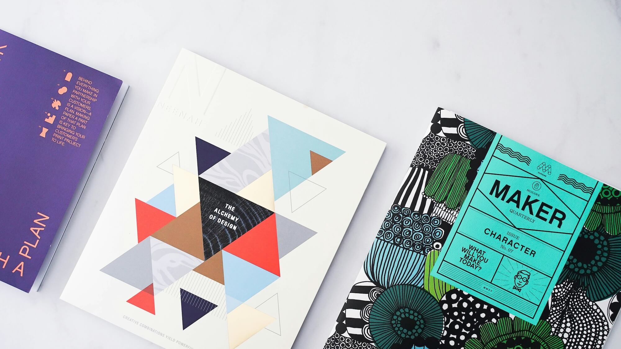
When it comes to the unity principle of design, one of the most crucial elements is maintaining consistency in color schemes. Colors have a significant impact on how a design is perceived and can evoke various emotions and responses. Sticking to a cohesive color palette helps ensure that all elements of your design work in harmony, creating a seamless visual experience. This doesn’t mean you should stick to a monotone approach, but rather, create a balanced mix that complements your overall theme.
For instance, if your brand is all about tranquility and calm, opting for softer shades of blue and green can infuse the feeling you aim to convey. On the other hand, for a more energetic and dynamic vibe, vibrant oranges and reds might be your go-to. Remember, a disjointed color scheme can make your design appear chaotic and unprofessional.
Cohesive Use of Fonts and Typography
Fonts are instrumental in reinforcing the unity principle of design. Typography is not just about readability; it’s also a visual cue that ties your design together. Using a limited set of fonts and applying them consistently throughout your project can create a unified look. It’s essential to choose fonts that complement each other and fit well with your brand’s voice.
For example, pairing a modern sans-serif font for headings with a classic serif font for body text can add layers of sophistication and clarity. Try not to use more than two or three different fonts in a single design, as this can break the unity and confuse the viewer. The goal is to find that sweet spot where all typographic elements work harmoniously together, adding to the overall cohesiveness of your design.
Harmonious Layout and Composition
A central aspect of the unity principle of design is achieving a harmonious layout and composition. The arrangement of elements needs to feel balanced and purposeful. This involves careful planning of where each part of your design will live and how they interact with each other. Good composition integrates elements like text, images, and space to create a visually appealing and functional design.
Consider using grids and alignment to keep your design structured and orderly. White space, often overlooked, is incredibly powerful in guiding the viewer’s eye and ensuring that your design doesn’t feel cluttered. The right layout can dramatically improve user experience by making navigation intuitive and increasing engagement with the content. Each element should naturally flow into the next, creating a smooth journey for the audience.
Balanced Scale and Proportion
Scale and proportion are fundamental to the unity principle of design. They refer to the size of elements and how they relate to each other within your layout. Getting the scale and proportion right ensures that your design feels balanced. A design where one element dwarfs everything else, unless intentionally done for emphasis, can throw off unity and make the composition feel awkward.
Think about how large or small elements like text, images, and icons should be in relation to each other. This not only impacts visual appeal but also functionality. For example, in web design, buttons should be high enough in contrast and size to stand out and invite action, but not so large that they dominate the page. Scale and proportion also apply to printed materials, ensuring all elements align perfectly regarding size and dimension.
Unity in design is about making everything work together seamlessly. From consistent color schemes to cohesive typography, harmonious layouts, and balanced proportions, each element plays a vital role in creating a unified look. Visual Soldiers can help you master these aspects, offering expert creative services to bring your design projects to life.
When it comes to the unity principle of design, seeing it in action across different fields really helps to solidify its importance. Whether you’re working in graphic design, web design, interior design, or even fashion design, unity plays a pivotal role in making your creations resonate. Let’s dive into how unity is practically applied in these four unique areas.
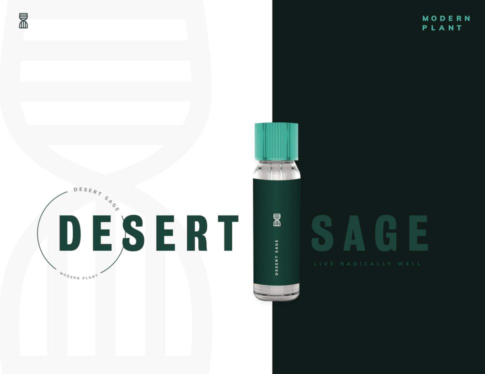
Graphic Design
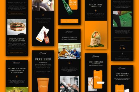
In graphic design, achieving unity is like finding the blend that makes a perfect cocktail. When different elements like images, fonts, colors, and shapes work in harmony, the design feels complete and purposeful. If you’re designing a brand’s marketing materials, for instance, everything from the logo to the business cards needs to have a consistent look and feel. This consistency helps establish brand identity, so when someone sees your design, they immediately recognize the brand it’s associated with.
Think about some of your favorite logos or advertisements. Chances are, they stick in your mind because all the elements fit together seamlessly. That’s the unity principle of design at work. Elements don’t compete for attention; instead, they complement each other, presenting a cohesive message that sticks.
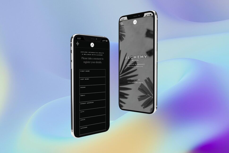
Web Design
When people think of unity in web design, consistency and seamless navigation usually come to mind. Unity here means your website shouldn’t look like a patchwork quilt of different styles and ideas. Instead, it should portray a single, consistent aesthetic and user experience.
Consider your color schemes, typography, and layout. They should all align throughout the various pages of your website. Buttons, links, and other interactive elements should behave consistently, ensuring that users know what to expect. This boosts the user’s experience and makes them more likely to stick around.
By practicing unity, web designers help make websites feel more user-friendly and intuitive. Imagine visiting a site where the header sizes change erratically, and each page looks like it’s part of a different website. Confusing, right? That’s why unity is essential in web design—it keeps everything smooth and cohesive, minimizing friction for the user.
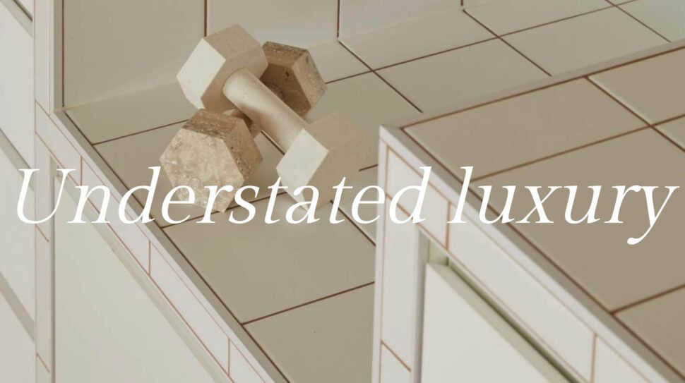
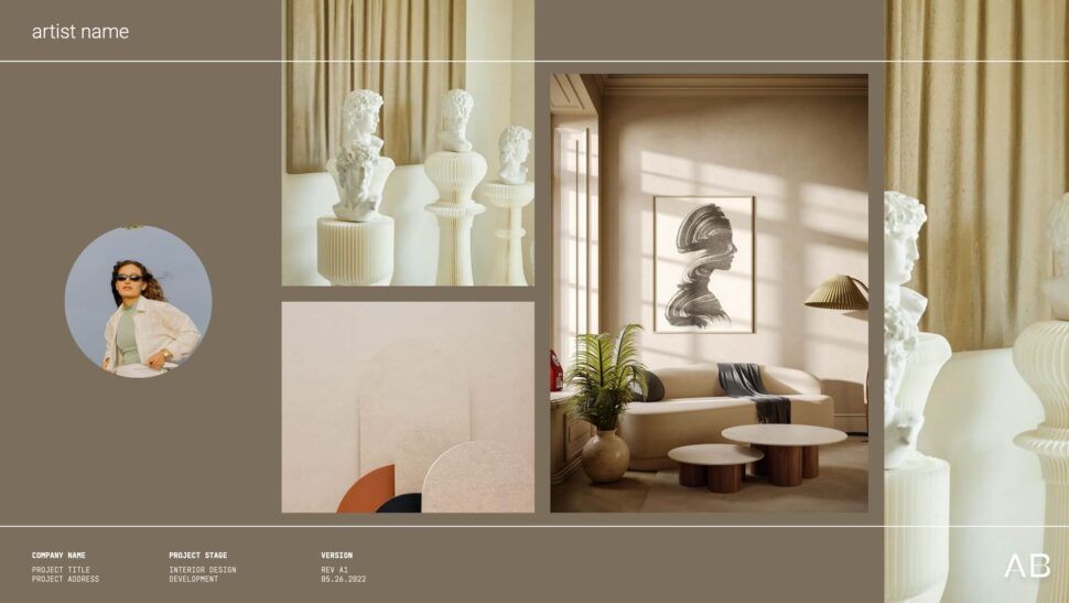
Interior Design
In the world of interior design, unity works behind the scenes to create spaces that feel welcoming and cohesive. A room where colors, furniture, and accessories all seem to clash can be jarring to the eyes and mind. But when elements are well-coordinated, the space becomes inviting and balanced.
Take a living room, for example. If the furniture, wall art, and decorations all follow a consistent theme and color scheme, the room feels unified. Everything belongs, and nothing looks out of place. It’s why designers often choose a color palette and stick to it, ensuring each piece either complements or contrasts in a deliberate way that contributes to the overall harmony.
Unity in interior design also plays into functionality. Elements that appear consistent and connected help people understand and navigate the space more easily. From the layout to the materials used, everything works together to serve both aesthetics and utility.
Fashion Design
You might not immediately think of the unity principle of design when you look at a stylish outfit, but it’s definitely there. Fashion designers use unity to ensure that the entire look feels cohesive, whether it’s a single garment or an entire collection.
For instance, in a fashion collection, details like fabric, color, and accessories often follow a consistent theme. This unity helps create a signature style that can be easily recognized. When a fashion show is cohesive, it tells a story. The consistency in elements helps viewers, buyers, and critics understand the designer’s vision and storytelling through fashion.
Imagine an outfit where the top, bottom, and accessories are mismatched. While it might make a statement, it often feels more chaotic than cohesive. By adhering to the unity principle, fashion designers create looks that are both visually appealing and thematically consistent.
Bringing it Together
Incorporating the unity principle of design in these different fields helps create designs that aren’t just aesthetically pleasing but also functional and easily recognizable. Whether you’re tasked with designing a stunning graphic, a user-friendly website, a welcoming interior space, or the next fashion trend, unity will be your best friend.
If you’re looking for expert creative services to bring unity to your designs, let’s talk. At Visual Soldiers, we know how to bring all the pieces together. How will you incorporate unity into your next project?
Tips for Achieving Unity in Your Designs
Strategies for Creating Visual Harmony
Achieving unity in design isn’t rocket science, but it does require a thoughtful approach. One of the first steps is ensuring that all elements within your design are visually connected. This can be done through consistent use of colors, typography, and imagery. Think of it as creating a family of elements that look like they belong together. By doing this, you’ll ensure that nothing feels out of place.
Another effective strategy is utilizing repetition. Repetition can help tie different parts of a design together and create a sense of predictability, making the viewer feel more comfortable. You can repeat patterns, shapes, or even design styles to achieve this. For instance, using the same border style on different sections of a webpage can create visual harmony, which is a core aspect of the unity principle of design.
Let’s not forget about alignment. Aligning your design elements—whether it’s text, images, or graphics—ensures that nothing feels randomly placed. Proper alignment gives structure and order to your design, enhancing its overall unity. Grid systems are particularly helpful here, offering a framework that keeps your layout tidy and well-organized.
Common Mistakes to Avoid
Even seasoned designers can slip up when it comes to achieving unity in their designs. One common mistake is using too many fonts. While it might be tempting to add some flair, using more than two or three fonts can make your design look chaotic and disorganized. Stick to a limited palette of typefaces to maintain cohesion.
Overloading your design with colors is another pitfall. A balanced color scheme with complementary hues creates a harmonious look, while too many colors can result in visual clutter. Use a color wheel to find harmonious color combinations that reinforce the unity principle of design.
Lastly, avoid inconsistent spacing. Whether it’s padding around text or margins in your layout, inconsistent spacing can disrupt the flow of your design. Pay attention to these small details, as they cumulatively impact the overall unity of your work.
Tools and Resources for Designers
Fortunately, there are several tools and resources that can help you nail the unity principle of design. A good starting point is style guides. A well-crafted style guide provides a reference point for colors, fonts, and layout rules. It’s like having a roadmap that ensures everyone on your team is on the same page.
Design software like Adobe Creative Suite offers robust features for maintaining design unity. From creating shared libraries of colors and styles to using grids and alignment tools, these applications are your best friends in achieving a cohesive design.
Let’s talk about inspiration. Websites like Behance and Dribbble showcase collections of beautifully unified designs. Browsing these platforms can provide you with ideas and show you how others are putting the unity principle into practice.
Social media platforms like Pinterest are also treasure troves for design inspiration. They allow you to create boards where you can pin examples and ideas that exemplify good design unity. This is particularly useful when you’re in the brainstorming phase of a project and looking for a cohesive direction.
If you’re keen to go even deeper into mastering the unity principle of design, consider taking online courses. Websites like Coursera and Skillshare offer courses taught by experienced professionals. Learning from experts can provide you with new techniques and insights that you might not have considered before.
Looking for expert creative services to ensure your designs achieve perfect unity?
At Visual Soldiers, we help marketing professionals like you turn concepts into cohesive, beautiful designs. Could your next project benefit from these unity-focused strategies?
Book a CallConclusion
In conclusion, the unity principle of design is a fundamental aspect that ties various design elements together to create a cohesive and aesthetically pleasing outcome. By understanding and implementing this principle, designers can ensure their work not only looks good but also communicates effectively with its audience. Remember, unity isn’t about making every element identical; it’s about creating a harmonious relationship between them.
From consistent color schemes and cohesive typography to harmonious layouts and balanced proportions, every detail plays a critical role in achieving unity. Whether you’re working in graphic design, web design, interior design, or even fashion design, the principle remains the same: unified elements strengthen the overall impact of your work.
If you’re looking to master this crucial design principle, start by focusing on strategies that promote visual harmony and avoid common pitfalls that can disrupt unity. Utilize tools and resources available to you, and never stop learning and experimenting.
At the end of the day, achieving unity in design is about balance and cohesion. It’s about making sure every piece of your design puzzle fits seamlessly together. So, next time you dive into a new project, ask yourself: how can you apply the unity principle of design to create something truly outstanding?
Visual Soldiers
Visual Soldiers is an Atlanta-based creative studio specializing in branding, design & digital experiences.
