December 10, 2025
Ultimate Guide to Visual Storytelling for Digital Design
-
Visual Soldiers
- Design
- minute read
Ultimate Guide to Visual Storytelling for Digital Design
Visual storytelling combines images, typography, motion, and interactivity to create narratives that engage users and drive action. It’s not just about aesthetics – it’s crafting a story with characters, conflict, and resolution while using design principles like hierarchy and composition. Why does this matter? People process visuals faster than text and remember stories better than facts, making storytelling a powerful tool for brands. Here’s what you need to know:
- What it is: Using visuals like videos, icons, and animations to tell interactive stories on websites, apps, and ads.
- Why it matters: Stories evoke emotions, improve user engagement, and help brands communicate their value effectively.
- Where it works best: Websites (product journeys, brand stories), mobile apps (onboarding, feature tours), social media (short videos, carousels), and ads.
- Core elements: Narrative structure (beginning, middle, end), design principles (hierarchy, typography, color, composition), and interactive features (animations, microinteractions).
- How to create it: Define the story, prototype it, test for clarity, and measure performance with metrics like scroll depth and conversion rates.
Visual storytelling isn’t just a trend – it’s a method to keep users engaged and emotionally connected while achieving business goals. Start by rethinking your digital designs as narratives, focusing on clarity, emotional appeal, and user interaction.
Storytelling in Visual Design: Journeys and Paths
Core Elements of Visual Storytelling
Visual storytelling in digital design relies on three main components: narrative structure, design principles, and interactive elements. Together, these create seamless, intuitive, and emotionally engaging experiences.
Narrative Structure and Emotional Connection
At its core, digital storytelling follows a simple structure: beginning, middle, and end. The beginning grabs attention with a visual hook, such as a striking hero image, an engaging headline, or a brief video. This hook introduces the context or a relatable problem. The middle develops the story, often showcasing a journey or challenge through step-by-step flows, case study timelines, or scroll-based sequences. Finally, the story concludes with a clear call to action – whether it’s signing up, exploring further, or making a purchase – that ties the narrative to the brand’s solution.
Color, imagery, and motion play a crucial role in amplifying the story. For instance, warm tones like reds and oranges can evoke energy or urgency, while blues and greens suggest trust and calmness. A wellness brand might lean on soft blues and natural visuals to create a sense of tranquility. Similarly, authentic photos featuring diverse individuals in relatable scenarios foster empathy, encouraging users to see themselves in the narrative. Subtle animations, such as fade-ins or parallax scrolling, guide attention while reducing perceived wait times, keeping U.S. audiences engaged and emotionally connected.
Design Principles That Support Storytelling
Design principles bring clarity and focus to the storytelling process. Four key principles – visual hierarchy, typography, color theory, and composition – work together to enhance the user experience.
- Visual hierarchy ensures that the most important elements, like a product name or price, stand out through size, contrast, and placement. Supporting elements, such as images or descriptive text, follow in order of importance.
- Typography sets the tone: bold sans-serif fonts convey modernity, while serif fonts evoke tradition and trust. Clear headings, short paragraphs, and bullet points make content more digestible and keep the narrative flowing.
- Color theory not only sets the mood but also communicates function. For example, red might signal errors, while green indicates success. Consistent accent colors create visual harmony and help tie the story together.
- Composition arranges elements in a balanced way, guiding the viewer’s gaze naturally through the content. Together, these principles reduce mental effort, making the story easier to follow and more memorable.
Interactive and Motion Design
Interactive and motion design transform storytelling from a passive experience into an active one. Micro-interactions – like a button changing color when hovered over or a pulsing heart icon – provide instant feedback, making interfaces feel more alive. Even small touches, like a checkmark animation after completing a form, can turn routine actions into satisfying moments of progress.
Animations and transitions also play a key role. Smooth page changes or scroll-triggered animations help users navigate through different parts of the story. For instance, a portfolio site might use parallax scrolling to reveal project chapters gradually, creating a cinematic feel that emphasizes key moments.
Dynamic visuals, such as interactive infographics, sliders, or 360° product views, let users explore content at their own pace. For example, an animated timeline with charts and maps can make complex data feel more relatable and urgent. Real-world examples bring these ideas to life: Spotify Wrapped uses playful animations and swipeable cards to turn personal music stats into a sharable story, while Apple’s product pages seamlessly combine bold visuals with subtle transitions to showcase innovation in an approachable way.

Workflow for Story-Driven Digital Design
Creating a story-driven digital experience requires a clear, structured approach. The process ensures the narrative remains engaging while staying aligned with brand goals. This workflow unfolds in three main phases: defining the story, translating it into prototypes, and testing for clarity. Each step is designed to keep the story cohesive from concept to launch.
Defining the Story and Aligning with Brand Goals
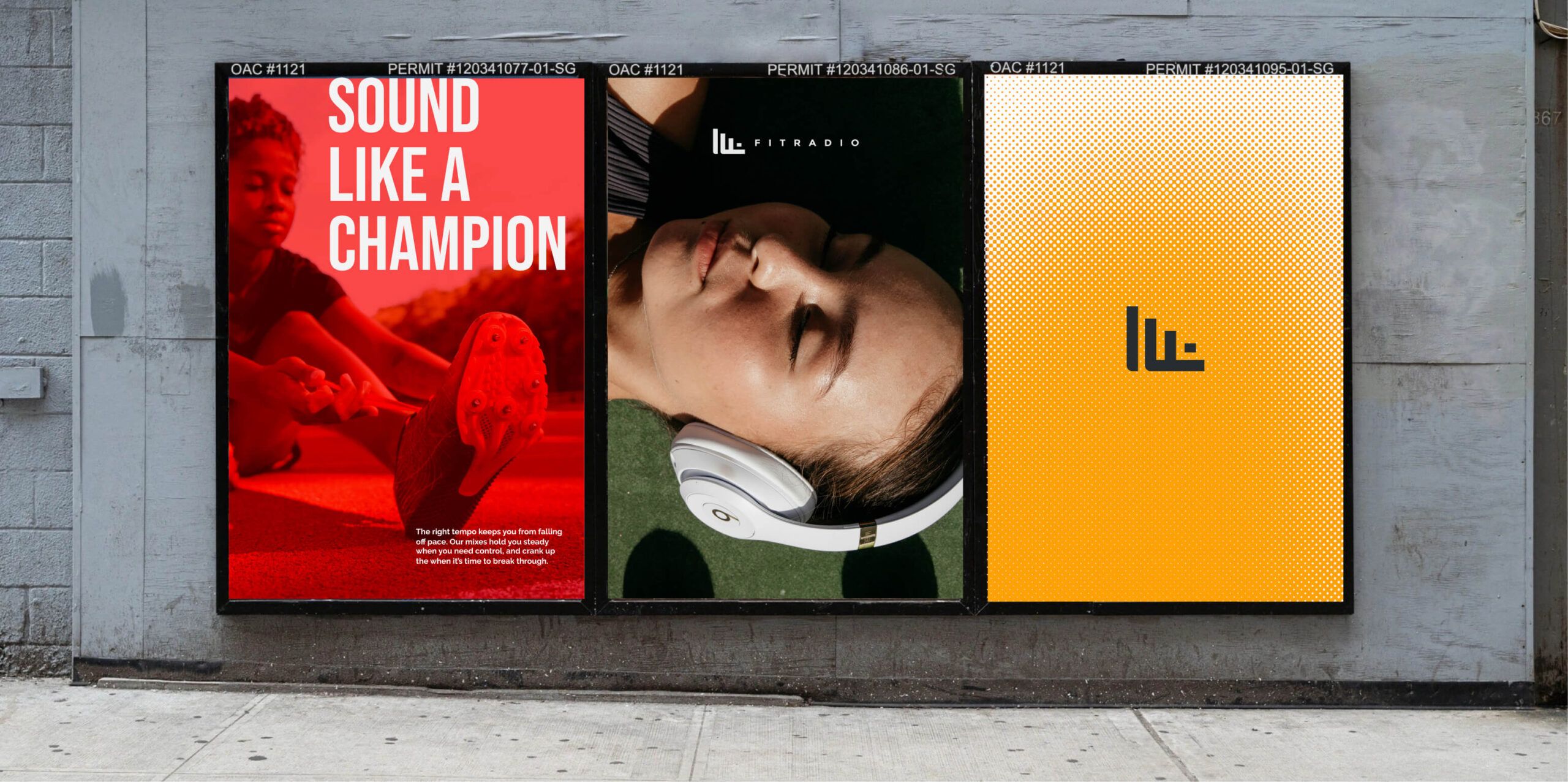
Start with a concise story brief that outlines the protagonist, conflict, and resolution. This brief should connect directly to business objectives – whether that’s driving sign-ups, increasing average order value, or building brand awareness. Agencies like Visual Soldiers excel at integrating narrative and brand strategy early in this phase.
The story should align seamlessly with the customer journey: grab attention during the awareness stage, build trust during consideration, and prompt action at the decision stage. Personas and journey maps are invaluable tools here. They help you understand your audience’s motivations, concerns, and the devices they prefer, shaping the tone, pacing, and complexity of interactions. For instance, a mobile-first U.S. audience may require shorter, punchier content and bold visuals, while a desktop experience might allow for more detailed storytelling.
Once the narrative is mapped to the user journey, you can transition into visualizing the story through storyboarding and prototyping.
Storyboarding and Prototyping
With the story defined, break it into key beats: the hook, conflict reveal, turning point, resolution, and call to action. Sketch these beats as storyboard frames, adding notes for transitions like scroll-triggered animations, tap interactions, or time-based reveals. These annotations help maintain the pacing and flow of the narrative.
Next, create clickable or scrollable prototypes using tools like Figma or Adobe XD. Focus on how the story unfolds and how elements transition, rather than perfecting visuals at this stage. For example, show how the conflict intensifies through dynamic changes, followed by a smooth resolution. This approach ensures the narrative flows naturally across screens without getting bogged down in design details too early. Keep a visual style guide handy to maintain consistency in colors, typography, imagery, and motion patterns as you refine the design.
Testing and Iteration for Story Clarity
Testing isn’t just about functionality – it’s about ensuring the story resonates. During moderated sessions, ask users to retell the story in their own words. This helps gauge whether the message is clear and memorable. Questions like “How did this screen make you feel?” can reveal how well the emotional beats are landing.
Track behavioral metrics such as scroll depth, clicks on narrative elements, and completion rates to identify where users lose interest. For example, if 60% of users drop off before the resolution, consider shortening the middle section or making the conflict reveal more engaging. Post-launch, use analytics and A/B testing to refine key elements like hooks, imagery, sequencing, and calls to action.
The goal of this iterative process is to simplify and clarify the story, enhance emotional impact, and ensure the visuals align with the brand identity. By continuously refining the narrative, you ensure it remains effective and compelling throughout the design lifecycle.
Techniques for Digital Storytelling
Building on a solid storytelling framework, these techniques enhance digital narratives by aligning content delivery with how users interact. By combining these methods with core storytelling principles, you can ensure every interaction feels like a meaningful part of the story.
Scrollytelling and Modular Story Components
Scrollytelling turns scrolling into a dynamic storytelling tool. As users scroll, text, visuals, and animations unfold sequentially – guiding them through the story’s key beats, such as the problem, rising tension, and resolution. On desktops, designers often pin certain panels in place for a layered effect. On mobile, the design shifts to shorter sections with less motion, favoring vertical stacking that’s easy to navigate with a thumb.
Each scroll step should focus on a single, clear idea. A great example of scrollytelling combines maps, videos, and data to create a seamless narrative. For U.S. audiences, this technique works best when it mirrors familiar formats like long-form articles or feature stories and ensures fast loading on typical broadband or 4G mobile connections.
Modular components – like cards and carousels – help break down complex stories into manageable pieces. Cards work best when each one has a specific purpose, such as introducing a concept, providing evidence, sharing a customer story, or prompting action. A card-based layout can guide users through a logical journey, while carousels are ideal for showing chronological progress (e.g., before, during, after) or comparing elements (e.g., challenge, approach, outcome). Consistency in typography, color, and imagery ties these modules together, while clear cues like “Start here” or “What changed” keep the sequence intuitive.
Data Storytelling and Visualizations
Data storytelling starts with a clear message, like “Online sales grew 35% YoY in the U.S.” Then, choose the chart type that best highlights the insight: line charts for trends, bar charts for comparisons, and maps for regional differences. The focus should be on key data points, using deliberate colors or annotations to draw attention while avoiding unnecessary clutter like extra gridlines or labels.
Pairing charts with plain-language captions – such as “Customers in the Southeast adopted the app twice as fast as other regions” – helps even non-experts quickly grasp the takeaway. Infographics can combine multiple charts into a cohesive narrative, starting with context, highlighting a key finding, and ending with actionable insights. Adding a human touch, like customer photos or quotes next to retention charts, makes the data feel more relatable and memorable.
Next, let’s look at how these techniques adapt across platforms to maintain consistency.
Adapting Techniques for Different Platforms
Websites offer the flexibility to create immersive narratives with hero visuals, scrollytelling case studies, and interactive data stories. On desktops, multi-column layouts and side-by-side charts can enhance the experience, while mobile web design requires a streamlined approach – single-column layouts, larger tap targets, and shorter text blocks optimized for standard U.S. device widths (typically 390–414 pixels).
Native mobile apps thrive on concise, screen-by-screen storytelling. Features like progressive onboarding and in-app walkthroughs help communicate value quickly. To address performance and offline use, these apps often rely on lightweight graphics, brief copy, and subtle animations to keep users engaged.
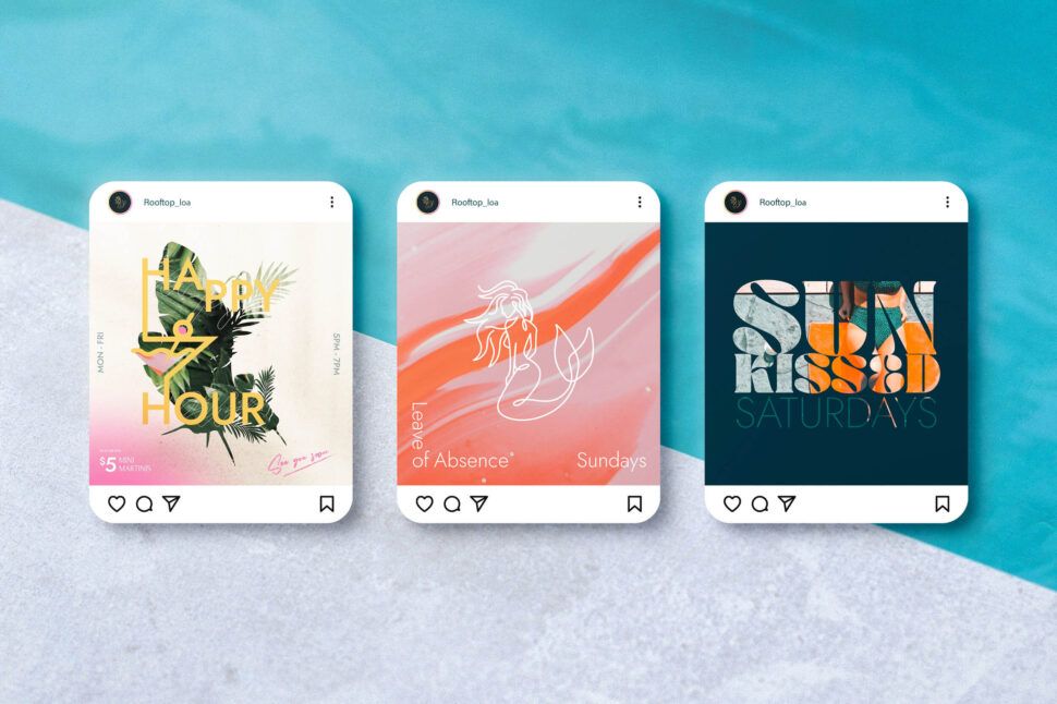
Social media demands compressed storytelling. Carousels, vertical videos, and before-and-after visuals can tease larger narratives and drive traffic back to your site or app. It’s important to maintain a consistent brand voice and visuals across platforms to reinforce the story.
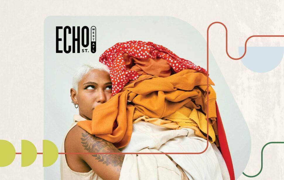
Agencies like Visual Soldiers excel at crafting brand-aligned storytelling for websites, apps, and digital campaigns, blending strategic narratives with custom design to create seamless digital experiences.


Measuring and Improving Storytelling Performance
Metrics for Measuring Success
To gauge how well your storytelling resonates, start by tracking engagement metrics like social shares, comments, and time spent on your content. These indicators show how much your audience connects with your story. Conversion rates are another key measure – they reveal whether your narrative inspires actions like purchases, sign-ups, or downloads. Beyond that, monitor task completion rates, backlinks, and overall site performance to understand how well your audience grasps and responds to your message.
For emotional impact, blend quantitative data – such as scroll depth and interaction rates – with qualitative insights from surveys and user testing. Tools like social listening and sentiment analysis can shed light on how your audience feels about your story, helping you refine its emotional appeal.
Building Accessible Storytelling
Accessibility is crucial to ensuring everyone can enjoy and engage with your visual narratives. Start by following WCAG 2.1 AA guidelines, which recommend a minimum contrast ratio of 4.5:1 for normal text to improve readability for users with visual impairments. Add descriptive alt text to images and graphics, explaining not just what they look like but also their purpose in the story.
For motion-based storytelling, include options to disable auto-playing animations to accommodate those sensitive to motion. Ensure all interactive elements are keyboard navigable and compatible with screen readers. For video content, provide captions and transcripts, and structure your content using semantic HTML to make the hierarchy clear. Finally, avoid relying solely on red-green color combinations to present critical information, making it accessible to color-blind users. These steps ensure your storytelling is inclusive, laying a strong foundation before you analyze its performance.
Using Analytics for Continuous Improvement
Analytics can provide deeper insights into how your narrative performs. Tools like heatmaps reveal where users click, hover, and linger, helping you identify which visuals grab attention and which ones fall flat. Scroll depth analytics and session recordings can show whether your audience stays engaged throughout the story or drops off at specific points.
To refine your approach, use A/B testing to experiment with different aspects of your narrative. Test one variable at a time – such as the opening visual, storyline structure, color scheme, or typography – over a span of one to two weeks to gather meaningful data. Once you identify the most effective variation, implement it and conduct moderated user tests to pinpoint areas of confusion. If multiple users struggle with a particular section, simplify or reorganize it to make your story clearer and more engaging. By continuously iterating, you can craft narratives that captivate and resonate with your audience.
Conclusion
Key Takeaways
Visual storytelling takes digital design beyond static layouts, turning it into a way to create impactful brand experiences that resonate emotionally and inspire action. The most effective visual stories follow a clear narrative structure – beginning, middle, and end – while sticking to solid design principles like hierarchy, simplicity, and consistency. These elements guide users seamlessly through the experience. Adding interactive features and motion design can amplify engagement, as long as they enhance rather than distract. Accessibility should be a priority from the start, with attention to contrast, typography, alt text, and keyboard navigation. Considering that visuals are processed 60,000 times faster than text and can increase views by up to 94%, these design choices aren’t just aesthetic – they shape how people perceive, remember, and respond to your message. Regularly measuring engagement ensures your narrative remains effective.
Next Steps for Implementing Visual Storytelling
To harness these benefits, start weaving visual storytelling into your designs today. Here’s how:
- Audit one existing page or user flow this week. Reimagine it as a narrative with a clear start, challenge, and resolution.
- Create a simple storyboard for a key user journey, such as your homepage, checkout process, or onboarding experience. Focus on the emotional beats that matter most.
- Revisit key design elements – like typography, spacing, and color choices – to refine your visual hierarchy. Aim to communicate your main message within the first second.
If you need expert guidance, consider specialized support. Whether you’re rebranding, launching a digital product, or seeking help with UX storytelling or motion design, working with a specialized agency can accelerate your progress. For instance, Visual Soldiers offers comprehensive services – from brand strategy and web design to app development and ad creative – ensuring your visual story remains consistent across all platforms.
This process works hand in hand with the iterative testing and refinement mentioned earlier. Whether you handle visual storytelling internally or partner with experts, treat it as an ongoing journey, not a one-off project. Use analytics to track narrative milestones, test different approaches, gather feedback, and adjust based on real-world data. Every iteration sharpens your story, boosting engagement, conversions, and loyalty over time.
Ready to tell your story?
Let’s shape a brand narrative that stands out, resonates, and wins attention.
Book a CallFAQs
To weave storytelling into your digital design projects, begin by getting to know your audience and crafting a clear narrative that resonates with them. Pinpoint the core message you want to communicate, ensuring it aligns seamlessly with your design objectives. Incorporate visual elements like compelling imagery, thoughtful typography, and harmonious color palettes to stir emotions and guide users effortlessly through the story.
You can also enhance the experience by adding interactive features or subtle animations, making the journey more immersive. Consistency is key – keep your storytelling aligned across all platforms and touchpoints to create a unified and engaging user experience. By combining artistic flair with a strategic approach, your designs can leave a lasting impression.
When crafting interactive elements for visual storytelling, it’s important to choose tools that balance design precision with functionality. Some top picks include Adobe After Effects for creating stunning motion graphics, Figma for seamless collaborative design work, and Webflow for building interactive web experiences without needing extensive coding skills. If you’re looking to add advanced animations, Lottie is a solid option, as it integrates effortlessly into both web and app designs. These tools can transform your stories into dynamic, visually captivating experiences.
To measure how visual storytelling influences user engagement and conversions, keep an eye on key performance indicators (KPIs) like website traffic, bounce rate, time spent on pages, click-through rates, and conversion rates (such as form submissions or purchases). These metrics help you understand how well your visuals are grabbing attention and encouraging users to take action.
Leverage analytics tools to dive into user behavior. Pay attention to how visitors interact with visual elements like images, videos, or infographics to uncover trends and areas that need improvement. By consistently analyzing these metrics, you can fine-tune your storytelling efforts and drive better outcomes.
Visual Soldiers
Visual Soldiers is an Atlanta-based creative studio specializing in branding, design & digital experiences.
