
Understanding the Core Principles of Design
Before we dive into variety in principles of design, it’s important to understand the core principles of design. Whether you’re a business owner looking to improve your brand or a marketing professional wanting to polish your creative chops, these principles serve as your roadmap.
So, what are these principles, exactly? They’re essentially the rules or guidelines that help designers create visually appealing and effective compositions. The key principles include balance, contrast, emphasis, movement, proportion, rhythm, and unity—each playing a critical role in crafting a design that’s both engaging and cohesive.
It’s kind of like cooking. You wouldn’t toss a bunch of random ingredients into a pot and expect a gourmet meal, right? The same goes for design. Applying these principles thoughtfully can turn fragmented elements into a deliciously coherent whole.
Significance of Each Principle in Creating Aesthetic Appeal
Imagine walking into a room where everything is either red or square. Not super inviting, right? The same idea applies to design. Each principle contributes to the overall aesthetic appeal in its own unique way, ensuring that the final output is both functional and pleasant to look at.
1. Balance: Balance provides stability and structure. Think of it like a well-balanced meal – you need just the right amounts of various nutrients to stay healthy.
2. Contrast: This one’s about making sure things stand out. It’s like adding a dash of hot sauce to an otherwise bland dish.
3. Emphasis: Here, you’re directing the viewer’s eyes to what’s most important. It’s the exclamation point in your design sentence.
4. Movement: This principle guides the viewer’s eye through the piece, making sure they see everything you want them to see. Like a well-choreographed dance move.
5. Proportion: It’s about ensuring that various elements in your design work well together. Kind of like the perfect harmony in a music ensemble.
6. Rhythm: Repeating elements to create a visually appealing flow. It’s the beat that keeps the viewer’s eye tapping along.
7. Unity: This principle brings all the different elements together, giving them a sense of harmony. Think of it as the glue holding everything in place.
Applying these principles isn’t a strict “follow the rules” scenario. There’s flexibility and room for creativity. Essentially, they’re tools that can help you make eye-catching designs that communicate your message clearly. By acknowledging the significance of each principle and tweaking them as per your unique needs, you’ll find that the quality and effectiveness of your designs dramatically improve. This, in turn, boosts your overall marketing efforts, making your brand not just noticeable, but unforgettable.
A Closer Look at Variety in Principles of Design
Defining Variety and Its Role in Design
So, what’s the big deal about variety in principles of design? Well, let’s break it down. Variety in design refers to the use of different elements to create visual interest and keep viewers engaged. Think about it: a design that uses the same color, shape, or texture everywhere can get pretty boring, right? Variety brings life and excitement to a composition.
When you mix things up—say, by pairing different fonts, colors, or shapes—you create a dynamic and stimulating visual experience. This not only captivates your audience but also helps to communicate your message more effectively. Variety can make or break the perception of a design, and when done right, it elevates the user experience to new heights.
Contrast Between Unity and Variety in Design Principles
Now, let’s talk about unity and variety. They might sound like opposites, but they actually work hand-in-hand. Unity in design means all the elements are harmonious, creating a consistent and cohesive look. On the flip side, variety introduces visual differences to make the design more engaging.
Imagine you’re hosting a dinner party. Unity is ensuring that all the dishes harmonize well together, maybe following a specific cuisine. Variety is having a mix of tastes, textures, and colors in those dishes to keep things exciting. A great meal—and great design—strikes a balance between consistency and diversity.
But here’s the catch: too much variety can lead to a chaotic, disjointed mess. Too much unity, and you risk being bland and monotonous. It’s like walking a tightrope—you need just the right mix to create effective designs.


Techniques to Achieve Variety in Design
Utilizing Colors, Shapes, and Textures
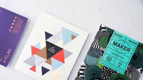
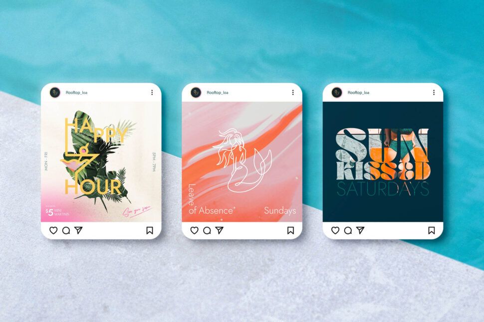
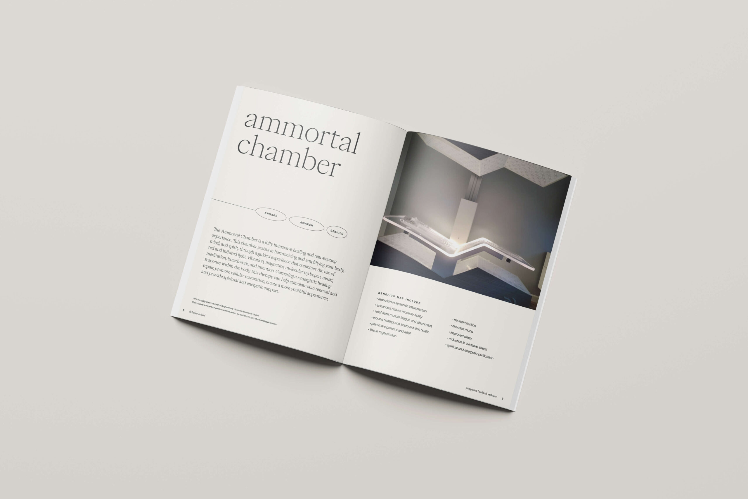
When it comes to infusing variety in your designs, colors, shapes, and textures are your best pals. Each of these elements can breathe life into a design by adding depth and interest. Think about it, ever seen a design that’s all one color? It’s not usually that engaging, right? Now, picture a design where there’s a harmonious blend of vivid hues, intriguing shapes, and diverse textures. It’s much more captivating.
Colors can convey emotions and set the tone for your design. Want something calming? Stick to blues and greens. Need to grab attention? Go bold with reds and yellows. Shapes also play a huge role. Geometric shapes can create a sense of order and stability, while organic shapes might feel more freeing and dynamic. And textures? They add tactile qualities, making the design feel more tangible and real. Whether it’s a rough texture that invokes a sense of ruggedness or a smooth one that feels modern and sleek, textures can elevate your design game.
Balancing Different Elements to Maintain Cohesion
But hey, variety isn’t just about throwing a bunch of different elements together. It’s all about balance. You don’t want your design to end up looking confusing or chaotic. The key is to find a sweet spot where these elements complement each other and contribute to a cohesive whole.
Start by establishing a hierarchy. Decide on the primary elements that will grab attention, and then layer in secondary and tertiary elements. Use your variety of colors, shapes, and textures to guide the viewer’s eye through the design smoothly. Contrasts can be helpful, too – like keeping a consistent color palette while varying the shapes and textures. Or, sticking with a consistent shape style but playing around with colors and textures.
Also, pay attention to spacing. It might sound simple, but giving your elements some breathing room can make a world of difference. Proper spacing helps the elements stand out more individually while contributing to the overall cohesiveness.
And remember, consistency is a form of variety. It sounds like a contradiction, but when you’re consistent with certain aspects – like font choices or border styles – it helps maintain the balance even when you’re adding a variety of other elements.
Applying The Knowledge
So, how do you put all this into practice? Let’s break it down with a simple step-by-step approach:
- Step 1: Define the purpose of your design. What message are you trying to convey, and to whom?
- Step 2: Choose a color scheme that aligns with your message and audience. Make sure it includes a mix of primary and accent colors for variety.
- Step 3: Decide on a mix of shapes and textures that support your design goal. Think about how these will interact with your chosen colors.
- Step 4: Lay out your main design elements and start placing them in a way that feels balanced. Don’t be afraid to tweak and adjust. Variety and balance often come with trial and error.
- Step 5: Review your design. Ask yourself if it feels cohesive despite the variety. If it’s feeling too busy or disjointed, decide what needs to be adjusted or simplified.
By following these steps, you’ll be well on your way to creating designs that are not only varied and interesting but also coherent and visually pleasing. Remember, the beauty of variety in principles of design lies in its ability to add interest and complexity without overwhelming the viewer.


Real-World Applications Showcasing Effective Use of Variety
Ever noticed how some designs just seem to grab your attention and keep it? It’s one thing to talk theory, but when you see these concepts in action, that’s where the magic happens. We’ve picked out some stellar examples that showcase the power of variety in design, and we’ll break down why they work so well.
Apple’s Product Design
Apple is a prime example when it comes to applying variety in design. Look at their products: the iPhone, iPad, MacBook—they all have their unique forms, colors, and textures. Yet, you can instantly tell they belong to the Apple family. This beautiful mix of variety and unity is what makes their design stand out. They use sleek metal finishes, different screen sizes, and colors, but maintain a cohesive brand feel through consistency in logo placement and interface design.
Coca-Cola’s Branding
Coca-Cola is another fantastic example. They’ve been around for over a century, and their branding has evolved dramatically over time. Yet, their design always brings something fresh to the table. From the iconic red and white color scheme to their funky bottle shapes and vibrant marketing campaigns, they constantly mix things up while maintaining a strong sense of identity. The frequent introduction of limited edition cans and bottles also showcases how variety can keep a brand exciting.
Analysis of Famous Designs Emphasizing Variety
Now, let’s take a closer look at some famous designs that beautifully emphasize the principle of variety. These examples will help cement the concept and give you some inspiration for your projects.
Google’s Ever-Changing Doodles
If you’ve ever used Google (who hasn’t, right?), you’ve likely seen their Google Doodles. These are prime examples of variety in design. Each doodle is different from the last, often reflecting current events, cultural milestones, or historical anniversaries. The variety keeps users engaged and coming back, eager to see what Google will do next. Despite the constant change, these doodles maintain Google’s playful and innovative spirit, which ties everything together.
Starbucks’ Seasonal Cups
Talk about a company that knows how to keep things interesting! Starbucks’ seasonal cups are a brilliant example of using variety to keep customers engaged. Every holiday season, they roll out new cup designs. These designs feature different colors, patterns, and illustrations but always feel unmistakably “Starbucks.” The anticipation of new designs adds an extra layer of excitement and creates a unique customer experience.
Visual Soldiers’ Creative Projects
At Visual Soldiers, we totally get the importance of variety in design. Our portfolio is filled with projects that use a balance of different colors, shapes, and textures to create eye-catching and functional designs. We’ve had the pleasure of working with diverse brands, helping them use variety to stand out while staying true to their unique identities. From logo creation to full-scale website designs, we strive to mix things up in a way that aligns perfectly with our clients’ goals.
In all these examples, you can see how variety is not just about throwing random elements together; it’s about creating a harmonious blend of different components that work well together. This balance is key to capturing attention and conveying the right message.
Conclusion
Incorporating variety in principles of design is an essential practice for any designer aiming to create visually engaging and effective work. By understanding and mastering the core principles, designers can strategically use variety to add interest, depth, and personality to their projects. Variety, when balanced with unity, ensures that designs are not only eye-catching but also cohesive and manageable. It’s all about striking that perfect balance where the elements of color, shape, and texture come together to form a harmonious yet dynamic composition.
Real-world examples demonstrate how variety in principles of design can lead to stunning results. From famous works of art to everyday marketing materials, many successful designs owe their appeal to the thoughtful application of variety. For instance, a well-designed website might use contrasting colors and varied typography to draw attention to key areas while maintaining an overall sense of unity.
Embrace the beauty of variety in your designs. Experiment, play with different elements, and always aim for that sweet spot where diversity and unity coexist beautifully. After all, a well-varied design is not only visually delightful but also tells a compelling story.
Visual Soldiers
Visual Soldiers is an Atlanta-based creative studio specializing in branding, design & digital experiences.
