Curait branding & identity design case study.
Curait
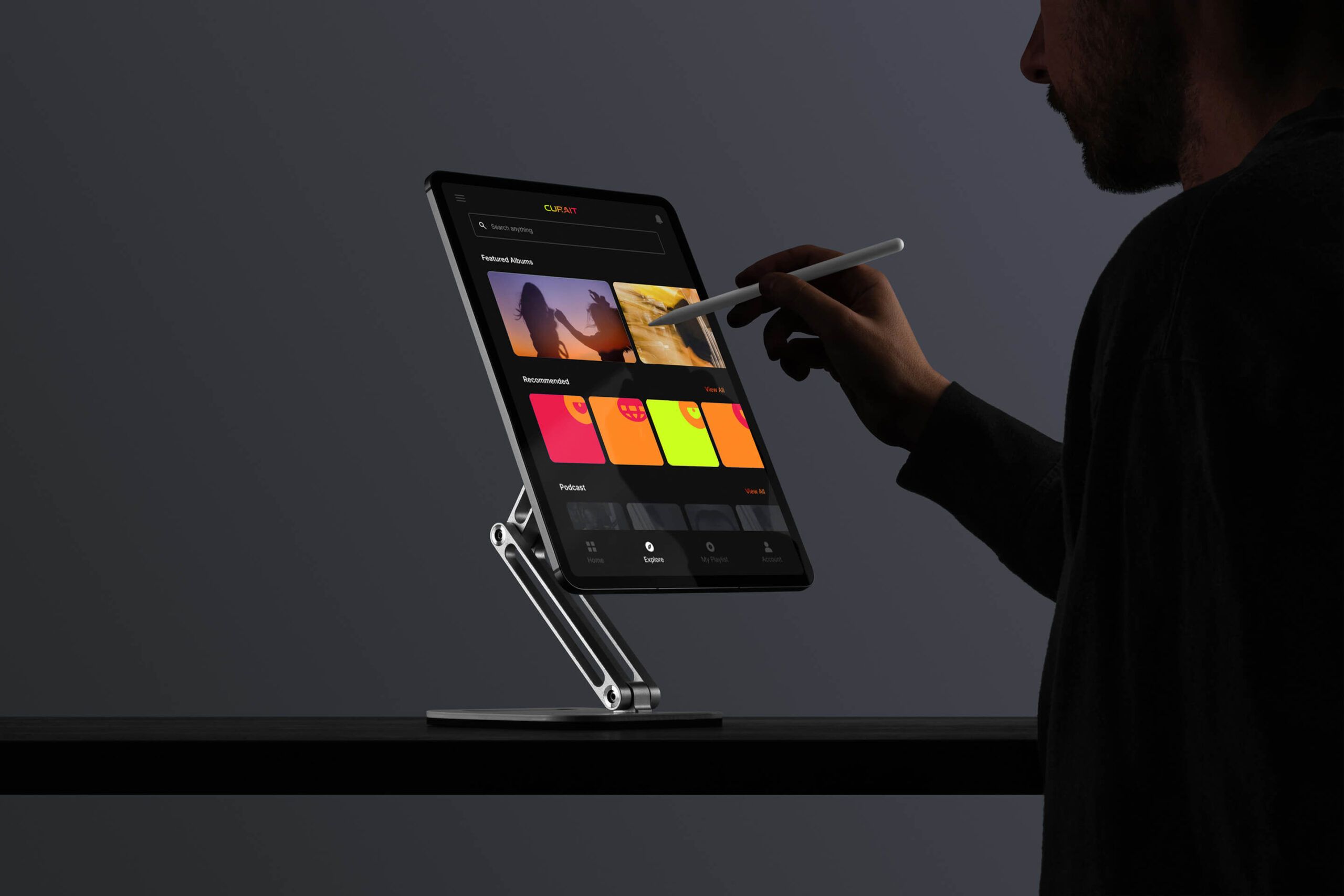
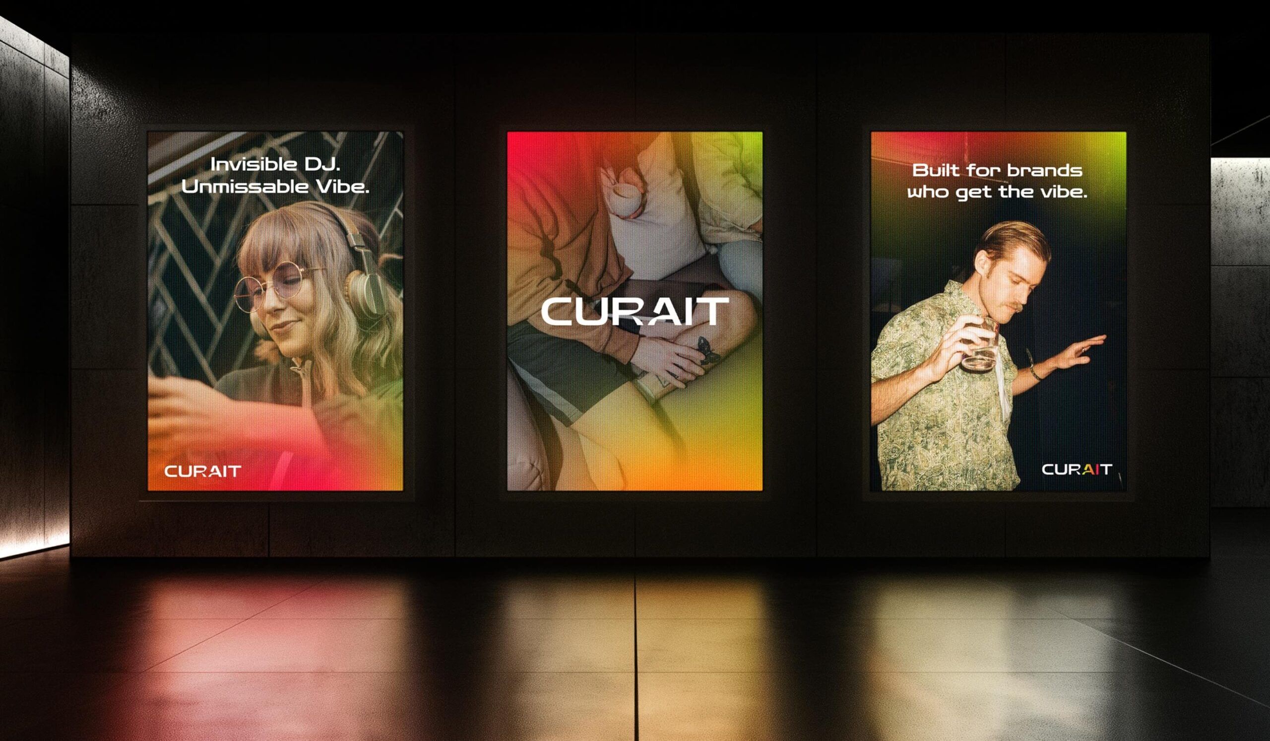
Curait is an AI-powered B2B music curation platform that helps businesses shape their physical spaces and elevate the customer experience through sound. By delivering perfectly tailored playlists, Curait empowers brands to create intentional, vibe-driven environments that resonate with their audiences. We partnered with the Curait team to bring their vision to life visually—developing a fresh brand identity and visual language that feels at home in both the music and tech worlds.
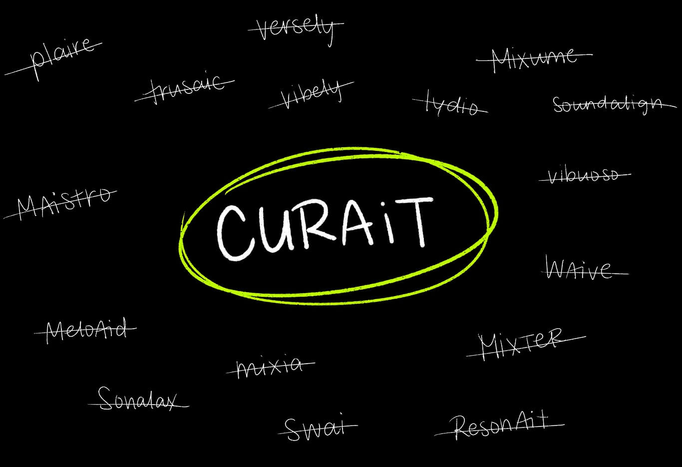
Naming with Intention
We explored a wide range of naming directions—from descriptive to abstract—grounded in themes of technology, music, and discovery. After thorough research and vetting for clarity, scalability, and domain availability, Curait rose to the top. A fusion of “curate” and “AI,” the name captures the platform’s core promise: intelligent, strategic music curation.
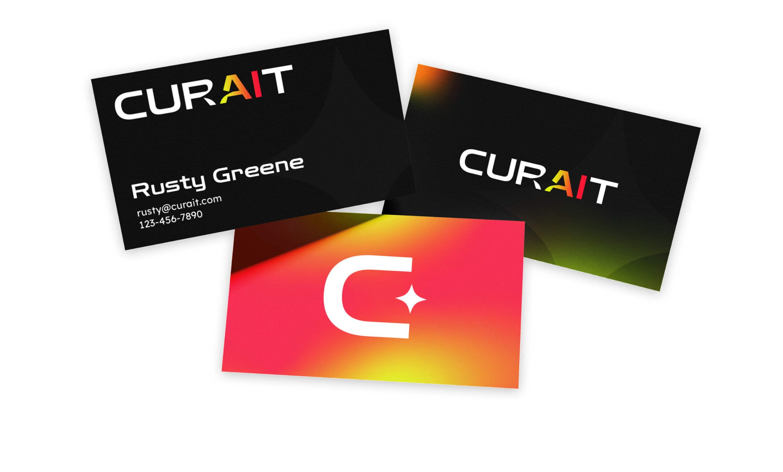
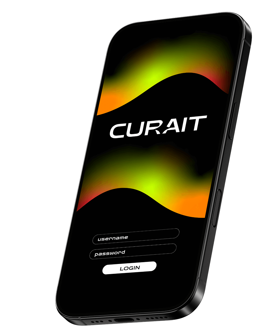
THE MARK
The Curait wordmark features a star subtly carved into the negative space of the letterforms—a quiet nod to the platform’s AI technology. It reflects how Curait shapes atmosphere through music, filling space in a way that’s intentional, seamless, and often felt more than seen.
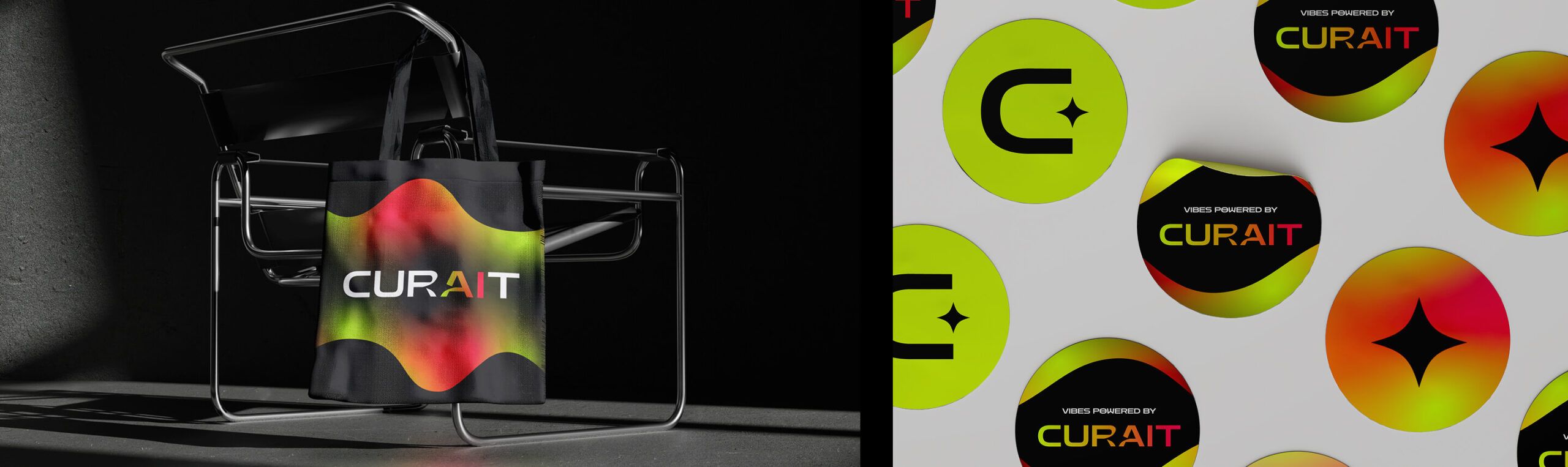
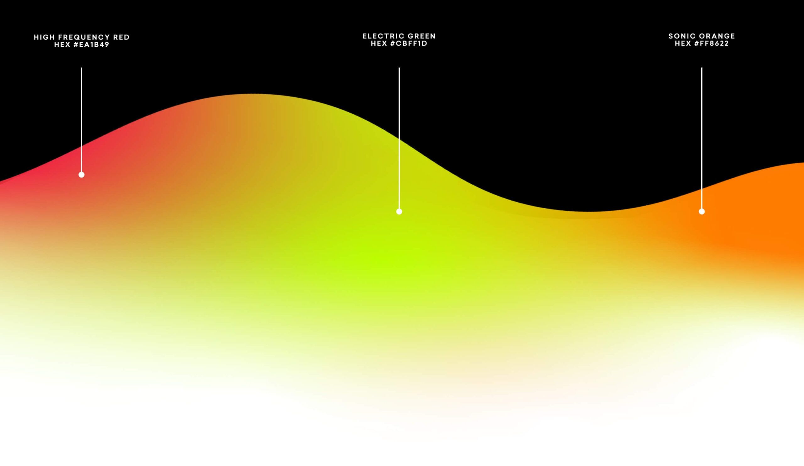
Sound Visualized
As a signature visual element of the Curait brand, gradient waves merge the three core brand colors into fluid, dynamic forms. Inspired by the visual language of sound, these waves adapt and flow, creating a sense of movement and atmosphere. With a balance of hard and soft edges, they provide visual contrast and versatility.
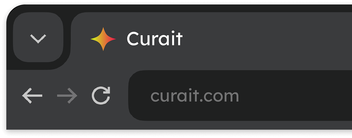
The Star of the Show
Pulled from the negative space of the logo, the star doubles as a graphic motif and a brand signature. As a recognizable icon of AI and intelligent creation, it nods subtly to the technology that powers Curait. The star can be scaled up with transparency to create ambient texture—ideal for backgrounds on print materials like business cards—or scaled down for use as a favicon in digital applications.