October 22, 2024
Effective Layout of Advertising: Key Strategies and Tips
- Visual Soldiers
- Design
- minute read

When it comes to grabbing your audience’s attention, the layout of advertising plays a pivotal role. Understanding the importance of a well-thought-out ad layout can be the difference between a campaign that converts and one that falters. In this article, we’re diving into key strategies and tips for crafting an effective layout of advertising that captures attention and drives results.
Understanding the Role of Ad Layouts in Marketing Success
When we talk about the layout of advertising, we’re digging into how everything is arranged within your ad space. The positioning of images, the selection of fonts, and the overall design work together to convey your message effectively. It plays a huge role in guiding the viewer’s eyes to the most important parts of the ad and, ultimately, in convincing them to take the desired action.
Why’s this so important? Well, folks are bombarded with tons of ads each day whether they’re scrolling through social media, browsing websites, or watching TV. If your ad doesn’t catch their eye in a split second, it’s doomed to fail. A strategic layout helps cut through the noise, grabbing attention and maintaining it long enough to get your message across.
Think of it this way: When you walk into a store, an organized setup helps you find what you’re looking for faster, right? Similarly, a well-thought-out layout of advertising does the same for your viewers. It makes their experience smoother and more intuitive, increasing the likelihood that they’ll engage with your ad.
How a Well-Designed Layout Enhances Viewer Engagement
So, what does a well-designed layout of advertising look like? Let’s break it down. A great ad layout does several things:
1. Grabs Attention Instantly: Your ad’s layout should be visually striking enough to catch someone’s eye right away. Bold headlines, captivating images, and contrasting colors can all help with this.
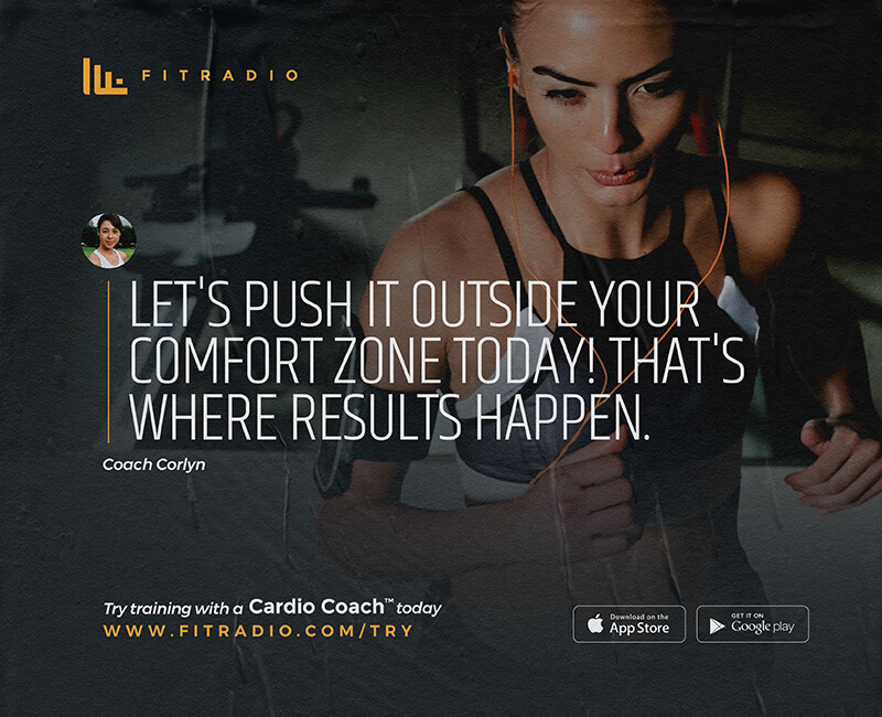
2. Guides the Viewer’s Eyes: Ever notice how your eyes tend to follow a certain path when you look at an ad? That’s intentional! A strategic layout uses visual hierarchy to lead viewers from one element to the next seamlessly. This ensures they get the complete message.
3. Creates an Emotional Connection: Hey, we’re all human, right? Emotion plays a big part in decision-making. A thoughtfully designed layout can evoke feelings that make viewers more likely to engage with your ad, whether that’s curiosity, excitement, or a sense of urgency.
4. Simplifies the Message: Less is more, folks. A cluttered ad is a confusing ad. A good layout keeps things straightforward, ensuring that the most important information stands out clearly.
In the world of advertising, there’s no one-size-fits-all approach. Your brand has its own unique voice, and your ad layout should reflect that. It’s all about striking the right balance between aesthetics and functionality to create something truly captivating.
Key Strategies for an Effective Layout of Advertising
Utilizing Visual Hierarchy and Focal Points
Alright, let’s dive into one of the most crucial aspects for achieving an effective layout of advertising: visual hierarchy. In simple terms, visual hierarchy is about organizing elements in a way that guides the viewer’s eye to the most important parts of your ad. Think of it like a map that leads the audience through your message naturally and effortlessly.
So, how do you employ visual hierarchy? Well, it’s all about highlighting certain elements to stand out more than others. For instance, using a larger, bolder font for your headline compared to your body text, or implementing contrasting colors to highlight a call-to-action (CTA). This helps grab attention where it’s needed most.
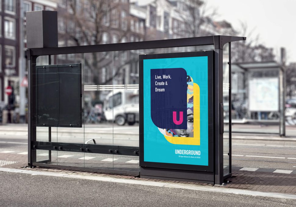
Then there’s the concept of focal points. Your ad should always have a primary focal point—the element you want viewers to gravitate towards immediately. This could be a striking image, a catchy headline, or even a visually appealing logo. By having a strong focal point, you ensure that your main message isn’t lost among the other elements. Bonus tip: Don’t overdo it with focal points—one strong focal point usually does the trick!
Balancing Text and Images for Maximum Impact
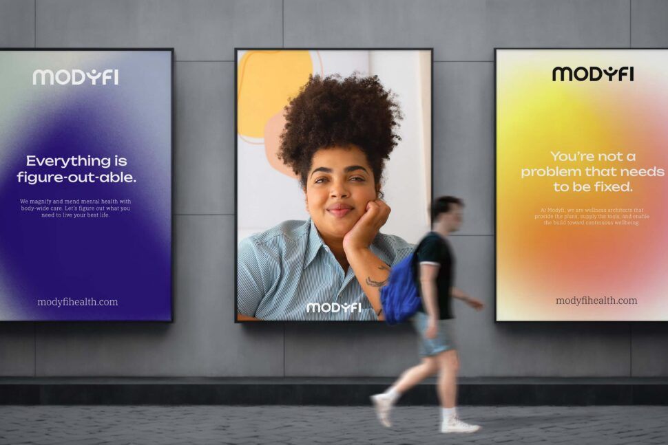
Here’s the part where a lot of ads miss the mark: balancing text and images. You don’t want an ad that’s too text-heavy, but on the flip side, an ad that’s all pictures with no substance won’t cut it either. Finding that sweet spot is key to an effective layout of advertising.
Images are powerful—they can evoke emotions and create a connection with the audience almost instantly. But, they’re most effective when paired with concise, compelling text. Think of your image as the hook and your text as the line and sinker that reels them in.
One way to achieve this balance is by adhering to the 80/20 rule. Use 80% of your space for visual elements and 20% for text. This keeps your ad clean, focused, and avoids overwhelming your viewers with too much information.
Also, pay attention to white space. White space, or negative space, is the empty area around your text and images. It might seem counterintuitive, but a good amount of white space actually enhances readability and makes your ad look more inviting. It’s like giving your eyes a little breathing room, making the whole ad easier to digest.
Visual Soldiers specializes in creating balanced, visually-striking ads that catch the eye and convert. By focusing on these principles, they help marketing professionals craft polished and effective ad layouts tailored to their unique needs.
Looking to build effective ad layout designs for your next creative campaign
Book a Call View Ad Creative ServicesConclusion
In the end, an effective layout of advertising boils down to the thoughtful arrangement of design elements. Key strategies like utilizing visual hierarchy, focal points, and effective white space help in directing attention where it matters most. Balancing text and images ensures that your message is clear yet visually appealing, making your ads both informative and captivating. Whether you’re a marketing professional, a business owner, or someone seeking top-notch creative services, honing these aspects can lead to more compelling and effective advertisements.
So, next time you’re crafting an ad, take a step back and ask yourself: Have I created a clear visual path for my audience? Is my focal point compelling enough? Will this ad generate an emotional response from the end user? Answer those questions, tweak where necessary, and you’ll be well on your way to advertising success.


