Webula Website Transformation Success
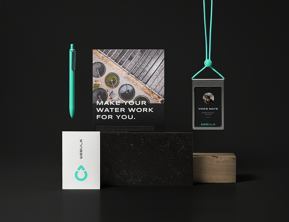
Webula
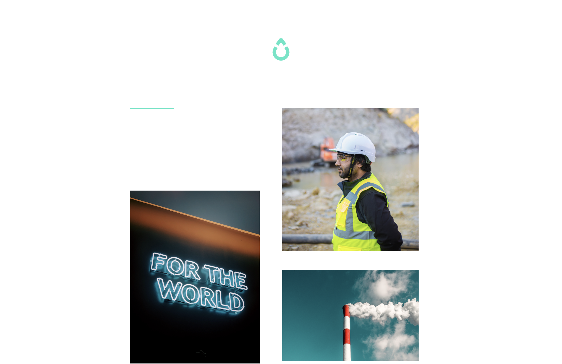
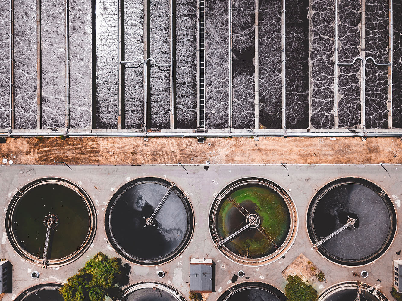
Treat your water the way you'd like to be treated– treat it well.
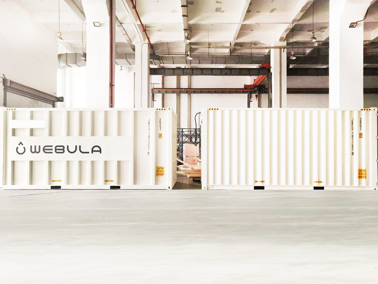
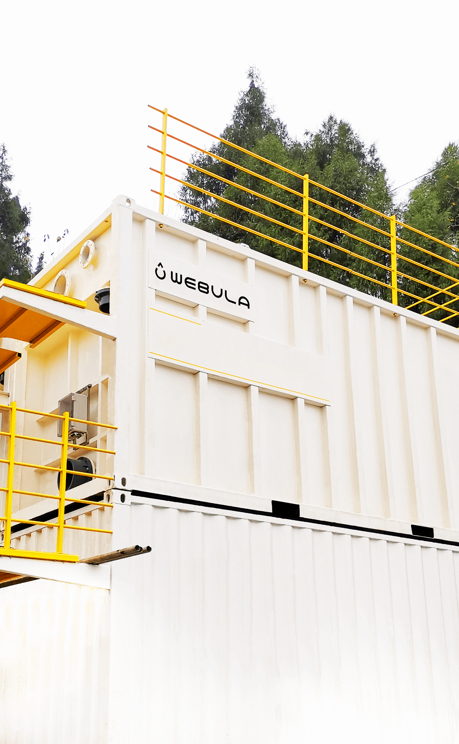
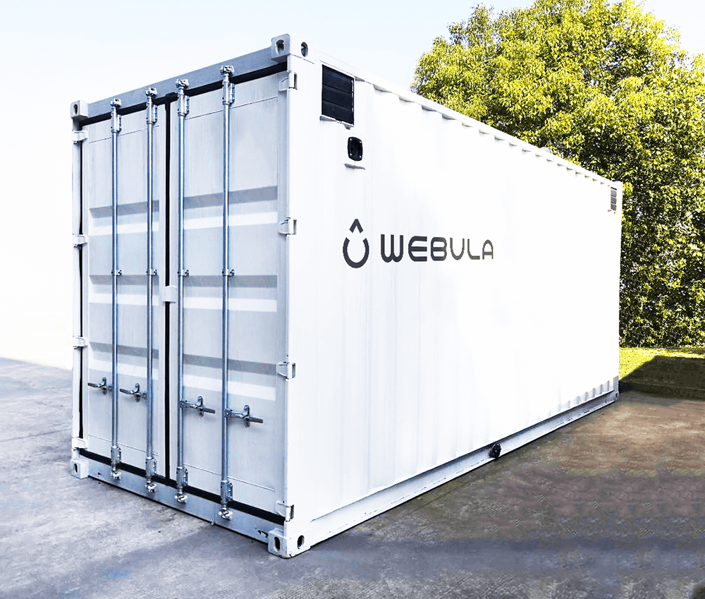
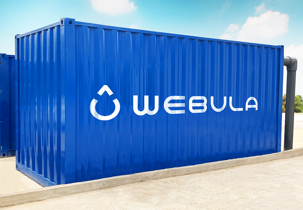
Webula advanced modular water filtration containers
We partnered with Webula to create a new strategy, identity, content library, and digital experience that could usher their filtration technology product into the state-side water market. With a product widely utilized in European and Asian markets, our goal with Webula’s brand strategy was to position them for success within the American water technology market.

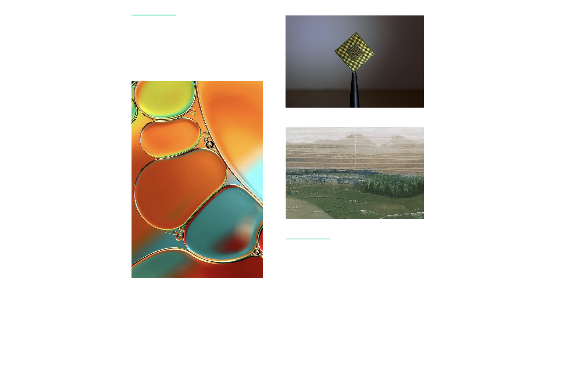
Fluid conceptual design
Throughout our brand discovery sessions we unearthed an eco-forward, upbeat personality to complement a simple, composed and niche method of operation. We allowed this bold and buoyant brand personality to overflow into the brand visuals and user experience. The custom, hand-lettered typography was modularly constructed to mirror the modular nature of the containers. The logo mark was derived from the ‘u’ of the Webula name. Its upward arrow symbolizes increased productivity of water and is reminiscent of a recycling icon.
Understanding the product & service
It’s no secret that this business seems pretty complex. We looked for ways to express the brand visually so that complicated ideas and systems felt understandable. Encouraging the audience to engage with their container and explore it interactively increases both the want to understand the product and the success of understanding the product. Our goal was to make the complex, simple.