Jackbilt Real Estate Brand Transformation
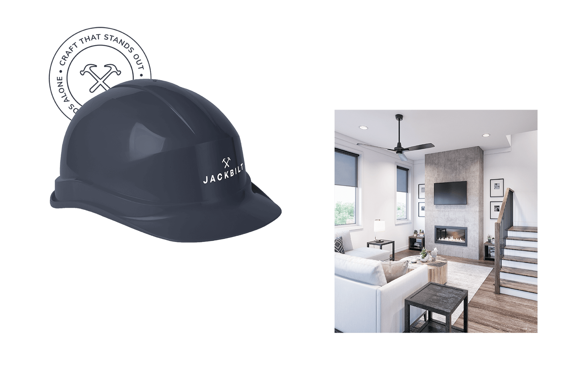
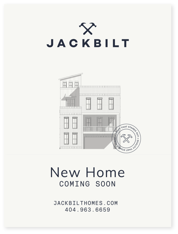
JackBilt
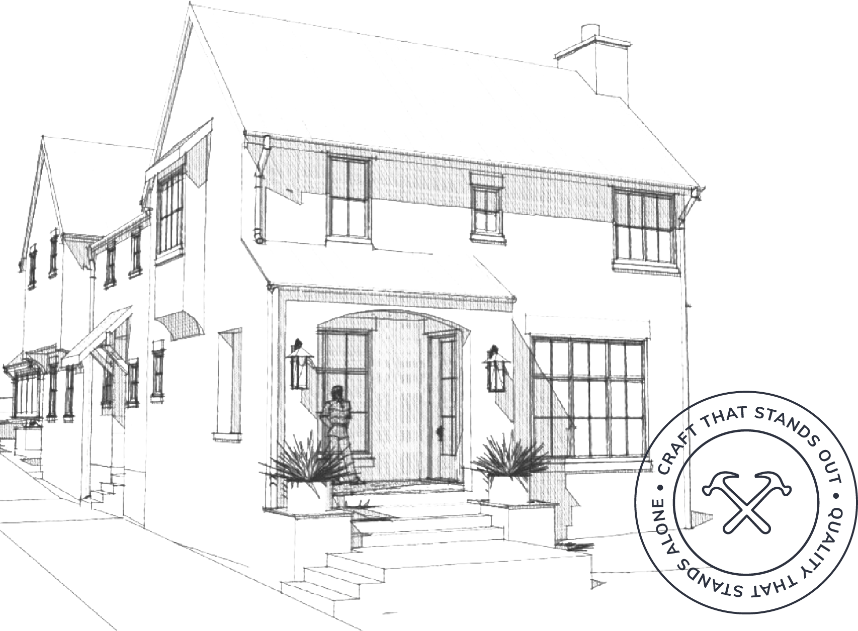
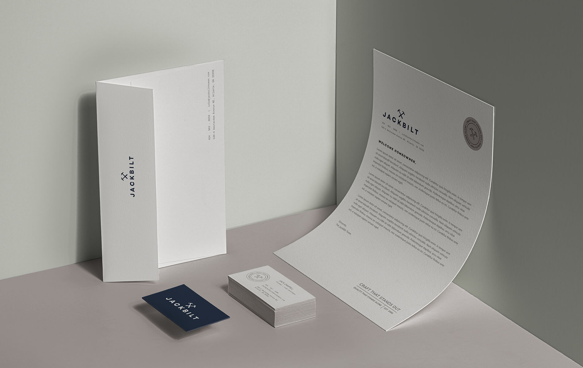
Craft that stands out. Quality that stands alone.
A seasoned developer bringing classic values and a robust, contemporary aesthetic.
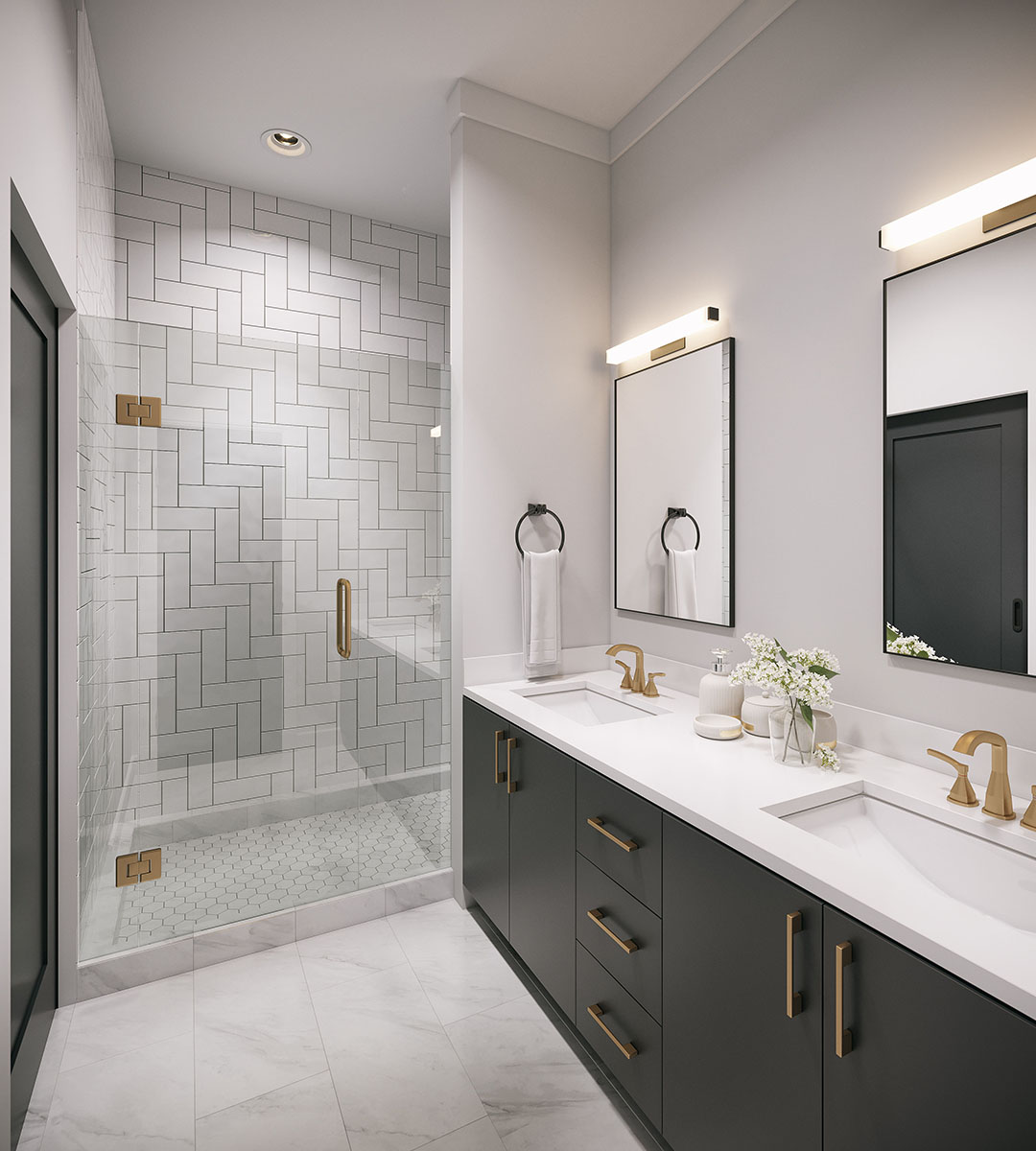
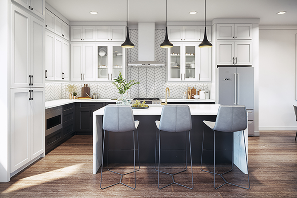
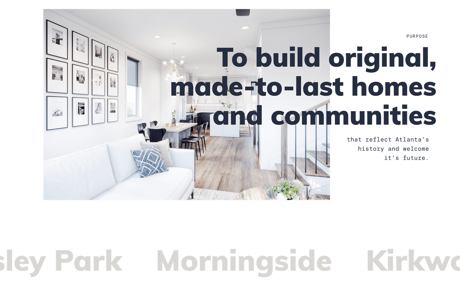
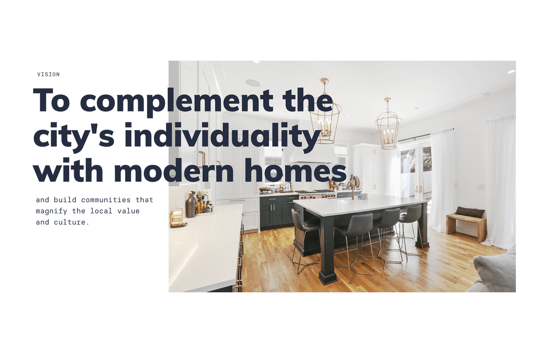
JackBilt develops brilliant Atlantan homes and communities, and we worked to create a brand that communicated that same brilliance, craftsmanship, and timelessness that shines through in their designs. Their new brand was created using a muted color palette with crisp shapes and typography, communicating humility, sophistication, and expertise.
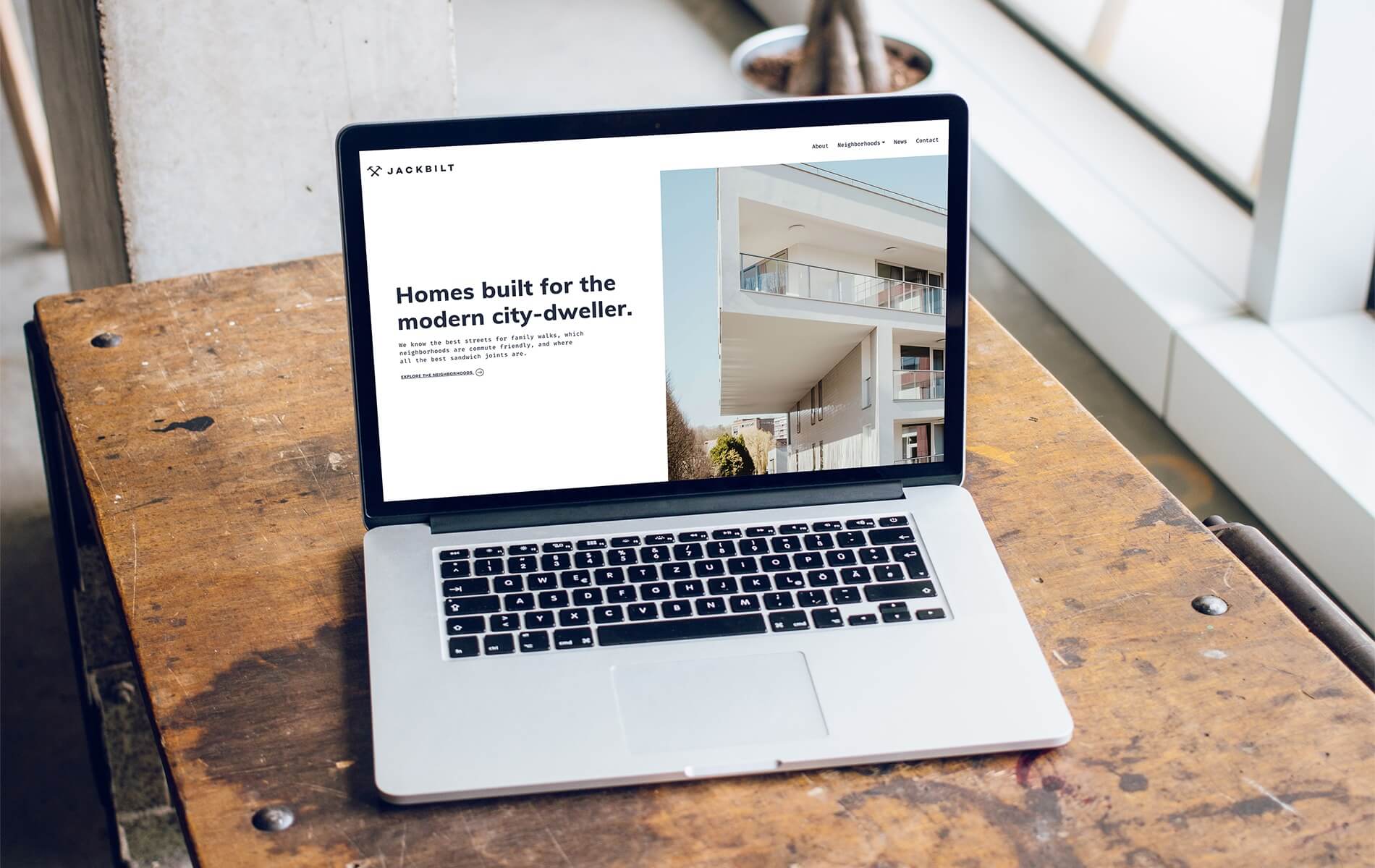
A Re-Imagined Brand Identity
A new visual identity can only come from a new strategy. It was immediately obvious that JackBilt was not just another developer, mindlessly demolishing city blocks and throwing up clapboard homes. JackBilt brings certain intentionality to every project, and that same intentionality needed to come through in the brand, both visually and through messaging.
A Foundation of Trust
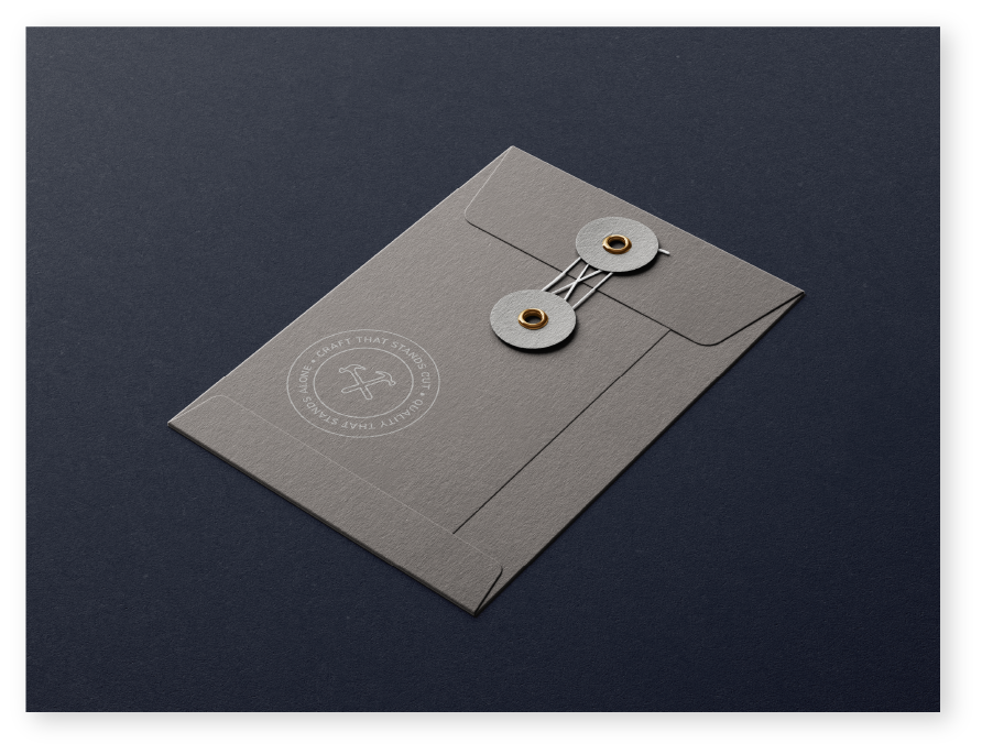
Jack’s new brand is designed to communicate the care that he puts into every decision. A home is a design ecosystem— the floors interacting with the walls, the cabinetry, the countertops, all under the glow of carefully selected light fixtures. By putting care into the brand identity, that deep-seated trust can begin with the very first interaction, whether it’s the sturdy business card, the thoughtful web experience, or the yard sign that speaks directly to the discerning client.