Underground Atlanta Revitalization Case Study
Underground Atlanta
Revisualizing one of Atlanta's most iconic locations – Underground Atlanta.
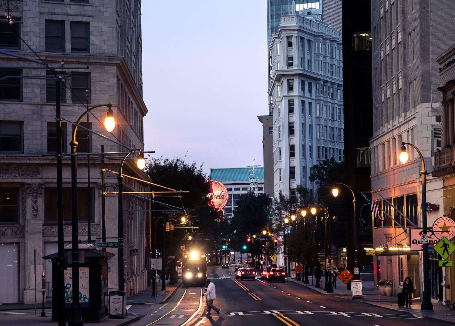
Revitalization of an iconic location
Underground is a unique location with historic significance to Atlanta. Positioned where Atlanta’s first mile was established, Underground has always been an integral part of the city.
We partnered with WRS Inc. to help revisualize Underground’s strategy, brand identity, and web experience and bring their new vision of creating a sustainable community to life.
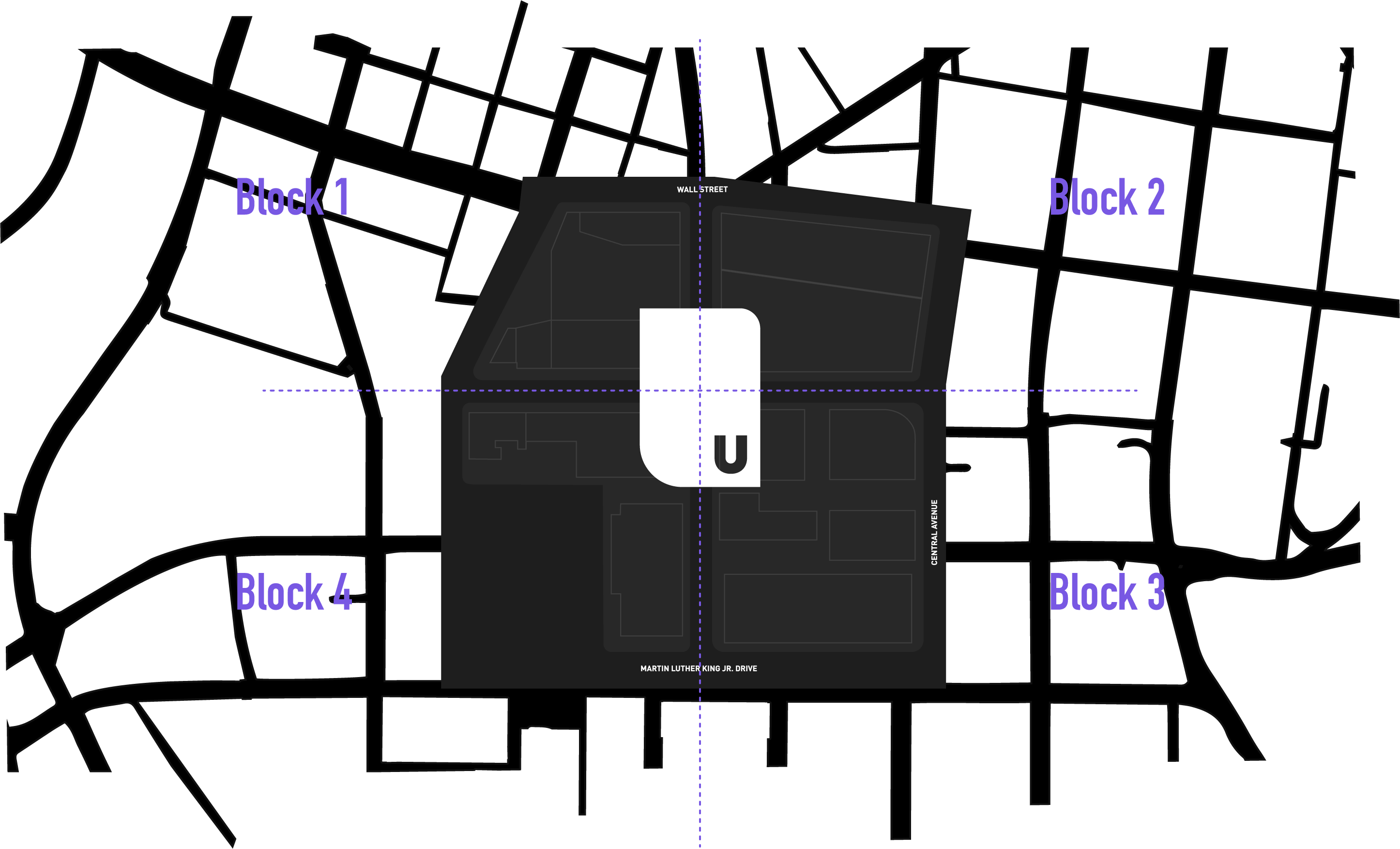
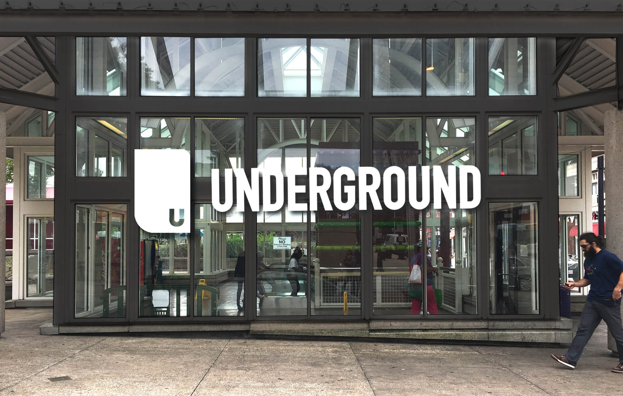
The new mark is an abstraction of the combined four city blocks that create Underground. The letter “U” is located in the bottom quadrant which is the heartbeat and first block of the redevelopment.
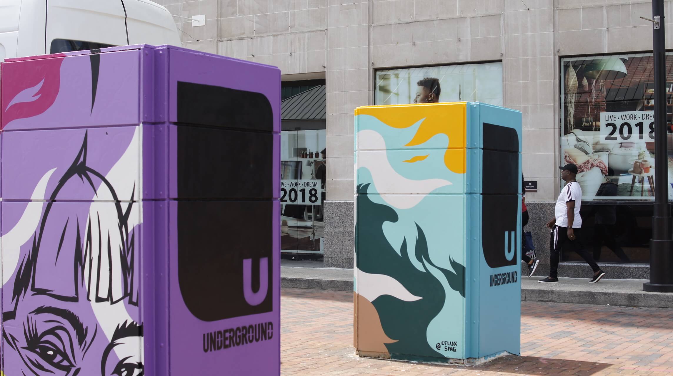
A mark as diverse as its community
To reflect the unique personality of the space, we selected three terms that act as building blocks to Underground’s visual language – bold, vibrant, and gritty. These elements celebrate Underground’s history, its’ changing landscape, and its fluid future as a new community begins to take shape.
Strengthening social fabric with an open canvas
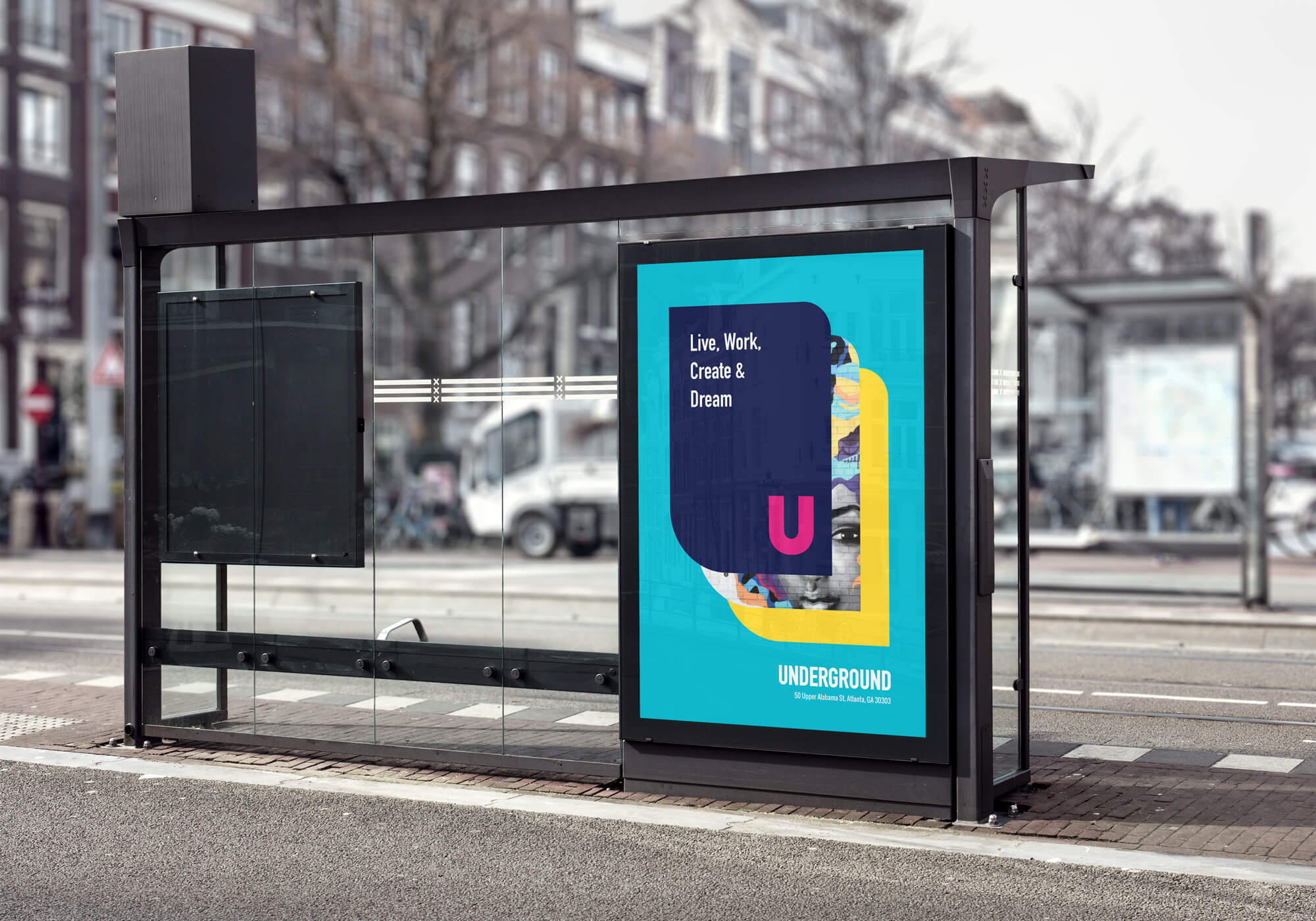
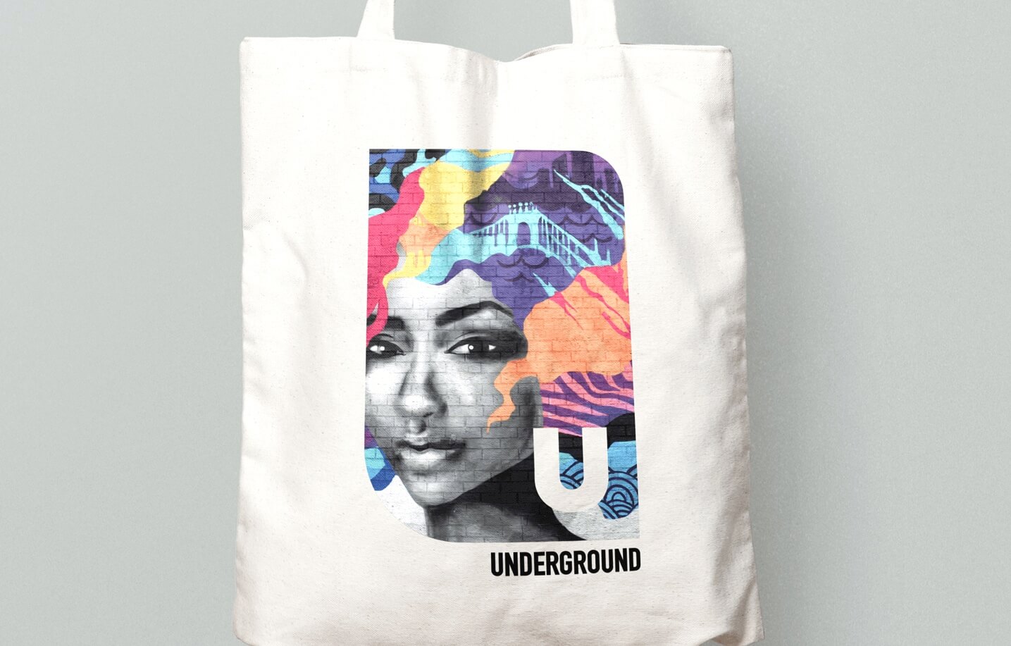
From the beginning, the big picture of Underground’s new development was always to generate a sustainable community. The mark was designed as a dynamic open canvas that could support a variety of textures and lifestyle photography. The new logo is also complemented by an energetic color palette which ties back to Underground’s concept from the early 80s. The vibrancy helps to connect with visitors emotionally and create the atmosphere for a lively, welcoming environment.
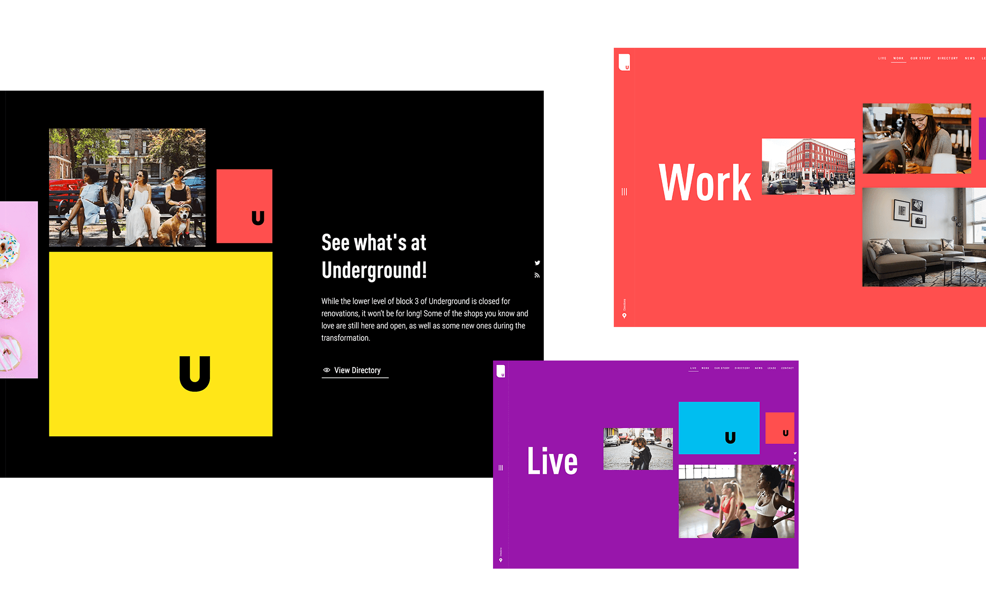
A digital experience with personality
Mimicking the brand identity’s vibrant look and feel, we designed and developed a seamless web experience for Underground. Visitors can follow the development, view the latest news articles, see upcoming events, and explore the directory of restaurants, shops, and entertainment.
