Formacist Brand
Formacist
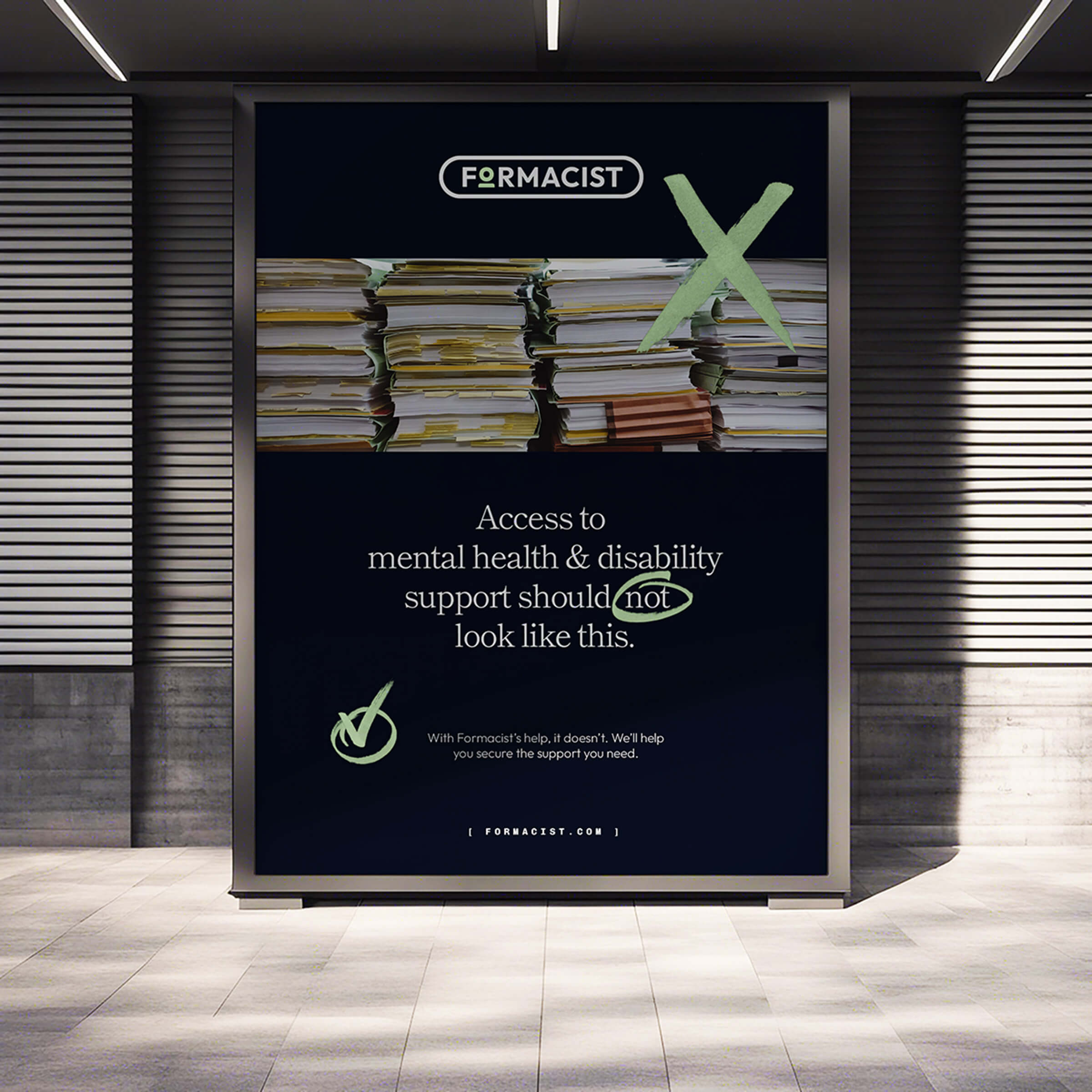
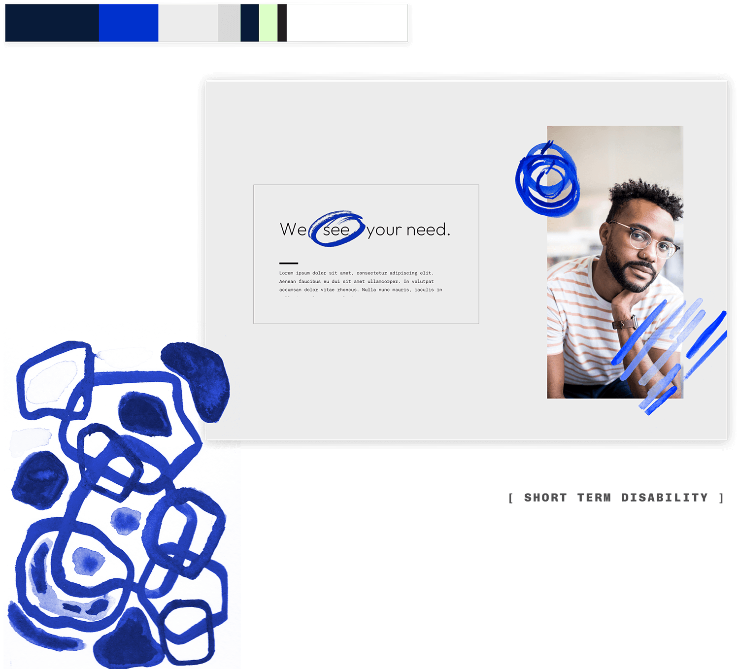
Introducing empathy into the disability claims process.
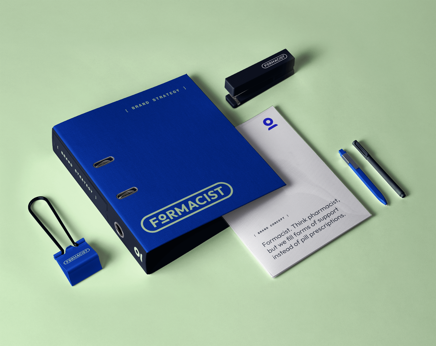
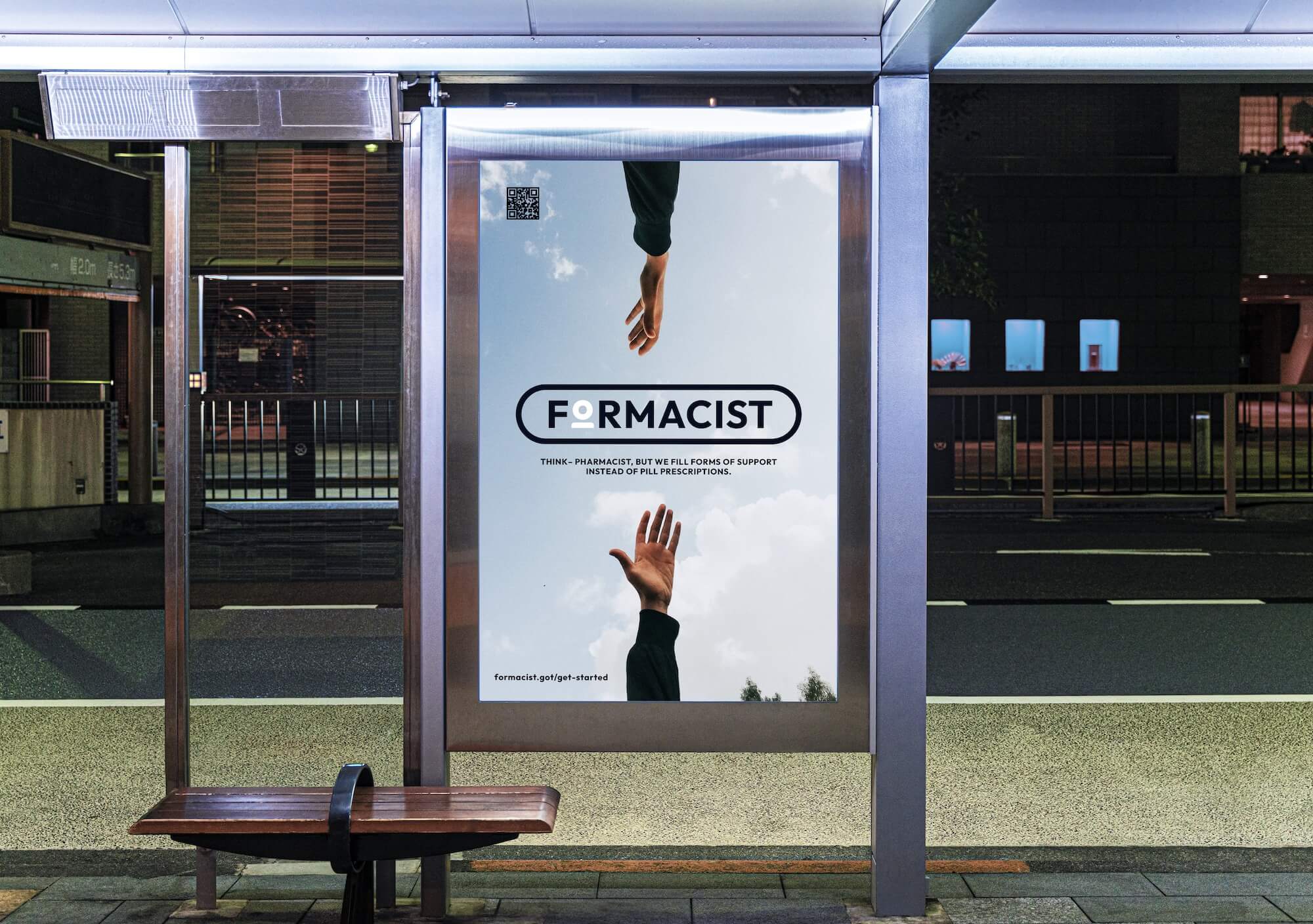
Formacist. Think pharmacist, but they fill forms of support instead of pill prescriptions.
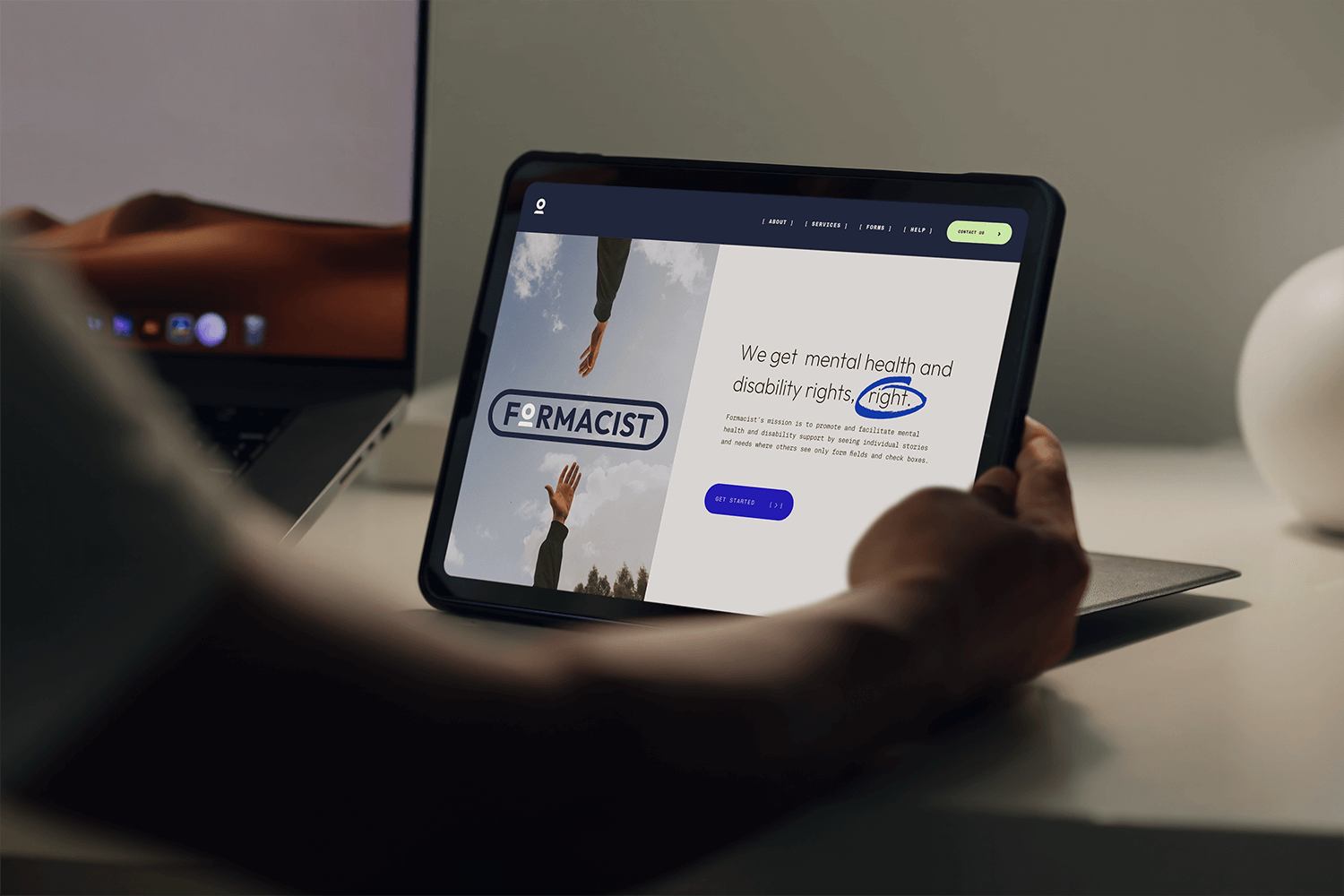
Formacist’s mission is to promote and facilitate mental health and disability support by seeing individual stories and needs where others see only form fields and check boxes.
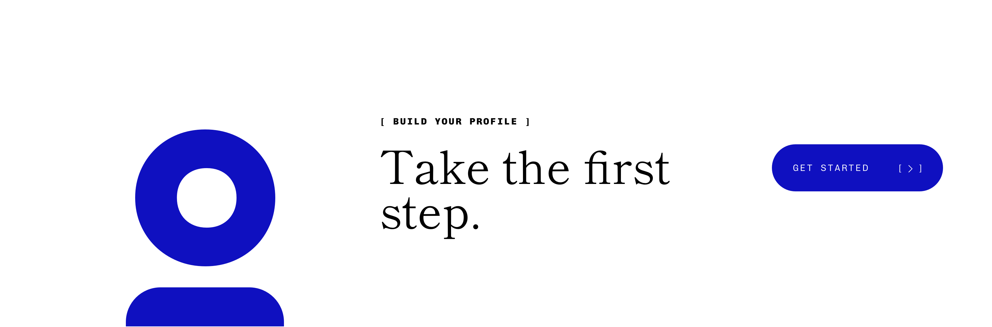
We were brought onboard to build Formacist’s brand strategy and visual identity with the same care and intentionality the company puts into providing support for folks in need. Their new brand strategy is centered around presenting Formacist as both a facilitator and a friend.

Identity Design Process
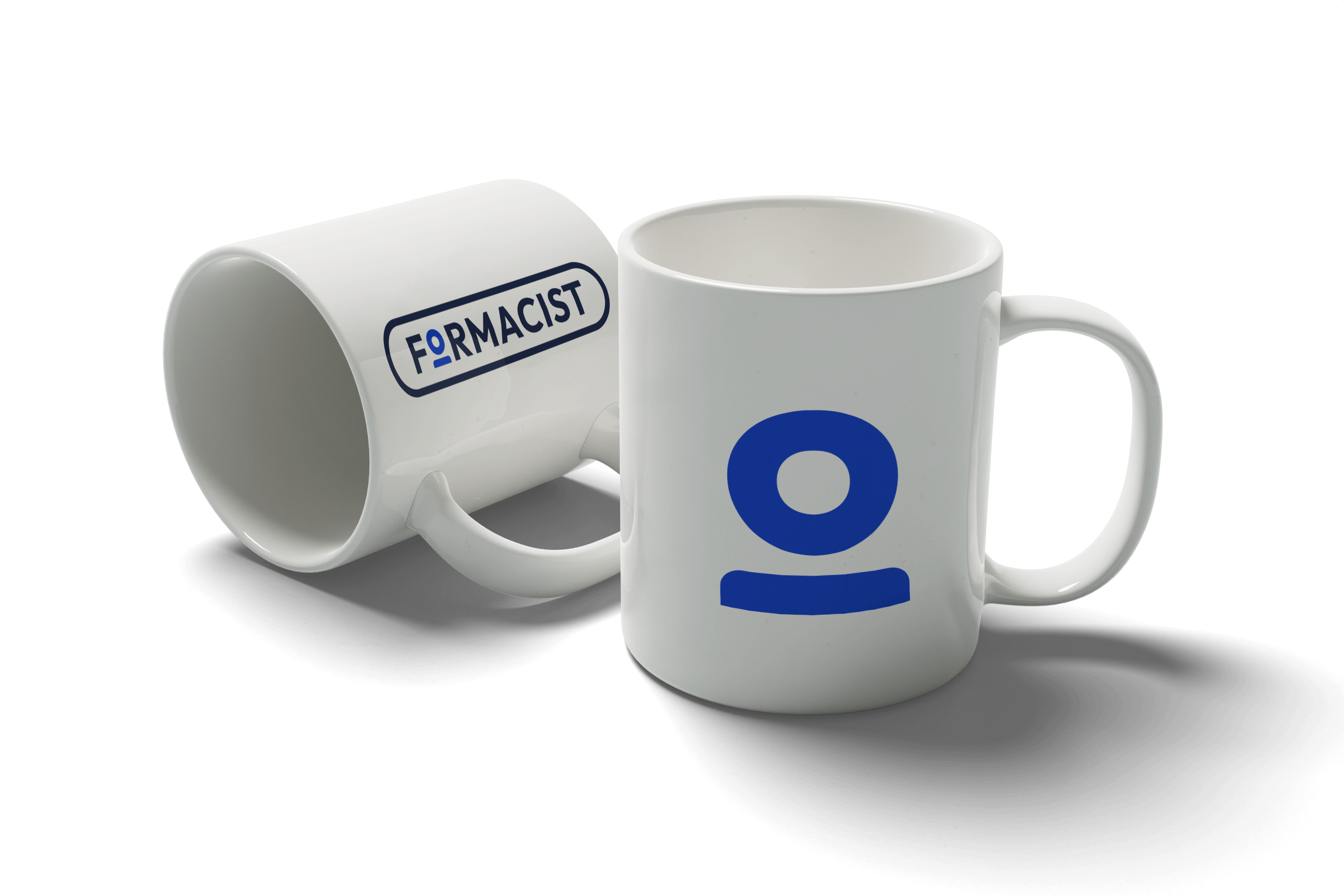
In the initial stages of designing the logo for Formacist, we were adamant about the mark being rooted in brand principles. It’s informed by two key concepts: see a real person in the form, and show accommodations as a viable and available form of treatment.
By using a “numero sign” typographic treatment (a common text visual found on prescription pads) on the letter ‘o’ in the word ‘form’, we created an easily-recognizable person icon. This dictates Formacist’s strong stance in the industry: where there are insurance companies who view patients as “just a number”, we’re turning that number into a real person with a unique case. By incorporating a pill shape (commonly used as a digital form filed) around the logotype, we are expressing another core brand value: that accommodation is another “form” of treatment.
This conceptual logo mark quite literally depicts the brands mission: to see individuals and their lived stories where others just see a “form”.

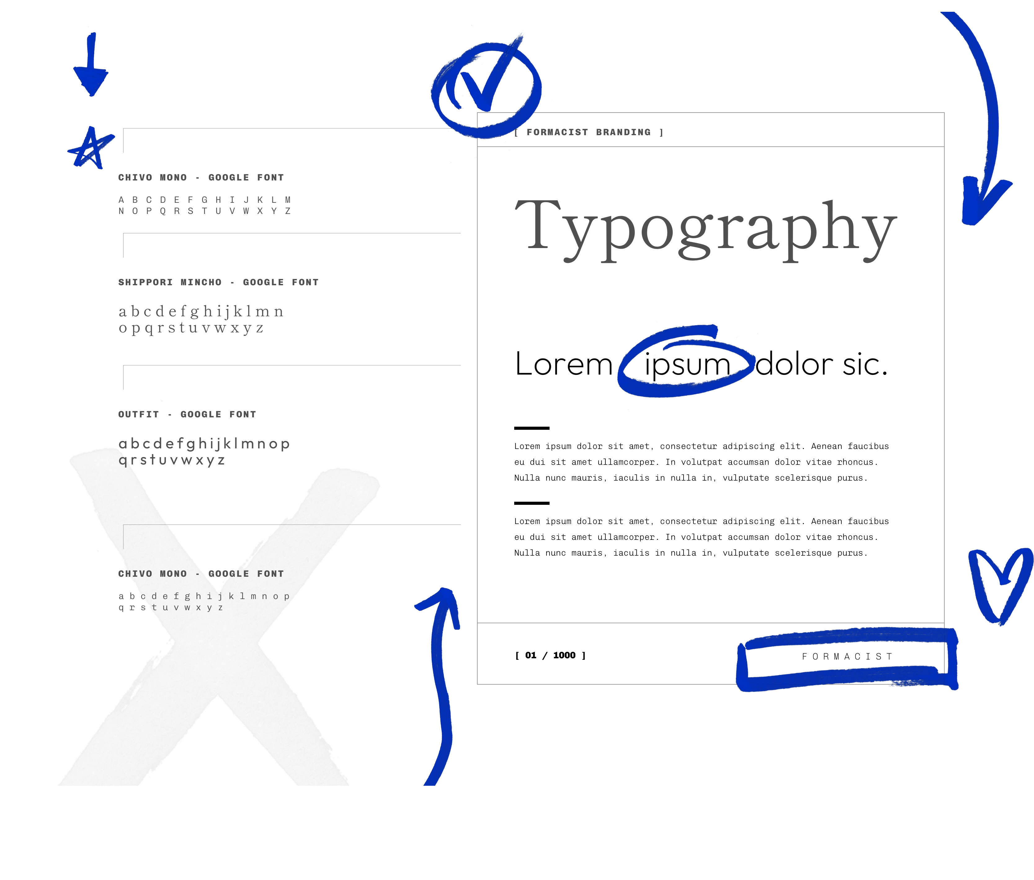
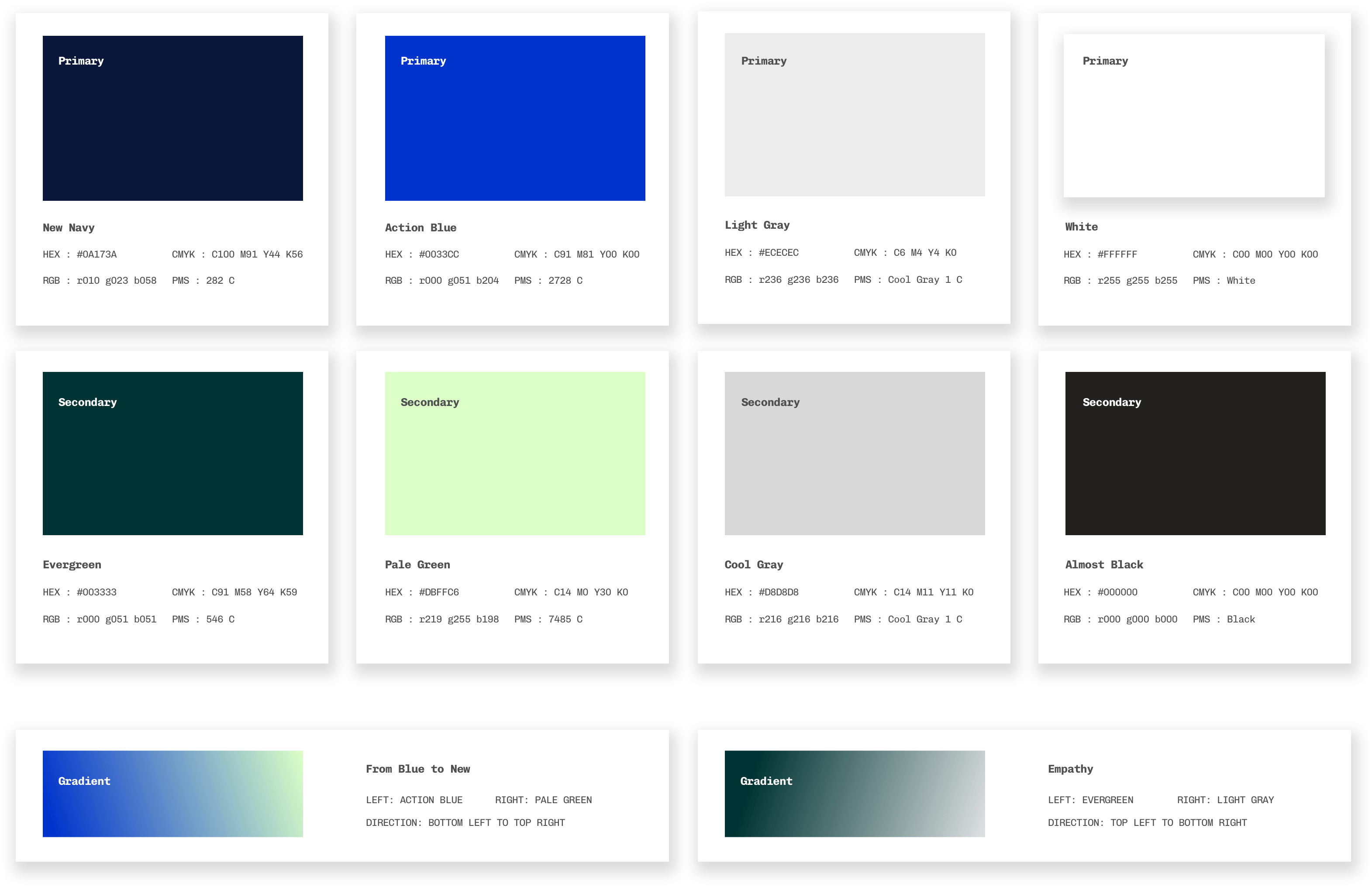
Typography & Color Palette


Custom design elements
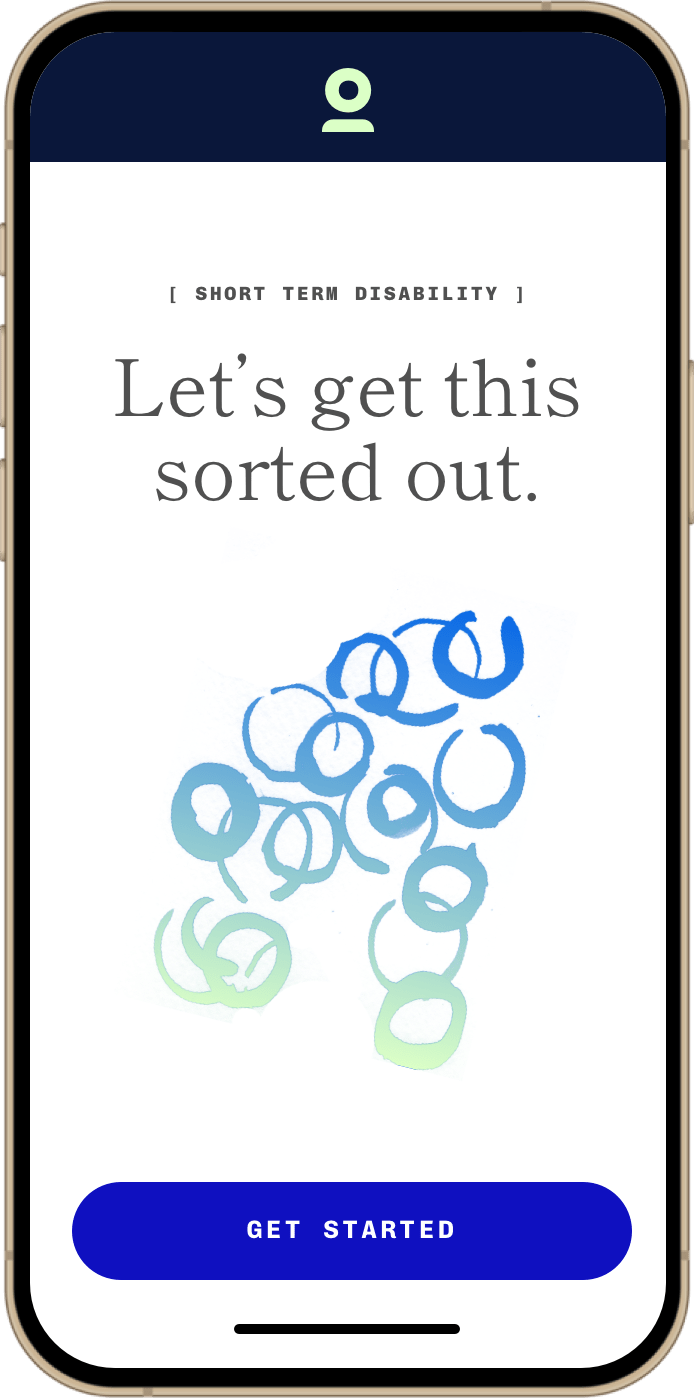
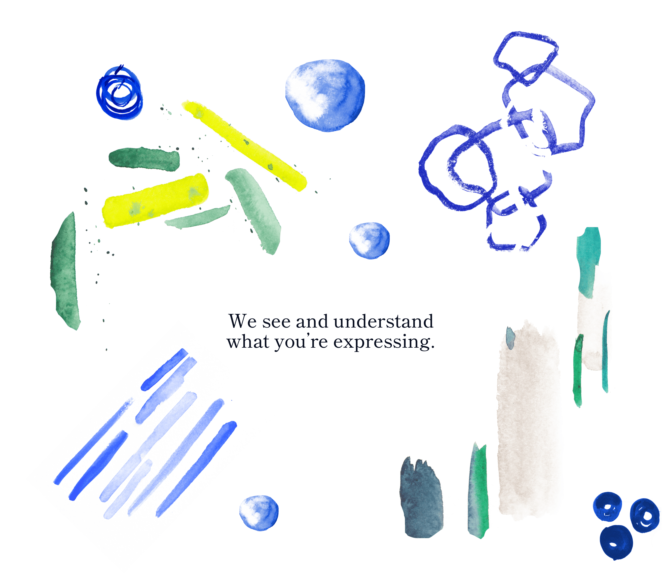
We wanted to build an experience that was authentic– a brand as beautiful, yet complex, as the experiences their users face. We worked with a local watercolor artist to create custom, one-of-a-kind marks that are reminiscent of and speak to the various mental health conditions and disabilities Formacist’s clients live with.
Asking for help is hard. We wanted Formacist’s brand to feel empathetic, understanding, and largely human. Real people helping individuals to get the support and accommodations they deserve.