Streamlining FLS Transport: A Brand Identity Case Study
FLS Transport is a third-party logistics service provider. Being the number one 3PL for cross-border freight, they’re well-recognized and widely experienced in the business of shipping and trucking.
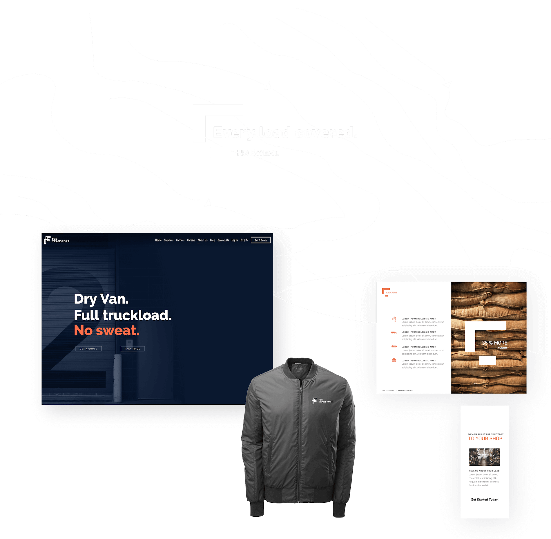
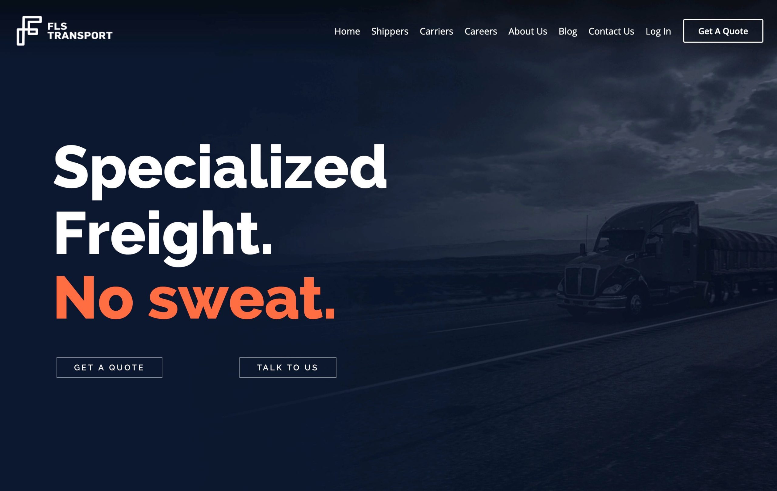
We worked closely with FLS to develop an authentic brand identity that defines them in their industry. The brand was created to be visually compelling and modern, yet simple and clean enough for versatile use.


Picking an agency for your brand re-fresh is one of the scariest decisions you make as a CMO. I am so glad we selected Visual Soldiers. They were world class with the discovery, review and delivery process. We will be working with Visual Soldiers for a long time… we’re BIG fans.

Tim Muenchen
VP of Sales & Marketing for FLS Transport

Shifting the shipping experience into high gear
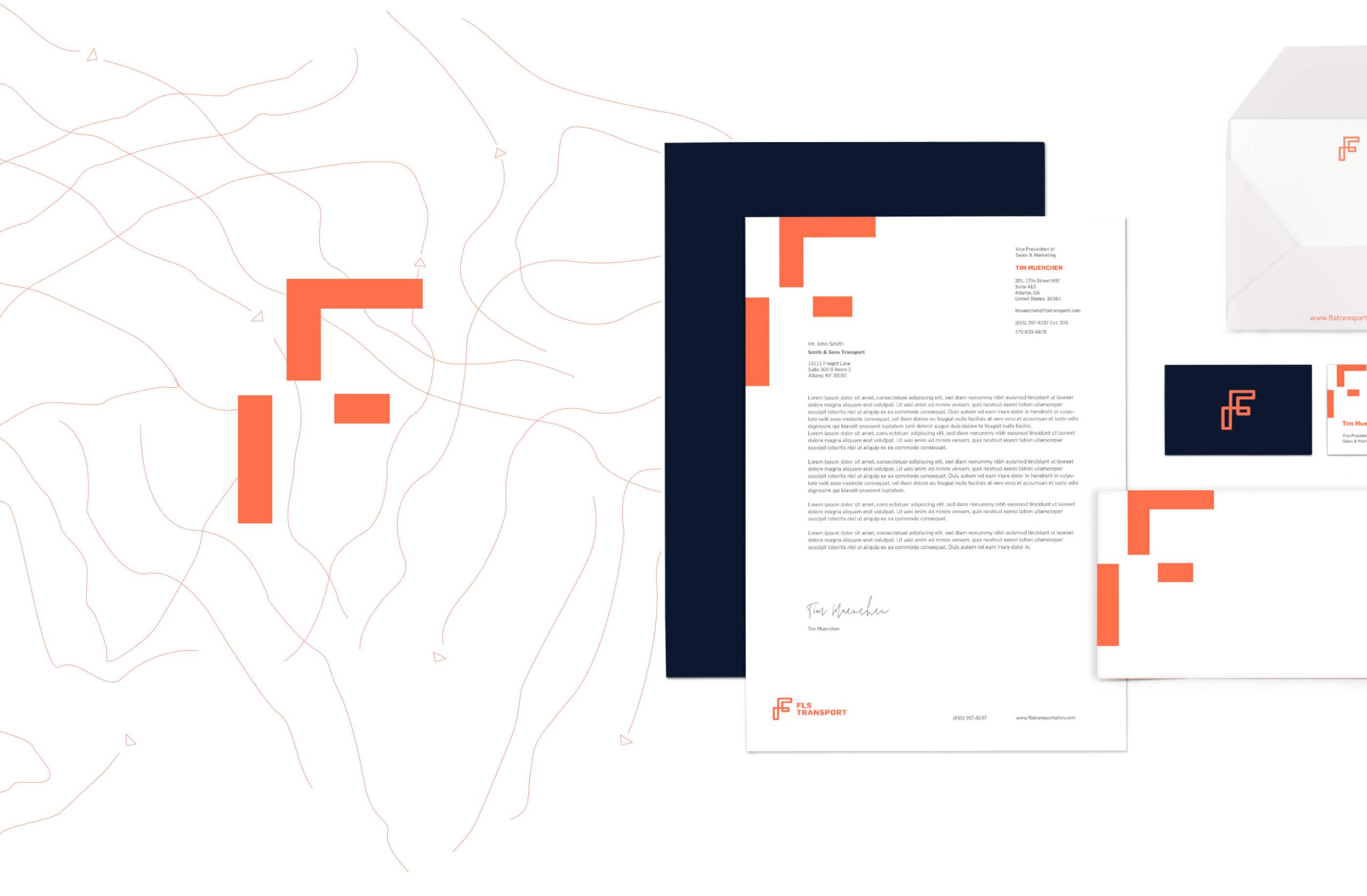
The mark represents the gear shift of the truck as it hits the various speeds required to deliver the load. The gridded structure mirrors the GPS routes that guide the driver from pick-up to drop-off.


A system of over ninety custom, industry-specific icons
FLS Transport has a wide variety of services and an audience that spans the continent. It was important to create a simple and unified icon style to provide them a secondary visual language for their marketing materials.

